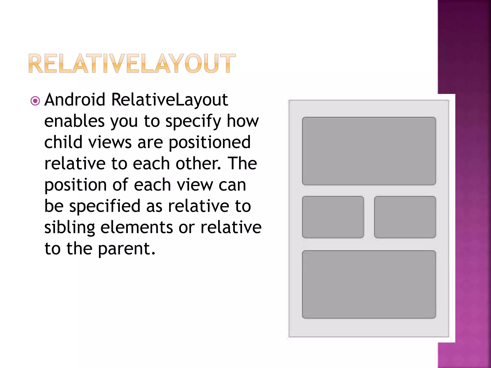
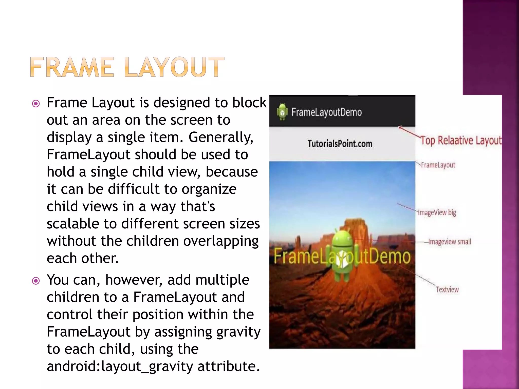
 Android LinearLayout is a view group that
aligns all children in
either vertically or horizontally.

 Android RelativeLayout
enables you to specify how
child views are positioned
relative to each other. The
position of each view can
be specified as relative to
sibling elements or relative
to the parent.
 Android TableLayout going
to be arranged groups of
views into rows and
columns. You will use the
<TableRow> element to
build a row in the table.
Each row has zero or more
cells; each cell can hold
one View object.
 TableLayout containers do
not display border lines for
their rows, columns, or
cells.
 An Absolute Layout lets
you specify exact
locations (x/y
coordinates) of its
children. Absolute layouts
are less flexible and
harder to maintain than
other types of layouts
without absolute
positioning.
 Frame Layout is designed to block
out an area on the screen to
display a single item. Generally,
FrameLayout should be used to
hold a single child view, because
it can be difficult to organize
child views in a way that's
scalable to different screen sizes
without the children overlapping
each other.
 You can, however, add multiple
children to a FrameLayout and
control their position within the
FrameLayout by assigning gravity
to each child, using the
android:layout_gravity attribute.
 Android ListView is a
view which groups
several items and
display them in vertical
scrollable list. The list
items are automatically
inserted to the list
using an Adapter that
pulls content from a
source such as an array
or database.
 Android GridView shows
items in two-
dimensional scrolling
grid (rows & columns)
and the grid items are
not necessarily
predetermined but they
automatically inserted
to the layout using
a ListAdapter
 TextView -It is a view which is used to display text
to the user.
 EditText -A subclass of the TextView view that
allows users to edit its text content
 Button(push button) -It is a push-button that can be
pressed, or clicked, by the user to perform an action.
 Toggle button -It is an on/off button with a light
indicator. -It displays checked/unchecked states using
a light indicator.
 Progress Bar : The ProgressBar view provides visual
feedback about some ongoing tasks, such as when you
are performing a task in the background.
 Spinner : A drop-down list that allows users to select
one value from a set.
 Time Picker : The TimePicker view enables users to
select a time of the day, in either 24-hour mode or
AM/PM mode.
 Image Button -It is similar to the Button
view, except that it also displays an image
 Checkbox -A special type of button that has
two states: checked or unchecked -You should
use checkboxes when presenting users with a
group of selectable options that are not
mutually exclusive.
 RadioButton RadioGroup and RadioButton :- -
The RadioButton has two states: either
checked or unchecked. -A RadioGroup is used
to group together one or more RadioButton
views, thereby allowing only one RadioButton
to be checked within the RadioGroup.
 Date Picker : The DatePicker view enables
users to select a date of the day.
layout and UI.pptx
layout and UI.pptx

layout and UI.pptx

  • 2.
     Android LinearLayoutis a view group that aligns all children in either vertically or horizontally. 
  • 3.
     Android RelativeLayout enablesyou to specify how child views are positioned relative to each other. The position of each view can be specified as relative to sibling elements or relative to the parent.
  • 4.
     Android TableLayoutgoing to be arranged groups of views into rows and columns. You will use the <TableRow> element to build a row in the table. Each row has zero or more cells; each cell can hold one View object.  TableLayout containers do not display border lines for their rows, columns, or cells.
  • 5.
     An AbsoluteLayout lets you specify exact locations (x/y coordinates) of its children. Absolute layouts are less flexible and harder to maintain than other types of layouts without absolute positioning.
  • 6.
     Frame Layoutis designed to block out an area on the screen to display a single item. Generally, FrameLayout should be used to hold a single child view, because it can be difficult to organize child views in a way that's scalable to different screen sizes without the children overlapping each other.  You can, however, add multiple children to a FrameLayout and control their position within the FrameLayout by assigning gravity to each child, using the android:layout_gravity attribute.
  • 7.
     Android ListViewis a view which groups several items and display them in vertical scrollable list. The list items are automatically inserted to the list using an Adapter that pulls content from a source such as an array or database.
  • 8.
     Android GridViewshows items in two- dimensional scrolling grid (rows & columns) and the grid items are not necessarily predetermined but they automatically inserted to the layout using a ListAdapter
  • 9.
     TextView -Itis a view which is used to display text to the user.  EditText -A subclass of the TextView view that allows users to edit its text content  Button(push button) -It is a push-button that can be pressed, or clicked, by the user to perform an action.  Toggle button -It is an on/off button with a light indicator. -It displays checked/unchecked states using a light indicator.  Progress Bar : The ProgressBar view provides visual feedback about some ongoing tasks, such as when you are performing a task in the background.  Spinner : A drop-down list that allows users to select one value from a set.  Time Picker : The TimePicker view enables users to select a time of the day, in either 24-hour mode or AM/PM mode.
  • 10.
     Image Button-It is similar to the Button view, except that it also displays an image  Checkbox -A special type of button that has two states: checked or unchecked -You should use checkboxes when presenting users with a group of selectable options that are not mutually exclusive.  RadioButton RadioGroup and RadioButton :- - The RadioButton has two states: either checked or unchecked. -A RadioGroup is used to group together one or more RadioButton views, thereby allowing only one RadioButton to be checked within the RadioGroup.  Date Picker : The DatePicker view enables users to select a date of the day.