Downloaded 111 times


![References ALVES F. Eduardo. SCMAD Study Guide, 27/04/2008. JAKL Andreas, Java Platform, Micro Edition Part 01 slides, 12/2007. Sun Certification Mobile Application Developer Website: [http://www.sun.com/training/certification/java/scmad.xml].](https://image.slidesharecdn.com/scmadchapter01-1212842403182104-8/85/Scmad-Chapter05-27-320.jpg)

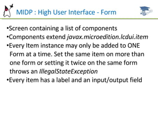
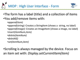
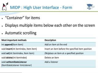
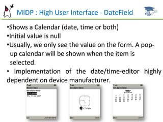
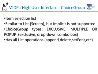
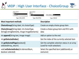
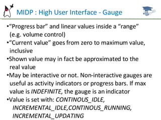
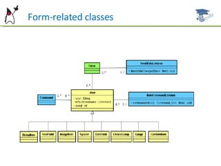
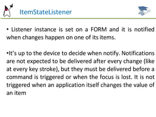
This document summarizes key aspects of user interface design in MIDP, including forms, common item types, layout, and event handling. It discusses the form class and how to add, remove, and arrange items. Common item types like StringItem, TextField, ImageItem, DateField, ChoiceGroup, and Gauge are described. It also covers item layout, commands, and the ItemStateListener for handling item events. Examples and references are provided for further studying MIDP user interface development.