2. Working Title
I have decided to go with the name POP for
my music magazine. It represents the brand
and the magazines genre of music instantly
which will attract the audience because
they’re instantly familiarised. It is short and
sweet just like NME and Q magazine which is
what my target audience preferred in the
survey research so therefore, it can be placed
in the top right hand corner of the magazine
cover. It sends the right message and is
straight to the point. Pop is the genre and the
title. The reader can’t get confused and can
instantly recognise what they will be reading
about. This, in the long term will help with a
strong brand image because the type of music
is the brand which is easily recognisable. From
my audience research a big image was by far
the most wanted and best attraction to a
magazine cover therefore, having the title
short allows the image to still be the pain
focus.
3. The Mission
Our mission here at POP is to keep it
real., with no gimmicks, our readers will
hear first hand from their favourite
artists about new releases, tour dates,
their inspirations and personal lives.
POP allows the reader to connect and
feel close to their favourite pop stars
giving them the close relationship
they’ve always wanted with their idols.
We care about our readers staying up to
date and providing them with all the
pop knowledge they need, especially
new artists entering the industry. We
pride ourselves for being a highly
recognised pop magazine for the teen
market where they can be inspired and
learn from the best in the pop industry,
with our USP being our in depth and
truthful interviews and ability to appeal
more and more each month to our
target audience.
4. The Mission
Our mission here at POP is to keep it
real., with no gimmicks, our readers will
hear first hand from their favourite
artists about new releases, tour dates,
their inspirations and personal lives.
POP allows the reader to connect and
feel close to their favourite pop stars
giving them the close relationship
they’ve always wanted with their idols.
We care about our readers staying up to
date and providing them with all the
pop knowledge they need, especially
new artists entering the industry. We
pride ourselves for being a highly
recognised pop magazine for the teen
market where they can be inspired and
learn from the best in the pop industry,
with our USP being our in depth and
truthful interviews and ability to appeal
more and more each month to our
target audience.
From my audience research I found that the
majority of people wanted to hear this information
and weren’t to bothered about gossip.
From my interviews with teenage girls they stated that they
loved social media like twitter and Facebook because it
allows them to stay in touch with friends but also allows
them to connect to celebrities.
The most wanted feature in the
magazine from my research was
interviews with artists therefore, I will
make this the magazines USP.
From the survey, people
seemed very keen to hear
about new artists in the
industry.
5. Genre
The genre of the magazine will be Pop / char
music. This is due to my research and the majority
of people wanted a music magazine of this genre.
This is a very popular genre of music and is almost
always targeted at young female teens. The
popularity of the genre means I will already have
a market and customer base however, my USP is
to aim the magazine to the older teen bracket,
therefore they will be attracted to the more
sophisticated and personal pop feel to the
magazine. The magazine will represent the genre
through choice of artists used and colour
schemes. Pop is a huge genre so I asked people
which types of artists they liked so that I had an
idea of which kinds of artists people liked
however the broad genre allows the magazine to
appeal to lots of people because a rage of artists
can be used to attract people. Also the title of my
magazine reinforces the genre of music
connecting the brand and genre will give a clear,
strong image of the magazines purpose.
6. Cover price/ Frequency
The magazine will be published monthly due to the majority of
people wanting this in my survey. This means that each
magazine will be able to hold lots of information from the past
month of pop music. The magazine can have lots of detailed
articles and interviews and polished and well thought out
photography shoots and live images because you won’t have
the rush of a weekly magazines so things won’t be missed out.
Also, a monthly magazine adds continuity and people will
remember to buy it once a month where as every two months
people may forget because it isn’t regular enough. It will be
published on the 1st of each month. This makes it new and
fresh for that month and readers don’t have to wait and also
allows seasonality themes in the magazine, for example in the
December issue there may be a Christmas vibe. The cost of
the magazine will be £3.99 because the results from my survey
show that the majority of people are prepared to pay this
however, I have taken into consideration my target audience
who will be mostly students or unemployed due to their age so
therefore, I will have a student discount rate for people with a
student card and this will be £2.99. This is affordable once a
month and will attract my target audience. Using psychological
pricing as well (99p) allows the reader to think they’re getting a
deal rather than the magazine being priced at £4.
7. Attitude
Sophisticated POP- My target audience is the
older teen bracket of 16- 19 year olds therefore,
I will not be having the traditional messy, vibrant
and over the top girly pop magazine. From my
interviews I found that teenage girls love their
fashion and music in a real sense and not an OTT
matter. The magazine will be sophisticated and
girly. Colours will still be aimed at the female
market however, the girls I interviewed said they
loved mutual colours like greys and blacks for
their fashion and said that this represented their
personality's. They described themselves as
confident, kind and fun which I want to be
reflected in the magazine. The range of text and
images will be varied with more images than
text as that is what was preferred from my
survey results. This will appeal to the reader and
also make it more interesting and fun to read.
The layouts preferred
Colour Scheme
8. Reader Profile
Key Facts
Male: 43.24
Female: 56.76%
Pop/ dance lovers:
62.17%
Age: 16-19
My readers are bubbly, loud and fun
people who love to be inspired and
connect with their favourite music
artists. They are students with a
budget but love to spend their money
on clothes and concert tickets.
Readers have mutual connections
and hobbies so we allow them to
interact together on the POP forum. ‘I
love Instagram because I can connect
with people’. Our magazine provides
the reader with the personal
connection they want with their
favourite artists. Our audience are
stylish but keep it real. They want a
good time and POP will provide them
with the talking points for their social
gatherings with friends.
9. Style Sheets
Masthead
Headline
will be in this font ‘Myraid Pro’
It’s very clear and organised. It isn’t fancy
which doesn’t distract from what the headline
is actually saying. It appears sophisticated
which is what the magazine is aiming to be.
Cover line
headings-
The cover lines will be in the font
‘Franklin Gothic heavy’ Again, its clear
and easy to read and complements the
headline font and masthead. It’s bolder
than the headline in order for them to
look important on the page as the
headline has size to stand out.
Article Text- Will be
‘Calibri (Body)’ This is a basic,
easy read font.
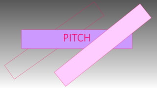
The masthead I have decided to
choose is the bottom one with
‘Cambria’ font. The bold, solid
colour allows the masthead to be
easily seen and the colour is also
appealing to the target audience.
The 3d/raised effect adds a
uniqueness to the masthead and
therefore, makes it recognisable and
of importance as it stands out as
coming out the page. The solid
colour will contrast boldly with the
background allowing it to stand out
even more. The capital letters make
it loud and stand out making sure no
one can miss it. Using a darker pink
is more bold and will stand out
better on backgrounds.
10. Magazine Flat plan
Images
Text
Advertisment
This is a flat plan for my monthly magazine. From the survey results it was said that more images were wanted than text so therefore I
have taken this into consideration. I have included advertisement because my target audience are teenagers and therefore look up to
their favourite artists and like to buy what they are interested in. Also, the advertisements can be aimed at things that the girls I
interviewed said they spent their money on, e.g.- clothes, music and social media sites. I have given the pages a variation of layouts
and text/picture ratio which makes the magazine interesting and more fun. The adverts also help transition the pages so its clear
when a new article is going to appear.