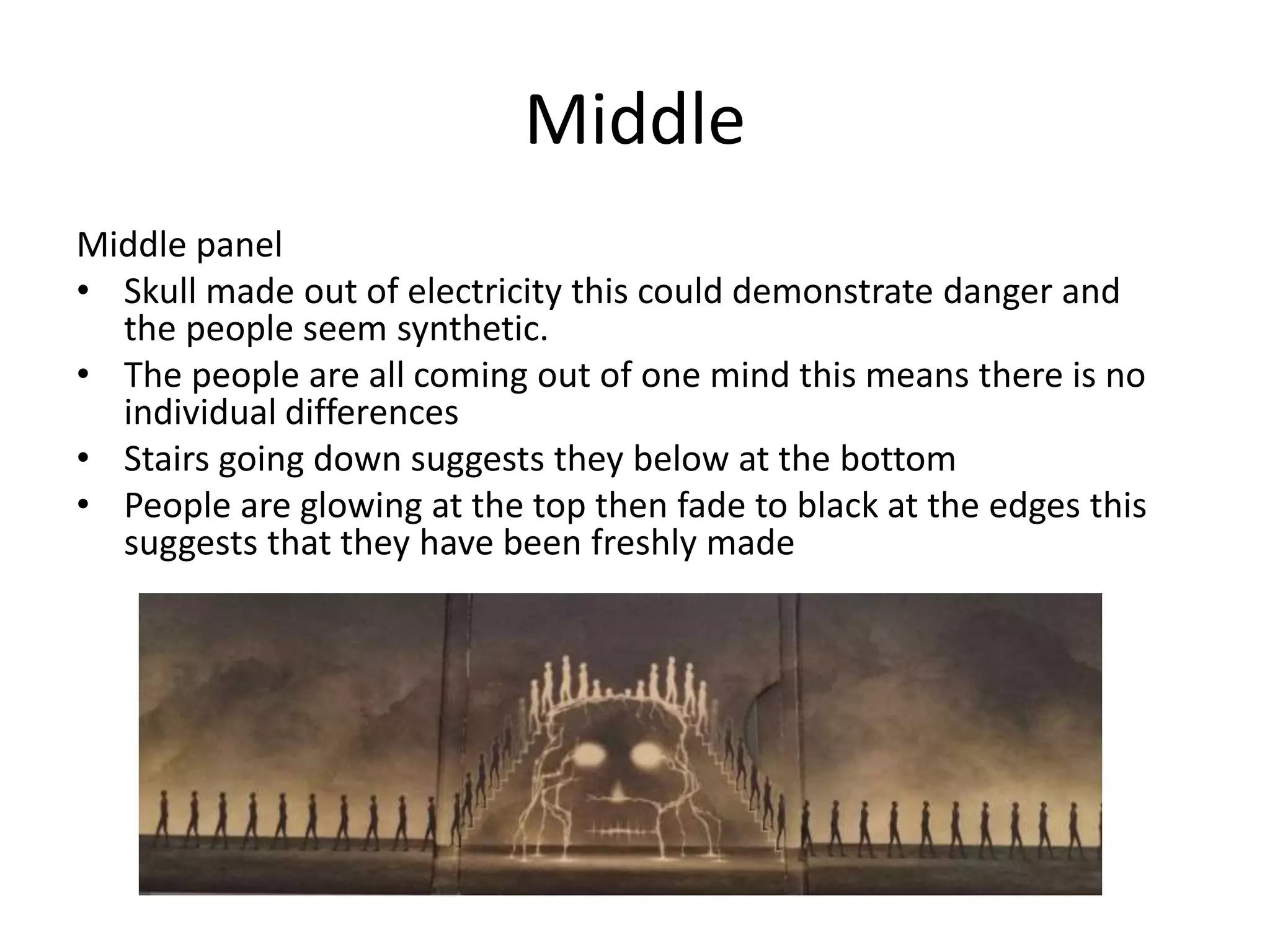
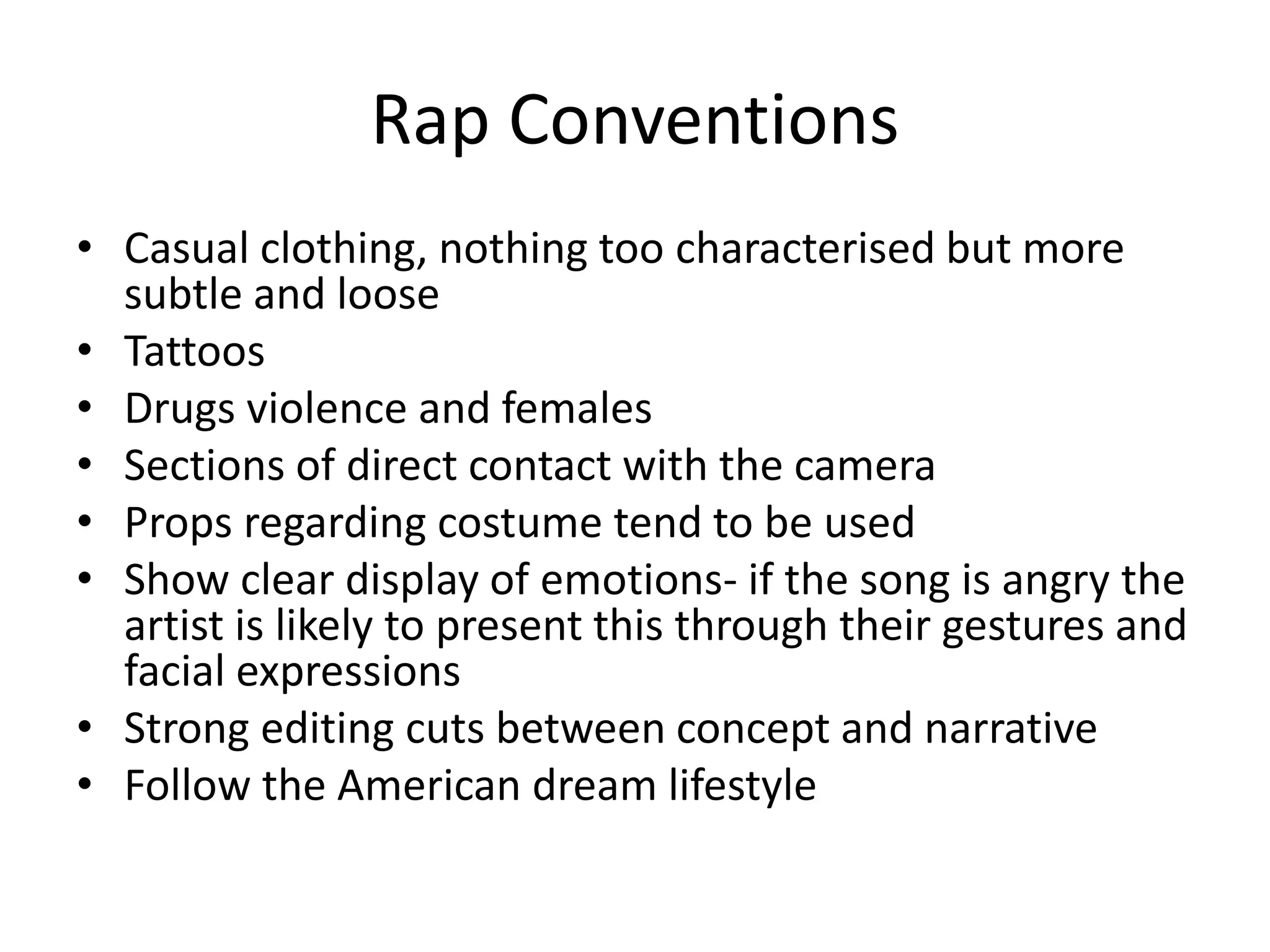
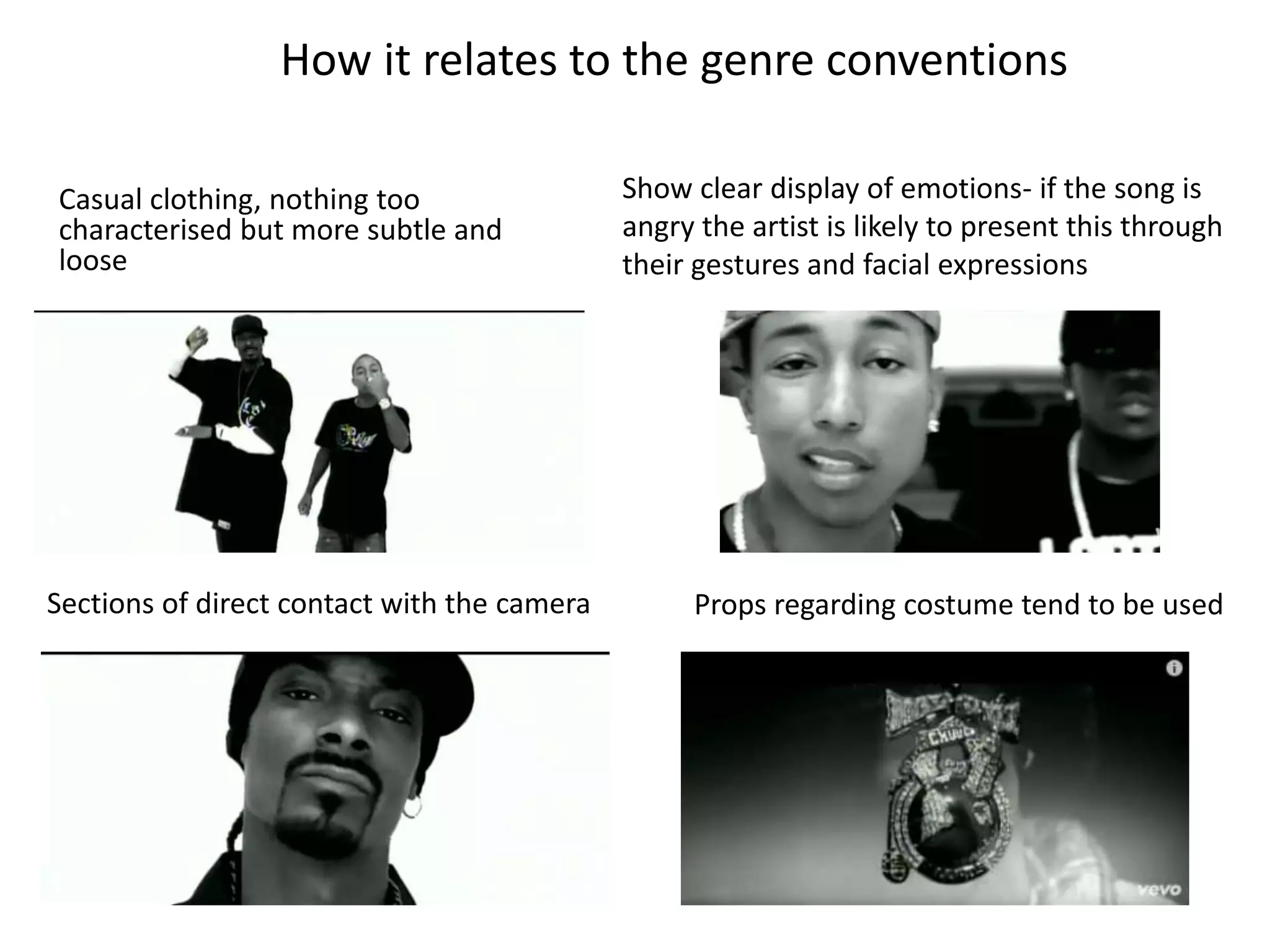
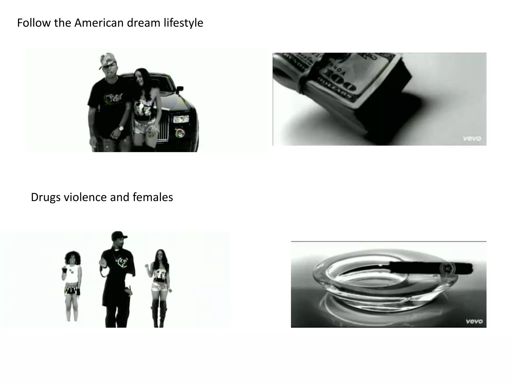
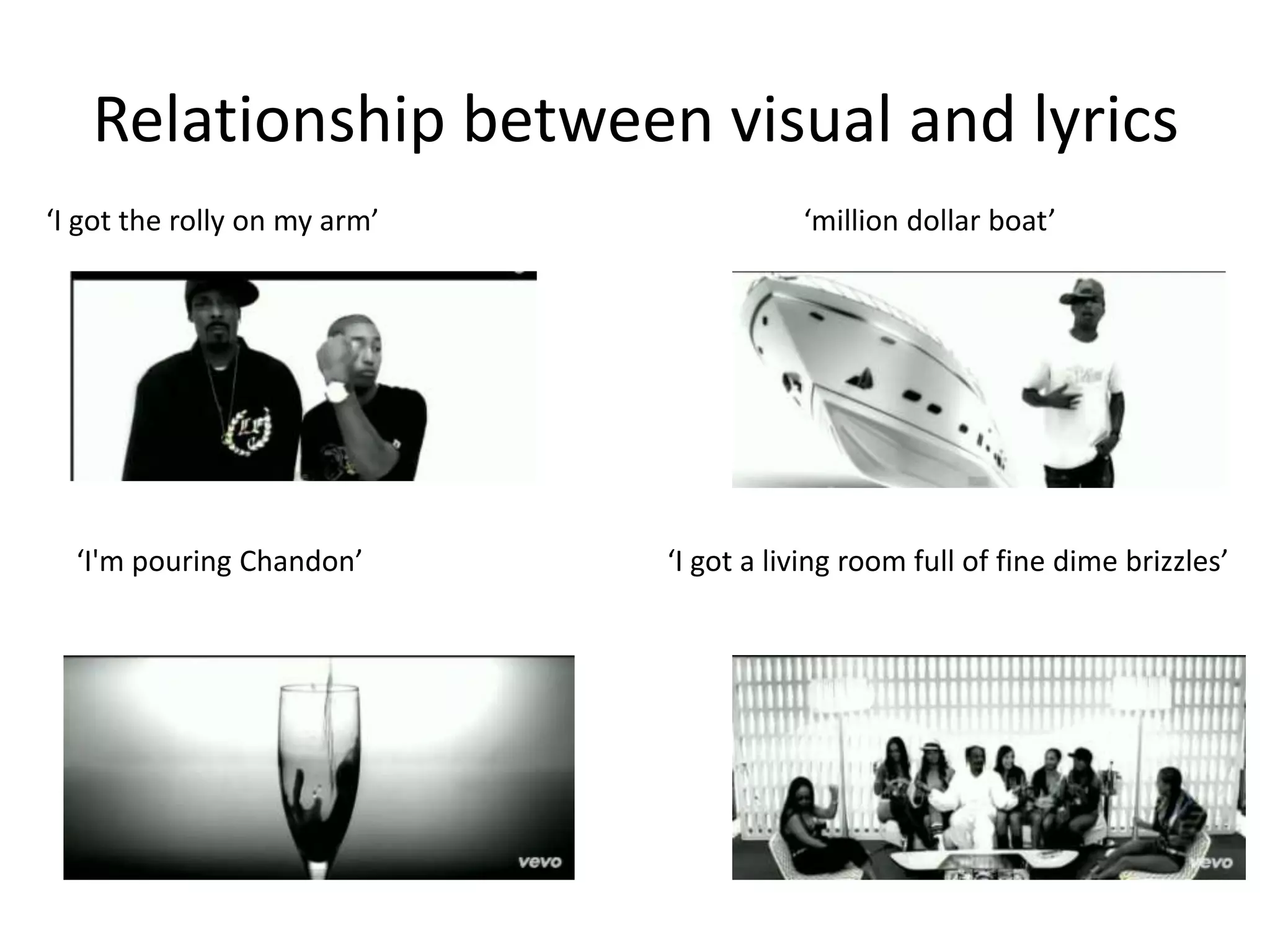
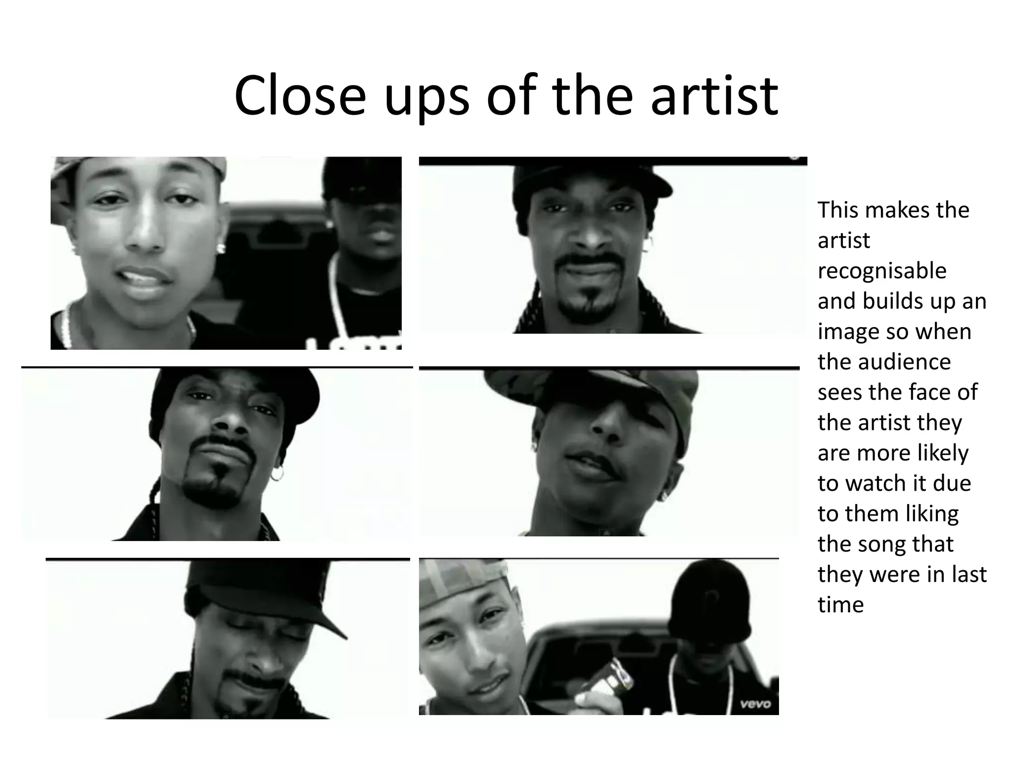
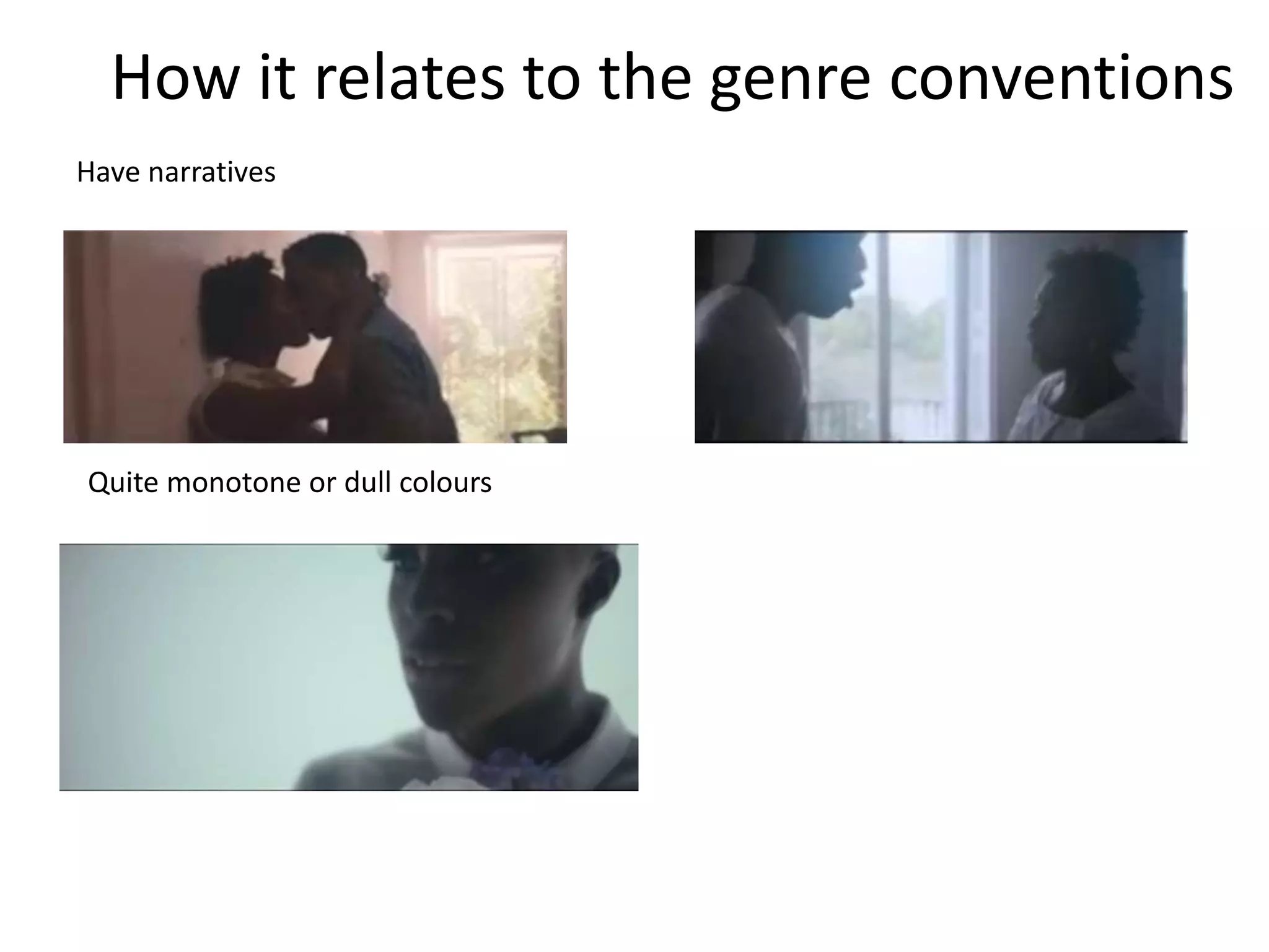
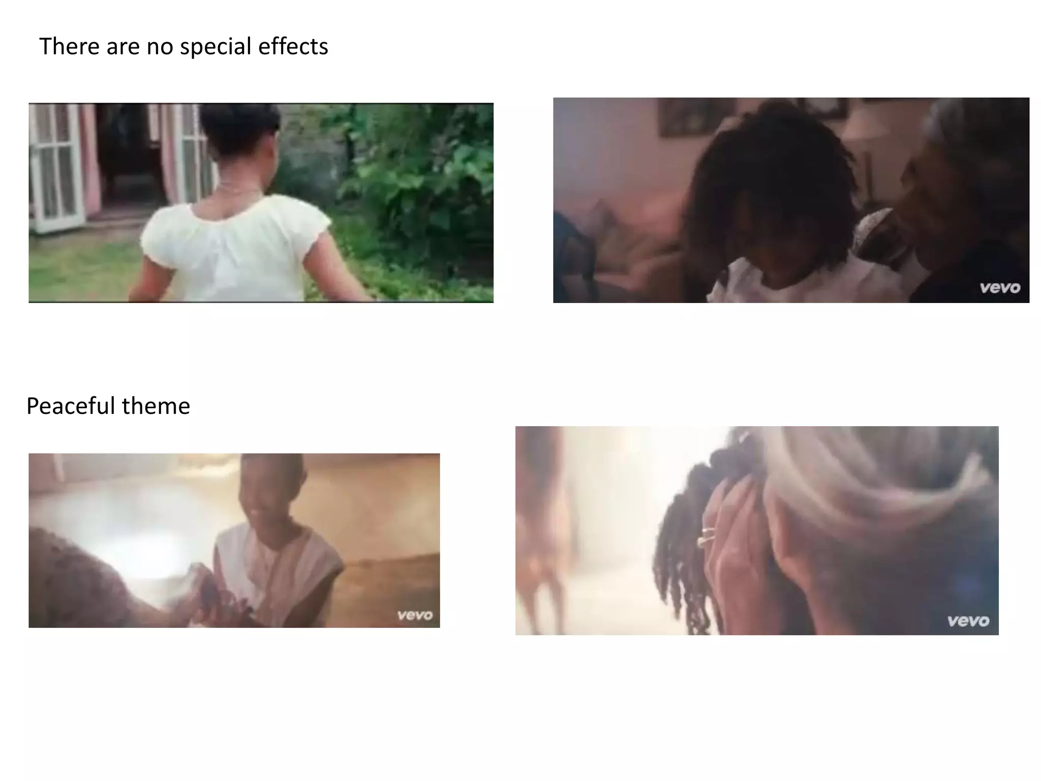
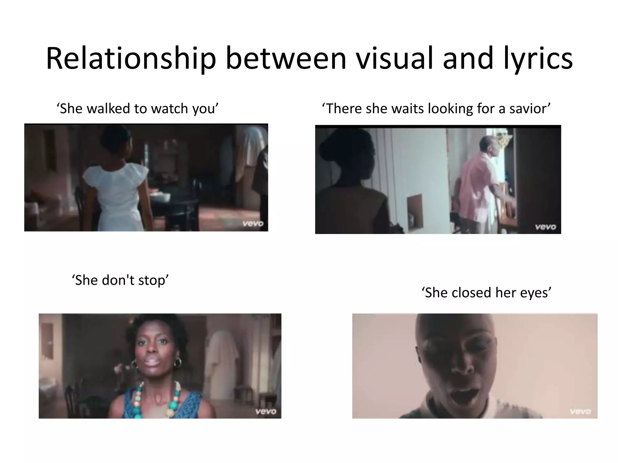
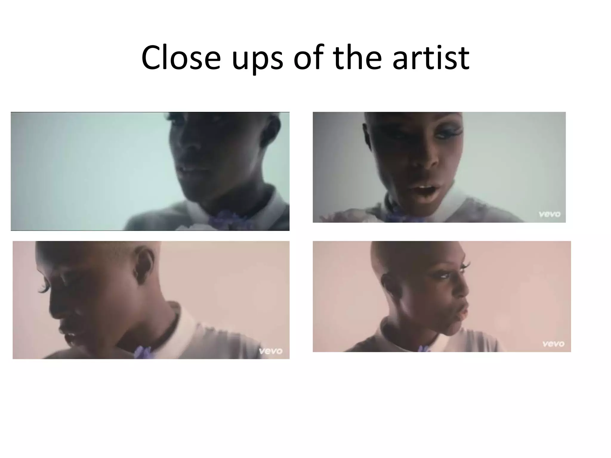
3. Front cover
• The colours purple, red represent
royalty which is seen a lot in rap music
• Gold chain around the characters
shows wealth
• The character is flying in the air which
could demonstrate that he is aiming
for success
• The Cheerleaders in the background
show that he has fans and they are
female which also links to the
convention of rap music having a lot of
females in
• Everyone happy which demonstrates
he is well respected and people are
happy for him succeeding
• The font isn't very clear and the
character isn't the artist which shows
that Kanye West doesn’t need to sell
himself to sell records because he has
such a big following
4. Middle
Left panel
• It is urban which reflects the rap convention of the location being in the city
• The colours are very dark which could demonstrate that he was in a bad place
• There is a car which could represent the materialistic side of the rap industry
• The character is running away. This could demonstrate he has a lot of problems or he is in trouble and he is trying to hide from his struggles, this is
a common theme in rap music
• In the far right of the panel the character is getting splashed with water, this could show that he isn't respected and gets pushed around
Middle panel
• The middle panel is lighter and has a futuristic feel to it due to the train above the buildings. This could demonstrate that time has passed but he is
still running away from his struggles (the monster). However he is closer to the audience so this could demonstrate he is getting closer to his goals
• There are a lot more cars and it is raining, this demonstrates the busy city life and the dull miserable side of it, which most rap people highlight in
their songs – the bad side of city life
Right panel
• The building is a lot more grand than the other buildings, this could show that he is in a good place
• The panel is light whereas the others are hard which also shows that he is in a good place and has got to where he wanted to get to
• There is an audience while the character is on the stage. This could demonstrate that he has a lot of fans and he likes being on the main stage in
the spot light
• He is graduating which links to the album title
5. Middle back
• The character is up high in
the sky which could show
he is ready to take on the
world and is in a good
powerful place because he
is above everyone else
• He has his graduation
outfit on which shows
intelligence
• The character looks angry
and motivated which
could mean he is ready for
anything that happens
• The mushroom is looking
up at him which shows
that he is admired by
people
6. Back
• The camera angle is in the
opposite side of the front
cover. Which means you
are seeing him being shot
off in the distance
• There are hats flying which
demonstrate people
waving him off into the
future
• The bar code and
information are in the left
hand corner and this
means it doesn’t take
anyway from the cover art
7. Poster
• There is the same style of writing on both the
poster and the digipak which makes it noticeable
to the audience
• It is also the same character which represents
kanye West this also links in with the point of
that he is such a big brand he doesn’t need to be
recognised to sell records
• the bear has Kanyes signature glasses on which
he wears in the music video ‘stronger’ which is
the most recognisable song on the album
• The colour schemes are simular, it has the colour
of blue which fits in with the purple theme
because blue and red make purple
• It is a simple design with just the head of the
bear and the title of the artist at the top and the
album name at the bottom. This draws you to
the key information and doesn’t distract you
from the advertisement
9. Front
• There is a hand controlling a
joystick which could
demonstrate that we live in a
world of manipulation
• There are people on the screen
in orderly lines which suggests
they are getting controlled
• The joystick is controlling
another joystick, which
demonstrates that nobody is in
control of themselves
• The joystick replaces a head
this shows that their thoughts
are controlled
• It is a dark monotone cover
with only the red joystick. The
colour red represents danger
10. Middle back
• People coming out of fog which represents mystery and the
unknown
• The orderly line demonstrates the control and discipline
• It is brown, cloudy cover which could represent a dirty world
that has been polluted
• It is in the middle of nowhere which suggests there’s no help
11. Middle
Middle panel
• Skull made out of electricity this could demonstrate danger and
the people seem synthetic.
• The people are all coming out of one mind this means there is no
individual differences
• Stairs going down suggests they below at the bottom
• People are glowing at the top then fade to black at the edges this
suggests that they have been freshly made
12. Back
• It is monotonous which suggest there is not much
character and happiness
• Arm reaching from an unknown figure suggests the
anonymity of this figure, creating a shroud of mystery
around power
• It links to the front cover
13. Poster
• It is urban which makes it more
powerful because there is a lot more
people in a city than in a country so
that demonstrates the control is wide
spread
• There is CCTV effect which suggests
they are getting watched which links
to the album cover of the people on
the TV screen
• The angle is a birds eye shot so it is
looking down on the city, this
suggests it less powerful than the
person looking down on it, which is
the audience so you feel in control.
• The poster uses the same font and
same position of the font which
makes it recognisable
15. Front
• It is very natural with lots of
trees and it is hilly, which
suggests they are in touch with
nature and the music will be
soft and calming
• It is a simple design with a
limited colour pallet, this also
indicates the music isn't going
to be using a lot of heavy
instruments
• The rabbit is hiding which
makes it seem very innocent
and the girl is looking up at the
sky which also suggests
innocence and vulnerability
16. Middle
• The waves make it more detailed and complicated but it also sticks with
the natural theme with the trees and hills. There is limited shading which
makes it more simple
• There is a boy looking in the distance which suggests there is a love theme
to this album
• The credits and thank you’s are in the middle which is unique for digipaks
17. Back
• This is the most
simple artwork out
of all the panels
because there isn't
a character. This
makes the audience
look at the key
information rather
than the art which
is good with
widening the
audience
18. Poster
• The poster uses earth colours and it
has flowers which links to the
digipak because it was a nature
theme, this makes the brand more
recognisable
• The book makes the audience feel
like it is very innocent and it is
calming and has lots of different
elements to it
• The origami makes it look clean and
natural due to there being no man
made, mass produced products
• Music notes suggests that is is not
edited and it is very clean cut and
natural which appeals to the singer
song writer audience
• The font is delicate which links to
the innocent theme
20. Rap Conventions
• Casual clothing, nothing too characterised but more
subtle and loose
• Tattoos
• Drugs violence and females
• Sections of direct contact with the camera
• Props regarding costume tend to be used
• Show clear display of emotions- if the song is angry the
artist is likely to present this through their gestures and
facial expressions
• Strong editing cuts between concept and narrative
• Follow the American dream lifestyle
21. Drop it like its hot – Snoop Dogg ft
Pharrell Williams
• https://www.youtube.com/watch?v=GtUVQei
3nX4
22. Casual clothing, nothing too
characterised but more subtle and
loose
Sections of direct contact with the camera
Show clear display of emotions- if the song is
angry the artist is likely to present this through
their gestures and facial expressions
Props regarding costume tend to be used
How it relates to the genre conventions
24. Relationship between visual and lyrics
‘I got the rolly on my arm’ ‘million dollar boat’
‘I'm pouring Chandon’ ‘I got a living room full of fine dime brizzles’
25. Close ups of the artist
This makes the
artist
recognisable
and builds up an
image so when
the audience
sees the face of
the artist they
are more likely
to watch it due
to them liking
the song that
they were in last
time
26. Soul Conventions
• Have narratives
• Quite monotone or dull colours
• Editing is slow pace
• There are no special effects
• Peaceful theme