FILM MAGAZINE COVER
ANALYSIS
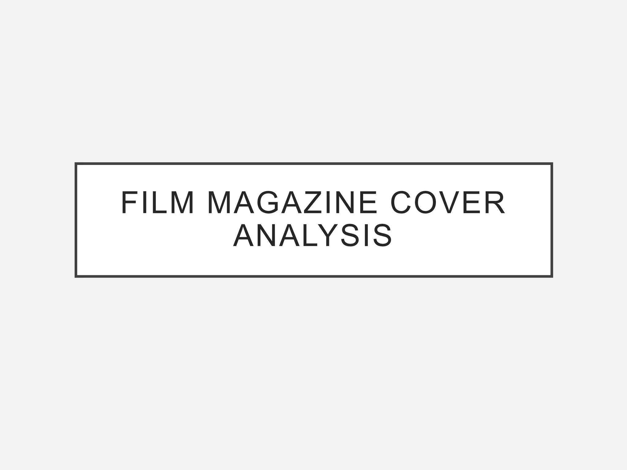
Image Source: http://www.famousfix.com/topic/empire-magazine-united-kingdom-march-1996
Other articles that are
in the magazine to
encourage the reader
to buy it.
The image is placed in
front of the title so that
it stands out more and
looks as if he is standing
proud of the magazine.
Title of the magazine is
covered by the image
but is well known so
people still know what
the title is.
Other stories that are in
the magazine that the
reader may also want to
see.
Magazine’s
slogan/tagline to
provide the reader
with more information
as to what the
magazine is about and
build their identity.
Line relating to or from
the film to engage the
reader.
The secondary story
that is also important.
This may attract more
readers and therefore
persuade them to buy
the magazine.
Barcode
The main articles title is
the prominent feature of
the magazine and is clear
to read. The white also
stands out against the
image well. There is also
more information as to
what the article is
focusing on about the
film.
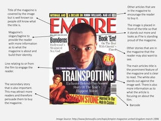
Image Source: http://collider.com/spectre-empire-magazine-covers/
The magazines name is
over the image, making
it stand out more so
against the background.
The gun is also covering
his face, making it seem
as if he is hiding.
Tagline to engage the
reader.
Issue date
and price.
Headline of the main
article to tell the
audience what it is
about specifically.
The writing is also
small, suggesting
that the image is the
main focus.
Extra information about
the article so the reader
knows more about
what it’s focusing on.
The gun connotes
violence and the
dark image creates
a sense of mystery.
This tells the
audience more
about the film
itself.
The image is a close up
shot and stands out to
the audience more,
especially with a dark
background and the
light only on his face.
The logo of the film
is in the title. It is
subtle yet stands
out because of the
gold on black.
There is a limited
colour palette of
gold, grey, white
and black.
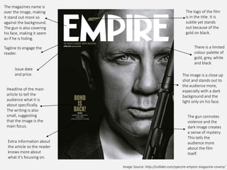
Image Source: https://uk.pinterest.com/alice4ja/movies/
Issue date and
price.
Title of the article
about the film. The
writing is quite small
and ’The Hunger
Games’ doesn’t
stand out as well
because it’s gold and
blends in more with
the background.
Provides more
information about
the article inside the
magazine for the
reader.
Title of the
magazine is partially
covered by the
image but can still
be read easily and
the image stands
out well on the
cover.
Symbol to show that it
is a special edition of
the magazine. It
stands out especially
because of the grey
background and
where it is positioned
on the logo.
The image has used the
setting and costumes
from the film and allows
the audience to get a
better understanding of
what the film is about.
The fire connotes
violence and danger and
the black links to danger
also and mystery. The
use of the weapons
creates a sense of a
strong woman,
contradicting the
stereotype that women
tend to be weaker than
men. The woman in the
iamge is also central,
drawing most of the
readers attention to her.
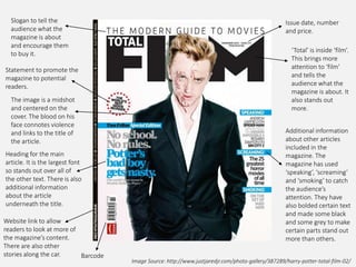
Image Source: http://www.justjaredjr.com/photo-gallery/387289/harry-potter-total-film-02/
Statement to promote the
magazine to potential
readers.
‘Total’ is inside ‘film’.
This brings more
attention to ‘film’
and tells the
audience what the
magazine is about. It
also stands out
more.
Issue date, number
and price.
Slogan to tell the
audience what the
magazine is about
and encourage them
to buy it.
Additional information
about other articles
included in the
magazine. The
magazine has used
‘speaking’, ‘screaming’
and ‘smoking’ to catch
the audience’s
attention. They have
also bolded certain text
and made some black
and some grey to make
certain parts stand out
more than others.
Barcode
Website link to allow
readers to look at more of
the magazine’s content.
There are also other
stories along the car.
Heading for the main
article. It is the largest font
so stands out over all of
the other text. There is also
additional information
about the article
underneath the title.
The image is a midshot
and centered on the
cover. The blood on his
face connotes violence
and links to the title of
the article.
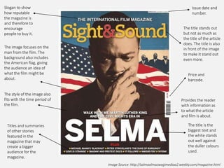
Image Source: http://salmaalmazwagimediaa2.weebly.com/magazine.html
Slogan to show
how reputable
the magazine is
and therefore to
encourage
people to buy it.
Issue date and
number.
Price and
barcode.
Titles and summaries
of other stories
featured in the
magazine that may
create a bigger
audience for the
magazine.
The image focuses on the
man from the film. The
background also includes
the American flag, giving
the audience an idea of
what the film might be
about.
The style of the image also
fits with the time period of
the film.
The title stands out
but not as much as
the title of the article
does. The title is also
in front of the image
to make it stand out
even more.
Provides the reader
with information as
to what the article
and film is about.
The title is the
biggest text and
the white stands
out well against
the duller colours
used.
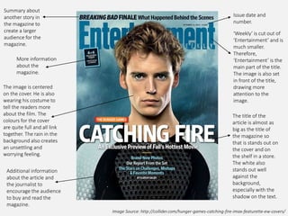
Image Source: http://collider.com/hunger-games-catching-fire-imax-featurette-ew-covers/
Issue date and
number.
‘Weekly’ is cut out of
‘Entertainment’ and is
much smaller.
Therefore,
‘Entertainment’ is the
main part of the title.
The image is also set
in front of the title,
drawing more
attention to the
image.
The title of the
article is almost as
big as the title of
the magazine so
that is stands out on
the cover and on
the shelf in a store.
The white also
stands out well
against the
background,
especially with the
shadow on the text.
Summary about
another story in
the magazine to
create a larger
audience for the
magazine.
More information
about the
magazine.
The image is centered
on the cover. He is also
wearing his costume to
tell the readers more
about the film. The
colours for the cover
are quite full and all link
together. The rain in the
background also creates
an unsettling and
worrying feeling.
Additional information
about the article and
the journalist to
encourage the audience
to buy and read the
magazine.

Film Magazine Covers Analysis

  • 1.
  • 2.
    Image Source: http://www.famousfix.com/topic/empire-magazine-united-kingdom-march-1996 Otherarticles that are in the magazine to encourage the reader to buy it. The image is placed in front of the title so that it stands out more and looks as if he is standing proud of the magazine. Title of the magazine is covered by the image but is well known so people still know what the title is. Other stories that are in the magazine that the reader may also want to see. Magazine’s slogan/tagline to provide the reader with more information as to what the magazine is about and build their identity. Line relating to or from the film to engage the reader. The secondary story that is also important. This may attract more readers and therefore persuade them to buy the magazine. Barcode The main articles title is the prominent feature of the magazine and is clear to read. The white also stands out against the image well. There is also more information as to what the article is focusing on about the film.
  • 3.
    Image Source: http://collider.com/spectre-empire-magazine-covers/ Themagazines name is over the image, making it stand out more so against the background. The gun is also covering his face, making it seem as if he is hiding. Tagline to engage the reader. Issue date and price. Headline of the main article to tell the audience what it is about specifically. The writing is also small, suggesting that the image is the main focus. Extra information about the article so the reader knows more about what it’s focusing on. The gun connotes violence and the dark image creates a sense of mystery. This tells the audience more about the film itself. The image is a close up shot and stands out to the audience more, especially with a dark background and the light only on his face. The logo of the film is in the title. It is subtle yet stands out because of the gold on black. There is a limited colour palette of gold, grey, white and black.
  • 4.
    Image Source: https://uk.pinterest.com/alice4ja/movies/ Issuedate and price. Title of the article about the film. The writing is quite small and ’The Hunger Games’ doesn’t stand out as well because it’s gold and blends in more with the background. Provides more information about the article inside the magazine for the reader. Title of the magazine is partially covered by the image but can still be read easily and the image stands out well on the cover. Symbol to show that it is a special edition of the magazine. It stands out especially because of the grey background and where it is positioned on the logo. The image has used the setting and costumes from the film and allows the audience to get a better understanding of what the film is about. The fire connotes violence and danger and the black links to danger also and mystery. The use of the weapons creates a sense of a strong woman, contradicting the stereotype that women tend to be weaker than men. The woman in the iamge is also central, drawing most of the readers attention to her.
  • 5.
    Image Source: http://www.justjaredjr.com/photo-gallery/387289/harry-potter-total-film-02/ Statementto promote the magazine to potential readers. ‘Total’ is inside ‘film’. This brings more attention to ‘film’ and tells the audience what the magazine is about. It also stands out more. Issue date, number and price. Slogan to tell the audience what the magazine is about and encourage them to buy it. Additional information about other articles included in the magazine. The magazine has used ‘speaking’, ‘screaming’ and ‘smoking’ to catch the audience’s attention. They have also bolded certain text and made some black and some grey to make certain parts stand out more than others. Barcode Website link to allow readers to look at more of the magazine’s content. There are also other stories along the car. Heading for the main article. It is the largest font so stands out over all of the other text. There is also additional information about the article underneath the title. The image is a midshot and centered on the cover. The blood on his face connotes violence and links to the title of the article.
  • 6.
    Image Source: http://salmaalmazwagimediaa2.weebly.com/magazine.html Sloganto show how reputable the magazine is and therefore to encourage people to buy it. Issue date and number. Price and barcode. Titles and summaries of other stories featured in the magazine that may create a bigger audience for the magazine. The image focuses on the man from the film. The background also includes the American flag, giving the audience an idea of what the film might be about. The style of the image also fits with the time period of the film. The title stands out but not as much as the title of the article does. The title is also in front of the image to make it stand out even more. Provides the reader with information as to what the article and film is about. The title is the biggest text and the white stands out well against the duller colours used.
  • 7.
    Image Source: http://collider.com/hunger-games-catching-fire-imax-featurette-ew-covers/ Issuedate and number. ‘Weekly’ is cut out of ‘Entertainment’ and is much smaller. Therefore, ‘Entertainment’ is the main part of the title. The image is also set in front of the title, drawing more attention to the image. The title of the article is almost as big as the title of the magazine so that is stands out on the cover and on the shelf in a store. The white also stands out well against the background, especially with the shadow on the text. Summary about another story in the magazine to create a larger audience for the magazine. More information about the magazine. The image is centered on the cover. He is also wearing his costume to tell the readers more about the film. The colours for the cover are quite full and all link together. The rain in the background also creates an unsettling and worrying feeling. Additional information about the article and the journalist to encourage the audience to buy and read the magazine.