Induction Project
September 2019
Erin Lily Stephenson
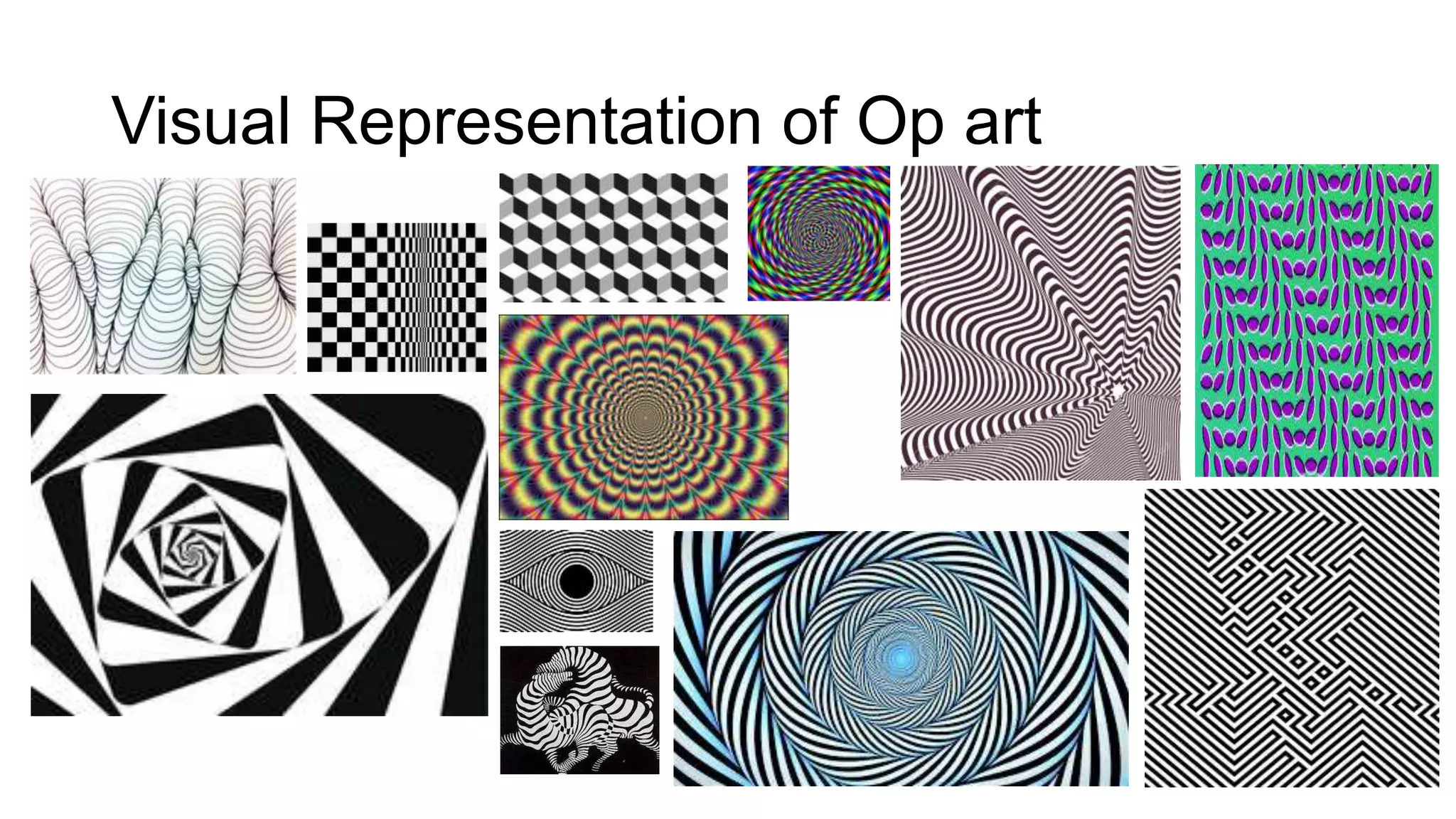
Visual Representation of Op art
Op art art terminology
• “The effects created by op art ranged from the subtle, to the disturbing and
disorienting.”
• A framework of purely geometric forms as the basis for the effects
• Draws on colour theory and psychology of perception
• Leading figures : Bridget Riley, Richard Allen, Victor Vasarely being one of the
originators of op art.
Title/Weblink/Date accessed: via tate gallery
2.2
2.3
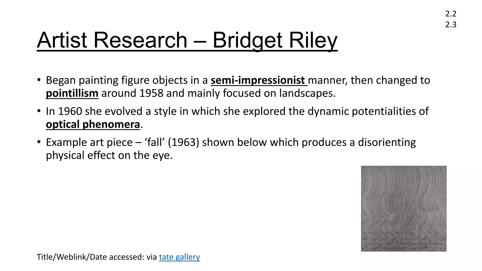
Artist Research – Bridget Riley
• Began painting figure objects in a semi-impressionist manner, then changed to
pointillism around 1958 and mainly focused on landscapes.
• In 1960 she evolved a style in which she explored the dynamic potentialities of
optical phenomera.
• Example art piece – ‘fall’ (1963) shown below which produces a disorienting
physical effect on the eye.
2.2
2.3
Title/Weblink/Date accessed: via tate gallery
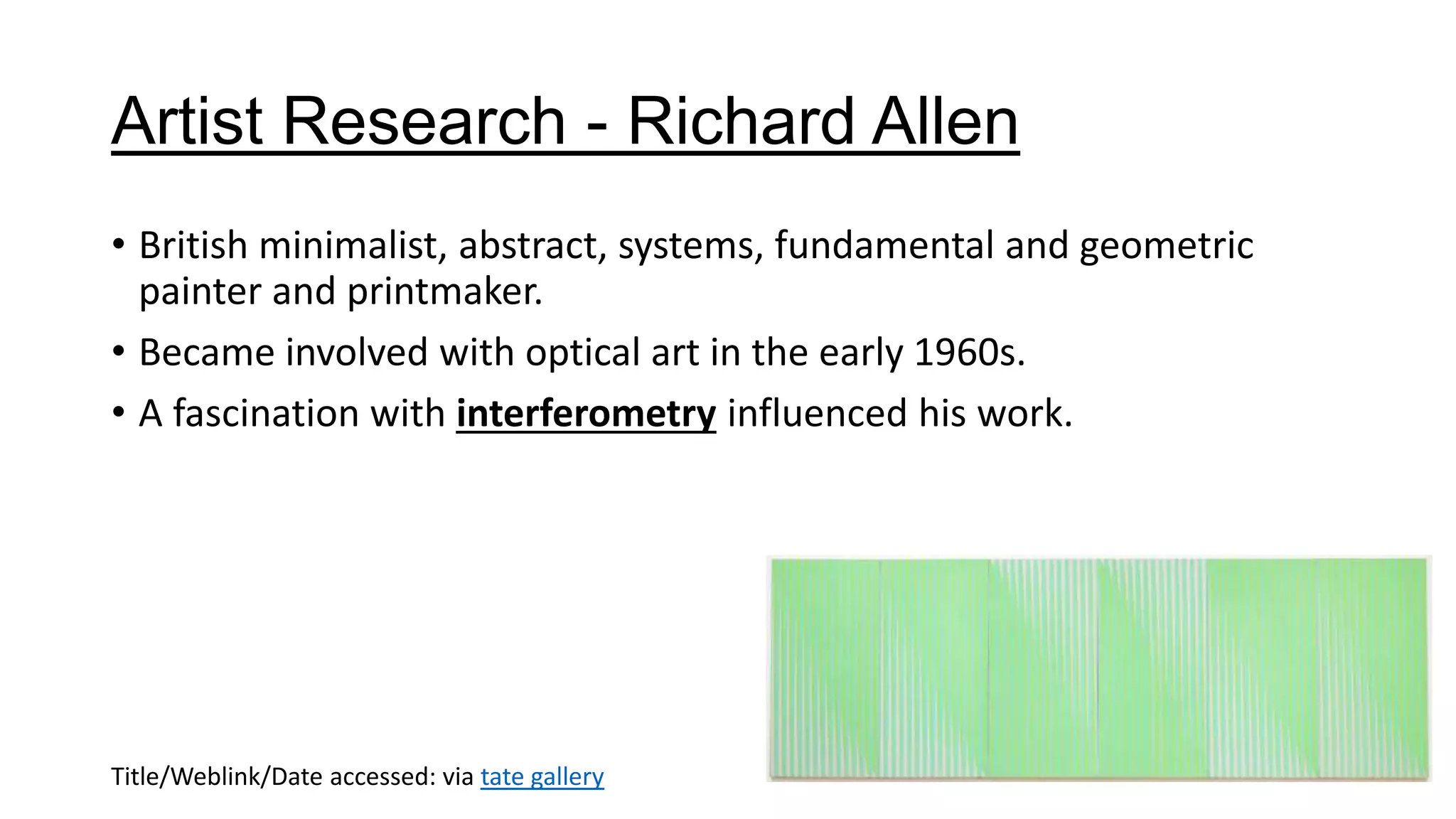
Artist Research - Richard Allen
• British minimalist, abstract, systems, fundamental and geometric
painter and printmaker.
• Became involved with optical art in the early 1960s.
• A fascination with interferometry influenced his work.
Title/Weblink/Date accessed: via tate gallery
Artist Research - Victor Vasarely
• Was a Hungarian-French artist
• His work entitled ‘Zebra’ (1930s) shown below is considered by some
to be one of the earliest examples of op art and this piece specifically
has inspired other people to recreate this illusion in his style
Title/Weblink/Date accessed: via tate gallery
Task 1 – Research – Book source
• Book title : series and singles
• Author – andy Warhol
• Library location – 709 2 war (2nd floor library)
• This book contains multiple examples of Warhols work showing the
pop art genre.
Book title/Author + Library location:
2.2
2.3
Task 2a – Idea Generation [individual]
• For colour theory – lean towards black & white to keep a
monochromatic feel
• Feature geometric forms
• Aim is to ‘trick the mind’
• One word title – play on illusion?
Task 2a – Idea Generation [group]
• Minimalist
• Surrealist
• Black & white (monochromatic)
• We all decided to stick to a monochromatic look and colour palette
with contrasting black & white however we all decided to go with
different names that will still fit the theme of optical illusion. Me and
Bronte are using my drawing of a location pin for the non-digital
aspect however Fred is handwriting the words.
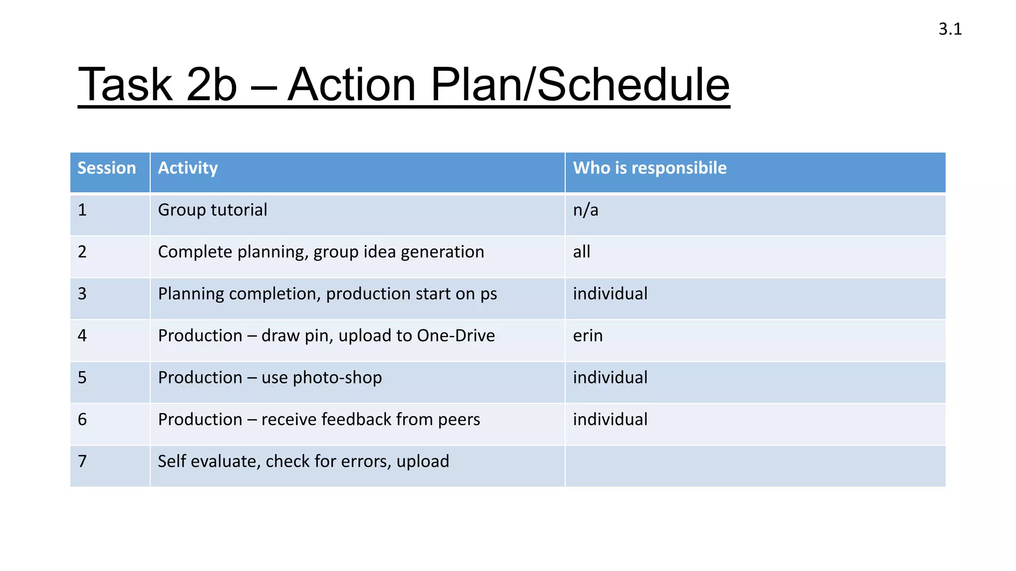
Task 2b – Action Plan/Schedule
Session Activity Who is responsibile
1 Group tutorial n/a
2 Complete planning, group idea generation all
3 Planning completion, production start on ps individual
4 Production – draw pin, upload to One-Drive erin
5 Production – use photo-shop individual
6 Production – receive feedback from peers individual
7 Self evaluate, check for errors, upload
3.1
Task 2b – Action Plan/Schedule
3.1
• The first thing that I need to work on is the non-
digital aspect of the product and I have decided to
draw a physical copy of a location pin but rather
than making it red as it is most recognised as, to
stick with my colour palette and the
monochromatic style of the poster, it will be black.
• I want to call it ‘monochrome’ as that fits with the
idea of optical illusions using contrasting colours
and black & white being the most contrasting.
• After creating the pin I will need to head into
photo-shop to create the actual poster with an A4
format. In terms of composition, sticking to the rule
of thirds, I aim to have an optical illusion taking up
at least the bottom third of the poster however I
wanted it to be cut at a diagonal to follow the
pattern shown in the illusion.
• After having the main background made in
photo-shop, I need to place the text including
the name, time and location.
• To tie in with my blog spot and looking from a
marketing perspective, I aim to create a QR code
that once scanned will load my personal blog
spot page.
• To try and keep a minimalist approach, I don’t
want to fill the poster with loads of text and
information as I want it to be kept as simple that
way people of all ages can easily understand it
and keeping my audience in mind.
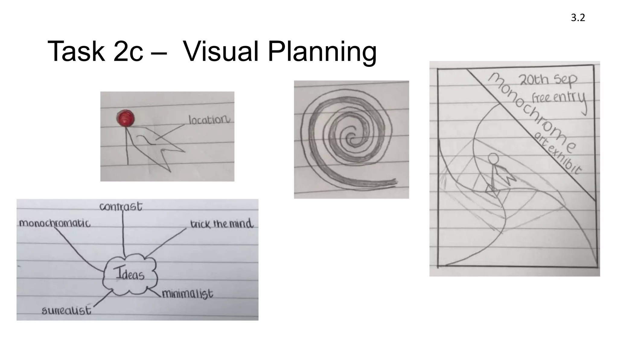
Task 2c – Visual Planning
3.2
Task 2c – Planning
• Composition – use rule of thirds, maybe diagonal cut?
• Keep everything contrasting with black & white
• Place pin in the centre of illusion
• SANS SERIF fonts
• Remember date, location and name has to be one word
• Include QR code
• Have some words that link to optical illusions (synonyms)
3.2
Task 4 – Production/Final Products
3.2
3.4
Blogger
Task 5 – Evaluation – Problem Solving
• A problem I faced when creating my poster was deleting the background of
the pin. I overcame this problem by creating a new ps file, deleting the
background in there and then dragging it into the main file. I also had to
change the format through adobe acrobat.
• Another problem that I faced making this poster was getting used to the
photo-shop controls and shortcuts with mac, I overcame this by checking
the shortcuts when they would appear and adapting to the software.
• I also struggled finding a mixture of sans-serif fonts that could also be italic
and bold but also fit well with other text. I overcame this by creating a new
file and mixing different fonts together to find which ones would work well
and still fit the style.
3.3
Task 5 – Evaluation – Working with
others
• I believe we all were able to communicate well with each other and
voicing our ideas and opinions which was useful as it allowed us to
come to a group decision and what we thought was best.
• We were able to help each other expand our personal ideas to try and
make our work better which was great in our project as we were able
to self-improve our work.
• When following out research we worked well together as we spread it
out with each of us searching a key artist and we all looked up
different styles of optical illusions.
1.2b
Task 5 – Evaluation - Feedback
• Discuss the feedback you received from your tutor during the project
and how you used this to improve the project
• Sticking to the monochromatic theme with no colour
• Use of synergy with the use of the QR code to advertise, also
interactive.
3.5
Task 5 – Evaluation – Active Engagement
• An example of active engagement in our studies was when we all did
our research on the different artists for the style. By doing this we
then had to communicate with each other and share our findings in
order for us all to gather the same information. Also when we were
creating our individual posters, we all discusses our ideas, evaluated
each others work and gave suggestions for improvement.
1.2a
Task 5 – Evaluation
Accessing and storing information
• Explain where the books/resources are for your area in the LC
• Book resources are on floor 1,2 and 3 however to find art related
books on floor 2
• Explain how to take a book/resource out of the LC
• To take out a book resource you scan your college ID.
2.1
Task 5 – Evaluation
Accessing and storing information
Explain where to store electronic information on the college network
• You can store electronic information on the macs by downloading
resources onto finder, then you can save it onto onedrive where it can
be accessed on multiple devices.
Explain where you upload work when it is completed
• When you complete work, you upload everything to your blogger but
for powerpoints you use slideshare.net first then you embed it onto a
blog post
2.1
Task 6 - How do you learn best?
• Explain some of the ways you think you learn best [refer to the VAK
questionnaire results in tutorial]:
I am referred to as a kinesthetic learner also known as an active learner
meaning that I am better at practical tasks. It also means that I prefer
to study while listening to music.
1.1
Task 6 - How do you learn best?
What makes it hard for you to study?
• Losing concentration
What strategies do you think would benefit your studies?
• A strategy that would help me study would be listening to music
whilst working
1.1

Induction project

  • 1.
  • 2.
  • 3.
    Op art artterminology • “The effects created by op art ranged from the subtle, to the disturbing and disorienting.” • A framework of purely geometric forms as the basis for the effects • Draws on colour theory and psychology of perception • Leading figures : Bridget Riley, Richard Allen, Victor Vasarely being one of the originators of op art. Title/Weblink/Date accessed: via tate gallery 2.2 2.3
  • 4.
    Artist Research –Bridget Riley • Began painting figure objects in a semi-impressionist manner, then changed to pointillism around 1958 and mainly focused on landscapes. • In 1960 she evolved a style in which she explored the dynamic potentialities of optical phenomera. • Example art piece – ‘fall’ (1963) shown below which produces a disorienting physical effect on the eye. 2.2 2.3 Title/Weblink/Date accessed: via tate gallery
  • 5.
    Artist Research -Richard Allen • British minimalist, abstract, systems, fundamental and geometric painter and printmaker. • Became involved with optical art in the early 1960s. • A fascination with interferometry influenced his work. Title/Weblink/Date accessed: via tate gallery
  • 6.
    Artist Research -Victor Vasarely • Was a Hungarian-French artist • His work entitled ‘Zebra’ (1930s) shown below is considered by some to be one of the earliest examples of op art and this piece specifically has inspired other people to recreate this illusion in his style Title/Weblink/Date accessed: via tate gallery
  • 7.
    Task 1 –Research – Book source • Book title : series and singles • Author – andy Warhol • Library location – 709 2 war (2nd floor library) • This book contains multiple examples of Warhols work showing the pop art genre. Book title/Author + Library location: 2.2 2.3
  • 8.
    Task 2a –Idea Generation [individual] • For colour theory – lean towards black & white to keep a monochromatic feel • Feature geometric forms • Aim is to ‘trick the mind’ • One word title – play on illusion?
  • 9.
    Task 2a –Idea Generation [group] • Minimalist • Surrealist • Black & white (monochromatic) • We all decided to stick to a monochromatic look and colour palette with contrasting black & white however we all decided to go with different names that will still fit the theme of optical illusion. Me and Bronte are using my drawing of a location pin for the non-digital aspect however Fred is handwriting the words.
  • 10.
    Task 2b –Action Plan/Schedule Session Activity Who is responsibile 1 Group tutorial n/a 2 Complete planning, group idea generation all 3 Planning completion, production start on ps individual 4 Production – draw pin, upload to One-Drive erin 5 Production – use photo-shop individual 6 Production – receive feedback from peers individual 7 Self evaluate, check for errors, upload 3.1
  • 11.
    Task 2b –Action Plan/Schedule 3.1 • The first thing that I need to work on is the non- digital aspect of the product and I have decided to draw a physical copy of a location pin but rather than making it red as it is most recognised as, to stick with my colour palette and the monochromatic style of the poster, it will be black. • I want to call it ‘monochrome’ as that fits with the idea of optical illusions using contrasting colours and black & white being the most contrasting. • After creating the pin I will need to head into photo-shop to create the actual poster with an A4 format. In terms of composition, sticking to the rule of thirds, I aim to have an optical illusion taking up at least the bottom third of the poster however I wanted it to be cut at a diagonal to follow the pattern shown in the illusion. • After having the main background made in photo-shop, I need to place the text including the name, time and location. • To tie in with my blog spot and looking from a marketing perspective, I aim to create a QR code that once scanned will load my personal blog spot page. • To try and keep a minimalist approach, I don’t want to fill the poster with loads of text and information as I want it to be kept as simple that way people of all ages can easily understand it and keeping my audience in mind.
  • 12.
    Task 2c –Visual Planning 3.2
  • 13.
    Task 2c –Planning • Composition – use rule of thirds, maybe diagonal cut? • Keep everything contrasting with black & white • Place pin in the centre of illusion • SANS SERIF fonts • Remember date, location and name has to be one word • Include QR code • Have some words that link to optical illusions (synonyms) 3.2
  • 14.
    Task 4 –Production/Final Products 3.2 3.4 Blogger
  • 15.
    Task 5 –Evaluation – Problem Solving • A problem I faced when creating my poster was deleting the background of the pin. I overcame this problem by creating a new ps file, deleting the background in there and then dragging it into the main file. I also had to change the format through adobe acrobat. • Another problem that I faced making this poster was getting used to the photo-shop controls and shortcuts with mac, I overcame this by checking the shortcuts when they would appear and adapting to the software. • I also struggled finding a mixture of sans-serif fonts that could also be italic and bold but also fit well with other text. I overcame this by creating a new file and mixing different fonts together to find which ones would work well and still fit the style. 3.3
  • 16.
    Task 5 –Evaluation – Working with others • I believe we all were able to communicate well with each other and voicing our ideas and opinions which was useful as it allowed us to come to a group decision and what we thought was best. • We were able to help each other expand our personal ideas to try and make our work better which was great in our project as we were able to self-improve our work. • When following out research we worked well together as we spread it out with each of us searching a key artist and we all looked up different styles of optical illusions. 1.2b
  • 17.
    Task 5 –Evaluation - Feedback • Discuss the feedback you received from your tutor during the project and how you used this to improve the project • Sticking to the monochromatic theme with no colour • Use of synergy with the use of the QR code to advertise, also interactive. 3.5
  • 18.
    Task 5 –Evaluation – Active Engagement • An example of active engagement in our studies was when we all did our research on the different artists for the style. By doing this we then had to communicate with each other and share our findings in order for us all to gather the same information. Also when we were creating our individual posters, we all discusses our ideas, evaluated each others work and gave suggestions for improvement. 1.2a
  • 19.
    Task 5 –Evaluation Accessing and storing information • Explain where the books/resources are for your area in the LC • Book resources are on floor 1,2 and 3 however to find art related books on floor 2 • Explain how to take a book/resource out of the LC • To take out a book resource you scan your college ID. 2.1
  • 20.
    Task 5 –Evaluation Accessing and storing information Explain where to store electronic information on the college network • You can store electronic information on the macs by downloading resources onto finder, then you can save it onto onedrive where it can be accessed on multiple devices. Explain where you upload work when it is completed • When you complete work, you upload everything to your blogger but for powerpoints you use slideshare.net first then you embed it onto a blog post 2.1
  • 21.
    Task 6 -How do you learn best? • Explain some of the ways you think you learn best [refer to the VAK questionnaire results in tutorial]: I am referred to as a kinesthetic learner also known as an active learner meaning that I am better at practical tasks. It also means that I prefer to study while listening to music. 1.1
  • 22.
    Task 6 -How do you learn best? What makes it hard for you to study? • Losing concentration What strategies do you think would benefit your studies? • A strategy that would help me study would be listening to music whilst working 1.1