Downloaded 21 times


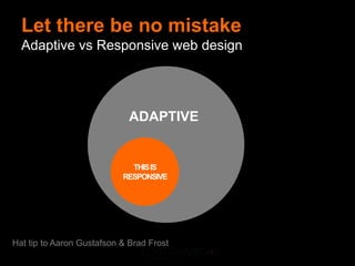


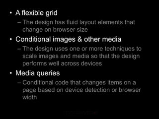


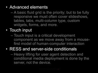

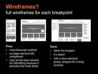
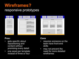


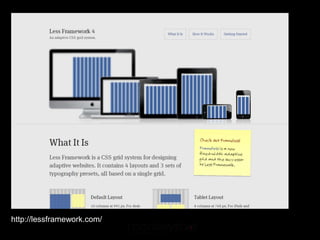
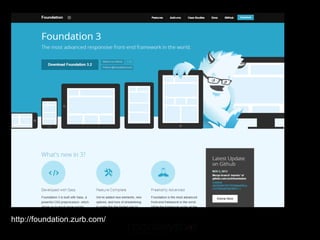
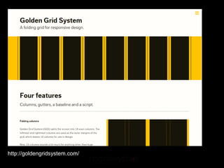

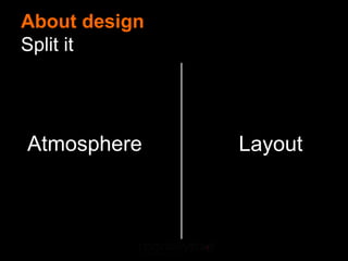

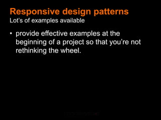

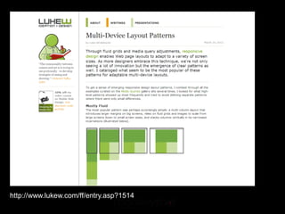


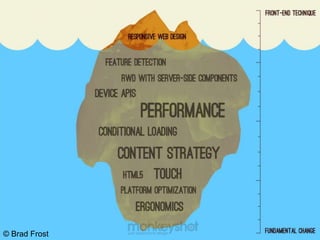
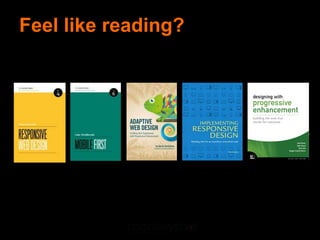


This document provides an overview of responsive web design. It begins by defining responsive web design as web design that provides an optimal experience across devices using a flexible grid, conditional images/media, and media queries. It distinguishes between adaptive and responsive design. The document then discusses the growing expectation for seamless content access across devices. It lists the basic ingredients of responsive design as a flexible grid, conditional images/media, and media queries. It also discusses advanced elements, touch input, and server-side conditionals. The document provides resources for learning about wireframes, grids, images, patterns, typography, and performance optimization for responsive design.


![Getting Started with Apache Spark: Big Data Made Simple [Free Meetup]](https://cdn.slidesharecdn.com/ss_thumbnails/apachesparkgettingstarted-260203175547-8361bcc3-thumbnail.jpg?width=640&height=640&fit=bounds)


