Download to read offline


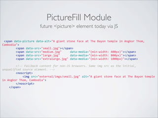
![; Set the conditional stylesheets that are processed by IE.
stylesheets-conditional[lt IE 7][all][] = ie6-and-below.css
stylesheets-conditional[IE 9][all][] = ie9.css
stylesheets-conditional[IE][print][] = ie-print.css
drupal.org/project/conditional_styles](https://image.slidesharecdn.com/design4drupal-130623113038-phpapp02/85/Design4Drupal-Boston-2013-Bumps-in-the-Road-to-Responsive-51-320.jpg)


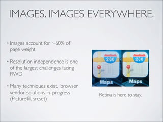


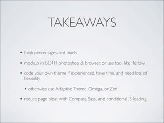


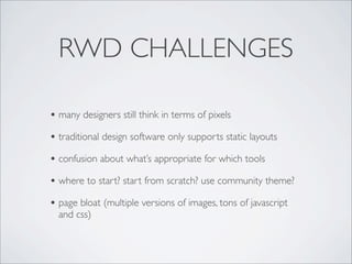
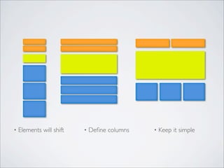
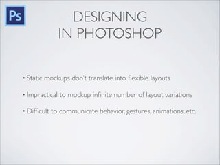
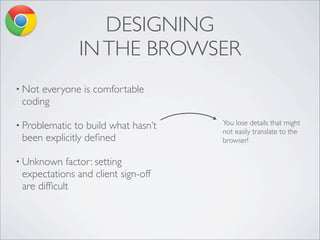
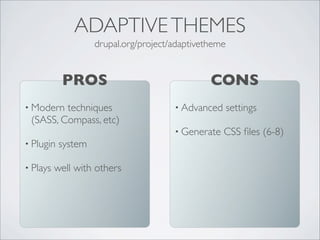
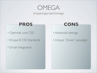
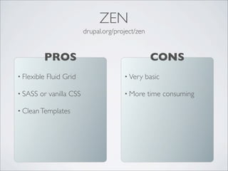
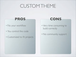
This document discusses challenges of responsive web design and provides solutions. It addresses issues like designers thinking in pixels rather than percentages, page bloat from multiple image versions, and lack of ideal design tools. Suggested approaches include using a fluid grid, delivering optimized responsive images, modular CSS, and conditionally loading content. The document also recommends starting with a community theme like AdaptiveTheme, Omega or Zen to save time. Drupal 8 is advancing responsive features like mobile initiatives and conditional loading to improve front-end performance.


