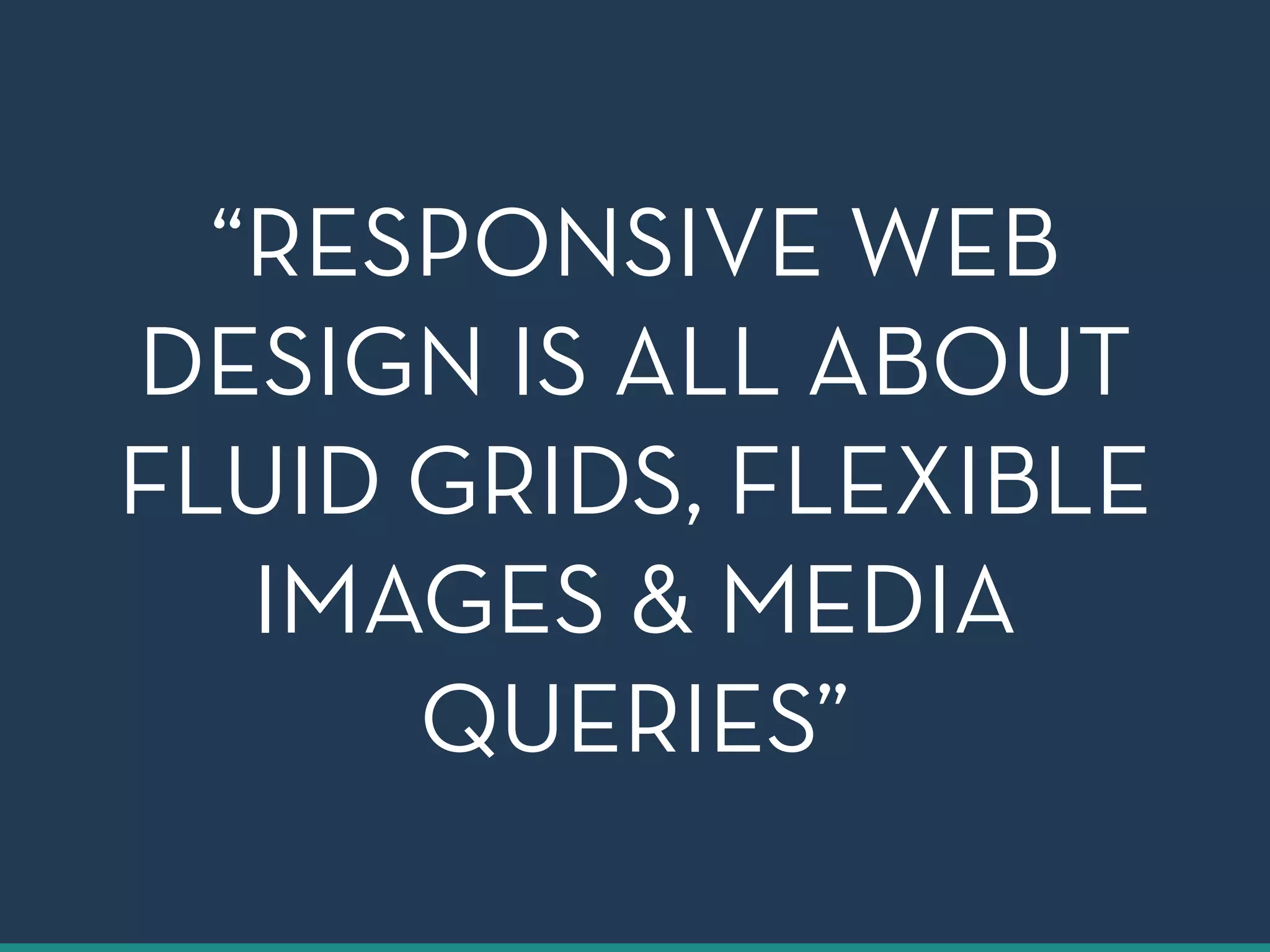
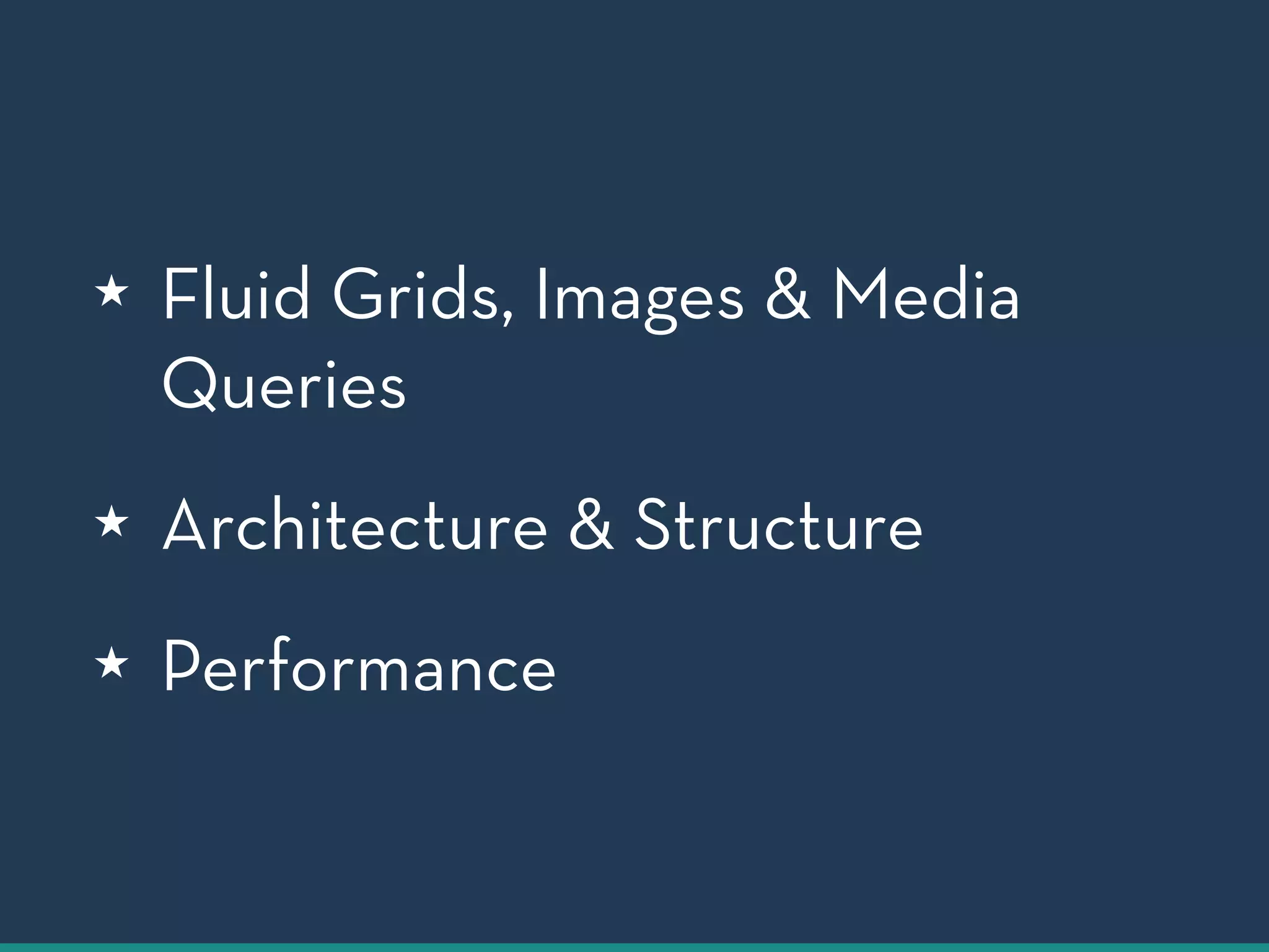
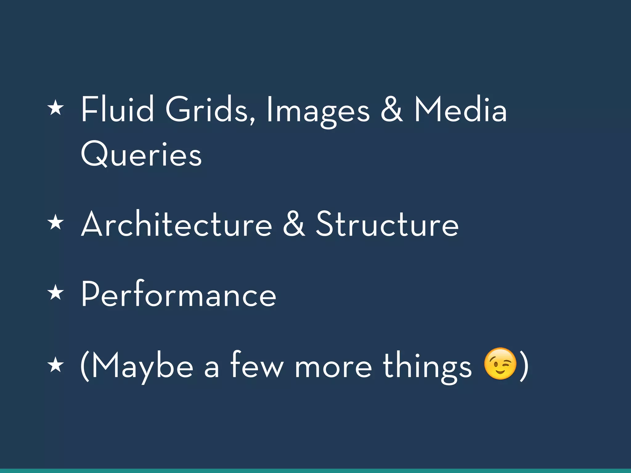
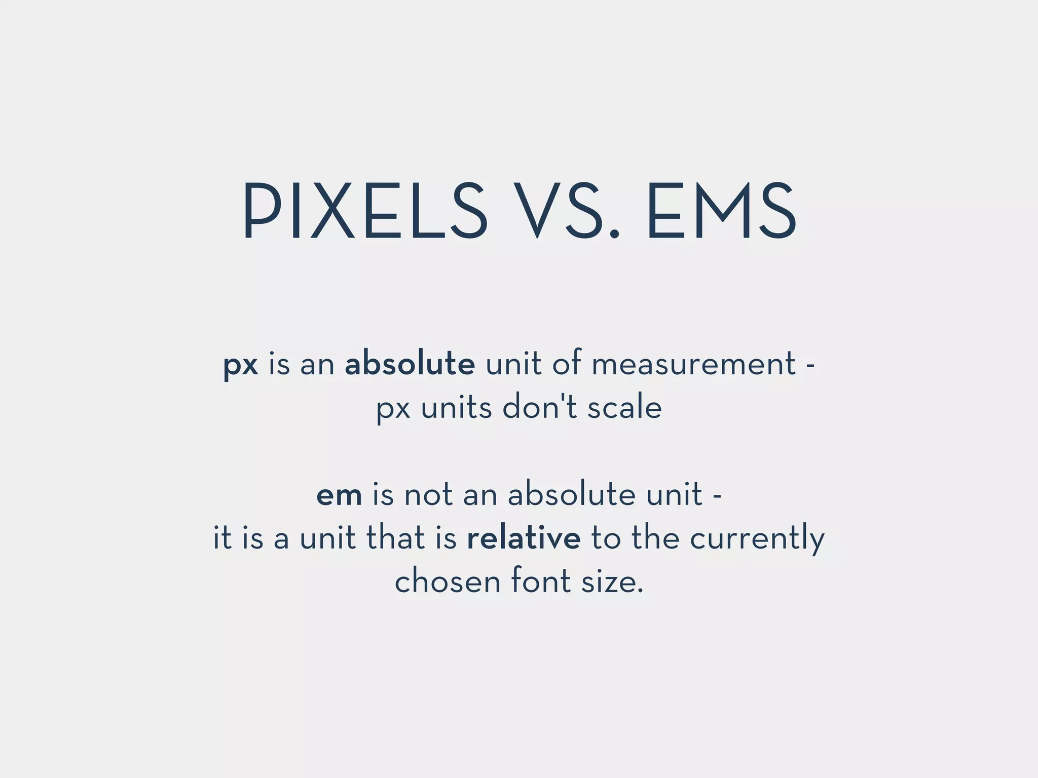
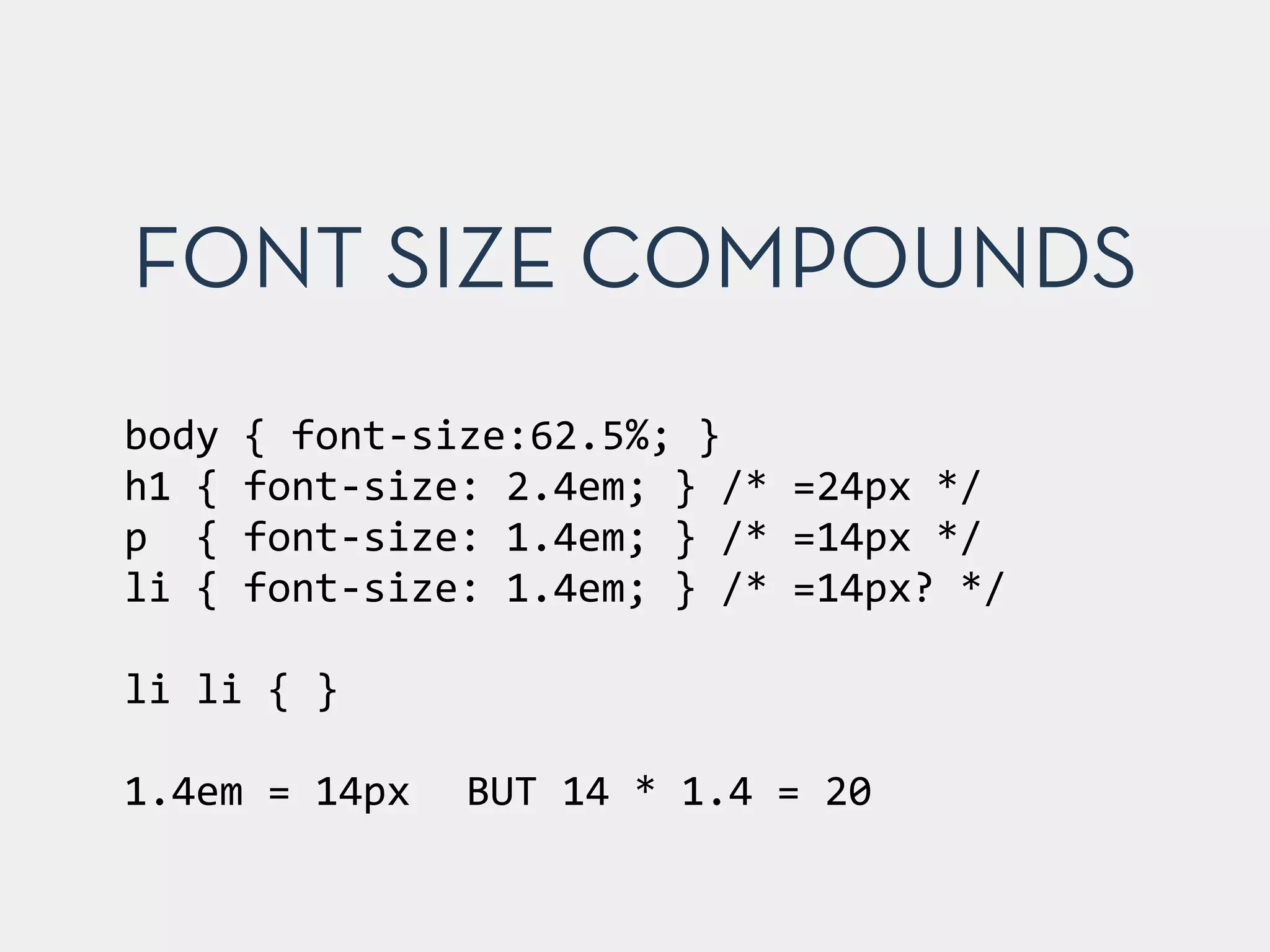
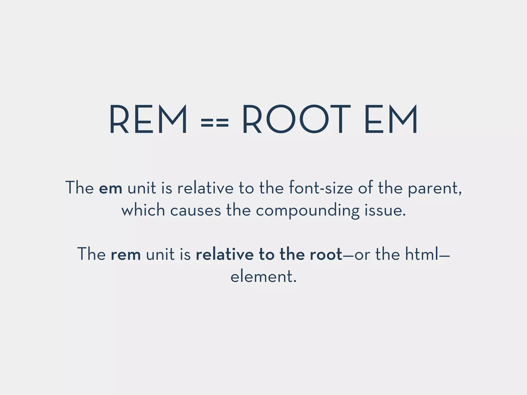
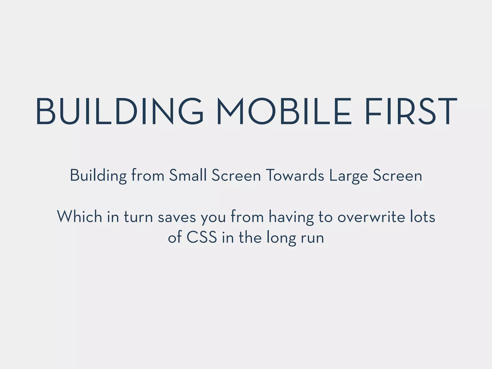
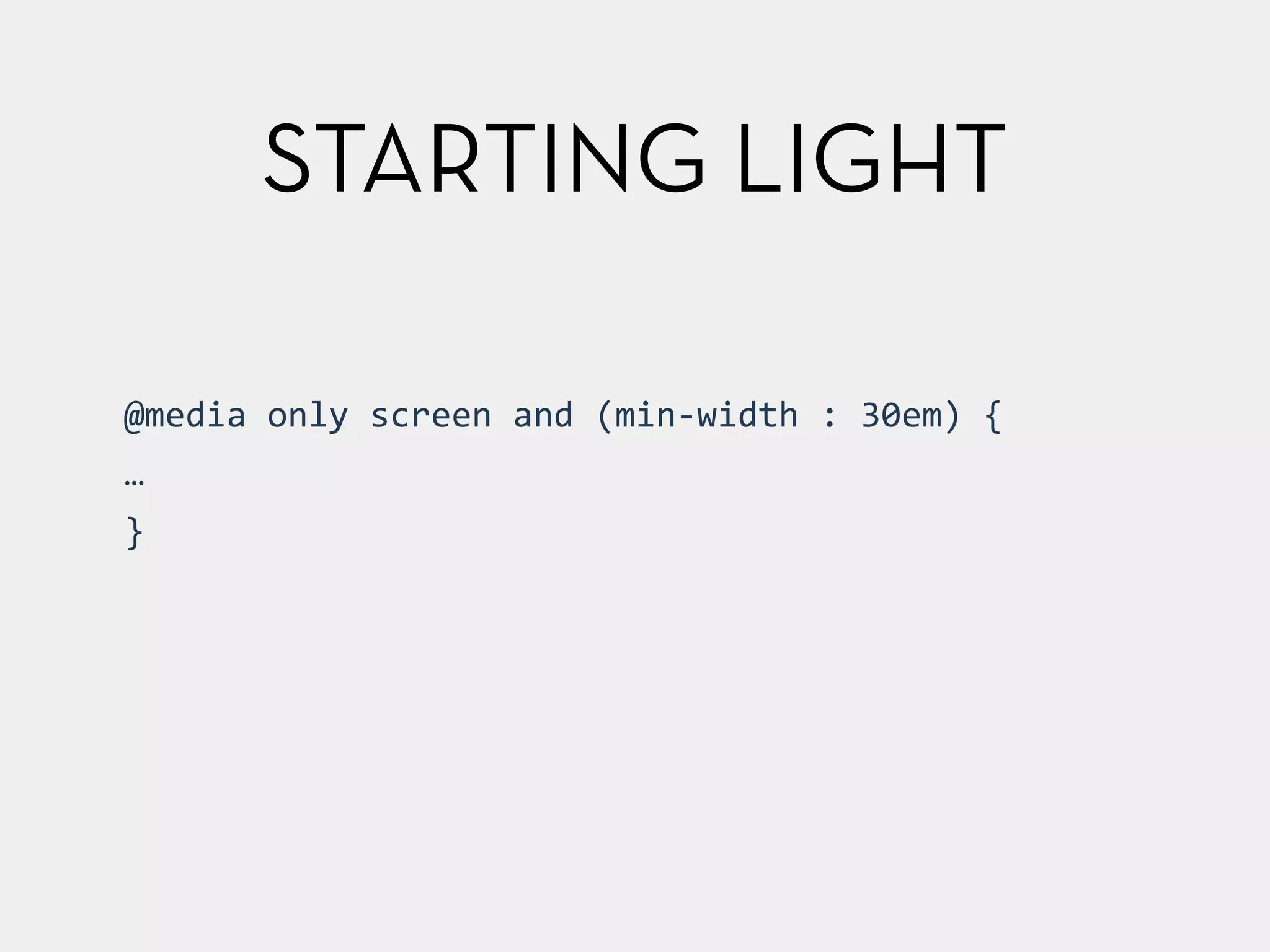
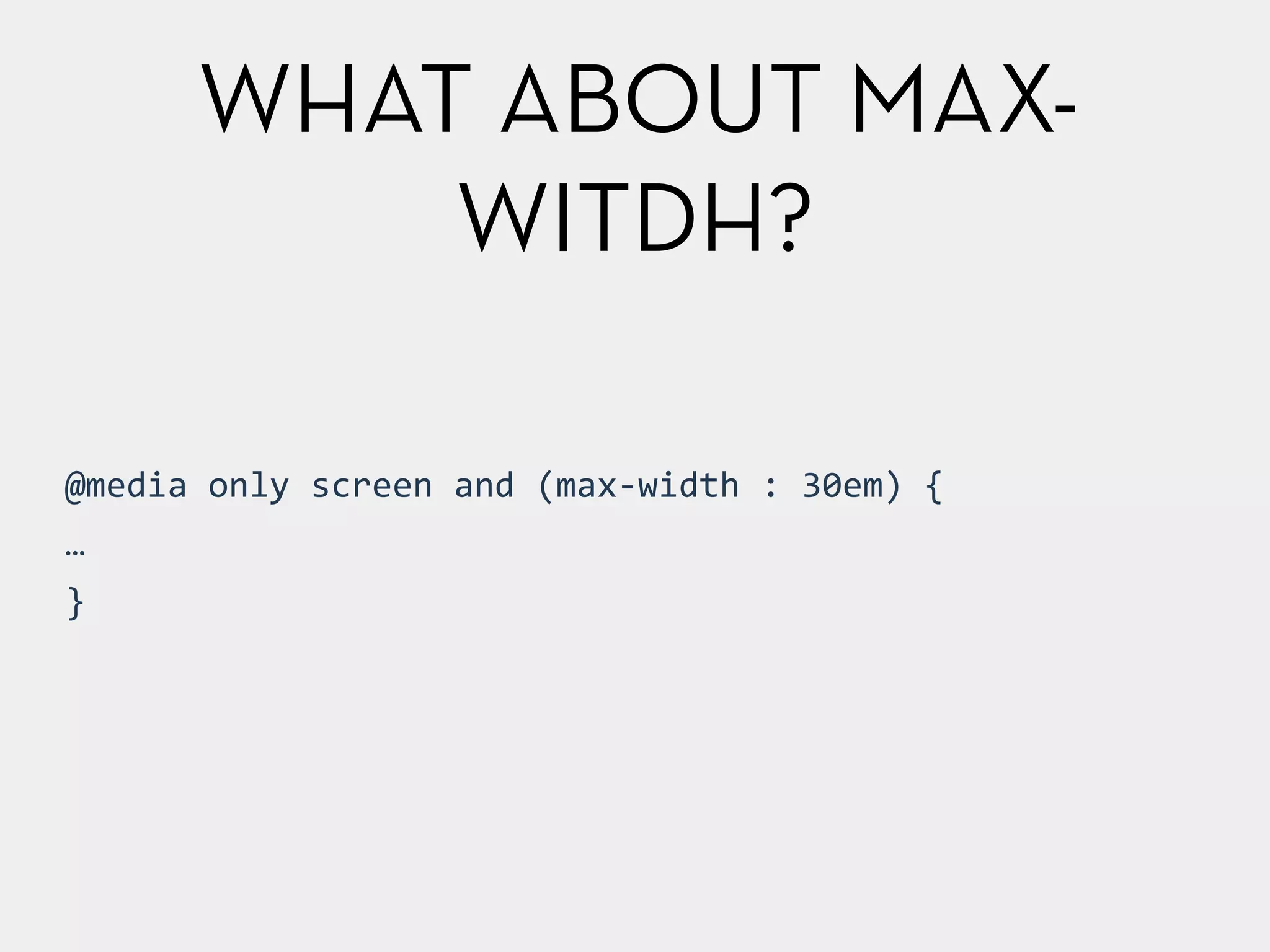
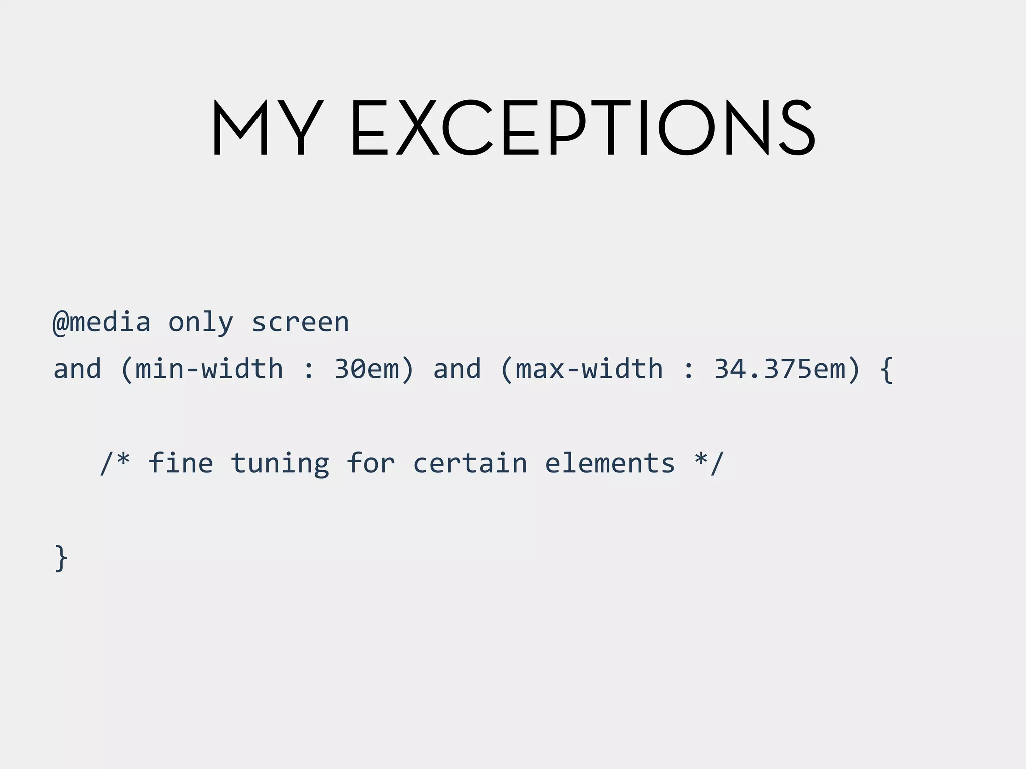
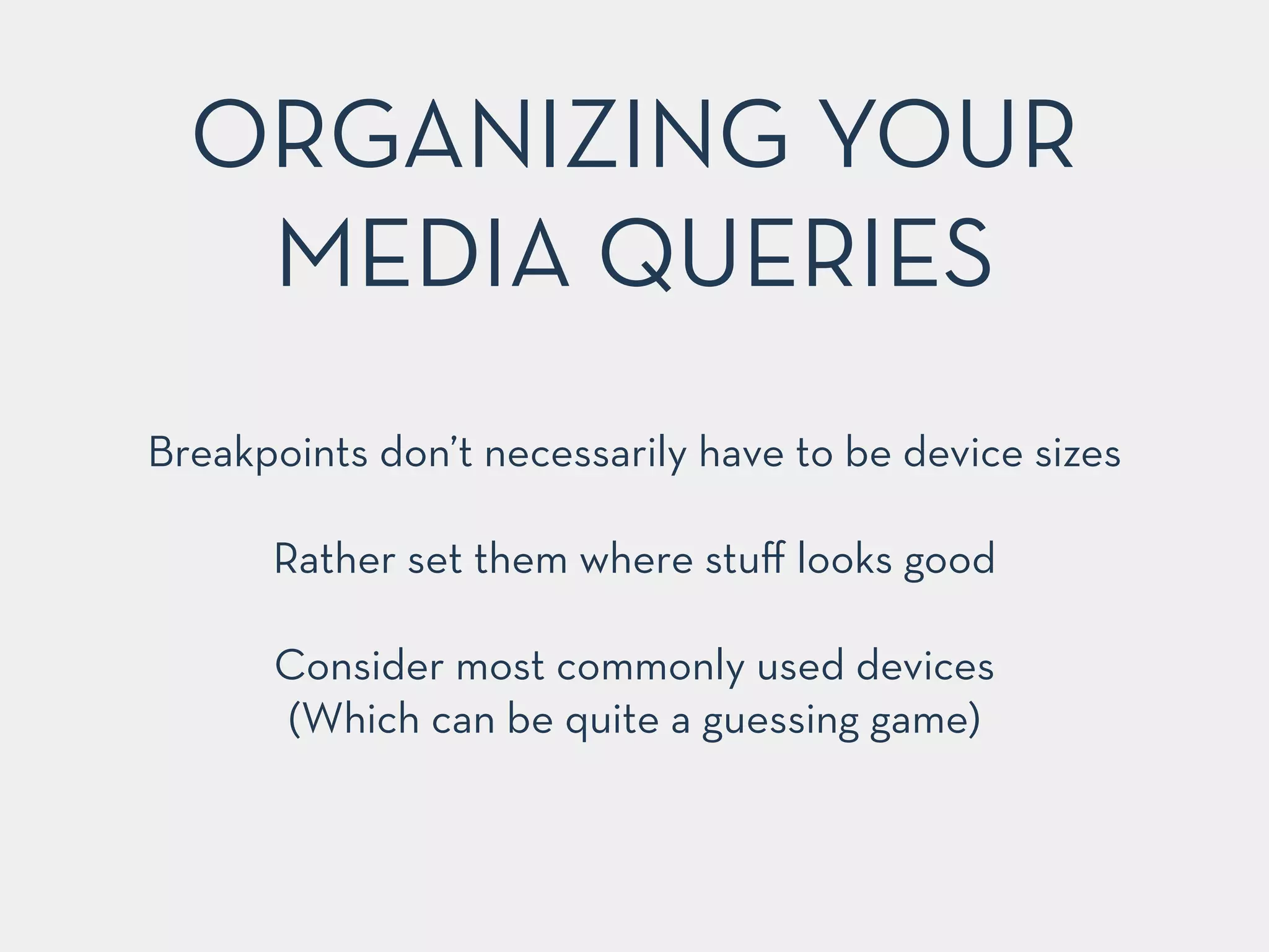
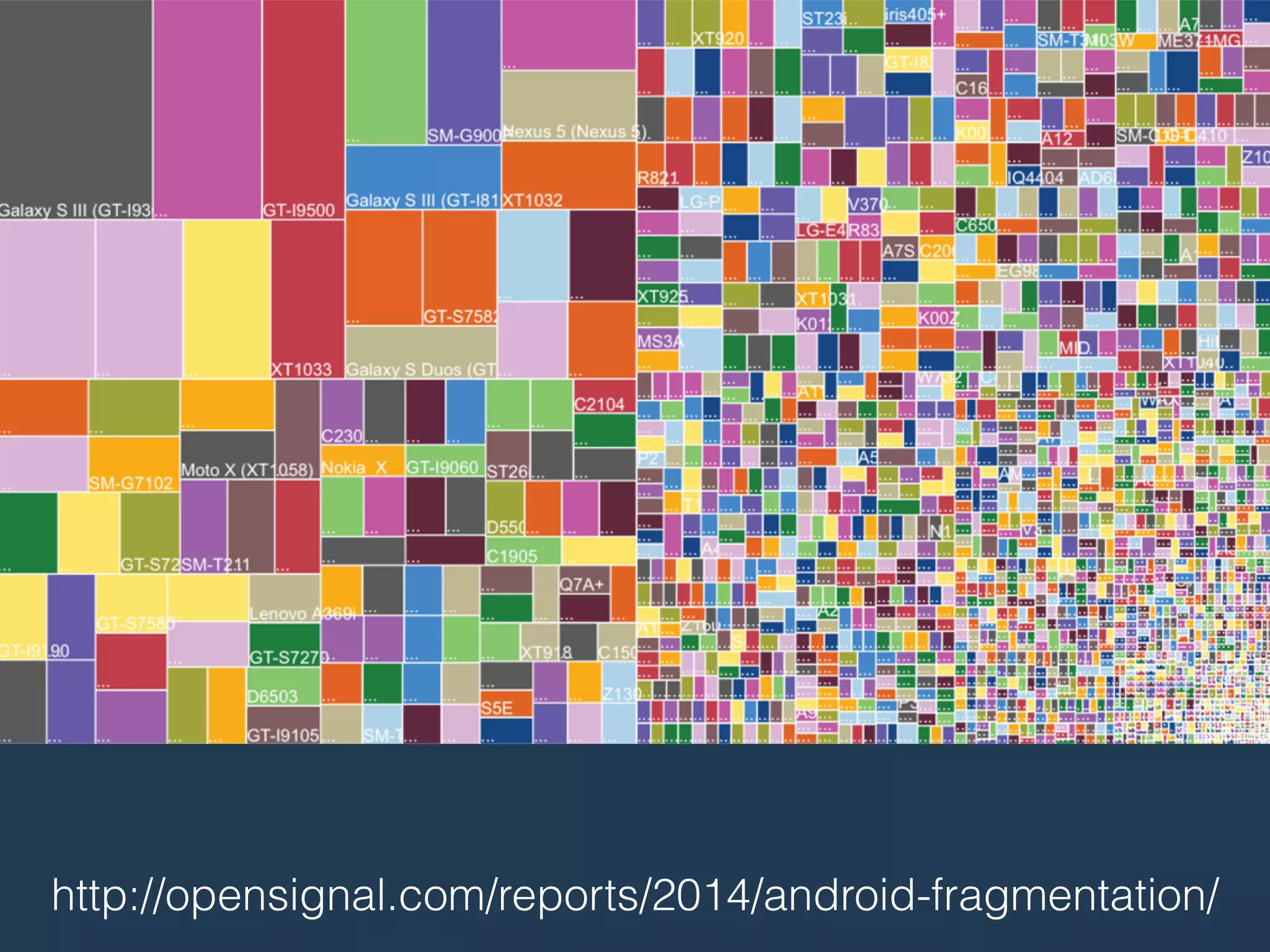
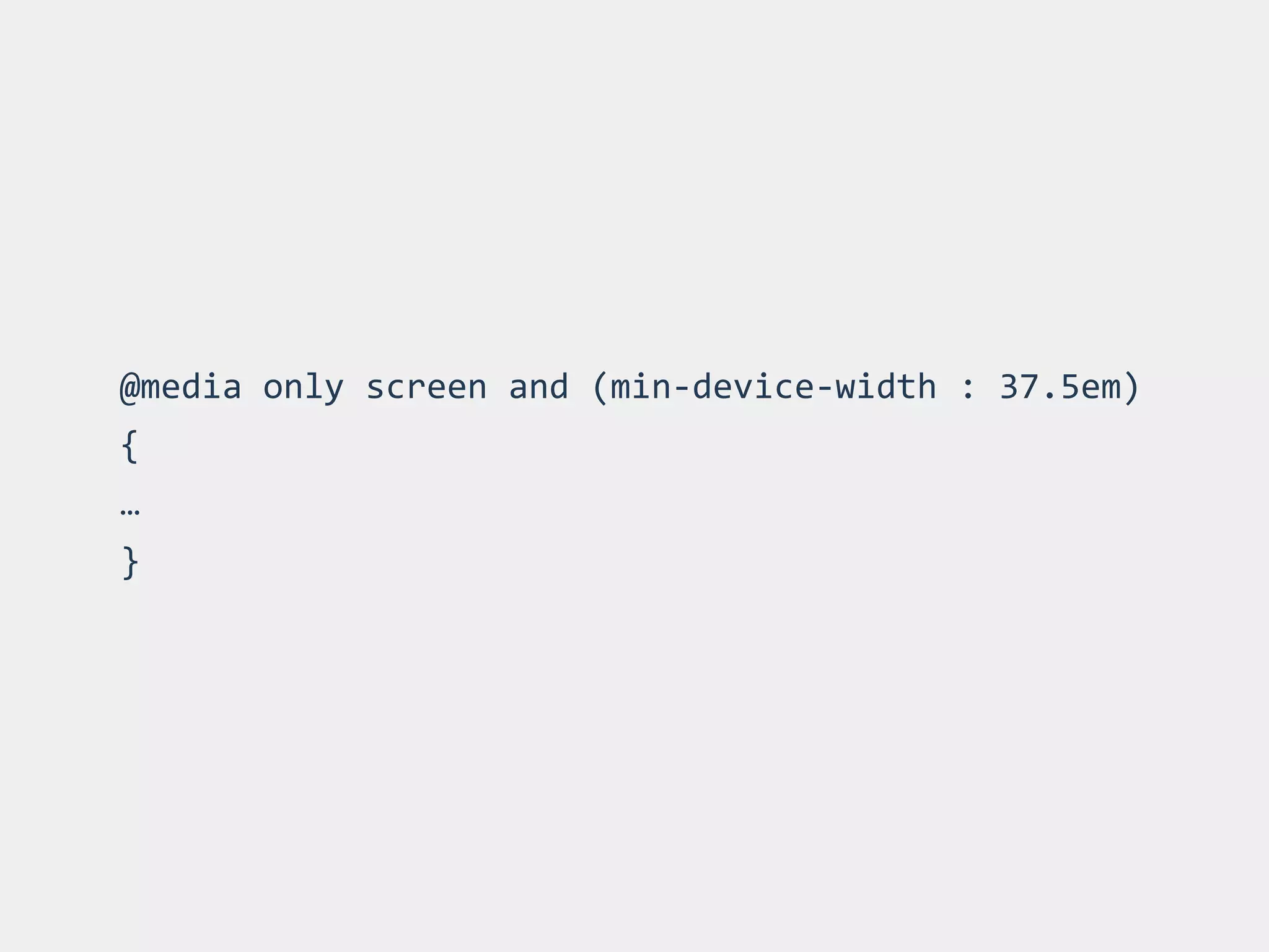
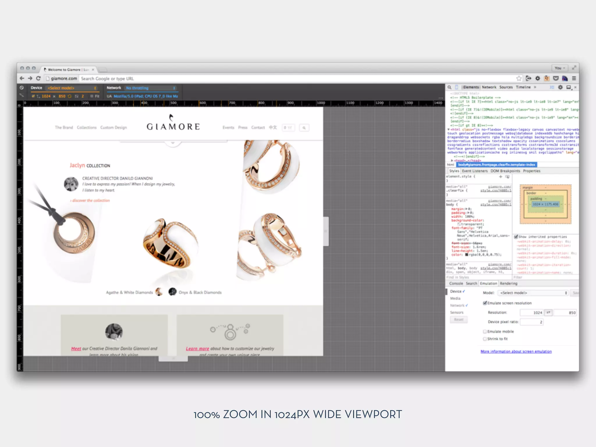
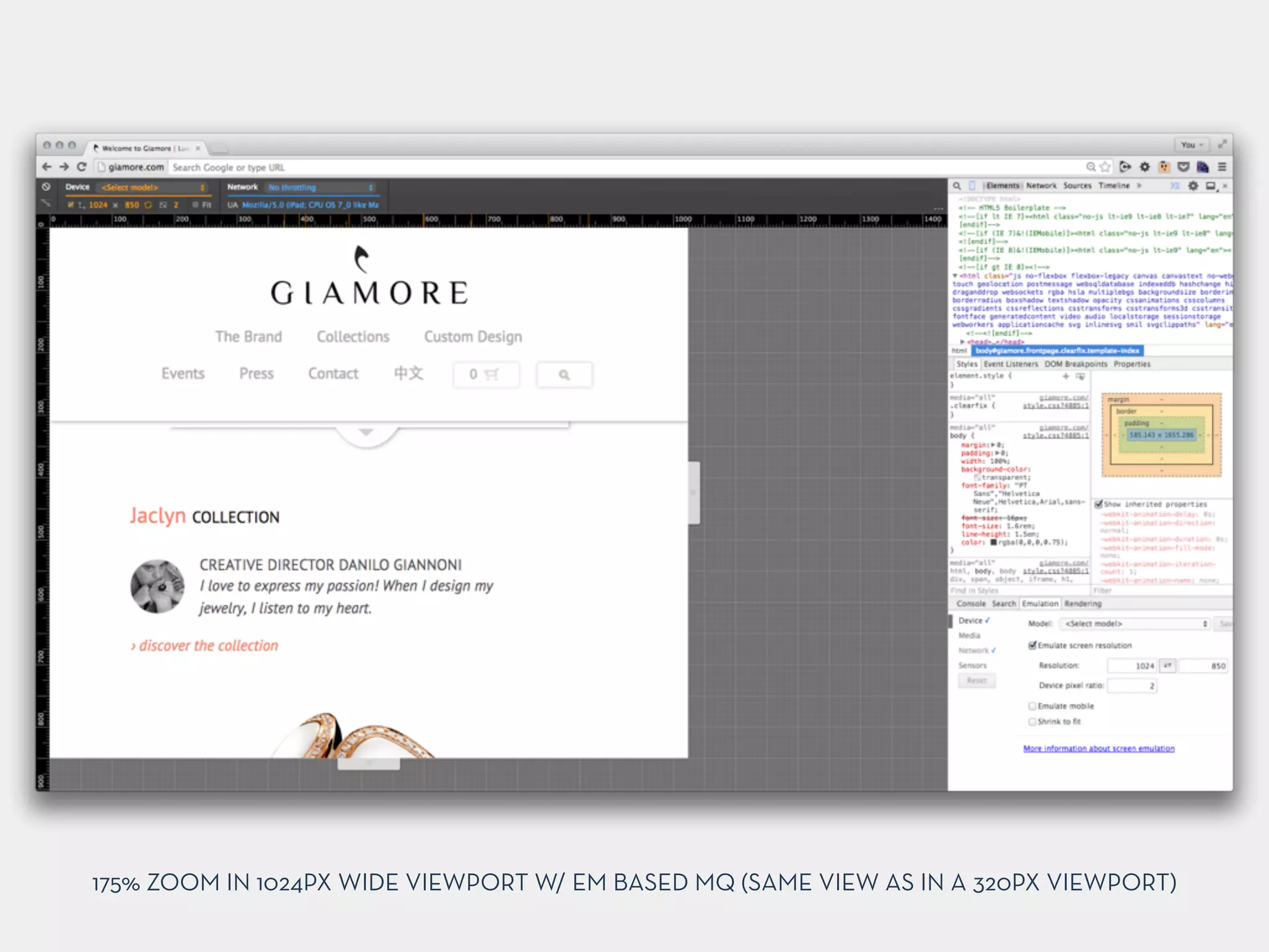
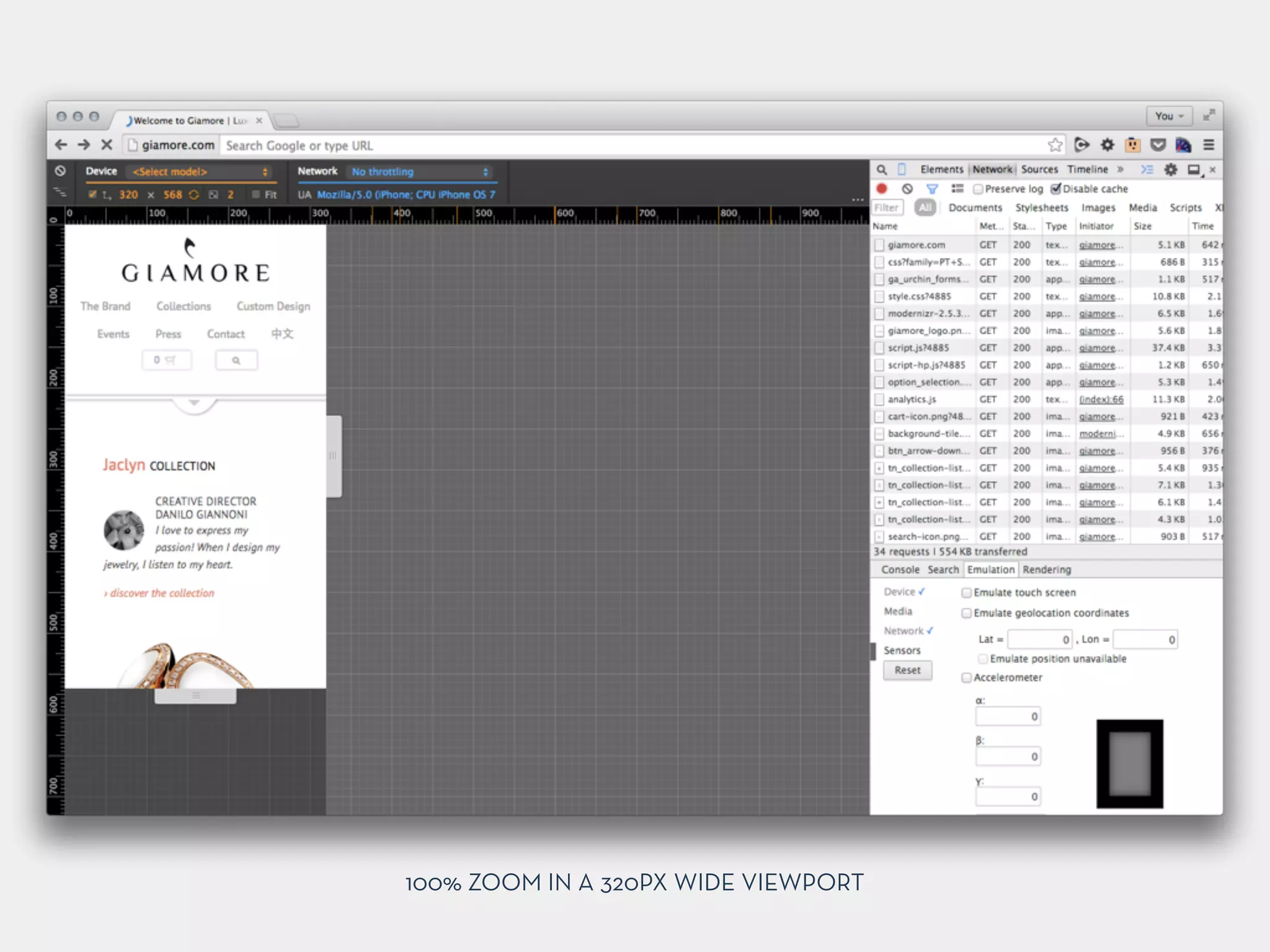
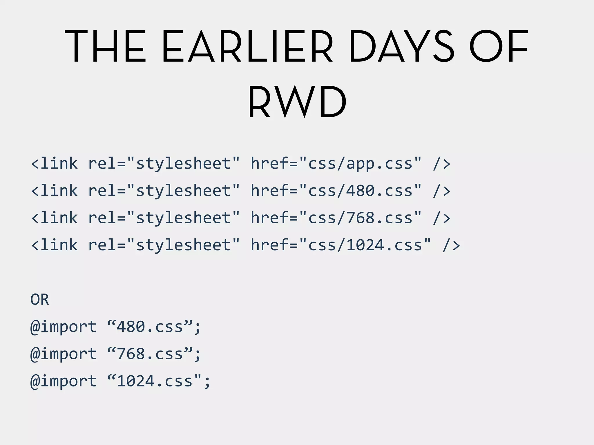
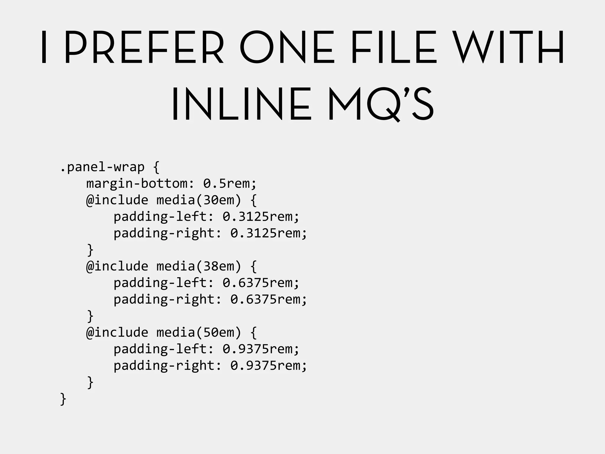
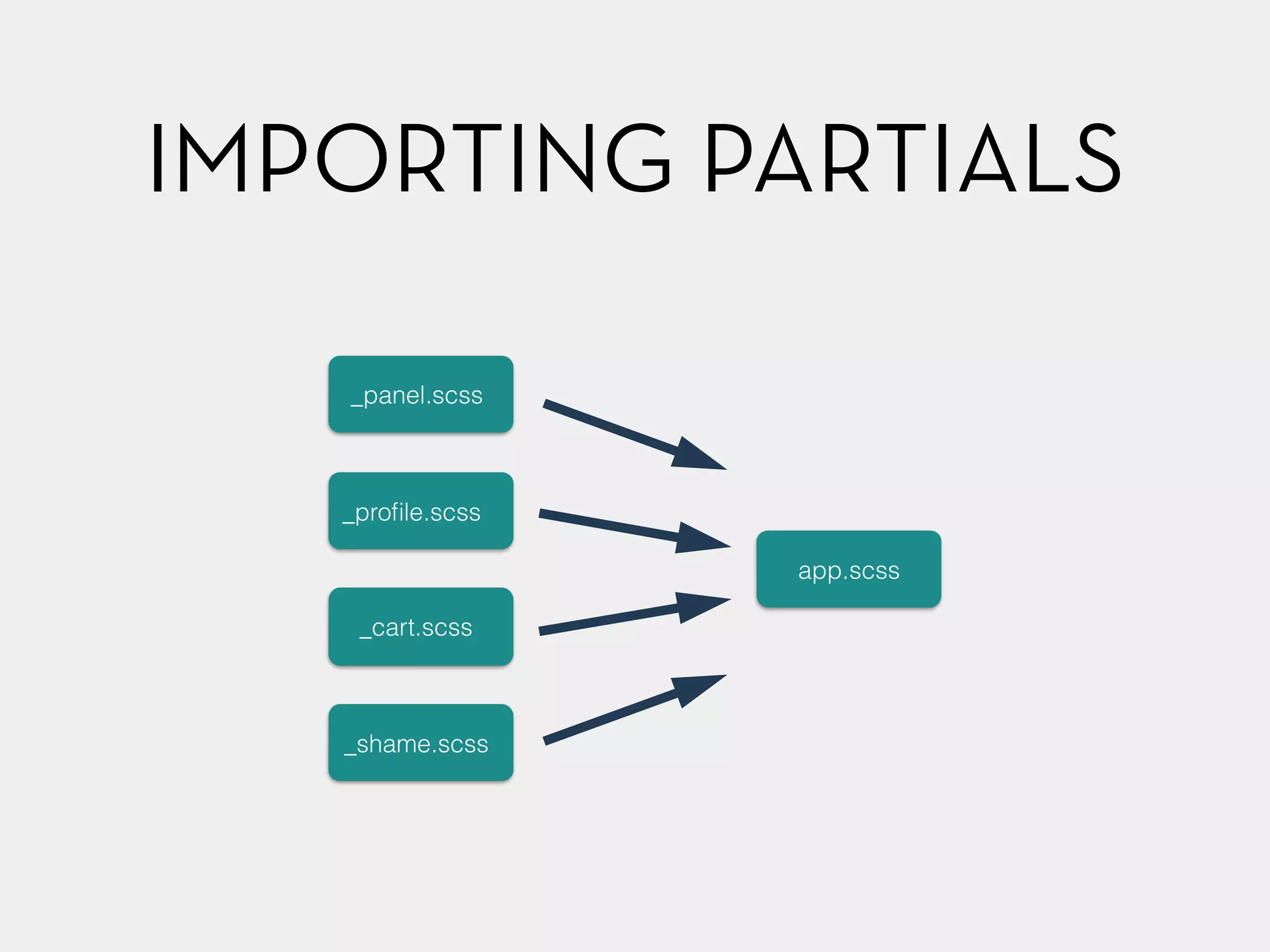
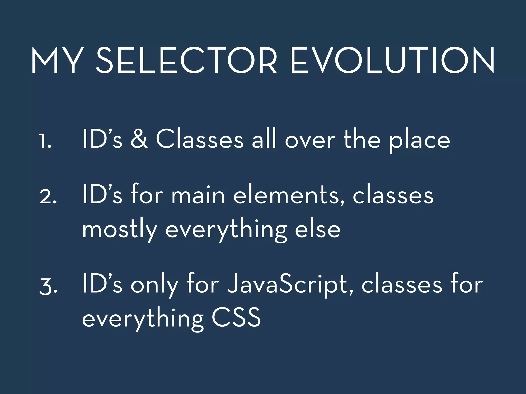
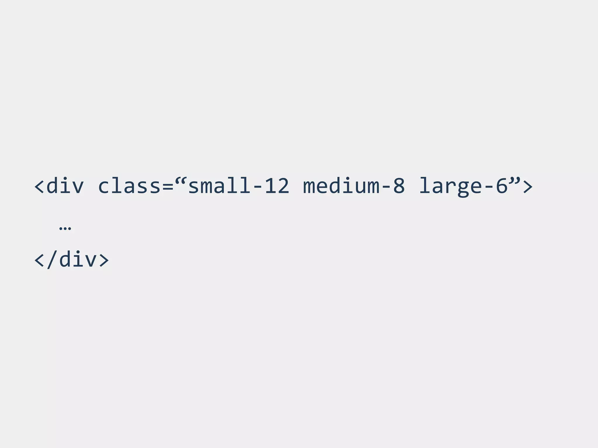
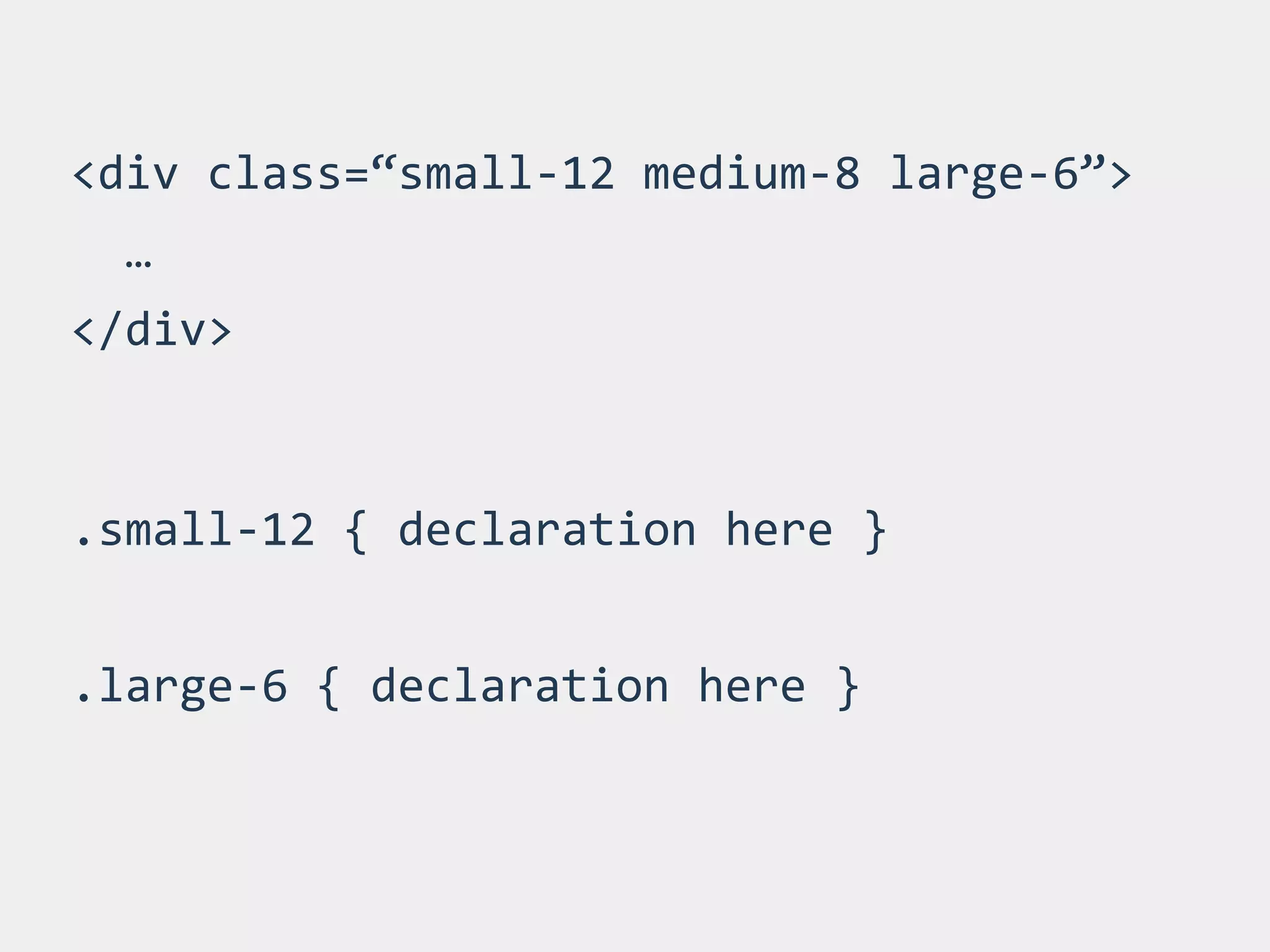
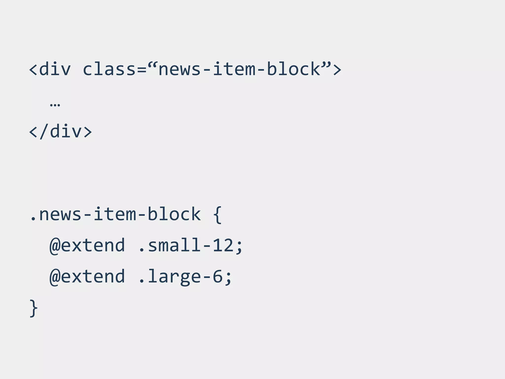
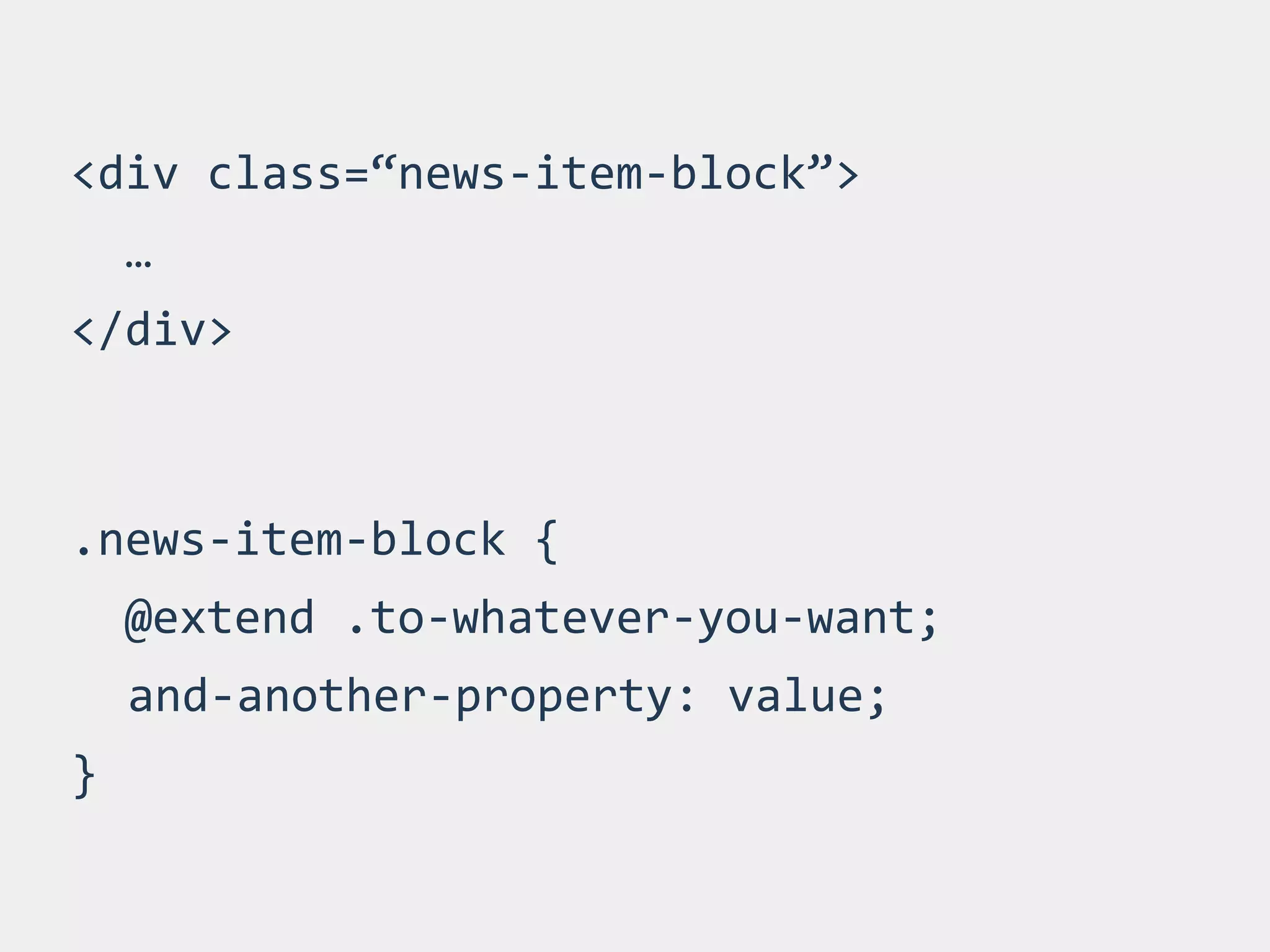
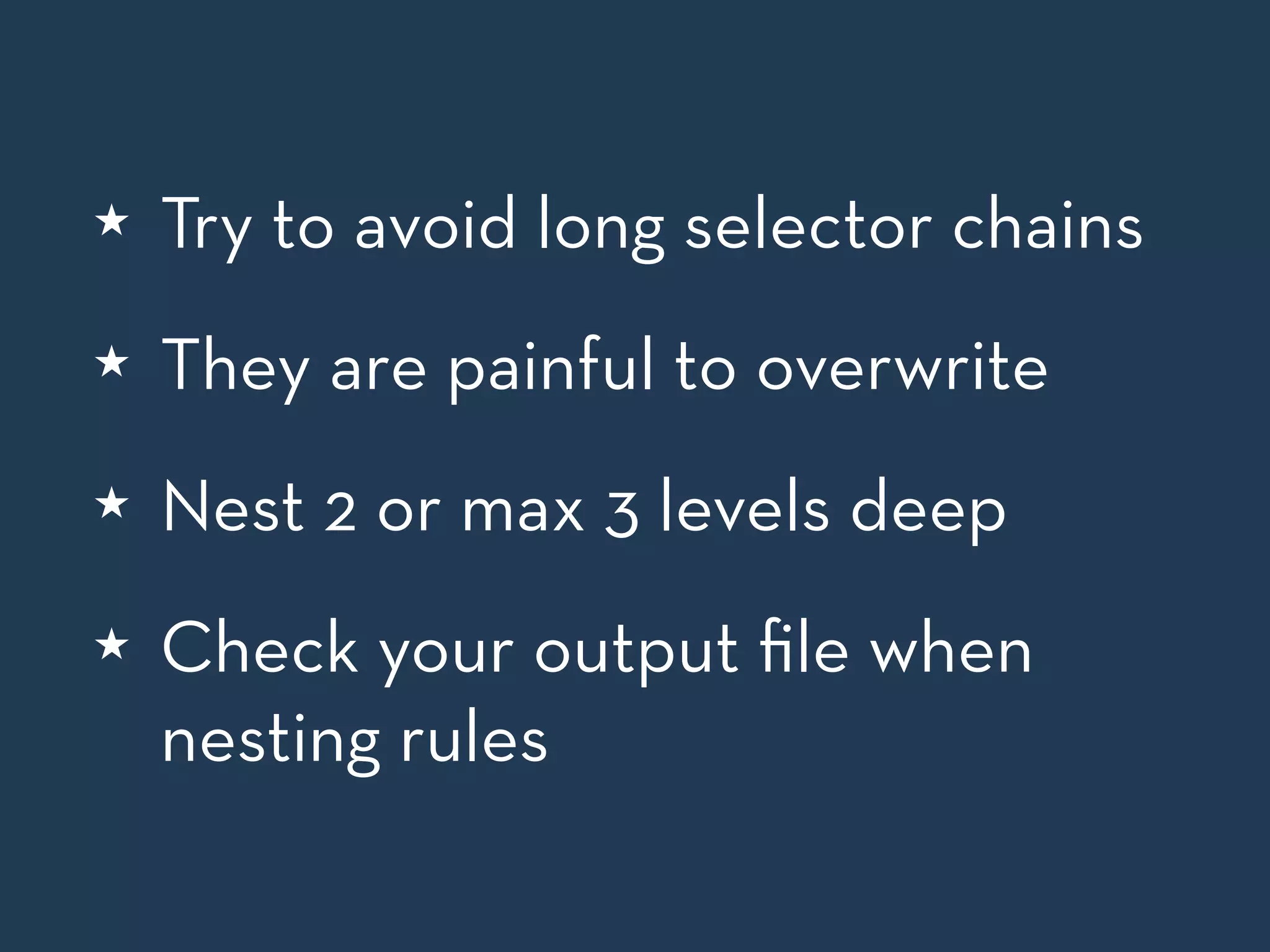
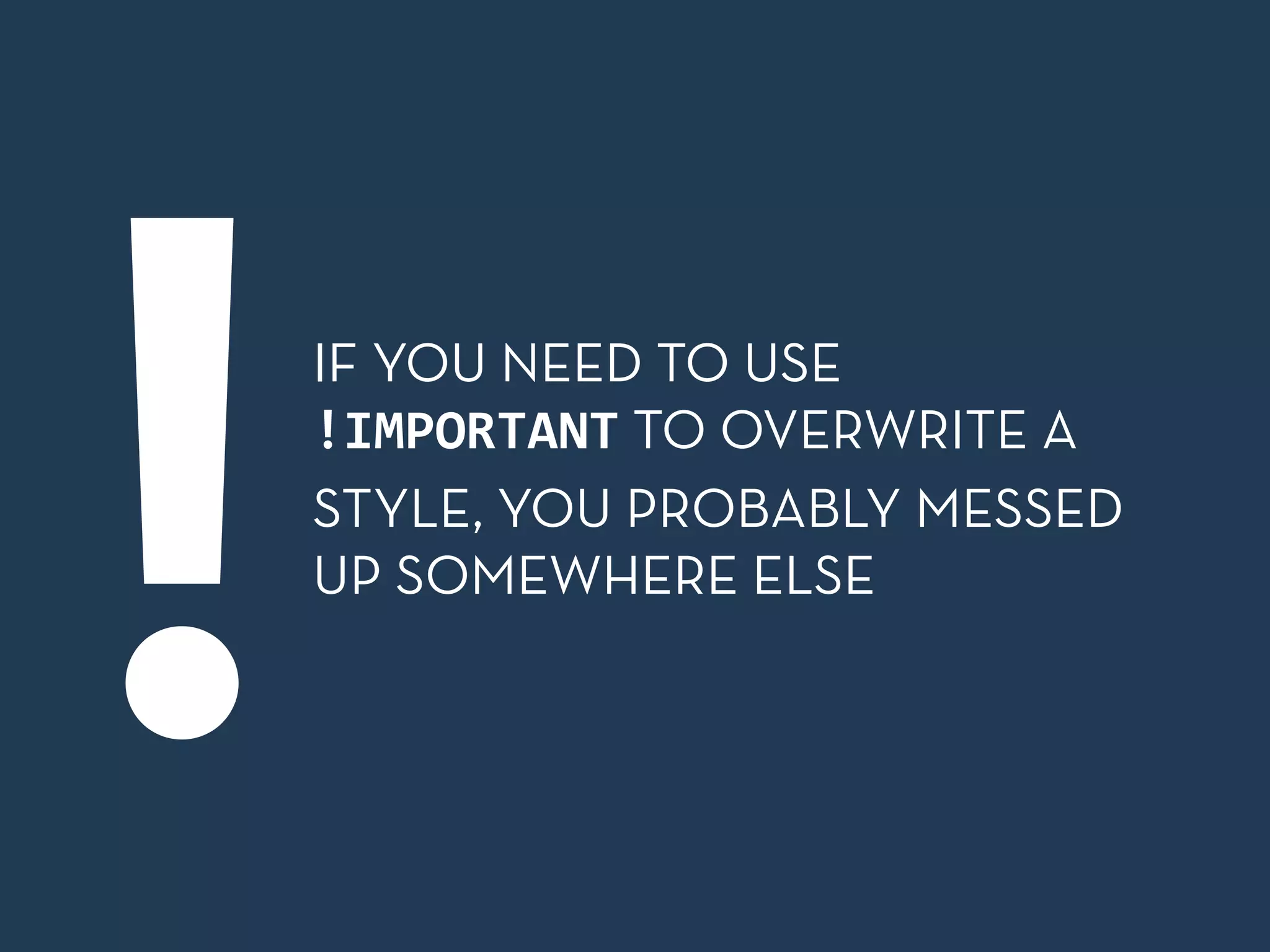
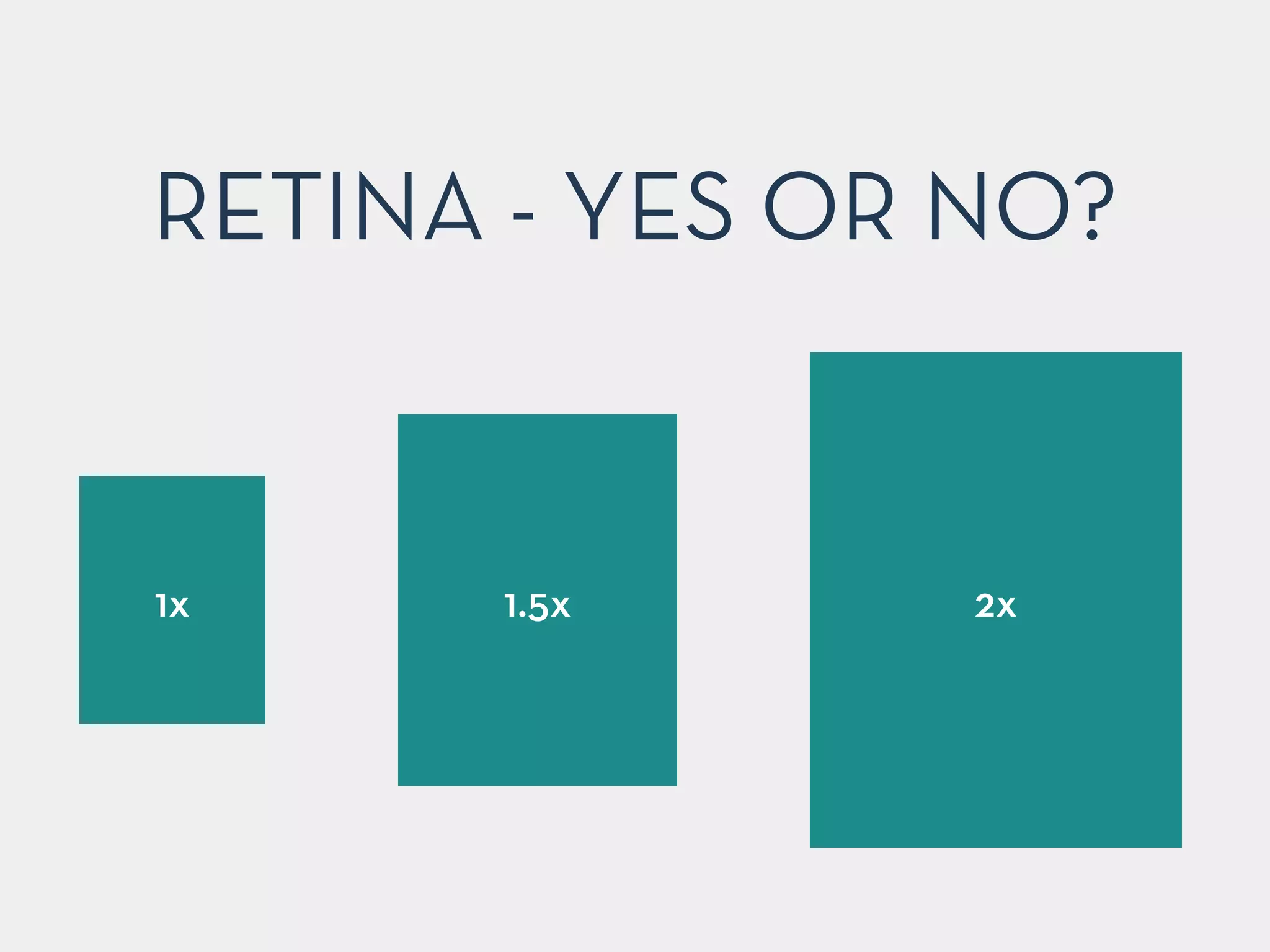
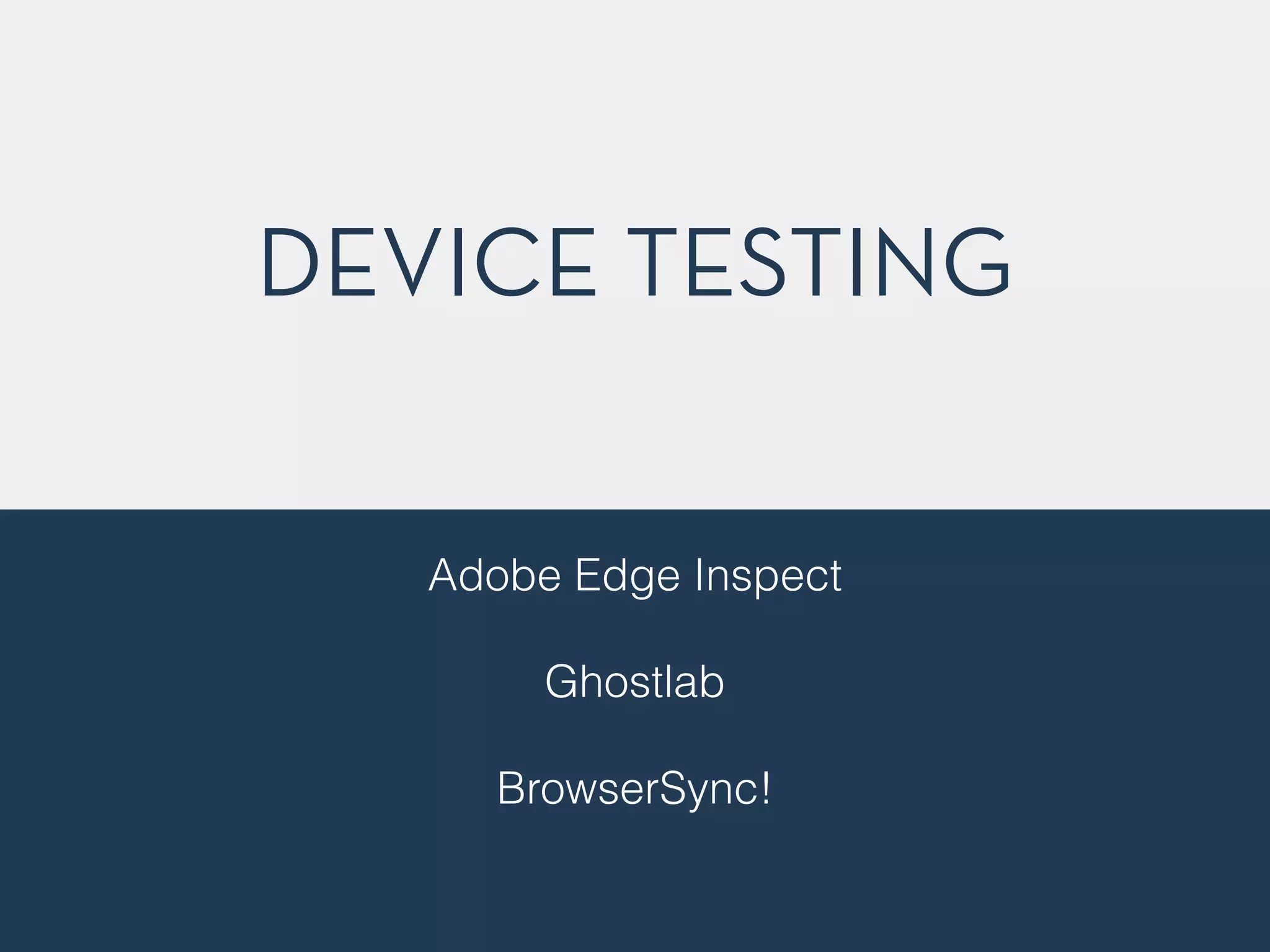
BUILDING BETTER 
RESPONSIVE 
SITES 
Holger Bartel | @foobartel | Harbour Front Monthly #1 on 27/08/2014
“RESPONSIVE WEB 
DESIGN IS ALL ABOUT 
FLUID GRIDS, FLEXIBLE 
IMAGES & MEDIA 
QUERIES”
EASY! 
http://en.wikipedia.org/wiki/Tightrope_walking
http://www.manonwire.com
TURNS OUT… 
NOT QUITE THAT EASY!
“It’s Damn Hard!” 
– Charis Rooda
“And it’s all a big hack!” 
– Charis Rooda
YOU’LL NEED MORE THAN JUST 3 
INGREDIENTS TO COOK A GREAT 
MEAL 
http://en.wikipedia.org/wiki/pasta
★ Fluid Grids, Images & Media 
Queries 
★ Architecture & Structure 
★ Performance
★ Fluid Grids, Images & Media 
Queries 
★ Architecture & Structure 
★ Performance 
★ (Maybe a few more things )
COMMUNICATE! 
Talk to your designers, co-workers, project managers (if 
any) & clients. 
! 
A lot.
GETTING MORE FLEXIBLE 
WITH FONT SIZE 
MEASUREMENTS
PIXELS VS. EMS 
px is an absolute unit of measurement - 
px units don't scale 
! 
em is not an absolute unit - 
it is a unit that is relative to the currently 
chosen font size.
FONT SIZE COMPOUNDS 
body 
{ 
font-­‐size:62.5%; 
} 
h1 
{ 
font-­‐size: 
2.4em; 
} 
/* 
=24px 
*/ 
p 
{ 
font-­‐size: 
1.4em; 
} 
/* 
=14px 
*/ 
li 
{ 
font-­‐size: 
1.4em; 
} 
/* 
=14px? 
*/ 
! 
li 
li 
{ 
} 
! 
1.4em 
= 
14px 
BUT 
14 
* 
1.4 
= 
20
REM == ROOT EM 
The em unit is relative to the font-size of the parent, 
which causes the compounding issue. 
! 
The rem unit is relative to the root—or the html— 
element.
BUILDING MOBILE FIRST
BUILDING MOBILE FIRST 
Building from Small Screen Towards Large Screen 
! 
Which in turn saves you from having to overwrite lots 
of CSS in the long run
STARTING LIGHT 
@media 
only 
screen 
and 
(min-­‐width 
: 
30em) 
{ 
… 
}
WHAT ABOUT MAX-WITDH? 
@media 
only 
screen 
and 
(max-­‐width 
: 
30em) 
{ 
… 
}
@media 
only 
screen 
and 
(min-­‐width 
: 
30em) 
and 
(max-­‐width 
: 
34.375em) 
{ 
! 
/* 
fine 
tuning 
for 
certain 
elements 
*/ 
! 
} 
MY EXCEPTIONS
ORGANIZING YOUR 
MEDIA QUERIES 
Breakpoints don’t necessarily have to be device sizes 
! 
Rather set them where stuff looks good 
! 
Consider most commonly used devices 
(Which can be quite a guessing game)
FLUID OR FIXED 
You could se"le for fixed breakpoints… 
but that’s cheating! ✌️ 
! 
Why should definitely opt for a fluid grid
The Mobile Landscape
The Many Many 
Different Flavors
6 Weeks 
! 
= 
! 
! 
! 
! 
428 Different ! Devices
http://opensignal.com/reports/2014/android-fragmentation/
LOVE MORE % 
…and other relative units. 
! 
This way you will be able to provide be!er and more 
future-proof cross device experiences, even for less 
popular devices.
USING EM’S IN MQ’S 
Let Your Breakpoints Scale with Font-Size
@media 
only 
screen 
and 
(min-­‐device-­‐width 
: 
37.5em) 
{ 
… 
}
100% ZOOM IN 1024PX WIDE VIEWPORT
175% ZOOM IN 1024PX WIDE VIEWPORT W/ EM BASED MQ (SAME VIEW AS IN A 320PX VIEWPORT)
100% ZOOM IN A 320PX WIDE VIEWPORT
THE EARLIER DAYS OF 
RWD 
<link 
rel="stylesheet" 
href="css/app.css" 
/> 
<link 
rel="stylesheet" 
href="css/480.css" 
/> 
<link 
rel="stylesheet" 
href="css/768.css" 
/> 
<link 
rel="stylesheet" 
href="css/1024.css" 
/> 
! 
OR 
@import 
“480.css”; 
@import 
“768.css”; 
@import 
“1024.css";
I PREFER ONE FILE WITH 
.panel-­‐wrap 
{ 
margin-­‐bottom: 
0.5rem; 
@include 
media(30em) 
{ 
padding-­‐left: 
0.3125rem; 
padding-­‐right: 
0.3125rem; 
} 
@include 
media(38em) 
{ 
padding-­‐left: 
0.6375rem; 
padding-­‐right: 
0.6375rem; 
} 
@include 
media(50em) 
{ 
padding-­‐left: 
0.9375rem; 
padding-­‐right: 
0.9375rem; 
} 
} 
INLINE MQ’S
IMPORTING PARTIALS 
_panel.scss 
_profile.scss 
_cart.scss 
_shame.scss 
app.scss
SELECTORS & CHOICES
CLASSES VS. ID’S
MY SELECTOR EVOLUTION 
1. ID’s & Classes all over the place 
2. ID’s for main elements, classes 
mostly everything else 
3. ID’s only for JavaScript, classes for 
everything CSS
SEMANTIC CLASSES 
! 
VS. 
! 
PRESENTATIONAL CLASSES
USE CLASS ATTRIBUTES 
WITH SEMANTICS IN MIND 
Choose your class names to what the 
element is instead of how it looks
.blue-­‐box 
{ 
background: 
#51A7F9; 
}
.blue-­‐box 
{ 
background: 
#DC0100; 
}
.box 
{ 
background: 
#F28717; 
}
ANOTHER ADVANTAGE OF USING 
SEMANTIC CLASSES OVER 
PRESENTATIONAL CLASSES 
CHANGE ELEMENT 
APPEARANCE WITHOUT 
TOUCHING YOUR HTML
<div 
class=“small-­‐12 
medium-­‐8 
large-­‐6”> 
… 
</div>
<div 
class=“small-­‐12 
medium-­‐8 
large-­‐6”> 
… 
</div> 
.small-­‐12 
{ 
declaration 
here 
} 
! 
.large-­‐6 
{ 
declaration 
here 
}
<div 
class=“news-­‐item-­‐block”> 
… 
</div> 
.news-­‐item-­‐block 
{ 
@extend 
.small-­‐12; 
@extend 
.large-­‐6; 
}
<div 
class=“news-­‐item-­‐block”> 
… 
</div> 
.news-­‐item-­‐block 
{ 
@extend 
.to-­‐whatever-­‐you-­‐want; 
and-­‐another-­‐property: 
value; 
}
CLASS NAMES
CLASS NAMING IS HARD 
http://en.wikipedia.org/wiki/Macaque#mediaviewer/File:Macaca_nigra_self-portrait.jpg
TOOLS & METHODOLOGIES 
TO SUPPORT BETTER 
NAMING & STRUCTURE
SMACSS 
SCALABLE AND MODULAR 
ARCHITECTURE FOR CSS 
https://www.smacss.com
OOCSS 
OBJECT ORIENTED CSS 
http://www.oocss.org
BEM 
BLOCK, ELEMENT, MODIFIER 
http://www.bem.info
DON’T MAKE YOUR LIFE 
HARDER THAN IT NEEDS TO 
BE
MY FAVORITE WORD: 
SPECIFICITY
★ Try to avoid long selector chains 
★ They are painful to overwrite 
★ Nest 2 or max 3 levels deep 
★ Check your output file when 
nesting rules
IF YOU NEED TO USE 
!IMPORTANT TO OVERWRITE A 
STYLE, YOU PROBABLY MESSED 
UP SOMEWHERE ELSE !
DON’T WORRY ABOUT 
THE SIZE OF YOUR CSS 
! 
RATHER CARE ABOUT 
IMAGE SIZE
IMAGES
AVERAGE RESPONSIVE 
SITE SIZE 
~ 1.8MB 
http://httparchive.org/interesting.php
INCREASE SINCE 2011 
http://httparchive.org/interesting.php
IMAGES OFTEN ACCOUNT FOR 
MOST OF THE DOWNLOADED 
BYTES ON A PAGE. 
! 
OPTIMIZING IMAGES CAN 
OFTEN YIELD LARGE BYTE 
SAVINGS AND PERFORMANCE 
IMPROVEMENTS.
MAKE A CALL 
You have to make decisions and sacrifices sometimes. 
As long as you know why you made them, it should be 
alright to do so
LARGE OR SMALL 
http://en.wikipedia.org/wiki/Tiger
RETINA - YES OR NO? 
1x 1.5x 2x
TOOLS FOR IMAGE 
OPTIMIZATION 
h"p://addyosmani.com/blog/image-optimization-tools/
TOOLS & STUFF
CODE GUIDE 
Standards for developing flexible, durable, and sustainable 
HTML and CSS. 
http://mdo.github.io/code-guide/
CHECK HTML5/CSS3 
BROWSER FEATURES 
http://www.caniuse.com
CODEKIT 
STEROIDS 
FOR WEB DEVELOPERS 
https://incident57.com/codekit/
CROSS-BROWSER 
TESTING 
VirtualBox 
! 
Modern.ie 
! 
Browserstack.com 
! 
Sauce Labs 
!
DEVICE TESTING 
Adobe Edge Inspect 
! 
Ghostlab 
! 
BrowserSync! 
! 
! 
!
PERFORMANCE TESTING 
http://www.webpagetest.org 
! 
http://tools.pingdom.com/fpt/ 
! 
https://developers.google.com/speed/pagespeed/ 
! 
https://developer.yahoo.com/yslow/ 
!
GRUNT 
JAVASCRIPT TASK 
RUNNER 
http://www.gruntjs.com
GULP 
ANOTHER TASK 
RUNNER 
http://www.gulpjs.com
“RESPONSIVE WEB 
DESIGN ISN’T QUITE 
ONLY ABOUT FLUID 
GRIDS, FLEXIBLE IMAGES 
& MEDIA QUERIES”
THANKS! 
Holger Bartel | @foobartel | Harbour Front Monthly #1 on 27/08/2014

Building Better Responsive Websites