Download to read offline
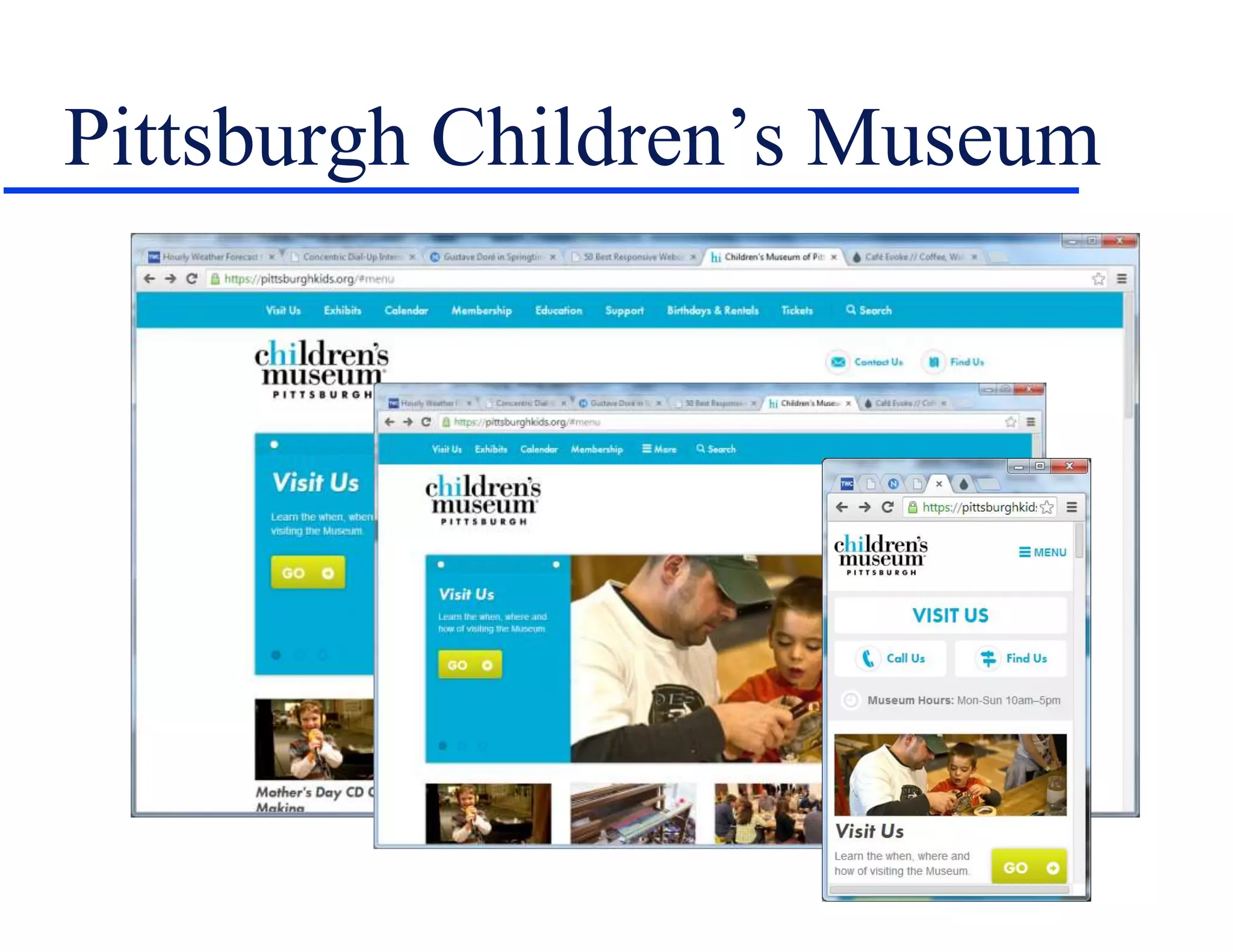
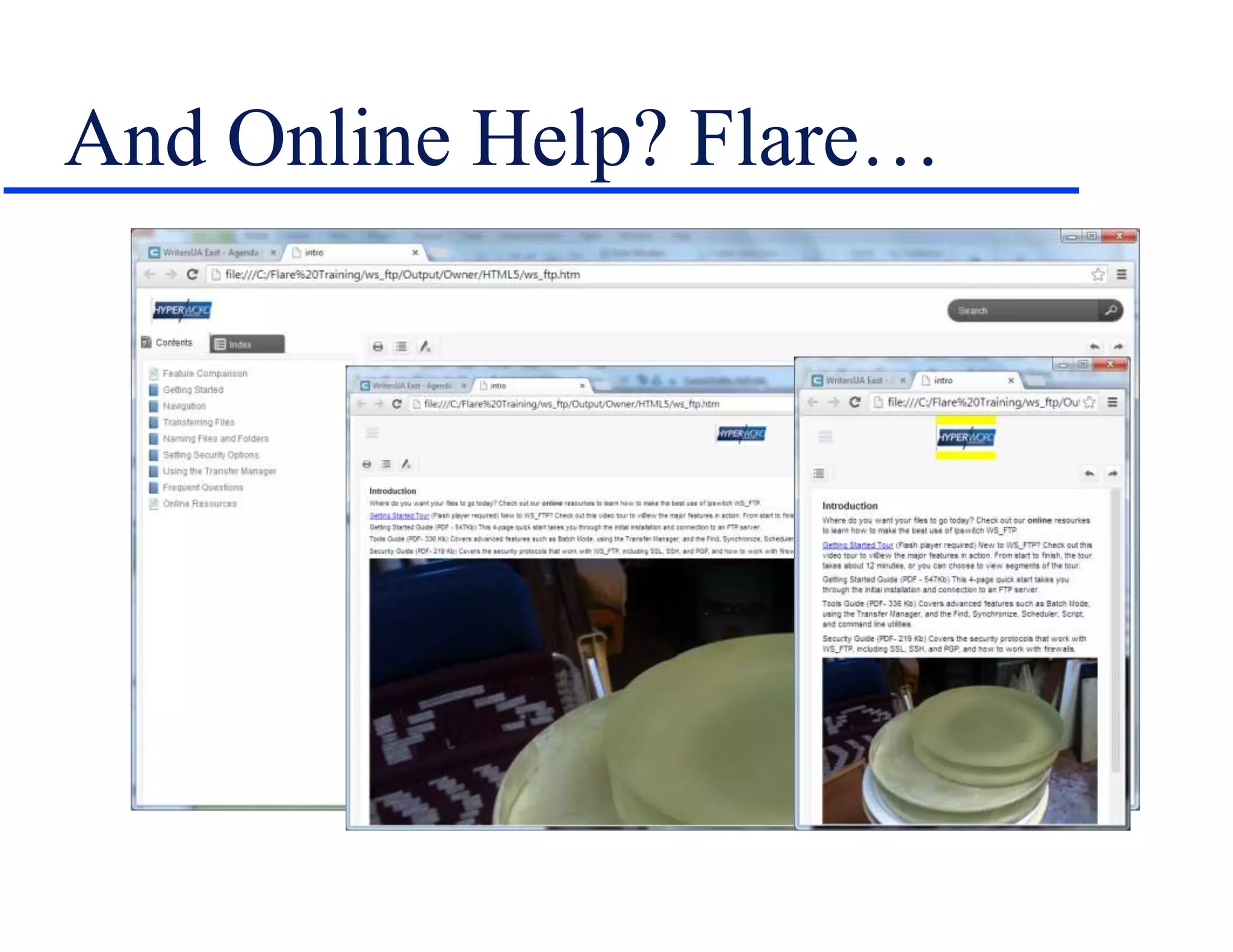
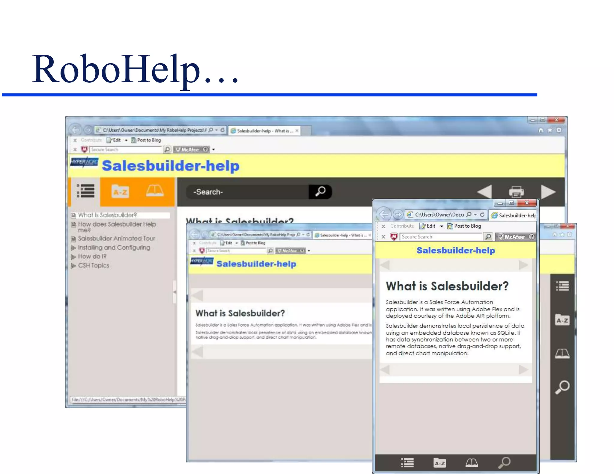
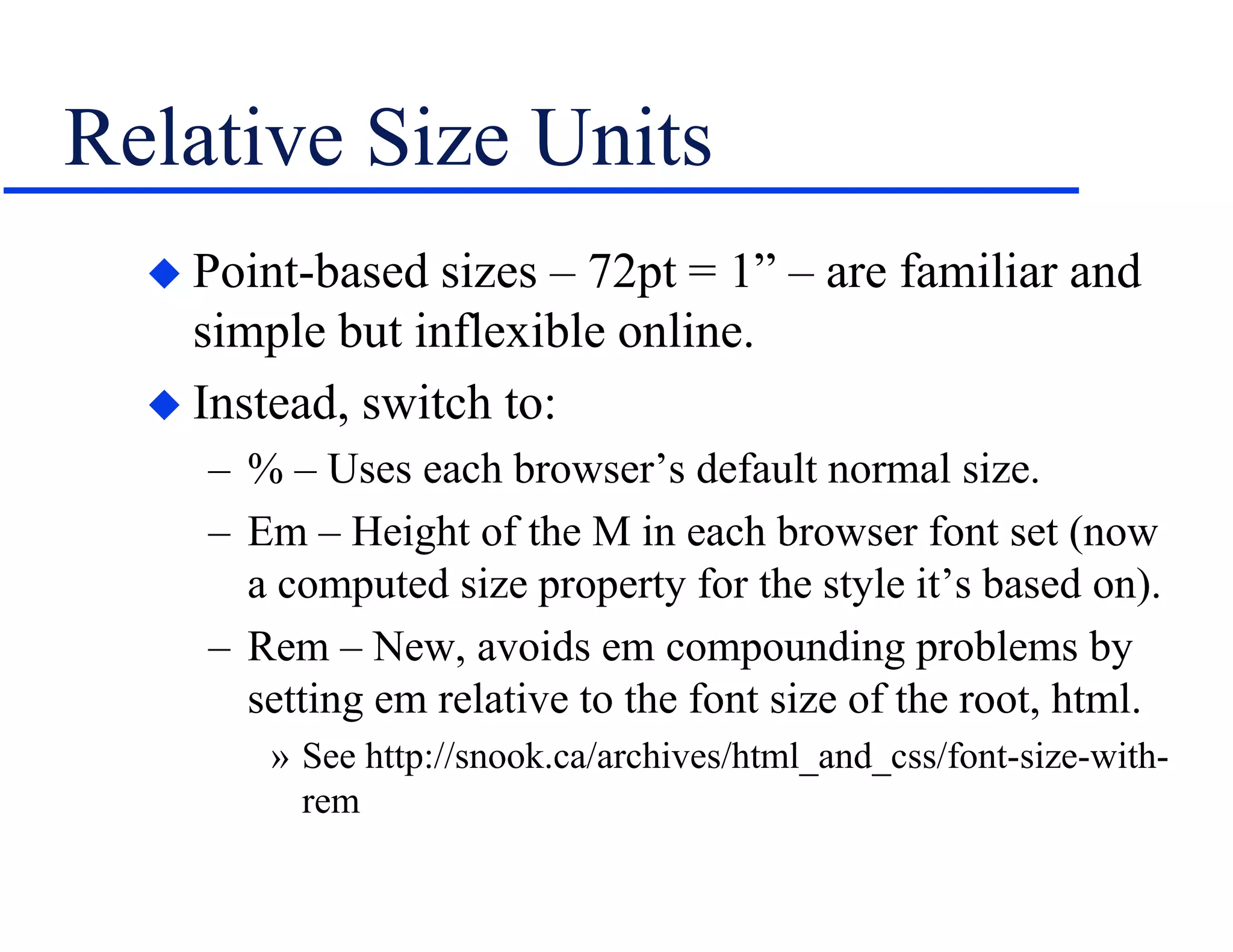
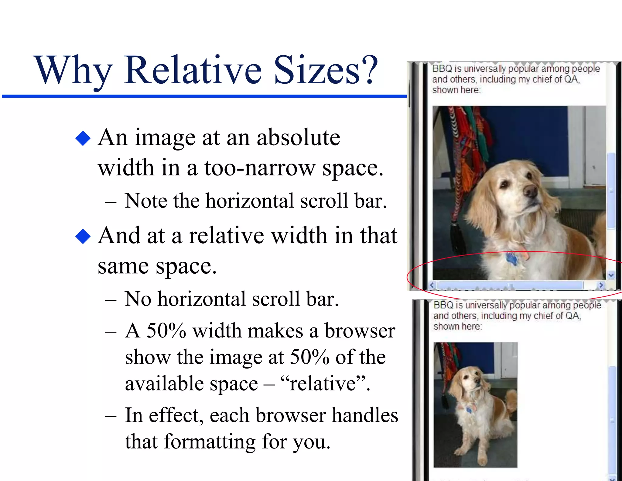
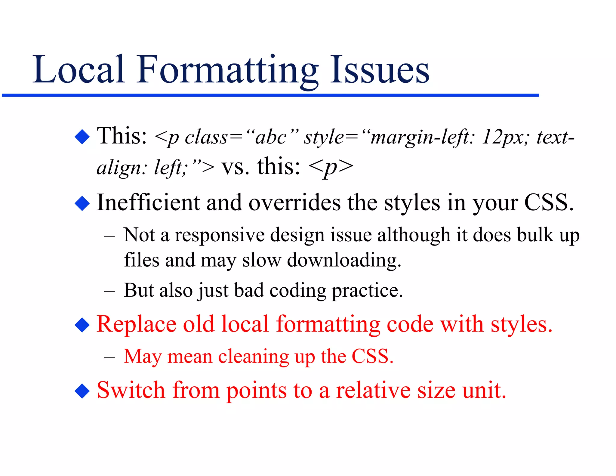
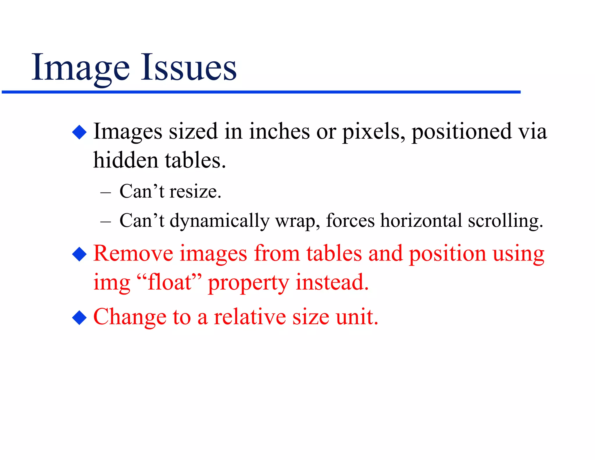
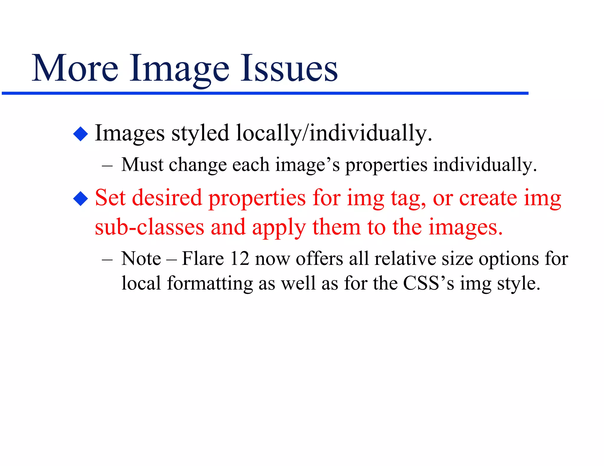
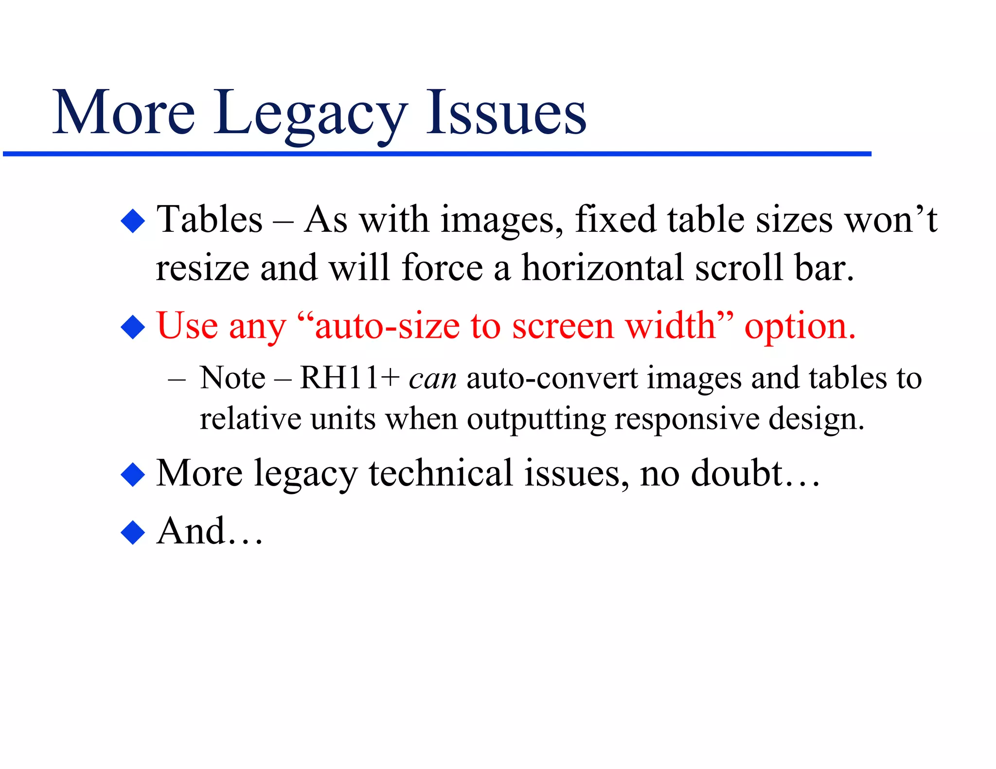
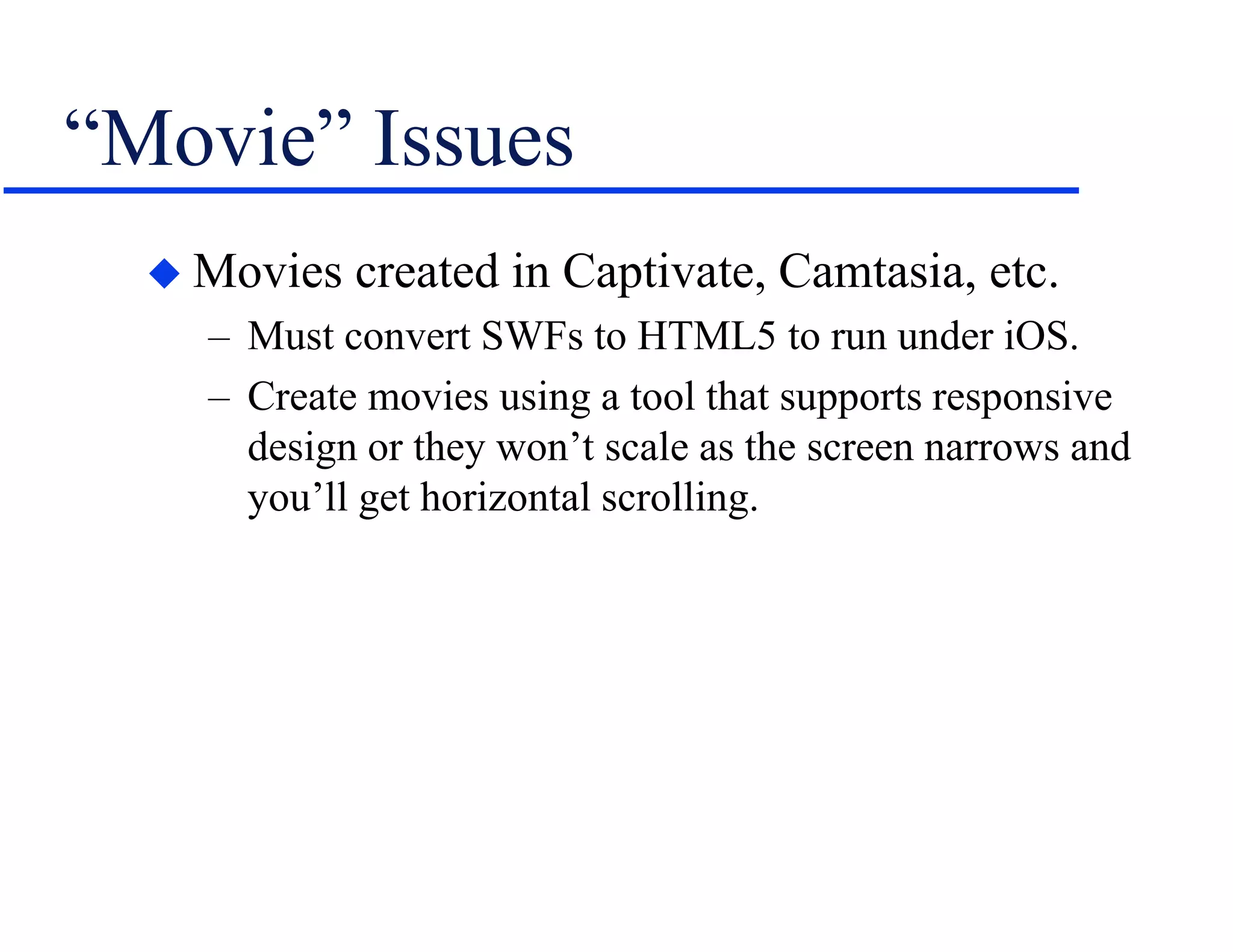
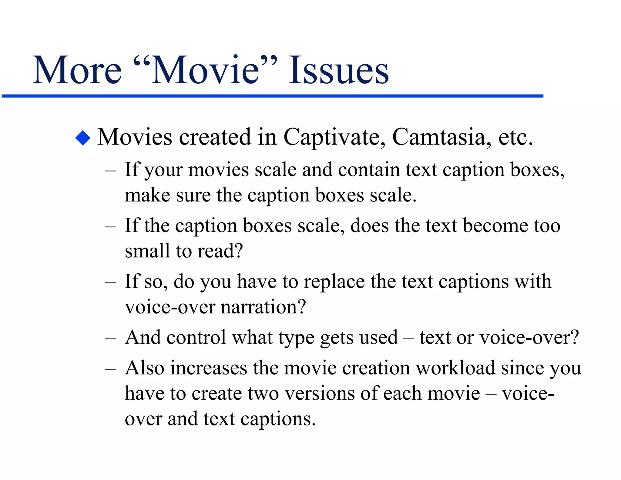
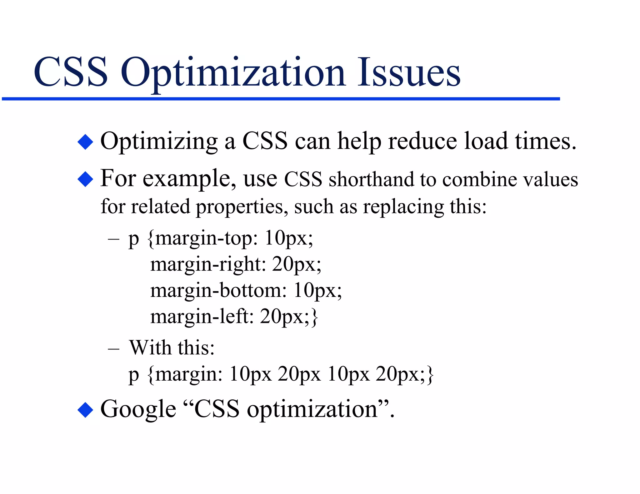
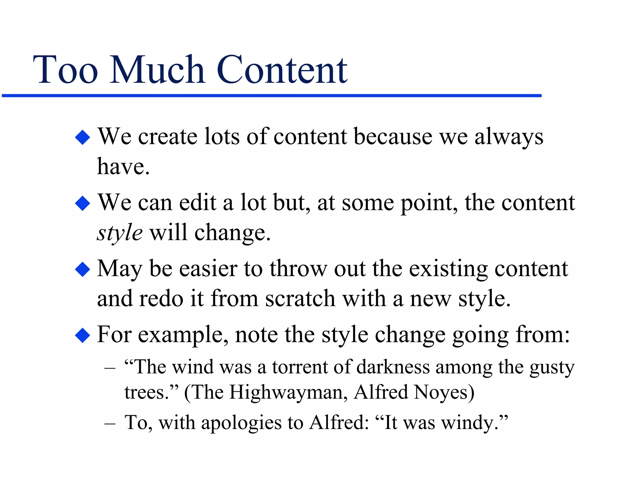

This document discusses responsive design for online help outputs from tools like Flare and RoboHelp. It covers converting legacy projects, which can involve addressing local formatting, images that are too large or not resizable, tables, and other issues. New issues with responsive design include supporting different image resolutions, handling videos and captions at different screen widths, and optimizing CSS. The document provides examples and suggestions for addressing many of these common challenges.