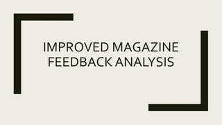
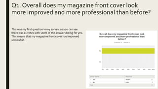
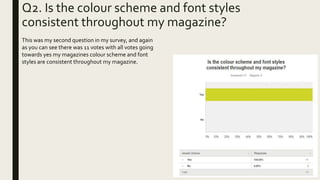
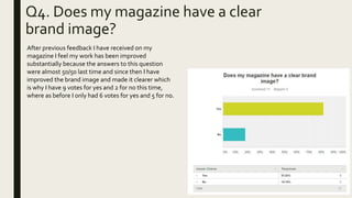
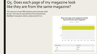
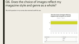
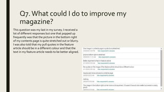
IMPROVED MAGAZINE
FEEDBACK ANALYSIS
Q1. Overall does my magazine front cover look
more improved and more professional than before?
This was my first question in my survey, as you can see
there was 11 votes with 100% of the answers being for yes.
This means that my magazine front cover has improved
somewhat.
Q2. Is the colour scheme and font styles
consistent throughout my magazine?
This was my second question in my survey, and again
as you can see there was 11 votes with all votes going
towards yes my magazines colour scheme and font
styles are consistent throughout my magazine.
Q3. Does the magazine as a whole
represent the genre?
This was my third question in my survey I received 10 votes
for yes and 1 for no. Overall this is a huge improvement to
before where I received 8 votes for yes and 3 for no.
Q4. Does my magazine have a clear
brand image?
After previous feedback I have received on my
magazine I feel my work has been improved
substantially because the answers to this question
were almost 50/50 last time and since then I have
improved the brand image and made it clearer which
is why I have 9 votes for yes and 2 for no this time,
where as before I only had 6 votes for yes and 5 for no.
Q5. Does each page of my magazine look
like they are from the same magazine?
This was my surveys fifth question and I received 100%
for yes.This was an improvement from the previous
feedback I was given where 3 votes were for no.
Q6. Does the choice of images reflect my
magazine style and genre as a whole?
My sixth question in my survey also received 100% for yes.
Q7.What could I do to improve my
magazine?
This question was my last in my survey. I received a
lot of different responses but one that popped up
frequently was that the picture in the bottom right
of my contents page is quite stretched out or blurry.
I was also told that my pull quotes in the feature
article should be in a different colour and that the
text in my feature article needs to be better aligned.

Improved magazine feedback analysis

  • 1.
  • 2.
    Q1. Overall doesmy magazine front cover look more improved and more professional than before? This was my first question in my survey, as you can see there was 11 votes with 100% of the answers being for yes. This means that my magazine front cover has improved somewhat.
  • 3.
    Q2. Is thecolour scheme and font styles consistent throughout my magazine? This was my second question in my survey, and again as you can see there was 11 votes with all votes going towards yes my magazines colour scheme and font styles are consistent throughout my magazine.
  • 4.
    Q3. Does themagazine as a whole represent the genre? This was my third question in my survey I received 10 votes for yes and 1 for no. Overall this is a huge improvement to before where I received 8 votes for yes and 3 for no.
  • 5.
    Q4. Does mymagazine have a clear brand image? After previous feedback I have received on my magazine I feel my work has been improved substantially because the answers to this question were almost 50/50 last time and since then I have improved the brand image and made it clearer which is why I have 9 votes for yes and 2 for no this time, where as before I only had 6 votes for yes and 5 for no.
  • 6.
    Q5. Does eachpage of my magazine look like they are from the same magazine? This was my surveys fifth question and I received 100% for yes.This was an improvement from the previous feedback I was given where 3 votes were for no.
  • 7.
    Q6. Does thechoice of images reflect my magazine style and genre as a whole? My sixth question in my survey also received 100% for yes.
  • 8.
    Q7.What could Ido to improve my magazine? This question was my last in my survey. I received a lot of different responses but one that popped up frequently was that the picture in the bottom right of my contents page is quite stretched out or blurry. I was also told that my pull quotes in the feature article should be in a different colour and that the text in my feature article needs to be better aligned.