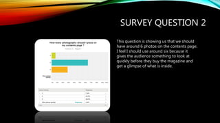
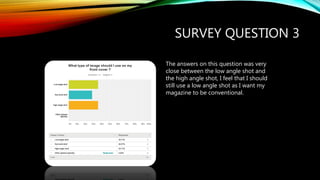
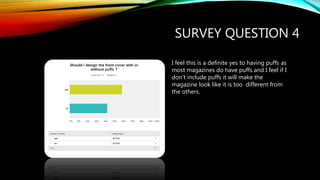
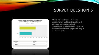
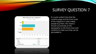
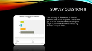
Harry Hartland analyzed the results of a survey about magazine design. Question 1 found that the audience prefers red and black color schemes. Question 2 showed that 6 photos on the contents page is best. Question 3 was close but a low angle shot is more conventional. Question 4 confirmed that readers expect puffs. Question 5 found mixed placement of photos and text is balanced. Question 6 showed front covers should not be cluttered. Question 7 revealed the importance of cover and contents typography. Question 8 covered using different fonts. Question 9 disagreed that pictures should outweigh text. Question 10 confirmed the subject should make eye contact. Overall, the survey provided useful guidance for Harry's magazine design.