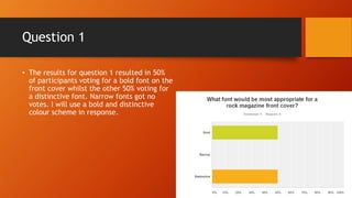
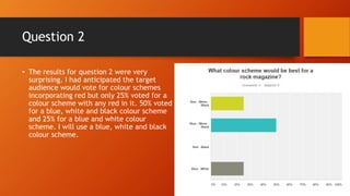
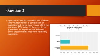
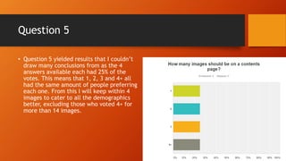
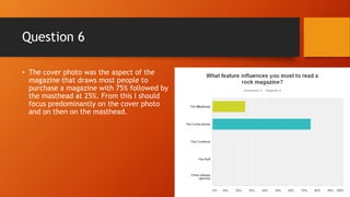
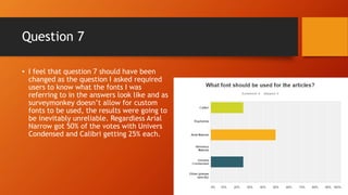
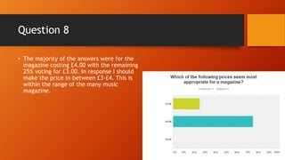
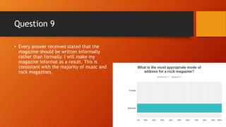
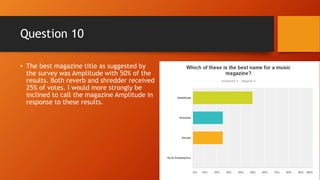
Magazine Survey Analysis
Question 1
• The results for question 1 resulted in 50%
of participants voting for a bold font on the
front cover whilst the other 50% voting for
a distinctive font. Narrow fonts got no
votes. I will use a bold and distinctive
colour scheme in response.
Question 2
• The results for question 2 were very
surprising. I had anticipated the target
audience would vote for colour schemes
incorporating red but only 25% voted for a
colour scheme with any red in it. 50% voted
for a blue, white and black colour scheme
and 25% for a blue and white colour
scheme. I will use a blue, white and black
colour scheme.
Question 3
• Question 3’s results show that 75% of those
who voted preferred a combination of
organised but messy front covers whilst the
remaining 25% preferred the cover to be
just messy. In response I will make my
cover predominantly messy but relatively
organised.
Question 4
• 75% of the participants wanted half of the
contents page to be reserved for images
and the other half for the table. 25% of the
results suggests that a quarter of the page
should be for the contents table and the
remainder for images. This suggests that
the majority of readers would value the
images and contents equally with a small
amount preferring more images than text.
Question 5
• Question 5 yielded results that I couldn’t
draw many conclusions from as the 4
answers available each had 25% of the
votes. This means that 1, 2, 3 and 4+ all
had the same amount of people preferring
each one. From this I will keep within 4
images to cater to all the demographics
better, excluding those who voted 4+ for
more than 4 images.
Question 6
• The cover photo was the aspect of the
magazine that draws most people to
purchase a magazine with 75% followed by
the masthead at 25%. From this I should
focus predominantly on the cover photo
and on then on the masthead.
Question 7
• I feel that question 7 should have been
changed as the question I asked required
users to know what the fonts I was
referring to in the answers look like and as
surveymonkey doesn’t allow for custom
fonts to be used, the results were going to
be inevitably unreliable. Regardless Arial
Narrow got 50% of the votes with Univers
Condensed and Calibri getting 25% each.
Question 8
• The majority of the answers were for the
magazine costing £4.00 with the remaining
25% voting for £3.00. In response I should
make the price in-between £3-£4. This is
within the range of the many music
magazine.
Question 9
• Every answer received stated that the
magazine should be written informally
rather than formally. I will make my
magazine informal as a result. This is
consistant with the majority of music and
rock magazines.
Question 10
• The best magazine title as suggested by
the survey was Amplitude with 50% of the
results. Both reverb and shredder received
25% of votes. I would more strongly be
inclined to call the magazine Amplitude in
response to these results.

Survey analysis slideshow

  • 1.
  • 2.
    Question 1 • Theresults for question 1 resulted in 50% of participants voting for a bold font on the front cover whilst the other 50% voting for a distinctive font. Narrow fonts got no votes. I will use a bold and distinctive colour scheme in response.
  • 3.
    Question 2 • Theresults for question 2 were very surprising. I had anticipated the target audience would vote for colour schemes incorporating red but only 25% voted for a colour scheme with any red in it. 50% voted for a blue, white and black colour scheme and 25% for a blue and white colour scheme. I will use a blue, white and black colour scheme.
  • 4.
    Question 3 • Question3’s results show that 75% of those who voted preferred a combination of organised but messy front covers whilst the remaining 25% preferred the cover to be just messy. In response I will make my cover predominantly messy but relatively organised.
  • 5.
    Question 4 • 75%of the participants wanted half of the contents page to be reserved for images and the other half for the table. 25% of the results suggests that a quarter of the page should be for the contents table and the remainder for images. This suggests that the majority of readers would value the images and contents equally with a small amount preferring more images than text.
  • 6.
    Question 5 • Question5 yielded results that I couldn’t draw many conclusions from as the 4 answers available each had 25% of the votes. This means that 1, 2, 3 and 4+ all had the same amount of people preferring each one. From this I will keep within 4 images to cater to all the demographics better, excluding those who voted 4+ for more than 4 images.
  • 7.
    Question 6 • Thecover photo was the aspect of the magazine that draws most people to purchase a magazine with 75% followed by the masthead at 25%. From this I should focus predominantly on the cover photo and on then on the masthead.
  • 8.
    Question 7 • Ifeel that question 7 should have been changed as the question I asked required users to know what the fonts I was referring to in the answers look like and as surveymonkey doesn’t allow for custom fonts to be used, the results were going to be inevitably unreliable. Regardless Arial Narrow got 50% of the votes with Univers Condensed and Calibri getting 25% each.
  • 9.
    Question 8 • Themajority of the answers were for the magazine costing £4.00 with the remaining 25% voting for £3.00. In response I should make the price in-between £3-£4. This is within the range of the many music magazine.
  • 10.
    Question 9 • Everyanswer received stated that the magazine should be written informally rather than formally. I will make my magazine informal as a result. This is consistant with the majority of music and rock magazines.
  • 11.
    Question 10 • Thebest magazine title as suggested by the survey was Amplitude with 50% of the results. Both reverb and shredder received 25% of votes. I would more strongly be inclined to call the magazine Amplitude in response to these results.