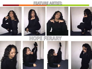
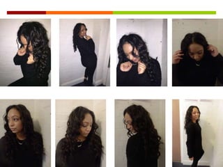
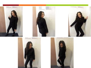
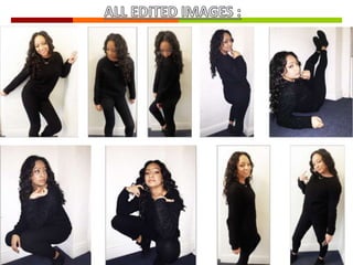
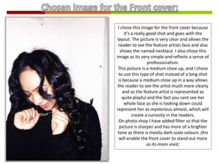
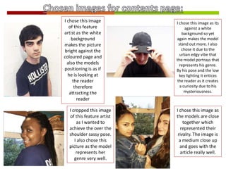
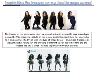
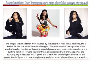
The document discusses the selection of various images for a magazine cover and spread. It describes choosing images that are clear and professional, as well as selecting shots like medium close-ups that allow readers to see the featured artists more clearly while creating intrigue. The photos are also adjusted in Photoshop to be sharper and brighter. Poses are selected that represent genres or position artists as looking at the reader to attract them. Images are inspired by poses from other artists meant to portray dominance, power and attract attention through their vibe.
11. I chose this image for the front cover because
it’s a really good shot and goes with the
layout. The picture is very clear and allows the
reader to see the feature artists face and also
shows the named necklace. I also chose this
image as its very simple and reflects a sense of
professionalism.
This picture is a medium close up, and I chose
to use this type of shot instead of a long shot
is because a medium close up in a way allows
the reader to see the artist much more clearly
and as the feature artist is represented as
quite playful and the fact you cant see her
whole face as she is looking down could
represent her as mysterious almost, which will
create a curiosity in the readers.
On photo shop I have added filter so that the
picture is sharper and has more of a brighter
tone as there is mostly dark scale colours ,this
will enable the front cover to stand out more
as its more vivid.
12. I chose this image
of this feature
artist as the white
background
makes the picture
bright against the
coloured page and
also the models
positioning is as if
he is looking at
the reader
therefore
attracting the
reader
I cropped this image
of this feature artist
as I wanted to
achieve the over the
shoulder sassy pose.
I also chose this
picture as the model
represents her
genre very well.
I chose this image as its
against a white
background so yet
again makes the model
stand out more. I also
chose it due to the
urban edgy vibe that
the model portrays that
represents his genre.
By his pose and the low
key lighting it entices
the reader as it creates
a curiosity due to his
mysteriousness.
I chose this image as
the models are close
together which
represented their
rivalry. The image is
a medium close up
and goes with the
article really well.
13. The images on the above were taken by me and put onto my double page spread was
inspired by Vibe magazines article on the female singer Solange, I liked this image due
to it originality as I hadn’t of seen this type of image before. I also chose it because it
shows the artist having fun and showing a different side of her to her fans and the
readers and this is what I wanted to portray in my own pictures.
14. The images that I had taken were inspired by this pose that Nicki Minaj has done, she is
known for her title as the best female rapper. This pose is one of her signature poses
which shows her dominance, boss status and also represents her as quite sexual as she is
pushing her chest forward however this is also associated with showing power and
authority. My model uses Nicki’s poses and creates her own image of a dominant and
power female figure, this pose also gives my model an urban vibe which attracts attention.