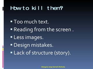
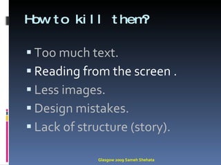
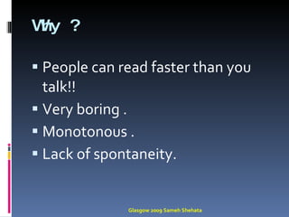
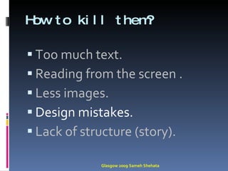
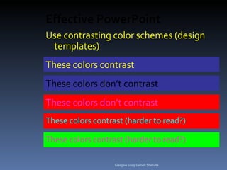
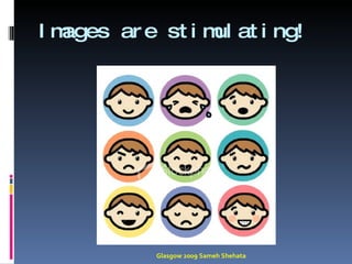
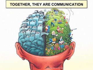
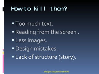
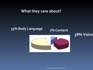
KILL Glasgow 2009 Sameh Shehata
Glasgow 2009 Sameh Shehata
How to kill them? Too much text. Reading from the screen . Less images. Design mistakes. Lack of structure (story). Glasgow 2009 Sameh Shehata
Glasgow 2009 Sameh Shehata
Try to avoid: Excessive Bullet Points in your presentations and not forgetting those annoying sound effects and fly-in entrance effects Glasgow 2009 Sameh Shehata Classic Mistakes
YOU DON’T NEED  MORE THAN ONE! (ok…maybe two) Glasgow 2009 Sameh Shehata
Rule of six  6  lines per slides . 6 words per line . 6 seconds to understand Slide !. 6 Glasgow 2009 Sameh Shehata
Points you should have per slide  One !! Glasgow 2009 Sameh Shehata
PEOPLE WILL REMEMBER THIS! Glasgow 2009 Sameh Shehata
Glasgow 2009 Sameh Shehata
So stop doing this ! Glasgow 2009 Sameh Shehata
Glasgow 2009 Sameh Shehata
Which leads to this : Glasgow 2009 Sameh Shehata
Glasgow 2009 Sameh Shehata
Bad  Reasons to give a talk To show everyone  how smart you are! To tell them  everything you know !  about your topic To give  all the technical details!  of your work. Glasgow 2009 Sameh Shehata
Good  Reasons to give a talk To give the audience an  outline for your idea To  stimulate   them to read your paper In short: To  engage, excite , and  provoke  the audience. Glasgow 2009 Sameh Shehata
How to kill them? Too much text. Reading from the screen . Less images. Design mistakes. Lack of structure (story). Glasgow 2009 Sameh Shehata
Glasgow 2009 Sameh Shehata
Why ? People can read faster than you talk!! Very boring . Monotonous . Lack of spontaneity. Glasgow 2009 Sameh Shehata
How to kill them? Too much text. Reading from the screen . Less images. Design mistakes. Lack of structure (story). Glasgow 2009 Sameh Shehata
Glasgow 2009 Sameh Shehata
Effective PowerPoint Use contrasting color schemes (design templates) ‏ These colors contrast These colors don’t contrast These colors contrast (harder to read?) ‏ These colors don’t contrast These   colors contrast (harder to read?) ‏ Glasgow 2009 Sameh Shehata
BACKGROUND: Too fancy, too bright, too terrible. Glasgow 2009 Sameh Shehata
Poor  Colour   schemes  and/ or use of  multiple colours  in a single slide for your  text that make  it almost unreadable for your   participants. Cheesy Spinning Word Art! Glasgow 2009 Sameh Shehata Classic Mistakes
Using animations! Glasgow 2009 Sameh Shehata Use animation effects very very very very very very very sparingly
F o n t   s i z e Glasgow 2009 Sameh Shehata
FONT: Too  big,  too  small , too  fancy , too much. Glasgow 2009 Sameh Shehata
Size  matters Glasgow 2009 Sameh Shehata
How to kill them? Too much text. Reading from the screen . Less images. Design mistakes. Lack of structure (story). Glasgow 2009 Sameh Shehata
Glasgow 2009 Sameh Shehata
How many homeless?  Between 2.3 and 3.5 million are likely to experience being homeless in a year 1.35 million of them are children 200,000 veterans may be homeless on a given night. 50% African-American, 35% White, 12% Latino, 2% Native American, 1% Asian Glasgow 2009 Sameh Shehata
How many experience being homeless ? Between 2.3 and 3.5 million people… 1.35 million are children 200,000 are veterans Glasgow 2009 Sameh Shehata
Communication is the transfer of emotion” Seth Godin Glasgow 2009 Sameh Shehata
Not transfer of information Glasgow 2009 Sameh Shehata
Glasgow 2009 Sameh Shehata
Images. Glasgow 2009 Sameh Shehata
Glasgow 2009 Sameh Shehata
Images are stimulating! Glasgow 2009 Sameh Shehata
Glasgow 2009 Sameh Shehata
Brain dominnace Rt Brain  Or Lt. Brain ? Glasgow 2009 Sameh Shehata
Glasgow 2009 Sameh Shehata
How to kill them? Too much text. Reading from the screen . Less images. Design mistakes. Lack of structure (story). Glasgow 2009 Sameh Shehata
manifestations solution message problem Glasgow 2009 Sameh Shehata
manifestations solution message problem manifestations Glasgow 2009 Sameh Shehata
The  Ideal  Audience Has  read  all your previous work. Has at least three  degrees  specialty . Eager  to learn about the latest developments . Is  fresh  and alert. Glasgow 2009 Sameh Shehata
Glasgow 2009 Sameh Shehata
The  Actual  Audience!! Has  never  heard of you. Has a  rough  idea of the work. Has heard about it, but  wish  it hadn’t Just came back from  lunch  and is ready for a nap Glasgow 2009 Sameh Shehata
Glasgow 2009 Sameh Shehata
Wake Them up! Glasgow 2009 Sameh Shehata
Grab   their attention Story . Quotation. Question . Joke !! Glasgow 2009 Sameh Shehata
Glasgow 2009 Sameh Shehata
What they care about? 55% Body Language 7% Content 38% Voice Glasgow 2009 Sameh Shehata
7%?? Glasgow 2009 Sameh Shehata
How to impress them !! Little text . More images . Decide what is you message. Make a story  Never read your slides. Glasgow 2009 Sameh Shehata
Good presentation is like a mini skirt ! Long  enough to cover vital parts . Short  enough to remain interesting !!.  Glasgow 2009 Sameh Shehata
Glasgow 2009 Sameh Shehata
Thank you !! Glasgow 2009 Sameh Shehata

How to deliver an extremely boring presentation

Editor's Notes

  • #16 PowerPoint as a Trainers Tool The top don'ts of PowerPoint's …. Having all the text on screen Means trainer is just simply reading from the slide making this a very dull, presentation and delivery style. Note that participants can read faster than you can talk through all the text on your slide. Cut down the text, more visuals – les text mean you have to more into the delivery and participants will then focus on the trainer more. 2. Spell Checks ‘Using RDD to process the IMS mean that most depts ppl or p’sel do not run spell Cheek’ try to avoid these errrs. Your presentation looks sloppy, poorly put together. Also, try to avoid using jargon. As with you verbal delivery, trainers must use simple conversational English to convey content. 3. Avoid excessive bullet points Just like text, using too many bullet points for a visual medium is dull and ineffective. They tend to be annoying. - If you are using bullet points, try to emphasize the point that your on, before moving to the next one. Keep them well spaced and try to keep it to one line. Trainers have to learn content management skills to do this. 4. Avoid using Cartoon Clipart (stuck in a corned of the slide). - In most cases, it just looks unprofessional and tacky. The positioning of most of these pictures is stuck in a corner not following any real rules of design of the slide and has little resemblance to the point being made. Try to use real pictures as much as possible and be bold with the pictures – PowerPoint is a visual medium. 5. Colour schemes Unless working on a corporate slide, try to watch for use of colour schemes, either as background colours or choice of templates. Most corporate templates are rather dull and use white, so you have to work within the confines of using white space. - try to blend colours of the same hue rather than hard contrasting colours. 6. Complicated Charts - To ensure all the data is there, most often, trainers pack in too much information making a chart – which should be simple to read- very complicated. - reduce charts down to a minimum – keep them very clear. 7. Pointless Animation Try to avoid pointless animation. Flying (typewriter sound effect) bullet points are not good uses of animation. In business and raining the animation should be subtle. Try to use it for transition between slides use it only to reflect motion or process or giving context to a scene 8 Font Type and Size Choose 1 or 2 fonts and stick with them – don’t choose too many fonts and make sure they are readable on an electronic media like PowerPoint. Also the size of the font is important – nothing should really fall below 24 pts. 9. Microsoft themed templates Poor templates and use of visuals means the slides become repetitive and visual boring after a while because of the way we have preconceived the way PowerPoint presentations to be. Imagine if you picked up a magazine and all the pages and layout were the same with lots of text and poor visuals. Default themes and backgrounds are usually ugly, so try not to use them. This media allows you to use some creativity. 10. Poor Visuals Either choosing the wrong picture to convey the message or using low res pictures. Also placement of visuals is poorly put in. - Follow basic rules of design such as the rule of thirds to assist in placement of text and visuals. PowerPoint is a visual media and should be exploited as such.
  • #26 © 2005 Michael zur Muehlen. All Rights Reserved.
  • #27 © 2005 Michael zur Muehlen. All Rights Reserved.
  • #36 © 2005 Michael zur Muehlen. All Rights Reserved.
  • #59 © 2005 Michael zur Muehlen. All Rights Reserved.
  • #61 © 2005 Michael zur Muehlen. All Rights Reserved.
  • #63 © 2005 Michael zur Muehlen. All Rights Reserved.