Downloaded 33 times


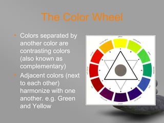
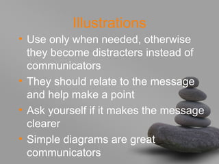

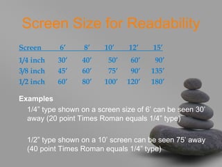


The document provides tips for creating effective presentations. It recommends using a consistent template with a clean, easy-to-read font in one or two types. Bullets should be concise and limited to six per slide to cue the audience. Text should not be all capital letters or overly long. Illustrations can communicate ideas if they are simple and relate to the message. Colors and backgrounds should balance attention-grabbing with readability based on screen size and audience distance. The presenter should enhance but not hide behind the media, as the audience came to see and hear from them.