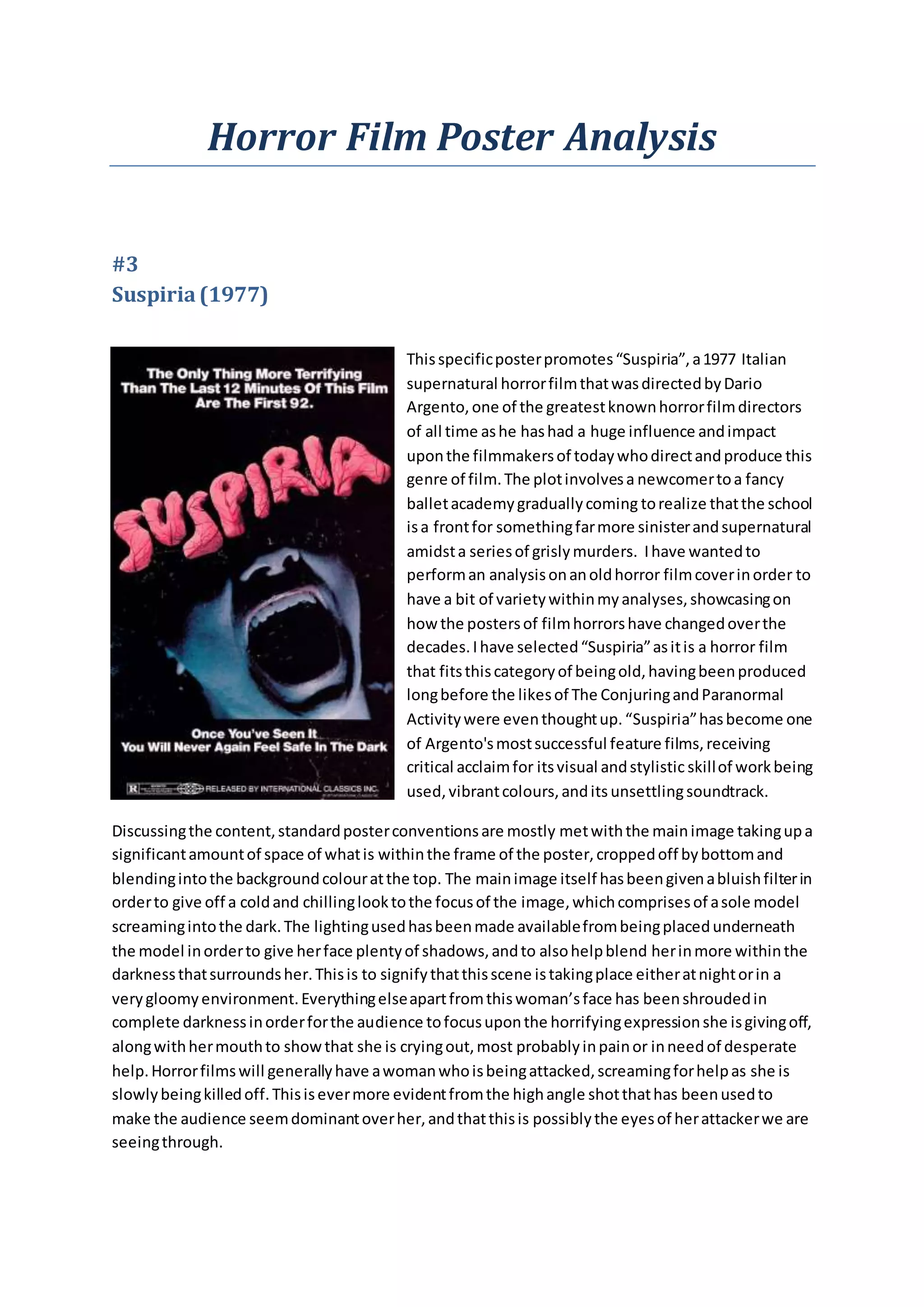
Horror Film Poster Analysis 
#3 
Suspiria (1977) 
This specific poster promotes “Suspiria”, a 1977 Italian 
supernatural horror film that was directed by Dario 
Argento, one of the greatest known horror film directors 
of all time as he has had a huge influence and impact 
upon the filmmakers of today who direct and produce this 
genre of film. The plot involves a newcomer to a fancy 
ballet academy gradually coming to realize that the school 
is a front for something far more sinister and supernatural 
amidst a series of grisly murders. I have wanted to 
perform an analysis on an old horror film cover in order to 
have a bit of variety within my analyses, showcasing on 
how the posters of film horrors have changed over the 
decades. I have selected “Suspiria” as it is a horror film 
that fits this category of being old, having been produced 
long before the likes of The Conjuring and Paranormal 
Activity were even thought up. “Suspiria” has become one 
of Argento's most successful feature films, receiving 
critical acclaim for its visual and stylistic skill of work being 
used, vibrant colours, and its unsettling soundtrack. 
Discussing the content, standard poster conventions are mostly met with the main image taking up a 
significant amount of space of what is within the frame of the poster, cropped off by bottom and 
blending into the background colour at the top. The main image itself has been given a bluish filter in 
order to give off a cold and chilling look to the focus of the image, which comprises of a sole model 
screaming into the dark. The lighting used has been made available from being placed underneath 
the model in order to give her face plenty of shadows, and to also help blend her in more within the 
darkness that surrounds her. This is to signify that this scene is taking place either at night or in a 
very gloomy environment. Everything else apart from this woman’s face has been shrouded in 
complete darkness in order for the audience to focus upon the horrifying expression she is giving off, 
along with her mouth to show that she is crying out, most probably in pain or in need of desperate 
help. Horror films will generally have a woman who is being attacked, screaming for help as she is 
slowly being killed off. This is ever more evident from the high angle shot that has been used to 
make the audience seem dominant over her, and that this is possibly the eyes of her attacker we are 
seeing through.
Her hair, only visible through the small light that penetrates through to it seems to be long and curly, 
as it covers up her eyes. Many women in the 1970s had a trend as having their hair long and curled 
up, showing that this woman being attacked is ordinary and just like any other normal woman in this 
era. Female audiences who are looking at this poster will then relate to this and may feel that this 
could happen to them, thus creating an even more scary effect that the poster gives off. Having the 
main image of a woman shouting out in fear would also stimulate male audiences to show an 
interest in the film as males get off on the thought of woman being in trouble. 
The title of this film is “Suspiria”, which is Latin for ‘Sighs’, a single exhilaration of air from the mouth 
or nose that often arises from a negative emotion, such as dismay, dissatisfaction, boredom, or 
futility. The title fits with the gloomy aspect of the film’s premise being that of a negative one. The 
text itself is the biggest on the poster and positioned more towards the top of the frame, keeping in 
with standard poster conventions. The font visuals give a fleshy feel to the title with the 
enlargement of veins being clearly visible and that each letter looks as if it has been cut out of 
human flesh. This possibly signifies that this film is going to have a lot of focus on gore, something 
that Dario Argento is known for incorporating within his masterpieces of horror. Other pieces of text 
include taglines and some institutional information. The tagline that is situated at the top of the 
poster presents to the audience that “the only thing more terrifying than the last 12 minutes of this 
film are the first 92”. This gives an impression that every minute of this film is going to be scary and 
terrifying for the audience to watch and will prompt more horror fans to view the film. The other 
tagline that is positioned below the main image indicates that “once you’ve seen it, you will never 
again feel safe in the dark”. This may suggest that the film leaves a negative impact upon the 
audience after watching “Suspiria”, leaving memorable images of the film that take place at night 
ingrained within their memory. There is institutional information at the bottom, showing the rating 
of the film and also what distribution company it is going to be released by. All of the text other than 
the title has been displayed in white in order to stand out from the black background and become 
more visible to the audience. 
In conclusion, I think this poster has a very good method of attracting its target audience, with its 
eye-opening taglines and simplistic yet chilling main image that is being presented here. The poster 
“Suspiria” seems to be somewhat of an influential one of the sort and I will be most probably 
incorporating the invigorating aspects and characters poster into the film poster that I will be 
producing for my promotional package.

Horror film poster analysis 3

  • 1.
    Horror Film PosterAnalysis #3 Suspiria (1977) This specific poster promotes “Suspiria”, a 1977 Italian supernatural horror film that was directed by Dario Argento, one of the greatest known horror film directors of all time as he has had a huge influence and impact upon the filmmakers of today who direct and produce this genre of film. The plot involves a newcomer to a fancy ballet academy gradually coming to realize that the school is a front for something far more sinister and supernatural amidst a series of grisly murders. I have wanted to perform an analysis on an old horror film cover in order to have a bit of variety within my analyses, showcasing on how the posters of film horrors have changed over the decades. I have selected “Suspiria” as it is a horror film that fits this category of being old, having been produced long before the likes of The Conjuring and Paranormal Activity were even thought up. “Suspiria” has become one of Argento's most successful feature films, receiving critical acclaim for its visual and stylistic skill of work being used, vibrant colours, and its unsettling soundtrack. Discussing the content, standard poster conventions are mostly met with the main image taking up a significant amount of space of what is within the frame of the poster, cropped off by bottom and blending into the background colour at the top. The main image itself has been given a bluish filter in order to give off a cold and chilling look to the focus of the image, which comprises of a sole model screaming into the dark. The lighting used has been made available from being placed underneath the model in order to give her face plenty of shadows, and to also help blend her in more within the darkness that surrounds her. This is to signify that this scene is taking place either at night or in a very gloomy environment. Everything else apart from this woman’s face has been shrouded in complete darkness in order for the audience to focus upon the horrifying expression she is giving off, along with her mouth to show that she is crying out, most probably in pain or in need of desperate help. Horror films will generally have a woman who is being attacked, screaming for help as she is slowly being killed off. This is ever more evident from the high angle shot that has been used to make the audience seem dominant over her, and that this is possibly the eyes of her attacker we are seeing through.
  • 2.
    Her hair, onlyvisible through the small light that penetrates through to it seems to be long and curly, as it covers up her eyes. Many women in the 1970s had a trend as having their hair long and curled up, showing that this woman being attacked is ordinary and just like any other normal woman in this era. Female audiences who are looking at this poster will then relate to this and may feel that this could happen to them, thus creating an even more scary effect that the poster gives off. Having the main image of a woman shouting out in fear would also stimulate male audiences to show an interest in the film as males get off on the thought of woman being in trouble. The title of this film is “Suspiria”, which is Latin for ‘Sighs’, a single exhilaration of air from the mouth or nose that often arises from a negative emotion, such as dismay, dissatisfaction, boredom, or futility. The title fits with the gloomy aspect of the film’s premise being that of a negative one. The text itself is the biggest on the poster and positioned more towards the top of the frame, keeping in with standard poster conventions. The font visuals give a fleshy feel to the title with the enlargement of veins being clearly visible and that each letter looks as if it has been cut out of human flesh. This possibly signifies that this film is going to have a lot of focus on gore, something that Dario Argento is known for incorporating within his masterpieces of horror. Other pieces of text include taglines and some institutional information. The tagline that is situated at the top of the poster presents to the audience that “the only thing more terrifying than the last 12 minutes of this film are the first 92”. This gives an impression that every minute of this film is going to be scary and terrifying for the audience to watch and will prompt more horror fans to view the film. The other tagline that is positioned below the main image indicates that “once you’ve seen it, you will never again feel safe in the dark”. This may suggest that the film leaves a negative impact upon the audience after watching “Suspiria”, leaving memorable images of the film that take place at night ingrained within their memory. There is institutional information at the bottom, showing the rating of the film and also what distribution company it is going to be released by. All of the text other than the title has been displayed in white in order to stand out from the black background and become more visible to the audience. In conclusion, I think this poster has a very good method of attracting its target audience, with its eye-opening taglines and simplistic yet chilling main image that is being presented here. The poster “Suspiria” seems to be somewhat of an influential one of the sort and I will be most probably incorporating the invigorating aspects and characters poster into the film poster that I will be producing for my promotional package.