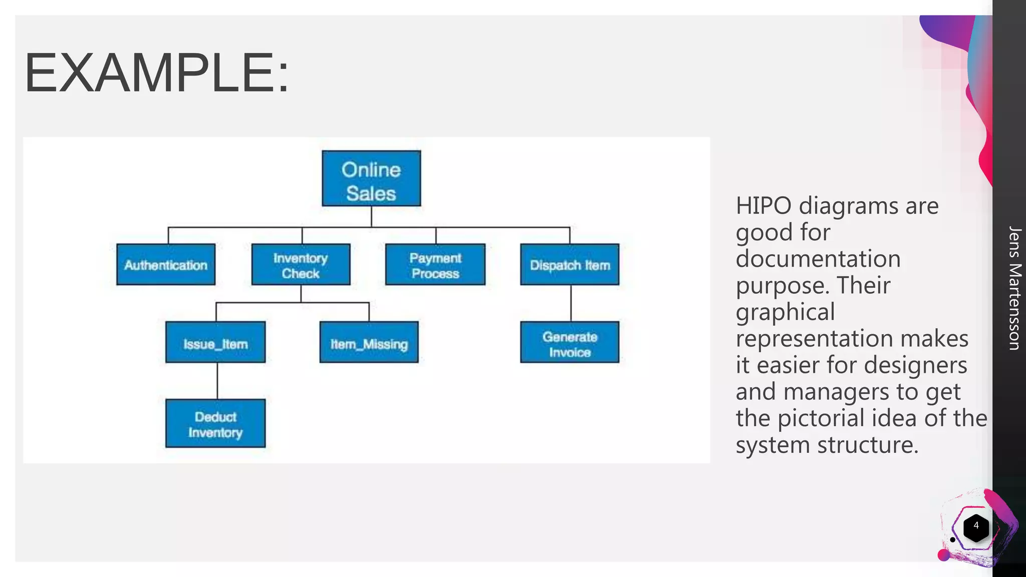
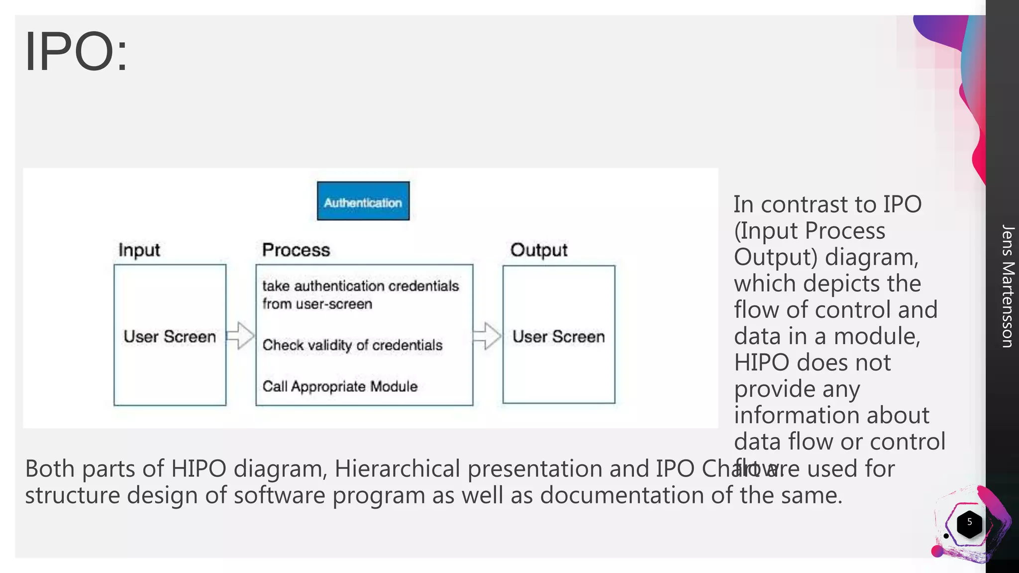
The HIPO diagram is a modeling technique developed by IBM in 1970 that combines a hierarchy chart with IPO (Input-Process-Output) charts. The hierarchy chart graphically represents a program's control structure, while the IPO charts describe the inputs, processes, and outputs of each module. HIPO diagrams are useful for both designing and documenting software structure, as their graphical nature makes the system design easier to understand for managers and designers. However, HIPO diagrams do not provide information about data or control flow within a module.


![Coded Agents – with UiPath SDK + LangGraph [Virtual Hands-on Workshop]](https://cdn.slidesharecdn.com/ss_thumbnails/codedagentsdeck-251215155422-5497c599-thumbnail.jpg?width=640&height=640&fit=bounds)


