#LeanMobileUX | @DesignCaffeine
$1 Prototype:
#LeanMobileUX
8 Lessons Learned
Greg Nudelman
Principal/CEO, DesignCaffeine, Inc.
@DesignCaffeine | #LeanMobileUX
Greg@DesignCaffeine.com
#LeanMobileUX
#LeanMobileUX | @DesignCaffeine
@DesignCaffeine#LeanMobileUX @DesignCaffeine#LeanMobileUX
@DesignCaffeine#LeanMobileUX
@DesignCaffeine#LeanMobileUX @DesignCaffeine#LeanMobileUX
@DesignCaffeine#LeanMobileUX
#LeanMobileUX | @DesignCaffeine
What is the best way to
design mobile interfaces?
@DesignCaffeine#LeanMobileUX
#LeanMobileUX | @DesignCaffeine
8 #LeanMobileUX Lessons Learned
1. Decide the What, improvise the How
2. Reflect correct doneness
3. Establish Where before Who
4. Focus on MVP (PROTOTYPE)
5. Embrace digital paper #awesomeness
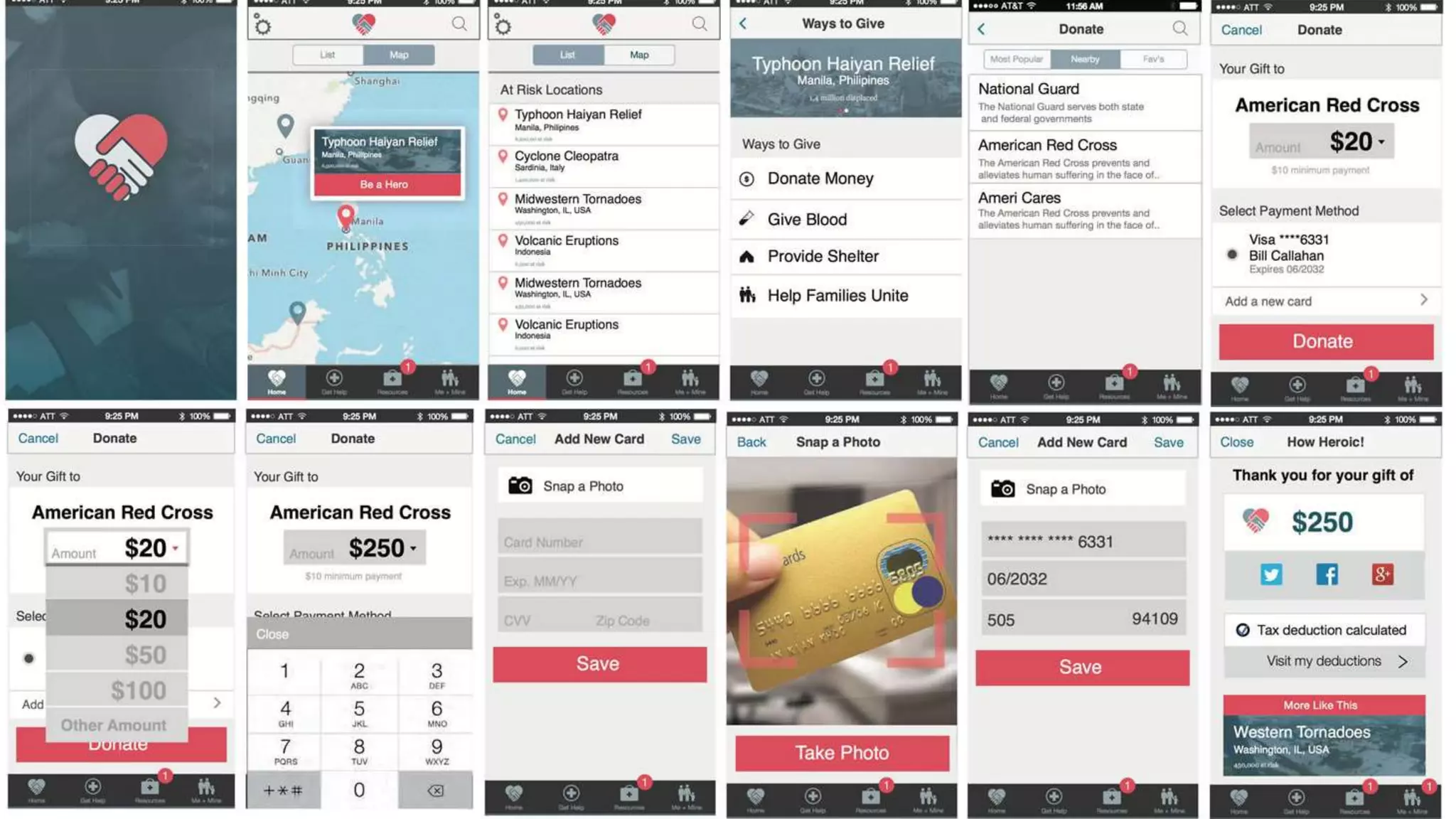
6. Test with decaffeinated UX Partners
7. Ask million-dollar questions
8. Know the difference between design and documentation
#LeanMobileUX | @DesignCaffeine
Decide
1
What
#LeanMobileUX | @DesignCaffeine
the HowImprovise
@DesignCaffeine#LeanMobileUX
Be a Hero!
@DesignCaffeine#LeanMobileUX
Establish Where before Who.
Context includes (and drives) Persona.
2
@DesignCaffeine#LeanMobileUX
Where
Are
You?
@DesignCaffeine#LeanMobileUX
Reflect correct doneness.3
Fidelity of the prototype must reflect the
state of completion of the project.
@DesignCaffeine#LeanMobileUX http://en.wikipedia.org/wiki/Vasa_(ship)
@DesignCaffeine#LeanMobileUX
http://www.vasamuseet.se/ImageVaultFiles/id_478/cf_271/932x299_F-rlisningen.JPG
@DesignCaffeine#LeanMobileUX
Prototype first.
@DesignCaffeine#LeanMobileUX
Focus on MVP (Minimum Viable PROTOTYPE).4
Institutionalize failure by removing risk. Fail
faster, cheaper, better.
@DesignCaffeine#LeanMobileUX
MVP means only
adding the detail
that is strictly
necessary. Let the
customer imagine
the rest.
@DesignCaffeine#LeanMobileUX
Embrace digital paper #awesomeness5
Real paper behaves just like digital paper.
Don’t give your customers paper cuts.
http://google.com/
#LeanMobileUX | @DesignCaffeine
http://stumptowncoffee.com/
Test with decaffeinated UX partners6
@DesignCaffeine#LeanMobileUX
Ask million-dollar questions7
Would you pay for this app?
If so, how much?
8
Design Documentation
#LeanMobileUX | @DesignCaffeine
Know the
difference!
#LeanMobileUX | @DesignCaffeine
Greg Nudelman
Principal/CEO, DesignCaffeine, Inc.
@DesignCaffeine | #LeanMobileUX
Greg@DesignCaffeine.com
What is the best way to
design mobile interfaces?
Focus on the Product.
Get out of deliverables business.
Greg Nudelman - One dollar prototype (From Business to Buttons 2015)

Greg Nudelman - One dollar prototype (From Business to Buttons 2015)

Editor's Notes

  • #2 Hej och välkommen! (hey o vielc[o]mmen)
  • #3 If you turned your phones off, you can turn them back on, I don’t mind. You can tweet amongst yourselves. All I ask is that you use this hashtag #leanmobileux so you can join the world-wide conversation about these ideas that is happening 24/7.
  • #4 When I first started out in mobile design 7 years ago, I used to draw everything in my Moleskine notebook, which was filled with diagrams like these. It made me feel very “designery”. Who here did this? Let’s see a show of hands! Who still does this this? Well, after today, I hope you will reconsider. Then one day I was at a client…
  • #5  caught without my magic designery notebook.
  • #6 I had to think with my pen, so I grabbed the first thing I could reach, a pack of sticky notes. And I did not have much time, so I drew the barest minimum: just the page layout and the controls. And it looked just like this one here.
  • #7 Now, imagine my astonishment, when the CEO of a company, normally a reserved, consummate professional, suddenly grabbed the pack of stickies and started enthusiastically tapping “buttons” saying “this is EXACTLY what I mean!”
  • #8 “Eureka!” Who knew that an 5,000 kronna mobile device, that temple of information, pinnacle of human achievement… Can be exceedingly well approximated by a $1 pack of sticky notes coupled with active imagination!
  • #9 Since that memorable moment, I’ve worked and taught for 7 years, always asking myself, this same question: what is the best way to design mobile interfaces? Or according to google Vad er det besta sarttet att-ut forma mobila granssnitt ?
  • #10 Over time, I’ve come up with this concept I call $1 Prototype, or at the current exchange rate I guess that would be “otta krona prototyp” and this year I’ve written a new book about it. And today I wanted to talk about 8 #LeanMobileUX lessons I learned while working on the book.
  • #11 8 lessons learned
  • #12 First up is: Decide the What. And once you make a choice to see the matrix for what it really is…
  • #13 the “how” is otherwise known as your vision. You have to get clear on your vision AND have your stakeholders approve that vision BEFORE you work on the implementation. The best way to do that in mobile design is
  • #14 with a storyboard. [walk them through the storyboard]
  • #15 Once you document the vision, you can implement the design using sticky notes, and then, eventually
  • #16 make it to a complete visual design.
  • #17 Speaking of storyboards, We discovered that WHERE the task is being performed is always more important than WHO. Using mobile often means moving around. So the relative importance of persona as a UX tool in Lean Mobile UX is yielding to context that includes and drives the Persona.
  • #18 So instead of starting with the WHO, that is, persona, it is much more effective to start your vision storyboard by asking…
  • #19 “WHERE are you?”. Like the opening shot of the movie, the “establishing shot” of your storyboard will help you design the UI appropriate to the place and time your app or mobile website will be used. And yes, you have my permission to call this “Where is Waldo?” Oh and there he is on the set of Delicatessen
  • #20 Here’s a great example of this principle where the storyboard does not even feature a persona, instead, it describes a typical commute from a SF apartment.
  • #21 One of the oldest and best demonstrations of this principle can be found right here in Stockholm. Anyone know what it is? No, it’s not pizza with bananas. It’s …
  • #22 that’s right — Vasa ship! Do you know the story? It sounds just like a typical IT project! His royal majesty, Gustavus Adolphus, the King of Sweden, commissions a giant warship to fight the Poles. He insists that the ship be narrow and tall. With 2 gun decks of 72 big guns.
  • #23 The day the ship sails a mild gust of wind hits the ship… causing it to capsize just 40 min into it’s maiden voyage. It’s no wonder the shipbuilder died from stress even before the thing was built!! But you know whats really remarkable? The second ship was built EXACTLY SAME, except it had smaller guns on top deck and was only 10% wider. Just 1 meter. It sailed just fine for 30 years. So the moral of the story?
  • #24  If you are not sure — build a model first.
  • #25 In other words, don’t invest time and energy into creating a high-definition pixel-perfect design BEFORE you decide on your basics [click and clap]— like information architecture, interactions, and copy…all things best decided using simple quick and cheap prototypes made with sticky notes. Note that this is the actual progression of different design the team tried before the were satisfied. Don’t know about you, but that’s avoiding a LOT of sunken ships!
  • #26 LEAN is all about the experimentation — essentially failure. By using the simplest possible prototype to express the experiment and going direct to consumer, we institutionalize failure and…
  • #27  at the same time avoid falling in love with a particular design. Every hour is an opportunity to fail cheaper and faster and in the process, make the product better. Sticky notes allow us to design and document at the same time, which is why I prefer this method. Coupled with only the minim of detail it is the most efficient way to design and document mobile interfaces. Any time invested beyond that point is simply waste. [That is why I recommend not putting the border around the design: it’s not needed. The entire sticky note is the touch screen interface. Also I recommend not filling out all the pictures and all the rows but just putting in the barest minimum of realistic detail to create an MVP: a minimum viable prototype.]
  • #28 Digital paper is awesome. Especially when designing for…
  • #29 Google Material Design. And you may wonder: just how did they came up with such a cool paradigm?
  • #30 I have it from direct from Google, that Google designers used the very same methodology we’ve been teaching for 7 years: that is, real paper pieces that represent the layers and these wooden disks to represent FABs. Playing around with physical objects is extremely instructive and effortlessly captures the wonderful physicality of the material design.
  • #31 Including the depth and interaction of layers that [click] drop from the top…
  • #32 or [click] come in from the side. Think about it. You can get *90%* of your design DONE with paper, even before your prototypes are digitalized. I mean, even his Royal Majesty Gustavus Adolphus wouldn’t say no to that!
  • #33 And let’s not forget the testing! I like to do my testing in coffee-shops. Not only do you get to drink great coffee, you get a steady supply of decaffeinated, anxious, bored people who will not hesitate to provide you with the most honest feedback of your life! In fact, I’d say everyone in line for their morning coffee is a bona-fide New Yorker (except for the decaffeinated part).
  • #34 For about $20, I am able to put my client’s app or website in front of 10 people in just a few hours, make changes as I go, and by that afternoon have a decent design to give to the developers. [CLICK] [Also, Getting honest unfiltered feedback is wonderfully cleansing for the ego — I can’t recommend this enough, especially if you think you are a real hot-shot mobile designer. ]
  • #35 While you test, don't forget to ask million-dollar questions! With over a million apps in each of the App and Play Stores, all of the low-hanging fruit is pretty much spoken for. Yet fantastic services like Uber and Waze seem to appear every day. How do you know if your app is valuable enough to be built? Should it even be an app and not a website? The answer is the magic question: “if this app was in the App Store/Play Store, would you pay for it? If so, how much?” This “million-dollar” question puts specific monetary value on the experience your prototype presents. Price is a sensitive issue and asking this question often reveals all kinds of useful details that are hard to get to otherwise, and helps you accurately gauge the level of customer’s general affinity for your product. Using the UX techniques from my talk, you will be able to test your business model from a single morning at a coffee shop for about $20 worth of coffee and $1 worth of sticky notes and before writing a single line of code.
  • #36 Finally, it’s essential to recognize the difference between design and documentation. If you are in the early stage of the project, You want to be in the design business: focusing on alignment with customer and business goals. And you want to get out of the business of producing pretty deliverables.
  • #37 So in conclusion, I wanted to return to the question we asked at the beginning: What is the best way to design mobile interfaces? The answer is simple: Stop wasting time and trying to please people: focus on the product and get out of deliverables business. “Glöm vackra bilder!" So I hope you give Lean Mobile UX a try — and drop me a line if you have any questions! Tak-sah mikhe!