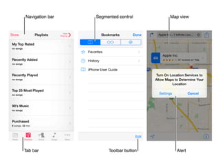
I N T R O T O U X : M O B I L E
I T P U N C O N F E R E N C E
W H AT A R E W E D O I N G H E R E ?
PA R T I
S O H E R E ’ S T H E
S T O RY F R O M
A T O Z
• What is UX generally?
• What is mobile UX and
how is it different?
• How do I get started?
• Where can I find
resources?
W H AT I S U X ?
PA R T I I
U X V S U I
A D V E N T U R E S I N
S K E T C H I N G
L E T ’ S D O S O M E T H I N G
1 - Draw a chair
2 - Draw something you
would want to sit on
3 - Draw something a kid
would would want to sit on
― D O N A L D A . N O R M A N 

T H E D E S I G N O F E V E RY D AY T H I N G S
Principles of design:
1. Use both knowledge in the world and
knowledge in the head.
2. Simplify the structure of tasks.
3. Make things visible: bridge gulfs between
Execution and Evaluation.
4. Get the mappings right.
5. Exploit the power of constraints.
6. Design for error.
7. When all else fails, standardize.
I N T E R A C T I O N V I S U A L
How users interact
with something
Wireframes
Storyboards
User Flows
What something
looks like
Styleguide
A lot like comics!
O T H E R PA R T S O F U X
• User Research
• Ethnography
• Usability tests
• Personas
• Information Architecture
• Prototyping
W H AT I S M O B I L E U X ?
PA R T I I
T H U M B WA R S
L E T ’ S D O S O M E T H I N G
~50% of users use
their phone
with just one hand
D E S I G N I N G F O R T O U C H
Visible
Keep content visible
regardless of how user holds it
Landscape vs Portrait
S TA R F I S H A N D
F L O R I D A S
L E T ’ S D O S O M E T H I N G
G E S T U R E S
Tap + Swipe
S E C O N D A RY G E S T U R E S
Double Tap
Tap and Hold
Shake
Pinch
S E C O N D A RY G E S T U R E S
Double Tap
Tap and Hold
Shake
Pinch
Discoverable


Users should be able to find
what they’re looking for
― D O N A L D A . N O R M A N 

T H E D E S I G N O F E V E RY D AY T H I N G S
Principles of design:
1. Use both knowledge in the world and
knowledge in the head.
2. Simplify the structure of tasks.
3. Make things visible: bridge gulfs between
Execution and Evaluation.
4. Get the mappings right.
5. Exploit the power of constraints.
6. Design for error.
7. When all else fails, standardize.
S T Y L U S E S A N D O T H E R
I N P U T S
( S T Y L I ? )
S C R E E N S I Z E S A N D W H Y
M O B I L E F I R S T
Recap
B AT H R O O M B R E A K !
I N T E R M I S S I O N
H O W D O I G E T S TA R T E D ?
PA R T I I I
D E S I G N C H A L L E N G E
PA R T I
L E T ’ S D O S O M E T H I N G
Pick something you’re really passionate about
to build an app!
Start with a storyboard of what the experience
on the phone would be like (don’t worry about the
interface just yet)
I N S P I R AT I O N
• Banking
• Messaging
• Puppies?
O S S P E C I F I C S
Do you have to design to be OS specific?
That depends on your app.
• Tap targets
• Interaction Patterns
• Scale - different screen sizes
Simple


Make it easy
for the user to figure out how to use
your app. Use what works
D E S I G N C H A L L E N G E
PA R T I I
L E T ’ S D O S O M E T H I N G
Build a few screens
W H E R E C A N I F I N D R E S O U R C E S ? 

A N D O T H E R M I S C T O P I C S
PA R T I V
W I R E F R A M E A N D D E S I G N T O O L S
• wireframing.cc
• UX Pin
• Sketch
• Azure
P R O T O T Y P I N G
• InVision
• Chrome Inspector - Mobile view
U X PAT T E R N S
• Apple Human Interface Guidelines
• Material Design Styleguide
B O O K S
• The Design of Everyday
Things - Don Norman
• Microinteractions - Dan
Saffer
• The Mobile Frontier -
Rachel Hitman
• (All of Rosenfeld Media’s
books)
P E O P L E T O F O L L O W
• Luke Wroblewski
• Josh Clark
• Karen McGrane
• IxD Conference
H O W D O I S C A L E T O
TA B L E T ?
W H AT ’ S M O B I L E U X L I K E
AT A C O M PA N Y ?
Q U E S T I O N S ?
http://goo.gl/forms/xp38bifp5V

Intro to Mobile UX

  • 1.
    I N TR O T O U X : M O B I L E I T P U N C O N F E R E N C E
  • 2.
    W H ATA R E W E D O I N G H E R E ? PA R T I
  • 7.
    S O HE R E ’ S T H E S T O RY F R O M A T O Z • What is UX generally? • What is mobile UX and how is it different? • How do I get started? • Where can I find resources?
  • 8.
    W H ATI S U X ? PA R T I I
  • 9.
    U X VS U I
  • 10.
    A D VE N T U R E S I N S K E T C H I N G L E T ’ S D O S O M E T H I N G
  • 11.
    1 - Drawa chair
  • 12.
    2 - Drawsomething you would want to sit on
  • 13.
    3 - Drawsomething a kid would would want to sit on
  • 15.
    ― D ON A L D A . N O R M A N 
 T H E D E S I G N O F E V E RY D AY T H I N G S Principles of design: 1. Use both knowledge in the world and knowledge in the head. 2. Simplify the structure of tasks. 3. Make things visible: bridge gulfs between Execution and Evaluation. 4. Get the mappings right. 5. Exploit the power of constraints. 6. Design for error. 7. When all else fails, standardize.
  • 16.
    I N TE R A C T I O N V I S U A L How users interact with something Wireframes Storyboards User Flows What something looks like Styleguide
  • 18.
    A lot likecomics!
  • 19.
    O T HE R PA R T S O F U X • User Research • Ethnography • Usability tests • Personas • Information Architecture • Prototyping
  • 20.
    W H ATI S M O B I L E U X ? PA R T I I
  • 23.
    T H UM B WA R S L E T ’ S D O S O M E T H I N G
  • 24.
    ~50% of usersuse their phone with just one hand D E S I G N I N G F O R T O U C H
  • 26.
  • 27.
  • 28.
    S TA RF I S H A N D F L O R I D A S L E T ’ S D O S O M E T H I N G
  • 30.
    G E ST U R E S
  • 31.
  • 32.
    S E CO N D A RY G E S T U R E S Double Tap Tap and Hold Shake Pinch
  • 33.
    S E CO N D A RY G E S T U R E S Double Tap Tap and Hold Shake Pinch
  • 34.
    Discoverable 
 Users should beable to find what they’re looking for
  • 35.
    ― D ON A L D A . N O R M A N 
 T H E D E S I G N O F E V E RY D AY T H I N G S Principles of design: 1. Use both knowledge in the world and knowledge in the head. 2. Simplify the structure of tasks. 3. Make things visible: bridge gulfs between Execution and Evaluation. 4. Get the mappings right. 5. Exploit the power of constraints. 6. Design for error. 7. When all else fails, standardize.
  • 36.
    S T YL U S E S A N D O T H E R I N P U T S ( S T Y L I ? )
  • 37.
    S C RE E N S I Z E S A N D W H Y M O B I L E F I R S T
  • 38.
  • 39.
    B AT HR O O M B R E A K ! I N T E R M I S S I O N
  • 40.
    H O WD O I G E T S TA R T E D ? PA R T I I I
  • 41.
    D E SI G N C H A L L E N G E PA R T I L E T ’ S D O S O M E T H I N G
  • 42.
    Pick something you’rereally passionate about to build an app! Start with a storyboard of what the experience on the phone would be like (don’t worry about the interface just yet)
  • 43.
    I N SP I R AT I O N • Banking • Messaging • Puppies?
  • 44.
    O S SP E C I F I C S
  • 45.
    Do you haveto design to be OS specific?
  • 48.
    Do you haveto design to be OS specific? That depends on your app.
  • 51.
    • Tap targets •Interaction Patterns • Scale - different screen sizes
  • 52.
    Simple 
 Make it easy forthe user to figure out how to use your app. Use what works
  • 53.
    D E SI G N C H A L L E N G E PA R T I I L E T ’ S D O S O M E T H I N G
  • 54.
    Build a fewscreens
  • 55.
    W H ER E C A N I F I N D R E S O U R C E S ? 
 A N D O T H E R M I S C T O P I C S PA R T I V
  • 56.
    W I RE F R A M E A N D D E S I G N T O O L S • wireframing.cc • UX Pin • Sketch • Azure
  • 57.
    P R OT O T Y P I N G • InVision • Chrome Inspector - Mobile view
  • 58.
    U X PATT E R N S • Apple Human Interface Guidelines • Material Design Styleguide
  • 59.
    B O OK S • The Design of Everyday Things - Don Norman • Microinteractions - Dan Saffer • The Mobile Frontier - Rachel Hitman • (All of Rosenfeld Media’s books)
  • 60.
    P E OP L E T O F O L L O W • Luke Wroblewski • Josh Clark • Karen McGrane • IxD Conference
  • 61.
    H O WD O I S C A L E T O TA B L E T ?
  • 62.
    W H AT’ S M O B I L E U X L I K E AT A C O M PA N Y ?
  • 63.
    Q U ES T I O N S ?
  • 64.