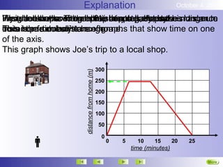
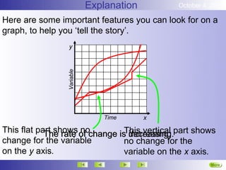
This graph shows Joe's trip to the local shop over time. It shows that Joe walked at a steady pace as the distance from his home to the shop increased linearly over 15 minutes. Then the distance remained the same as he spent more time at the shop before returning home. The graph uses distance from home on the y-axis and time on the x-axis to tell the story of Joe's shopping trip.
2. Explanation October 4, 2012
If you Joe down Time inhis shopping, Hepace. longer to
Weighed walks to the shop they steady takes
First, look at some all 6½ at a tell story.
Here he shops. withgraphs, minutes.aJoeis the maximum
He reaches the shop continues to pass, but his distance
This isthefrom home. ofhome. that show time on one
cover particularly change.
distance same distance graphs
from home doesn’ttrue
of the axis.
This graph shows Joe’s trip to a local shop.
300
distance from home (m)
250
200
150
100
50
0
0 5 10 15 20 25
time (minutes)
More
Next
3. Explanation October 4, 2012
Here are some important features you can look for on a
graph, to help you ‘tell the story’.
y
Variable
Time x
This flat part shows of change is increasing. part shows
The rate no This vertical
decreasing.
change for the variable no change for the
on the y axis. variable on the x axis.
More
Next
4. Explanation October 4, 2012
This graph shows the noise level at a football match.
6 p.m.
The home
team score.
5 p.m.
Full time.
Kick off. Half time.
4 p.m.
Noise rapidly
Noise gradually declines, as the
3 p.m.
builds, as the Half time ground empties.
ground fills. ends.
2 p.m.
sound level
More
Next
End