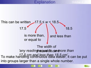
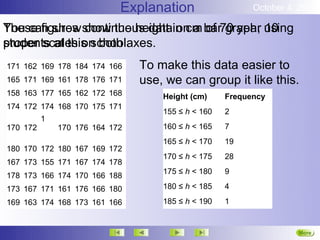
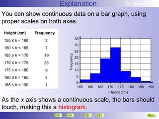
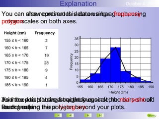
October 4, 2012

         Grouping Data


3. Representing continuous data.


                                      Next
Explanation             October 4, 2012

Sometimes data is continuous. That means it doesn't fit
into distinct categories, such as shoe size, but changes
gradually.
Height, weight, length, time and temperature are all
continuous. There is a continuous scale that can be
read at an infinite number of points.
If you record a measurement with a figure, such as
18 cm, it is unlikely that this is actually exact.


                                                       More
                                                       Next
Explanation             October 4, 2012

This credit card card is about 8 cm long…


                                 but if we look closer…
we can see that it is 8.2 cm long…


and if we look closer still…

                  we see that it is 8.2 cm, and a bit more.
                                                        More
                                                        Next
Explanation              October 4, 2012

So when you make any measurement, you are probably
rounding it up or down, whether to a decimal place, or a
whole figure.
Even when you use decimal places, you are unlikely to
write an absolutely exact measurement.
You are in fact grouping the data at the level of accuracy
you choose to use.
When you say something is ‘18 cm’, you may mean…

           ‘any reading equal to, or more than
           17.5 cm and less than 18.5 cm’.

                                                        More
                                                        Next
Explanation              October 4, 2012


This can be written   17.5 ≤ w < 18.5
           17.5                         18.5
              is more than,    and less than
              or equal to
                        The width of
           ‘any reading equal to,card
                        the credit or more than
           17.5 cm and less than 18.5 cm’.
To make handling continuous data easier, it can be put
into groups larger than a single whole number.
                                                         More
                                                         Next
Explanation                   October 4, 2012

These figures show the height in cm bar70 year using
You can show continuous data on a of graph, 10
students at this school.
proper scales on both axes.
171 162 169 178 184 174 166     To make this data easier to
165 171 169 161 178 176 171     use, we can group it like this.
158 163 177 165 162 172 168         Height (cm)     Frequency
174 172 174 168 170 175 171
                                    155 ≤ h < 160   2
          1
170 172       170 176 164 172       160 ≤ h < 165   7
                                    165 ≤ h < 170   19
180 170 172 180 167 169 172
                                    170 ≤ h < 175   28
167 173 155 171 167 174 178
                                    175 ≤ h < 180   9
178 173 166 174 170 166 188
173 167 171 161 176 166 180         180 ≤ h < 185   4

169 163 174 168 173 161 166         185 ≤ h < 190   1


                                                                    More
                                                                    Next
Explanation                             October 4, 2012

You can show continuous data on a bar graph, using
proper scales on both axes.
Height (cm)     Frequency
                                          35
155 ≤ h < 160       2
                                          30
160 ≤ h < 165       7
                                          25
165 ≤ h < 170       19


                              Frequency
                                          20
170 ≤ h < 175       28                    15
175 ≤ h < 180       9                     10

180 ≤ h < 185       4                     5
                                          0
185 ≤ h < 190       1                     155   160   165   170 175 180    185   190
                                                             Height (cm)

As the x axis shows a continuous scale, the bars should
touch, making this a histogram.
                                                                                 More
Explanation                             October 4, 2012

You can show continuous data on a bar graph, using
         also represent this data using a frequency
polygon.
proper scales on both axes.
Height (cm)     Frequency
                                          35
155 ≤ h < 160       2
                                          30
160 ≤ h < 165       7
                                          25
165 ≤ h < 170       19


                              Frequency
                                          20
170 ≤ h < 175       28                    15
175 ≤ h < 180       9                     10

180 ≤ h < 185       4                     5
                                          0
185 ≤ h < 190       1                     155   160   165   170 175 180    185   190
                                                             Height (cm)

Join need to plot the a continuous scale, themid point of
You the axis shows straight lines.
As the x points using frequency against the bars should
Do not making the polygon beyond your plots.
each group.
touch, extend this a histogram.
                                                                                 More
Explanation                             October 4, 2012

As you do not know the exact value for each item of
You can also represent this data using a frequency
data, you
polygon. can only estimate the mean of grouped data.
Height (cm)     Frequency
                                          35
155 ≤ h < 160       2
                                          30
160 ≤ h < 165       7
                                          25
165 ≤ h < 170       19


                              Frequency
                                          20
170 ≤ h < 175       28                    15
175 ≤ h < 180       9                     10

180 ≤ h < 185       4                     5
                                          0
185 ≤ h < 190       1                     155   160   165   170 175 180    185   190
                                                             Height (cm)

Join the points using straight lines.
Do not extend the polygon beyond your plots.
                                                                                 More
Explanation     October 4, 2012

As you do not know the exact midpoint × frequency
Add columns for midpoint and value for each item of to
data, you and a row for totals.
your tablecan only estimate the mean of grouped data.
Height (cm)     Frequency
155 ≤ h < 160       2
160 ≤ h < 165       7
165 ≤ h < 170       19
170 ≤ h < 175       28
175 ≤ h < 180       9
180 ≤ h < 185       4
185 ≤ h < 190       1


                                                      More
Explanation          October 4, 2012

Add mean = the total of the midpoint × frequency column
The columns for midpoint and midpoint × frequency to
your table and total offor totals.
divided by the a row the frequency column.
Height (cm)     Frequency   Midpoint   M×F
155 ≤ h < 160       2        157.5      315
160 ≤ h < 165       7        162.5      975
165 ≤ h < 170       19       167.5      3015
170 ≤ h < 175       28       172.5     4312.5
175 ≤ h < 180       9        177.5     1597.5
180 ≤ h < 185       4        182.5      730
185 ≤ h < 190       1        187.5      187.5
     Totals         65                 11132.5


Mean = 11132.5 ÷ 65 = 171.3 cm to 1d.p.
                                                           More
Explanation          October 4, 2012

The mean = the total ofgroup with the×highest frequency.
     modal cannot be statedmidpoint frequency column
     range class is the the accurately, as we do not
divided by the total of the frequencymeasure.
know the actual highest and lowest column.
Height (cm)       Frequency   Midpoint   M×F
155 ≤ h < 160         2        157.5      315
160 ≤ h < 165         7        162.5      975
165 ≤ h < 170         19       167.5      3015
  170 ≤ h < 175       28       172.5     4312.5
  175 ≤ h < 180       9        177.5     1597.5
180 ≤ h < 185         4        182.5      730
185 ≤ h < 190         1        187.5      187.5
     Totals           65                 11132.5

The range is estimated by taking the mid points of the
Mean = 11132.5 ÷ 65 = 171.3 cm to 1d.p.
highest and lowest groups. Range = 157.5 to 187.5
                                                             More
                                                             Next
                                                             End

Grouping data continuous

  • 1.
    October 4, 2012 Grouping Data 3. Representing continuous data. Next
  • 2.
    Explanation October 4, 2012 Sometimes data is continuous. That means it doesn't fit into distinct categories, such as shoe size, but changes gradually. Height, weight, length, time and temperature are all continuous. There is a continuous scale that can be read at an infinite number of points. If you record a measurement with a figure, such as 18 cm, it is unlikely that this is actually exact. More Next
  • 3.
    Explanation October 4, 2012 This credit card card is about 8 cm long… but if we look closer… we can see that it is 8.2 cm long… and if we look closer still… we see that it is 8.2 cm, and a bit more. More Next
  • 4.
    Explanation October 4, 2012 So when you make any measurement, you are probably rounding it up or down, whether to a decimal place, or a whole figure. Even when you use decimal places, you are unlikely to write an absolutely exact measurement. You are in fact grouping the data at the level of accuracy you choose to use. When you say something is ‘18 cm’, you may mean… ‘any reading equal to, or more than 17.5 cm and less than 18.5 cm’. More Next
  • 5.
    Explanation October 4, 2012 This can be written 17.5 ≤ w < 18.5 17.5 18.5 is more than, and less than or equal to The width of ‘any reading equal to,card the credit or more than 17.5 cm and less than 18.5 cm’. To make handling continuous data easier, it can be put into groups larger than a single whole number. More Next
  • 6.
    Explanation October 4, 2012 These figures show the height in cm bar70 year using You can show continuous data on a of graph, 10 students at this school. proper scales on both axes. 171 162 169 178 184 174 166 To make this data easier to 165 171 169 161 178 176 171 use, we can group it like this. 158 163 177 165 162 172 168 Height (cm) Frequency 174 172 174 168 170 175 171 155 ≤ h < 160 2 1 170 172 170 176 164 172 160 ≤ h < 165 7 165 ≤ h < 170 19 180 170 172 180 167 169 172 170 ≤ h < 175 28 167 173 155 171 167 174 178 175 ≤ h < 180 9 178 173 166 174 170 166 188 173 167 171 161 176 166 180 180 ≤ h < 185 4 169 163 174 168 173 161 166 185 ≤ h < 190 1 More Next
  • 7.
    Explanation October 4, 2012 You can show continuous data on a bar graph, using proper scales on both axes. Height (cm) Frequency 35 155 ≤ h < 160 2 30 160 ≤ h < 165 7 25 165 ≤ h < 170 19 Frequency 20 170 ≤ h < 175 28 15 175 ≤ h < 180 9 10 180 ≤ h < 185 4 5 0 185 ≤ h < 190 1 155 160 165 170 175 180 185 190 Height (cm) As the x axis shows a continuous scale, the bars should touch, making this a histogram. More
  • 8.
    Explanation October 4, 2012 You can show continuous data on a bar graph, using also represent this data using a frequency polygon. proper scales on both axes. Height (cm) Frequency 35 155 ≤ h < 160 2 30 160 ≤ h < 165 7 25 165 ≤ h < 170 19 Frequency 20 170 ≤ h < 175 28 15 175 ≤ h < 180 9 10 180 ≤ h < 185 4 5 0 185 ≤ h < 190 1 155 160 165 170 175 180 185 190 Height (cm) Join need to plot the a continuous scale, themid point of You the axis shows straight lines. As the x points using frequency against the bars should Do not making the polygon beyond your plots. each group. touch, extend this a histogram. More
  • 9.
    Explanation October 4, 2012 As you do not know the exact value for each item of You can also represent this data using a frequency data, you polygon. can only estimate the mean of grouped data. Height (cm) Frequency 35 155 ≤ h < 160 2 30 160 ≤ h < 165 7 25 165 ≤ h < 170 19 Frequency 20 170 ≤ h < 175 28 15 175 ≤ h < 180 9 10 180 ≤ h < 185 4 5 0 185 ≤ h < 190 1 155 160 165 170 175 180 185 190 Height (cm) Join the points using straight lines. Do not extend the polygon beyond your plots. More
  • 10.
    Explanation October 4, 2012 As you do not know the exact midpoint × frequency Add columns for midpoint and value for each item of to data, you and a row for totals. your tablecan only estimate the mean of grouped data. Height (cm) Frequency 155 ≤ h < 160 2 160 ≤ h < 165 7 165 ≤ h < 170 19 170 ≤ h < 175 28 175 ≤ h < 180 9 180 ≤ h < 185 4 185 ≤ h < 190 1 More
  • 11.
    Explanation October 4, 2012 Add mean = the total of the midpoint × frequency column The columns for midpoint and midpoint × frequency to your table and total offor totals. divided by the a row the frequency column. Height (cm) Frequency Midpoint M×F 155 ≤ h < 160 2 157.5 315 160 ≤ h < 165 7 162.5 975 165 ≤ h < 170 19 167.5 3015 170 ≤ h < 175 28 172.5 4312.5 175 ≤ h < 180 9 177.5 1597.5 180 ≤ h < 185 4 182.5 730 185 ≤ h < 190 1 187.5 187.5 Totals 65 11132.5 Mean = 11132.5 ÷ 65 = 171.3 cm to 1d.p. More
  • 12.
    Explanation October 4, 2012 The mean = the total ofgroup with the×highest frequency. modal cannot be statedmidpoint frequency column range class is the the accurately, as we do not divided by the total of the frequencymeasure. know the actual highest and lowest column. Height (cm) Frequency Midpoint M×F 155 ≤ h < 160 2 157.5 315 160 ≤ h < 165 7 162.5 975 165 ≤ h < 170 19 167.5 3015 170 ≤ h < 175 28 172.5 4312.5 175 ≤ h < 180 9 177.5 1597.5 180 ≤ h < 185 4 182.5 730 185 ≤ h < 190 1 187.5 187.5 Totals 65 11132.5 The range is estimated by taking the mid points of the Mean = 11132.5 ÷ 65 = 171.3 cm to 1d.p. highest and lowest groups. Range = 157.5 to 187.5 More Next End