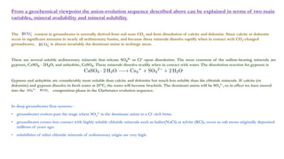
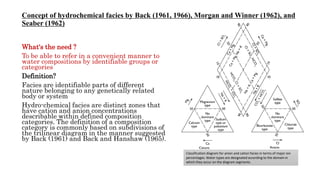
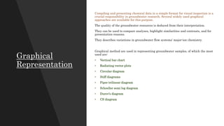
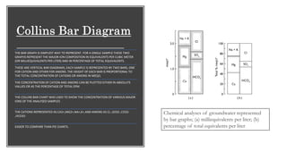
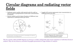
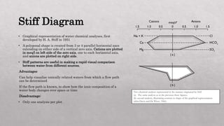
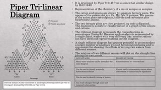
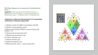
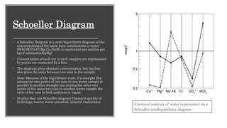
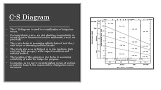
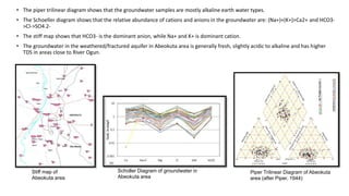
The document discusses various graphical methods for representing water quality data, including bar graphs, circular diagrams, vector plots, Stiff diagrams, and the Piper trilinear diagram. It provides examples of each method using sample water chemistry data. The Piper diagram is described as the most commonly used method, as it allows for representation of cation and anion concentrations as percentages on separate ternary plots projected onto a single diamond-shaped plot. This facilitates comparison of multiple samples and identification of mixing trends between water sources.