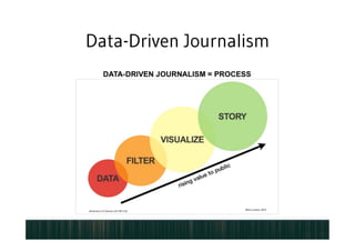
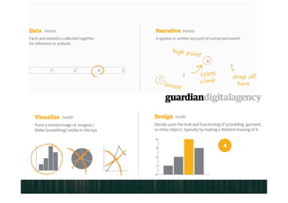

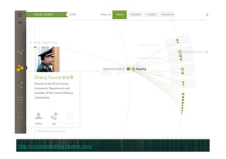
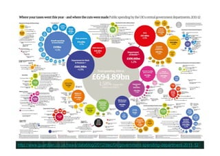
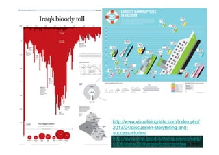

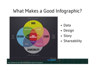
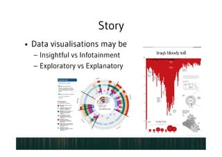
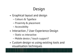
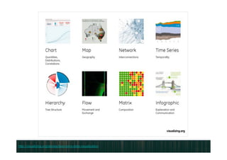
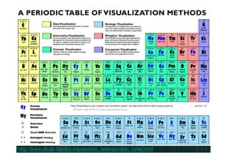
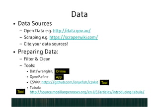


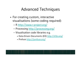
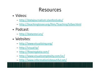
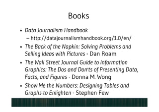

The document provides an overview of data visualization within data-driven journalism, emphasizing the importance of communicating complex information through compelling visual storytelling. It outlines key components that make effective infographics, such as data quality, design aesthetics, and the narrative aspect, alongside tools and techniques for creating visual content. Additionally, it offers resources for further learning and advanced techniques for producing interactive visualizations.