
Recommended
More Related Content
What's hot
What's hot (19)
Similar to Genre analysis
Similar to Genre analysis (20)
More from yasmin begum
More from yasmin begum (16)
Recently uploaded
Recently uploaded (20)
Genre analysis
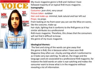
- 1. My music magazine genre is RnB and I believe I have followed majority of an typical RnB music magazine. Iconography: Costumes- jean shirt, very casual Picture taken- outdoor Hair and make up- minimal, look natural and hair left out Props- no props From looking at my front cover you can see the Mise-en-scene, like the costume, make-up hair style, lighting that it conforms to the RnB genre as it has similar attributes to a professional RnB music magazine. Therefore, this shows that the consumers will not find it difficult to know the genre of my music magazine. Ideological themes: The font and sizing of the words can give away that the genre is RnB, this is because when I have seen RnB Magazine they often are chunky and big which I conformed to as it looks very eye catching. To add on, the image and the language used are associated to a professional RnB magazine, for instance the bold words on color is eye-catching and makes the consumer want to know what is in the magazine without revealing a lot of information.
- 2. Technical aspect: The layout design of my front cover conforms to an RnB magazine as I had used a sub- Heading with a banner to make it stand out, I also wrote the artists name and placed it On the center of her with boarders around it, this is because majority of RnB magazine Will have the artists who is modeling for the magazines name on it so the audience Will know who Characterization: I have chosen to go with a female who is Asian for my front Cover, this is because majority of RnB magazine the model are often male and black. This shows that I had subverted from the RnB genre because I wanted to show that other ethnicities can also be in an RnB magazine, also she comes from a working-class background, which I believe majority of working class background listen to an RnB music. However, I made her look older than she really is so I can conform to the genre because the artist are mainly young adults.
- 3. Both of these magazine are professional magazine of the genre RnB, which inspired the look I went for, for my magazine. Both of these magazine look similar like the use of colour, lighting and image, which I was trying to achieve when I had analyzed both of these magazine. Within the Mise-en-scene, it shows that my magazine conforms to a professional magazine like the background is white but yet has light coming from the back and the hair is left out as well as minimal make up.
- 4. This is a professional film poster, looking at the iconography you could already tell what the genre of this film is and as well as an idea of what the film will be about. For instance, you can see two man side by side pointing at the gun at each end, this would give a hint it maybe action or gangster crime. The background looks dark and foggy which also tells the audience it could also be thriller. Iconography: As you can see the Mise-en-scene, you can see that they are holding a gun which is very common in any type of crime or action movies, the location you can see that it is going to be set in the City because of the buildings, also there clothing it’s very casual which shows that its going to be action or a crime movie because they have to be comfortable to maybe chase people as the gun gives it away. Ideological themes: This poster helps the audience narrow down the genre of the movie because the use of dark color which also goes with the sell line, “face your past-fight your future”, this could mean that the past is haunting the present and making sure the future doesn’t get affected by it and the used of dark color shows power, evil and even mystery. The poster doesn’t have a lot of sell lines which intrigues the audience to find out more about the movie.
- 5. Characterization: This poster shows two male, one who is middle aged and the other who is a young adult, both Are white and maybe play the role of a guy who comes from a working-class background Because of their clothes. This help the audience know the genre of the movie because action, Thriller or even crime movies are mainly dominated my males, which it conforms to the genre. Technical aspects: The layout of the poster can help the audience know what genre it is by having the characters Name above the image, the name of the movie below the characters and also having minimal Information on the poster so it does not make the image less eye catching.