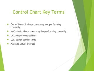
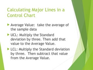
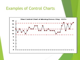
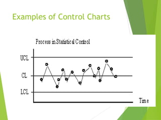
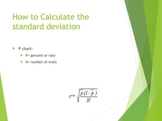
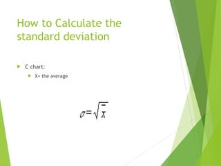
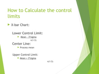
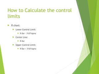
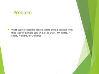
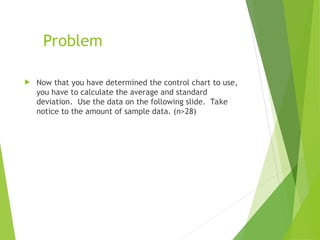
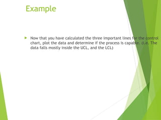
The Control charts plot data points over time with center line representing the process average and upper and lower control limits acting as thresholds for the variation expected within the process.
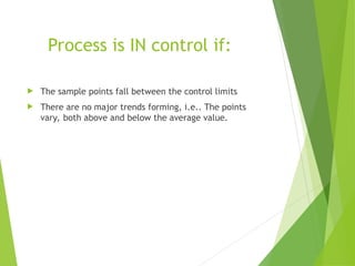
If all points lie within the control limits and there is no discernible pattern the process is considered in the control.
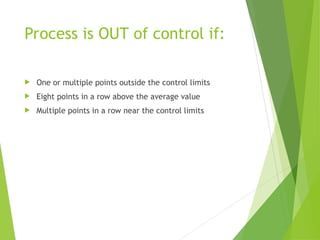
If a point falls outside the control limits or there is a non-random pattern it signals that the process may be out of the control and corrective actions should be taken


![Control Charts[1]](https://cdn.slidesharecdn.com/ss_thumbnails/controlcharts1-1226081330857138-9-thumbnail.jpg?width=640&height=640&fit=bounds)
![Control charts[1]](https://cdn.slidesharecdn.com/ss_thumbnails/controlcharts1-100924110931-phpapp01-thumbnail.jpg?width=640&height=640&fit=bounds)
![Control Charts[1]](https://cdn.slidesharecdn.com/ss_thumbnails/controlcharts1-1226961283054520-8-thumbnail.jpg?width=640&height=640&fit=bounds)


