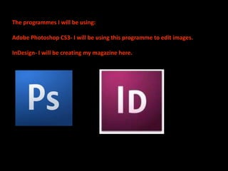
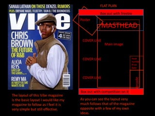
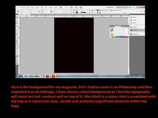
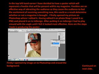
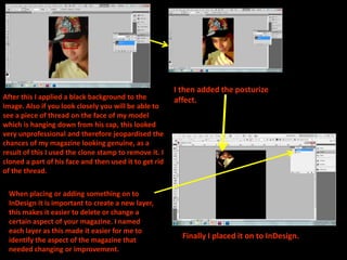
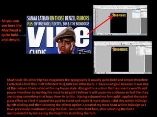
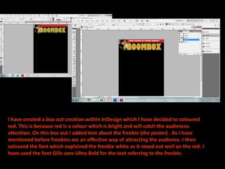
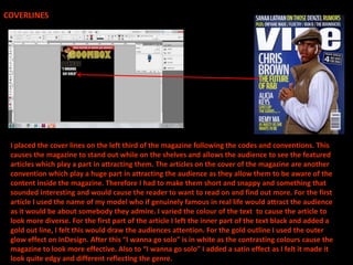
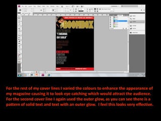
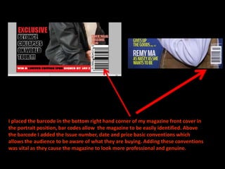
MUSIC MAGAZINE FRONT
COVER CONSTRUCTION.
The programmes I will be using:

Adobe Photoshop CS3- I will be using this programme to edit images.

InDesign- I will be creating my magazine here.
FLAT PLAN

                                                  Box out with freebie
                                      Poster
                                                  MASTHEAD
                                       COVER LINE
                                                    Main image


                                       COVER LINE                      Issue
                                                                       number
                                                                       Price
                                                                       Date


                                       COVER LINE


                                                                          Barcode
                                      Box out with competition on it
The layout of this Vibe magazine
is the basic layout I would like my   As you can see the layout very
magazine to follow as I feel it is    much follows that of the magazine
very simple but still effective.      opposite with a few of my own
                                      ideas.
Here is the background for my magazine, first I had to create it on Photoshop and then
imported it on to InDesign, I have chosen a black background as I feel the typography
will stand out and contrast well on top of it. Also black is a colour that is associated with
hip hop as it represents style, wealth and authority (significant elements within hip
hop).
In the top left hand corner I have decided to have a poster which will
  represent a freebie that will be present within my magazine. Freebies are an
  effective way of attracting the audience as they cause the audience to feel
  the excitement of receiving something new, this could as a result determine
  whether or not a magazine is brought . I firstly opened my picture on
  Photoshop where I edited it. Having edited it on photo Shop I saved it as
  PNG and placed it on to InDesign. After putting it on InDesign I had to play
  around with the angle until I felt it looked most effective. Here are the steps
  I took in producing the poster:


Firstly I opened my image on to Photoshop and erased the
background.                                                                 Continued on
                                                                            next slide.
I then added the posturize
After this I applied a black background to the          affect.
image. Also if you look closely you will be able to
see a piece of thread on the face of my model
which is hanging down from his cap, this looked
very unprofessional and therefore jeopardised the
chances of my magazine looking genuine, as a
result of this I used the clone stamp to remove it. I
cloned a part of his face and then used it to get rid
of the thread.

 When placing or adding something on to
 InDesign it is important to create a new layer,
 this makes it easier to delete or change a
 certain aspect of your magazine. I named
 each layer as this made it easier for me to
 identify the aspect of the magazine that                 Finally I placed it on to InDesign.
 needed changing or improvement.
As you can
see here the
Masthead is
quite bold
and simple.


   Masthead- On other hip hop magazines the typography is usually quite bold and simple therefore
   I selected a font that I felt reflected this( Gills San Ultra Bold). I have used gold because it was one
   of the colours I have selected for my house style. Also gold is a colour that represents wealth and
   power therefore by making the mast head gold I believe it will cause my audience to feel like they
   are buying something that buys them in to this. Having coloured my font gold I applied the outer
   glow effect as I feel it caused the gold to stand and made it more glossy. I did this within InDesign
   by left clicking and then selecting the effects option. I created my mast head within InDesign as I
   have previously mentioned using the Gills Sans Ultra Bold font, after selecting the font I
   manipulated it by increasing the height by stretching the font.
I have created a box out creation within InDesign which I have decided to coloured
red. This is because red is a colour which is bright and will catch the audiences
attention. On this box out I added text about the freebie (the poster) . As I have
mentioned before freebies are an effective way of attracting the audience. I then
coloured the font which explained the freebie white as it stood out well on the red. I
have used the font Gills sans Ultra Bold for the text referring to the freebie.
COVERLINES


 I placed the cover lines on the left third of the magazine following the codes and conventions. This
 causes the magazine to stand out while on the shelves and allows the audience to see the featured
 articles which play a part in attracting them. The articles on the cover of the magazine are another
 convention which play a huge part in attracting the audience as they allow them to be aware of the
 content inside the magazine. Therefore I had to make them short and snappy and something that
 sounded interesting and would cause the reader to want to read on and find out more. For the first
 article I used the name of my model who if genuinely famous in real life would attract the audience
 as it would be about somebody they admire. I varied the colour of the text to cause the article to
 look more diverse. For the first part of the article I left the inner part of the text black and added a
 gold out line, I felt this would draw the audiences attention. For the gold outline I used the outer
 glow effect on InDesign. After this “I wanna go solo” is in white as the contrasting colours cause the
 magazine to look more effective. Also to “I wanna go solo” I added a satin effect as I felt it made it
 look quite edgy and different reflecting the genre.
For the rest of my cover lines I varied the colours to enhance the appearance of
my magazine causing it to look eye catching which would attract the audience.
For the second cover line I again used the outer glow, as you can see there is a
pattern of solid text and text with an outer glow. I feel this looks very effective.
Having selected the image I was
going to use on the cover of my
magazine I erased the back
ground within Photoshop, I chose
a picture I felt would be placed
well on my magazine and
portrayed a hip hop stars
persona best. I knew the picture
had to be extremely good and
excellent quality as the main
image of the magazine plays a
huge part in the presentation of
the magazine. After erasing the
back ground with the magic
wand tool I inverse selected it      Step 1- removal of the
and then feathered it to give it a   background
smoother finish allowing it to
blend in to the background well.
After doing this I saved my
picture as a PNG ( so the
background would be
transparent) and imported it on
to InDesign. On InDesign I played
about with the positioning of my
image, the idea was to have it
placed so that it would be
overlapping the masthead. This is
because I had seen this
technique used on a number of
other magazines, and I feel it
looks very effective.
Step 2-Select inversing
the image
Step 3- Feathering my image using a feather radius of
twelve.
Finally I placed my image on to
 InDesign.


Here you can see the
overlapping of the
image on to the Mast
head, this is what I
have tried to
incorporate on to my
magazine.
I created a second box out on InDesign for the bottom of my magazine which I
coloured red as I would after put a competition on it, I felt it contrasted well with
the black and having it in red would again catch the readers attention. I varied the
colour of the words limited edition Ipod as I had it in black instead of white like
the rest of the text. I did this as I felt it emphasised the importance of the prize
increasing its appeal to the audience.
As you can see here
there is a blank space
therefore I have
decided to place
something here.
                 I have covered
                 this area by
                 adding another
                 cover line.
I placed the barcode in the bottom right hand corner of my magazine front cover in
the portrait position, bar codes allow the magazine to be easily identified. Above
the barcode I added the Issue number, date and price basic conventions which
allows the audience to be aware of what they are buying. Adding these conventions
was vital as they cause the magazine to look more professional and genuine.

Front cover construction

  • 1.
  • 2.
    The programmes Iwill be using: Adobe Photoshop CS3- I will be using this programme to edit images. InDesign- I will be creating my magazine here.
  • 3.
    FLAT PLAN Box out with freebie Poster MASTHEAD COVER LINE Main image COVER LINE Issue number Price Date COVER LINE Barcode Box out with competition on it The layout of this Vibe magazine is the basic layout I would like my As you can see the layout very magazine to follow as I feel it is much follows that of the magazine very simple but still effective. opposite with a few of my own ideas.
  • 4.
    Here is thebackground for my magazine, first I had to create it on Photoshop and then imported it on to InDesign, I have chosen a black background as I feel the typography will stand out and contrast well on top of it. Also black is a colour that is associated with hip hop as it represents style, wealth and authority (significant elements within hip hop).
  • 5.
    In the topleft hand corner I have decided to have a poster which will represent a freebie that will be present within my magazine. Freebies are an effective way of attracting the audience as they cause the audience to feel the excitement of receiving something new, this could as a result determine whether or not a magazine is brought . I firstly opened my picture on Photoshop where I edited it. Having edited it on photo Shop I saved it as PNG and placed it on to InDesign. After putting it on InDesign I had to play around with the angle until I felt it looked most effective. Here are the steps I took in producing the poster: Firstly I opened my image on to Photoshop and erased the background. Continued on next slide.
  • 6.
    I then addedthe posturize After this I applied a black background to the affect. image. Also if you look closely you will be able to see a piece of thread on the face of my model which is hanging down from his cap, this looked very unprofessional and therefore jeopardised the chances of my magazine looking genuine, as a result of this I used the clone stamp to remove it. I cloned a part of his face and then used it to get rid of the thread. When placing or adding something on to InDesign it is important to create a new layer, this makes it easier to delete or change a certain aspect of your magazine. I named each layer as this made it easier for me to identify the aspect of the magazine that Finally I placed it on to InDesign. needed changing or improvement.
  • 7.
    As you can seehere the Masthead is quite bold and simple. Masthead- On other hip hop magazines the typography is usually quite bold and simple therefore I selected a font that I felt reflected this( Gills San Ultra Bold). I have used gold because it was one of the colours I have selected for my house style. Also gold is a colour that represents wealth and power therefore by making the mast head gold I believe it will cause my audience to feel like they are buying something that buys them in to this. Having coloured my font gold I applied the outer glow effect as I feel it caused the gold to stand and made it more glossy. I did this within InDesign by left clicking and then selecting the effects option. I created my mast head within InDesign as I have previously mentioned using the Gills Sans Ultra Bold font, after selecting the font I manipulated it by increasing the height by stretching the font.
  • 8.
    I have createda box out creation within InDesign which I have decided to coloured red. This is because red is a colour which is bright and will catch the audiences attention. On this box out I added text about the freebie (the poster) . As I have mentioned before freebies are an effective way of attracting the audience. I then coloured the font which explained the freebie white as it stood out well on the red. I have used the font Gills sans Ultra Bold for the text referring to the freebie.
  • 9.
    COVERLINES I placedthe cover lines on the left third of the magazine following the codes and conventions. This causes the magazine to stand out while on the shelves and allows the audience to see the featured articles which play a part in attracting them. The articles on the cover of the magazine are another convention which play a huge part in attracting the audience as they allow them to be aware of the content inside the magazine. Therefore I had to make them short and snappy and something that sounded interesting and would cause the reader to want to read on and find out more. For the first article I used the name of my model who if genuinely famous in real life would attract the audience as it would be about somebody they admire. I varied the colour of the text to cause the article to look more diverse. For the first part of the article I left the inner part of the text black and added a gold out line, I felt this would draw the audiences attention. For the gold outline I used the outer glow effect on InDesign. After this “I wanna go solo” is in white as the contrasting colours cause the magazine to look more effective. Also to “I wanna go solo” I added a satin effect as I felt it made it look quite edgy and different reflecting the genre.
  • 10.
    For the restof my cover lines I varied the colours to enhance the appearance of my magazine causing it to look eye catching which would attract the audience. For the second cover line I again used the outer glow, as you can see there is a pattern of solid text and text with an outer glow. I feel this looks very effective.
  • 11.
    Having selected theimage I was going to use on the cover of my magazine I erased the back ground within Photoshop, I chose a picture I felt would be placed well on my magazine and portrayed a hip hop stars persona best. I knew the picture had to be extremely good and excellent quality as the main image of the magazine plays a huge part in the presentation of the magazine. After erasing the back ground with the magic wand tool I inverse selected it Step 1- removal of the and then feathered it to give it a background smoother finish allowing it to blend in to the background well. After doing this I saved my picture as a PNG ( so the background would be transparent) and imported it on to InDesign. On InDesign I played about with the positioning of my image, the idea was to have it placed so that it would be overlapping the masthead. This is because I had seen this technique used on a number of other magazines, and I feel it looks very effective.
  • 12.
  • 13.
    Step 3- Featheringmy image using a feather radius of twelve.
  • 14.
    Finally I placedmy image on to InDesign. Here you can see the overlapping of the image on to the Mast head, this is what I have tried to incorporate on to my magazine.
  • 15.
    I created asecond box out on InDesign for the bottom of my magazine which I coloured red as I would after put a competition on it, I felt it contrasted well with the black and having it in red would again catch the readers attention. I varied the colour of the words limited edition Ipod as I had it in black instead of white like the rest of the text. I did this as I felt it emphasised the importance of the prize increasing its appeal to the audience.
  • 16.
    As you cansee here there is a blank space therefore I have decided to place something here. I have covered this area by adding another cover line.
  • 17.
    I placed thebarcode in the bottom right hand corner of my magazine front cover in the portrait position, bar codes allow the magazine to be easily identified. Above the barcode I added the Issue number, date and price basic conventions which allows the audience to be aware of what they are buying. Adding these conventions was vital as they cause the magazine to look more professional and genuine.