
Recommended
More Related Content
What's hot
What's hot (20)
Similar to Empire Magazine Cover Analysis
Similar to Empire Magazine Cover Analysis (20)
More from JadeMelady
More from JadeMelady (15)
Recently uploaded
Recently uploaded (20)
Empire Magazine Cover Analysis
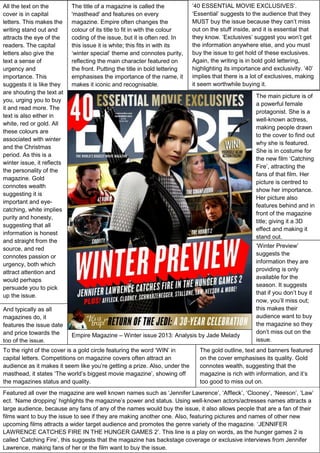
- 1. All the text on the cover is in capital letters. This makes the writing stand out and attracts the eye of the readers. The capital letters also give the text a sense of urgency and importance. This suggests it is like they are shouting the text at you, urging you to buy it and read more. The text is also either in white, red or gold. All these colours are associated with winter and the Christmas period. As this is a winter issue, it reflects the personality of the magazine. Gold connotes wealth suggesting it is important and eyecatching, white implies purity and honesty, suggesting that all information is honest and straight from the source, and red connotes passion or urgency, both which attract attention and would perhaps persuade you to pick up the issue. And typically as all magazines do, it features the issue date and price towards the top of the issue. The title of a magazine is called the 'masthead' and features on every magazine. Empire often changes the colour of its title to fit in with the colour coding of the issue, but it is often red. In this issue it is white; this fits in with its ‘winter special’ theme and connotes purity, reflecting the main character featured on the front. Putting the title in bold lettering emphasises the importance of the name, it makes it iconic and recognisable. ’40 ESSENTIAL MOVIE EXCLUSIVES’. ‘Essential’ suggests to the audience that they MUST buy the issue because they can’t miss out on the stuff inside, and it is essential that they know. ‘Exclusives’ suggest you won’t get the information anywhere else, and you must buy the issue to get hold of these exclusives. Again, the writing is in bold gold lettering, highlighting its importance and exclusivity. ‘40’ implies that there is a lot of exclusives, making it seem worthwhile buying it. The main picture is of a powerful female protagonist. She is a well-known actress, making people drawn to the cover to find out why she is featured. She is in costume for the new film ‘Catching Fire’, attracting the fans of that film. Her picture is centred to show her importance. Her picture also features behind and in front of the magazine title; giving it a 3D effect and making it stand out. Empire Magazine – Winter issue 2013: Analysis by Jade Melady To the right of the cover is a gold circle featuring the word ‘WIN’ in capital letters. Competitions on magazine covers often attract an audience as it makes it seem like you’re getting a prize. Also, under the masthead, it states ‘The world’s biggest movie magazine’, showing off the magazines status and quality. ‘Winter Preview’ suggests the information they are providing is only available for the season. It suggests that if you don’t buy it now, you’ll miss out; this makes their audience want to buy the magazine so they don’t miss out on the issue. The gold outline, text and banners featured on the cover emphasises its quality. Gold connotes wealth, suggesting that the magazine is rich with information, and it’s too good to miss out on. Featured all over the magazine are well known names such as ‘Jennifer Lawrence’, ‘Affleck’, ‘Clooney’, ‘Neeson’, ‘Law’ ect. ‘Name dropping’ highlights the magazine’s power and status. Using well-known actors/actresses names attracts a large audience, because any fans of any of the names would buy the issue, it also allows people that are a fan of their films want to buy the issue to see if they are making another one. Also, featuring pictures and names of other new upcoming films attracts a wider target audience and promotes the genre variety of the magazine. ‘JENNIFER LAWRENCE CATCHES FIRE IN THE HUNGER GAMES 2’. This line is a play on words, as the hunger games 2 is called ‘Catching Fire’, this suggests that the magazine has backstage coverage or exclusive interviews from Jennifer Lawrence, making fans of her or the film want to buy the issue.