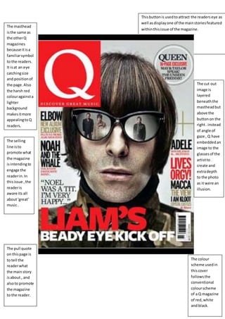
1. The masthead
isthe same as
the otherQ
magazines
because itisa
familiarsymbol
to the readers.
It isat an eye
catchingsize
and positionof
the page.Also
the harsh red
colouragainsta
lighter
background
makesitmore
appealingtoQ
readers.
The selling
line isto
promote what
the magazine
isintendingto
engage the
readerin.In
thisissue ,the
readeris
aware its all
about‘great’
music.
The pull quote
on thispage is
to tell the
readerwhat
the mainstory
isabout , and
alsoto promote
the magazine
to the reader.
Thisbuttonis usedtoattract the readerseye as
well asdisplayone of the mainstoriesfeatured
withinthisissue of the magazine.
The cut out
image is
layered
beneath the
mastheadbut
above the
buttonon the
right. instead
of angle of
gaze , Q have
embeddedan
image to the
glassesof the
artistto
create and
extradepth
to the photo
as it were an
illusion.
The colour
scheme usedin
thiscover
followsthe
conventional
colourscheme
of a Q magazine
of red,white
and black.