1. Lauren Dearden
Imagery
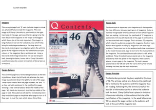
This contents page from ‘Q’ uses multiple images to show
you what will feature inside the magazine. The main
image is of Cheryl Cole which is positioned on the right-
hand side of the page, we know Cheryl is going to be the
main focus in the magazine as her image is the biggest
which shows she is the most important. The image is a
long shot so we can see her seductive pose which helps
bring the male target audience in. The long shot is in
black and white to give it an edgy look which fits with the
genre of the magazine and also fits with the house style
colours of the magazine; Black, white and red. Using a
black and white image shows that it is raw and stripped
back, showing the darker, honest side of Cheryl Cole which
could foreshadow the content in the article of Cheryl later on
in the issue.
House style
The house style is important for a magazine as it distinguishes
the clear difference between each genre of magazine. It also is
instantly recognisable for the audience to know what magazine
they are reading. In this case, the masthead of ‘Q’ magazine is
positioned at the top left hand side of the page in white with a
red box stretched over the page. This is on every ‘Q’ magazine
which helps the audience recognise the magazine. Another main
feature that appears in every ‘Q’ magazine is the bold page
numbers. These stand out to the audience and show importance
as the reader knows what page to turn to for the main articles in
the magazine. The consistent house style colour is: red, white
and black. These three bold colours stand out on the magazine
and clearly show the genre of the magazine, these colours
appear in every page in the magazine. The text is always
positioned on the left side with the name of the artist in bold
showing that they are the most important.
Design Balance
This contents page has a formal design balance as the text
is positioned down the left hand side whereas the main
image is positioned down the right hand side of the page.
There is also balance with the page numbers ‘46’ and ‘72’
as they are both positioned in the middle of the page
showing a clear central balance down the middle of the
page. ‘46’ stands out more as it is as the top middle of the
page in bold. The audience will see this immediately when
they look at this page so they know what page to turn to if
they want to read the main article about Cheryl Cole.
Design Principle
The Guttenberg principle has been applied to this issue
of ‘Q’. The primary optical area features the masthead
‘Q’ to familiarise the audience with the magazine they
are reading. Following this, the terminal area has the
least bit of information as this is where the audience
look the least. Cheryl Cole’s face is placed in the stray
fallow area indicating to the audience that she is the
main feature of the magazine. In the weak fallow area,
‘Q’ has placed the page number as the audience will
look at this part of the magazine last.