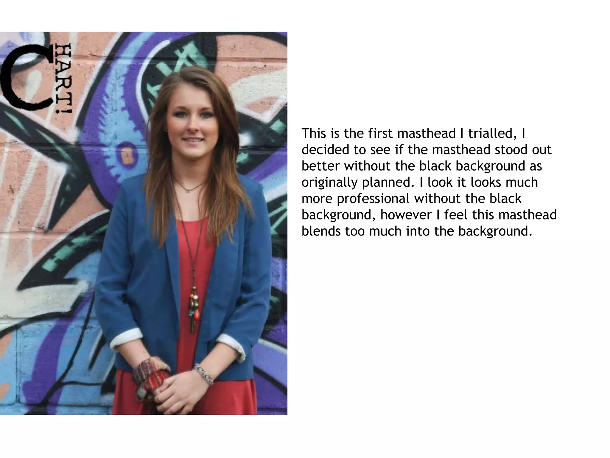
This is the first masthead I trialled, I
decided to see if the masthead stood out
better without the black background as
originally planned. I look it looks much
more professional without the black
background, however I feel this masthead
blends too much into the background.
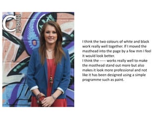
I think the two colours of white and black
work really well together. If I moved the
masthead into the page by a few mm I feel
it would look better.
I think the ----- works really well to make
the masthead stand out more but also
makes it look more professional and not
like it has been designed using a simple
programme such as paint.
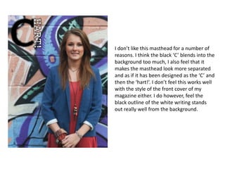
I don’t like this masthead for a number of
reasons. I think the black ‘C’ blends into the
background too much, I also feel that it
makes the masthead look more separated
and as if it has been designed as the ‘C’ and
then the ‘hart!’. I don’t feel this works well
with the style of the front cover of my
magazine either. I do however, feel the
black outline of the white writing stands
out really well from the background.
I think this masthead looks too simple and
under designed. I think it looks like it hasn’t
been thought about and has been made
very simple and quickly.
I decided to try rearranging the letters of
‘Chart!’ for my masthead. I think this
works really well and makes the whole
masthead really stand out.
I feel the design of this works really well
and the colours black and white work
well with my background.
I really like this masthead, I think it works
really well against the background and
stands out really well. To improve this
further I think I could include more white
to outline the black letters though.
I really like this masthead and I feel it is really
eye-catching which is needed for my
magazine. The black and white contrast each
other well and the ratio of white to black is
good. I think to improve this masthead further
I could thicken the black border very slightly.

Front cover

  • 1.
    This is thefirst masthead I trialled, I decided to see if the masthead stood out better without the black background as originally planned. I look it looks much more professional without the black background, however I feel this masthead blends too much into the background.
  • 2.
    I think thetwo colours of white and black work really well together. If I moved the masthead into the page by a few mm I feel it would look better. I think the ----- works really well to make the masthead stand out more but also makes it look more professional and not like it has been designed using a simple programme such as paint.
  • 3.
    I don’t likethis masthead for a number of reasons. I think the black ‘C’ blends into the background too much, I also feel that it makes the masthead look more separated and as if it has been designed as the ‘C’ and then the ‘hart!’. I don’t feel this works well with the style of the front cover of my magazine either. I do however, feel the black outline of the white writing stands out really well from the background.
  • 4.
    I think thismasthead looks too simple and under designed. I think it looks like it hasn’t been thought about and has been made very simple and quickly.
  • 5.
    I decided totry rearranging the letters of ‘Chart!’ for my masthead. I think this works really well and makes the whole masthead really stand out. I feel the design of this works really well and the colours black and white work well with my background.
  • 6.
    I really likethis masthead, I think it works really well against the background and stands out really well. To improve this further I think I could include more white to outline the black letters though.
  • 7.
    I really likethis masthead and I feel it is really eye-catching which is needed for my magazine. The black and white contrast each other well and the ratio of white to black is good. I think to improve this masthead further I could thicken the black border very slightly.