1. This is my first drafting of my front cover.
I don’t like the way that these magazines look and the way that they are laid out as
there isn’t very much for the viewer to look at. On the next draft I am going to add a
lot more to the cover and will also change the masthead font as I don’t think this font
makes the magazine stand out.
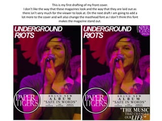
2. This is my second drafting of my front cover.
On this I have added a new masthead, a price, barcode and date. I have also added
the contents of the magazine as there was to much empty space. I think that I could
improve this by changing the masthead again. I think this as again it isn’t really a font
that will make the magazine stand out.
3. This is my third drafting of my front cover.
On this I have again changed the masthead. I have changed this because I didn’t really
like the font of the mast head on my last drafts so I have changed it to a different font.
I like this font however I don’t like how it is set out so I am going to redo it and try to
lay it out in a different way.