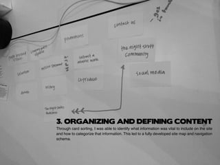
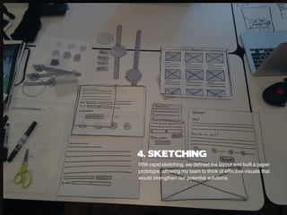
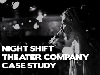
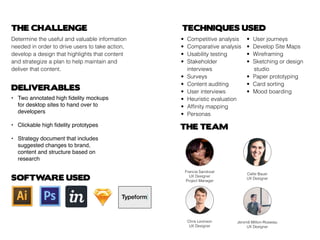
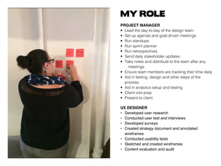
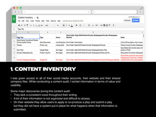
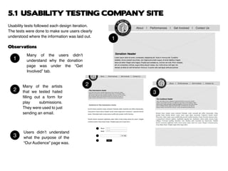
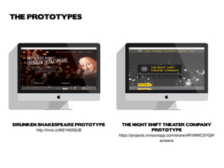
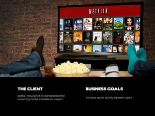
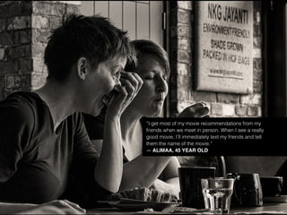
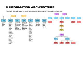
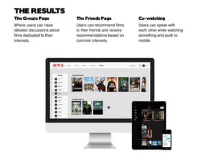
FRANCIA SANDOVAL
UX SPECIALIST
UX PORTFOLIO 2015
CONTENTS
3 ................................................................ABOUT ME
17 ..................... NETFLIX (SPEC WORK) CASE STUDY
NIGHT SHIFT THEATER COMPANY
CASE STUDY5 ............................................................
HELLO!
I’m Francia and I’m a UX Specialist.
I’m interested in the unmet needs of the user and
the usability of design. I studied Screen Studies and
Journalism but I have experience in UX Design. I firmly
believe that creating memorable user experiences
begins with a great idea and a whole lot of research.
MY PROCESS USUALLY LOOKS LIKE THIS:
DRINKATO
N
OF COFFE
E
EACHDAY
Ideation
Research
-interviews
-observations
-surveys
Analysis
Design
Test
Deliver
Evaluate
-personas
-scenarios
When I’m not working, I can be found searching for the perfect burger and the DeLorean (the modified
time machine, not just the car), watching travel documentaries or reading a graphic novel.
NIGHT SHIFT
THEATER COMPANY
CASE STUDY
THE CLIENT
BUSINESS GOALS
THE PROBLEM
The Night Shift Theater Company is a small
non-profit company that was looking to
improve their web presence.
They wanted to appeal to art foundations
and other grant givers while promoting their
monthly bar event, Drunken Shakespeare.
Based on initial usability testing of their website
I found that users felt ambiguous and were
reluctant to participate throughout any of their
offerings. Through this, I made the realization
that this company needed some content
strategy.
THE CHALLENGE
Determine the useful and valuable information
needed in order to drive users to take action,
develop a design that highlights that content
and strategize a plan to help maintain and
deliver that content.
DELIVERABLES
THE TEAM
TECHNIQUES USED
•	 Competitive analysis
•	 Comparative analysis
•	 Usability testing
•	 Stakeholder 			
	interviews
•	Surveys
•	 Content auditing
•	 User interviews
•	 Heuristic evaluation
•	 Affinity mapping
•	Personas
•	 User journeys
•	 Develop Site Maps
•	Wireframing
•	 Sketching or design 	
			studio
•	 Paper prototyping
•	 Card sorting
•	 Mood boarding
SOFTWARE USED
Callie Bauer
UX Designer
Chris Levinson
UX Designer
Jeromê Million-Rosseau
UX Designer
Francia Sandoval
UX Designer
Project Manager
• 	 Two annotated high fidelity mockups 		
	 for desktop sites to hand over to 			
	 developers
•	 Clickable high fidelity prototypes
•	 Strategy document that includes 			
	 suggested changes to brand,
	 content and structure based on 			
	 research
MY ROLE
PROJECT MANAGER
• 	Lead the day-to-day of the design team
• 	Set up agenda and goal-driven meetings
• 	Run standups
• 	Run sprint planner
• 	Run retrospectives
• 	Send daily stakeholder updates
• 	Take notes and distribute to the team after any 	
		meetings
• 	Ensure team members are tracking their time daily
• 	Aid in testing, design and other steps of the 		
	process
• 	Aid in analytics setup and testing
• 	Client visit prep
• 	Present to client
UX DESIGNER
• 	 Developed user research
• 	 Conducted user test and interviews
• 	 Developed surveys
• 	 Created strategy document and annotated 		
	 wireframes
• 	 Conducted usability tests
• 	 Sketched and created wireframes
• 	 Content evaluation and audit
I was given access to all of their social media accounts, their website and their shared
company files. While conducting a content audit, I sorted information in terms of value and
usability.
1. CONTENT INVENTORY
Some major discoveries during this content audit:
•	 They lack a consistent voice throughout their writing.
• 	 A lot of their information is not organized and difficult to access.
• 	 On their website they allow users to apply to co-produce a play and submit a play 			
	 but they did not have a system put in place for what happens when that information is 		
	 submitted.
•Competitive Analysis: examined how other theater companies, tell their story and promote
themselves.
•Comparative Analysis: Looked in to A/B testing results on the Obama Campaign website
in order to examine different donation processes.
•Secondary Research: Looked into request for proposals from art foundations to discover
what appeals to them. I found that art foundations like theater companies that show their
history, story and if they are giving back to their community.
•Primary Research: Conducted surveys and interviews focused on understanding people’s
habits when RSVPing to events, donating and how they submit plays. Research shows that
people are more likely to donate when they are being told what their money is being used
for and how much of it. When it comes to attending free events, most people are more likely
to go when they are reminded of the event.
2. RESEARCH & KEY TAKEAWAYS
Through card sorting, I was able to identify what information was vital to include on the site
and how to categorize that information. This led to a fully developed site map and navigation
schema.
3. ORGANIZING AND DEFINING CONTENT
With rapid sketching, we defined the layout and built a paper
prototype, allowing my team to think of effective visuals that
would strengthen our potential solutions.
4. SKETCHING
Usability tests followed each design iteration.
The tests were done to make sure users clearly
understood where the information was laid out.
Observations
Many of the users didn’t
understand why the donation
page was under the “Get
Involved” tab.
Many of the artists
that we tested hated
filling out a form for
play submissions.
They were used to just
sending an email.
Users didn’t understand
what the purpose of the
“Our Audience” page was.
1
1
2
2
3
3
5.1 USABILITY TESTING COMPANY SITE
Testing the Drunken Shakespeare site allowed us
to experiment more with different layouts due to the
more colloquial vibe of the site.
Observations
“Support Us” was clearer and
more effective language than
“Get Involved”
Many users thought that having
the logo in the center of the
navigation was distracting.
The different sizes for the and
the sliding interactions that we
had planned out for the RSVP
buttons were unclear and
unnecessary.
1
1
2
2
3 3
5.2 USABILITY TESTING DRUNKEN SHAKESPEARE SITE
After several rounds of testing and iterations. All wireframes and flows
were updated. Style guides and mood boards were developed to reflect
each site’s tone. Then all documents were compiled, packaged and
annotated and delivered to the client’s development team.
6. DOCUMENTATION
DRUNKEN SHAKESPEARE PROTOTYPE
http://invis.io/M21N0S6JB
THE NIGHT SHIFT THEATER COMPANY
PROTOTYPE
https://projects.invisionapp.com/share/4R1MWCSYQ#/
screens
THE PROTOTYPES
NETFLIX
CASE STUDY
THE CLIENT BUSINESS GOALS
Netflix: provider of on-demand Internet
streaming media available to viewers.
Increase social activity between users.
THE CHALLENGE
Netflix was looking to increase social activity
between users. We asked ourselves how do
we develop a feature that increases social
activity in a seamless way, without disrupting
the existing flow and layout that Netflix
currently has?
DELIVERABLES
THE SOLUTION THE TEAM
TECHNIQUES USED
•	 Competitive analysis
•	 Comparative analysis
•	 Usability testing
•	Surveys
•	 User interviews
•	 Heuristic evaluation
•	 Affinity mapping
•	Personas
•	 User journeys
•	 Develop Site Maps
•	Wireframing
•	 Sketching or design 	
			studio
•	 Paper prototyping
SOFTWARE USED
• 	 Sketches
•	 Wireframes
•	 User flows
•	 Sitemaps
•	 Navigation schema
•	 Responsive designs
•	 Interactive prototypes
•	 Developed features
The development of three main features:
	 •	 Friends page
	 •	 Groups page
	 •	 Co-watching feature
Francia Sandoval
UX Designer
Pedro Do Ó
UX Designer
Tulga Enhsaihan
Project Manager
MY ROLE
UX DESIGNER
	 • 	Developed user research
	 • 	Conducted user test and interviews
	 • 	Developed surveys
	 • 	Conducted usability tests
	 • 	Sketched and created wireframes
1. ANALYZING SURVEY RESULTS
Discuss what they watch with their friends. Use their smartphone while watching something on Netflix.
Text while watching something on Netflix.
Source: 195 survey respondents
Discuss what they watch in person.
Use Netflix to recommend films and TV shows.
Even though there are social interactions between users, they are communicating with each other in
inefficient and unstructured ways.
91% 72%
76% 60%
27%
“I text my friends funny clips from the shows that I am watching and
we laugh about it and talk about it.”
— WILMER GARCIA, 17 YEAR-OLD NETFLIX USER
2. ANALYZING USER INTERVIEWS
“I get most of my movie recommendations from my
friends when we meet in person. When I see a really
good movie, I’ll immediately text my friends and tell
them the name of the movie.”
— ALIMAA, 45 YEAR OLD
While working on the comparative analysis, the focus was to highlight the ways users interact with each other
on these sites. Based on this analysis we decided to incorporate these features:
	 •	 Facebook’s Group set up
	 •	 Spotify’s messaging system
	 •	 Twitch’s co-watching feature
Working on the competitive analysis, we focus our questions on the feature sets to determine an unmet need.
	 •	 How do users find and share films?
	 •	 What does their community look like?
	 •	 How do users have conversations with each other or interact?
	 •	 What features do these sites have that Netflix users will expect?
	 •	 What features are missing in this market?
3. COMPETITIVE ANALYSIS
COMPARATIVE ANALYSIS
4. DEVELOPING PERSONAS
We created affinity maps based on the data collected from the survey, interviews and behavioral
patterns. Then we used this insight to develop fully fledged personas.
5. USER JOURNEYS
User journeys and flows were developed in order to determine the unmet needs of the user. It allowed us to
figure out how our design would improve these inefficiencies.
6. INFORMATION ARCHITECTURE
Sitemaps and navigation schemas were used to determine the information architecture.
7. DESIGN STUDIO
Design studio was used to sketch and refine ideas prior to paper prototyping.
8. USER TESTING
We tested each feature to make sure the user flow was understandable and seamless.
Observations
Users were confused how
their friends would be able
to interact with the user’s list
of recommendations.
User testing revealed friends
chat feature blocked the
recommendation list.
1
1
2
2
9. USER TESTING MEDIUM FIDELITY PROTOTYPE
Medium fidelity wireframes and digital prototypes were produced to support the outcome of the research and
usability testing.
Observations
Users had difficulty setting up their discussion
groups because the feature did not reflect
familiar best practices.
THE RESULTS
Where users can have
detailed discussions about
films dedicated to their
interests.
Users can recommend films
to their friends and receive
recommendations based on
common interests.
Users can speak with
each other while watching
something and push to
mobile.
The Groups Page The Friends Page Co-watching
THE PROTOTYPE
Link to the prototype or just click on the image below.
http://invis.io/J61G2SS8X

Francia Sandoval UX Portfolio

  • 1.
  • 2.
    CONTENTS 3 ................................................................ABOUT ME 17..................... NETFLIX (SPEC WORK) CASE STUDY NIGHT SHIFT THEATER COMPANY CASE STUDY5 ............................................................
  • 3.
    HELLO! I’m Francia andI’m a UX Specialist. I’m interested in the unmet needs of the user and the usability of design. I studied Screen Studies and Journalism but I have experience in UX Design. I firmly believe that creating memorable user experiences begins with a great idea and a whole lot of research.
  • 4.
    MY PROCESS USUALLYLOOKS LIKE THIS: DRINKATO N OF COFFE E EACHDAY Ideation Research -interviews -observations -surveys Analysis Design Test Deliver Evaluate -personas -scenarios When I’m not working, I can be found searching for the perfect burger and the DeLorean (the modified time machine, not just the car), watching travel documentaries or reading a graphic novel.
  • 5.
  • 6.
    THE CLIENT BUSINESS GOALS THEPROBLEM The Night Shift Theater Company is a small non-profit company that was looking to improve their web presence. They wanted to appeal to art foundations and other grant givers while promoting their monthly bar event, Drunken Shakespeare. Based on initial usability testing of their website I found that users felt ambiguous and were reluctant to participate throughout any of their offerings. Through this, I made the realization that this company needed some content strategy.
  • 7.
    THE CHALLENGE Determine theuseful and valuable information needed in order to drive users to take action, develop a design that highlights that content and strategize a plan to help maintain and deliver that content. DELIVERABLES THE TEAM TECHNIQUES USED • Competitive analysis • Comparative analysis • Usability testing • Stakeholder interviews • Surveys • Content auditing • User interviews • Heuristic evaluation • Affinity mapping • Personas • User journeys • Develop Site Maps • Wireframing • Sketching or design studio • Paper prototyping • Card sorting • Mood boarding SOFTWARE USED Callie Bauer UX Designer Chris Levinson UX Designer Jeromê Million-Rosseau UX Designer Francia Sandoval UX Designer Project Manager • Two annotated high fidelity mockups for desktop sites to hand over to developers • Clickable high fidelity prototypes • Strategy document that includes suggested changes to brand, content and structure based on research
  • 8.
    MY ROLE PROJECT MANAGER • Lead the day-to-day of the design team • Set up agenda and goal-driven meetings • Run standups • Run sprint planner • Run retrospectives • Send daily stakeholder updates • Take notes and distribute to the team after any meetings • Ensure team members are tracking their time daily • Aid in testing, design and other steps of the process • Aid in analytics setup and testing • Client visit prep • Present to client UX DESIGNER • Developed user research • Conducted user test and interviews • Developed surveys • Created strategy document and annotated wireframes • Conducted usability tests • Sketched and created wireframes • Content evaluation and audit
  • 9.
    I was givenaccess to all of their social media accounts, their website and their shared company files. While conducting a content audit, I sorted information in terms of value and usability. 1. CONTENT INVENTORY Some major discoveries during this content audit: • They lack a consistent voice throughout their writing. • A lot of their information is not organized and difficult to access. • On their website they allow users to apply to co-produce a play and submit a play but they did not have a system put in place for what happens when that information is submitted.
  • 10.
    •Competitive Analysis: examinedhow other theater companies, tell their story and promote themselves. •Comparative Analysis: Looked in to A/B testing results on the Obama Campaign website in order to examine different donation processes. •Secondary Research: Looked into request for proposals from art foundations to discover what appeals to them. I found that art foundations like theater companies that show their history, story and if they are giving back to their community. •Primary Research: Conducted surveys and interviews focused on understanding people’s habits when RSVPing to events, donating and how they submit plays. Research shows that people are more likely to donate when they are being told what their money is being used for and how much of it. When it comes to attending free events, most people are more likely to go when they are reminded of the event. 2. RESEARCH & KEY TAKEAWAYS
  • 11.
    Through card sorting,I was able to identify what information was vital to include on the site and how to categorize that information. This led to a fully developed site map and navigation schema. 3. ORGANIZING AND DEFINING CONTENT
  • 12.
    With rapid sketching,we defined the layout and built a paper prototype, allowing my team to think of effective visuals that would strengthen our potential solutions. 4. SKETCHING
  • 13.
    Usability tests followedeach design iteration. The tests were done to make sure users clearly understood where the information was laid out. Observations Many of the users didn’t understand why the donation page was under the “Get Involved” tab. Many of the artists that we tested hated filling out a form for play submissions. They were used to just sending an email. Users didn’t understand what the purpose of the “Our Audience” page was. 1 1 2 2 3 3 5.1 USABILITY TESTING COMPANY SITE
  • 14.
    Testing the DrunkenShakespeare site allowed us to experiment more with different layouts due to the more colloquial vibe of the site. Observations “Support Us” was clearer and more effective language than “Get Involved” Many users thought that having the logo in the center of the navigation was distracting. The different sizes for the and the sliding interactions that we had planned out for the RSVP buttons were unclear and unnecessary. 1 1 2 2 3 3 5.2 USABILITY TESTING DRUNKEN SHAKESPEARE SITE
  • 15.
    After several roundsof testing and iterations. All wireframes and flows were updated. Style guides and mood boards were developed to reflect each site’s tone. Then all documents were compiled, packaged and annotated and delivered to the client’s development team. 6. DOCUMENTATION
  • 16.
    DRUNKEN SHAKESPEARE PROTOTYPE http://invis.io/M21N0S6JB THENIGHT SHIFT THEATER COMPANY PROTOTYPE https://projects.invisionapp.com/share/4R1MWCSYQ#/ screens THE PROTOTYPES
  • 17.
  • 18.
    THE CLIENT BUSINESSGOALS Netflix: provider of on-demand Internet streaming media available to viewers. Increase social activity between users.
  • 19.
    THE CHALLENGE Netflix waslooking to increase social activity between users. We asked ourselves how do we develop a feature that increases social activity in a seamless way, without disrupting the existing flow and layout that Netflix currently has? DELIVERABLES THE SOLUTION THE TEAM TECHNIQUES USED • Competitive analysis • Comparative analysis • Usability testing • Surveys • User interviews • Heuristic evaluation • Affinity mapping • Personas • User journeys • Develop Site Maps • Wireframing • Sketching or design studio • Paper prototyping SOFTWARE USED • Sketches • Wireframes • User flows • Sitemaps • Navigation schema • Responsive designs • Interactive prototypes • Developed features The development of three main features: • Friends page • Groups page • Co-watching feature Francia Sandoval UX Designer Pedro Do Ó UX Designer Tulga Enhsaihan Project Manager
  • 20.
    MY ROLE UX DESIGNER • Developed user research • Conducted user test and interviews • Developed surveys • Conducted usability tests • Sketched and created wireframes
  • 21.
    1. ANALYZING SURVEYRESULTS Discuss what they watch with their friends. Use their smartphone while watching something on Netflix. Text while watching something on Netflix. Source: 195 survey respondents Discuss what they watch in person. Use Netflix to recommend films and TV shows. Even though there are social interactions between users, they are communicating with each other in inefficient and unstructured ways. 91% 72% 76% 60% 27%
  • 22.
    “I text myfriends funny clips from the shows that I am watching and we laugh about it and talk about it.” — WILMER GARCIA, 17 YEAR-OLD NETFLIX USER 2. ANALYZING USER INTERVIEWS
  • 23.
    “I get mostof my movie recommendations from my friends when we meet in person. When I see a really good movie, I’ll immediately text my friends and tell them the name of the movie.” — ALIMAA, 45 YEAR OLD
  • 24.
    While working onthe comparative analysis, the focus was to highlight the ways users interact with each other on these sites. Based on this analysis we decided to incorporate these features: • Facebook’s Group set up • Spotify’s messaging system • Twitch’s co-watching feature Working on the competitive analysis, we focus our questions on the feature sets to determine an unmet need. • How do users find and share films? • What does their community look like? • How do users have conversations with each other or interact? • What features do these sites have that Netflix users will expect? • What features are missing in this market? 3. COMPETITIVE ANALYSIS COMPARATIVE ANALYSIS
  • 25.
    4. DEVELOPING PERSONAS Wecreated affinity maps based on the data collected from the survey, interviews and behavioral patterns. Then we used this insight to develop fully fledged personas.
  • 26.
    5. USER JOURNEYS Userjourneys and flows were developed in order to determine the unmet needs of the user. It allowed us to figure out how our design would improve these inefficiencies.
  • 27.
    6. INFORMATION ARCHITECTURE Sitemapsand navigation schemas were used to determine the information architecture.
  • 28.
    7. DESIGN STUDIO Designstudio was used to sketch and refine ideas prior to paper prototyping.
  • 29.
    8. USER TESTING Wetested each feature to make sure the user flow was understandable and seamless. Observations Users were confused how their friends would be able to interact with the user’s list of recommendations. User testing revealed friends chat feature blocked the recommendation list. 1 1 2 2
  • 30.
    9. USER TESTINGMEDIUM FIDELITY PROTOTYPE Medium fidelity wireframes and digital prototypes were produced to support the outcome of the research and usability testing. Observations Users had difficulty setting up their discussion groups because the feature did not reflect familiar best practices.
  • 31.
    THE RESULTS Where userscan have detailed discussions about films dedicated to their interests. Users can recommend films to their friends and receive recommendations based on common interests. Users can speak with each other while watching something and push to mobile. The Groups Page The Friends Page Co-watching
  • 32.
    THE PROTOTYPE Link tothe prototype or just click on the image below. http://invis.io/J61G2SS8X