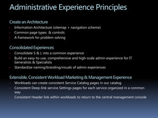
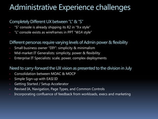
The document provides details about a UX designer and their experience and design process. It then summarizes two projects the designer worked on:
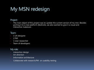
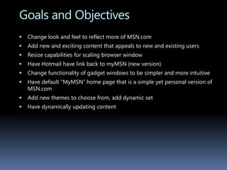
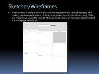
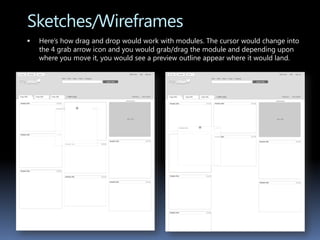
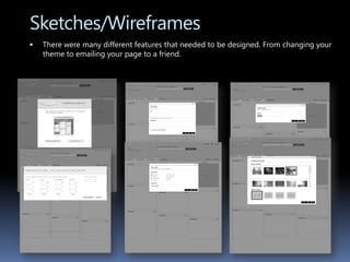
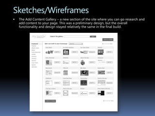
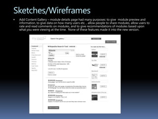
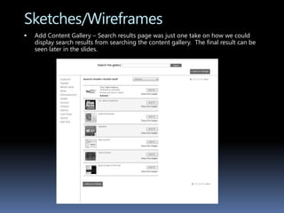
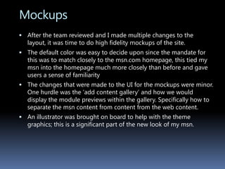
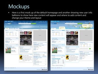
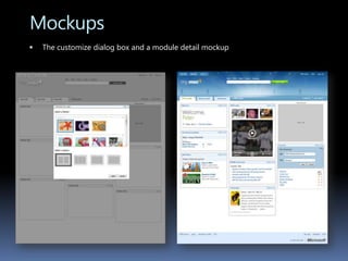
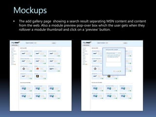
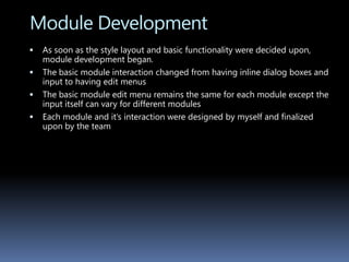
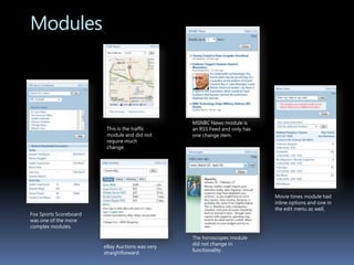
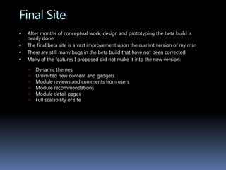
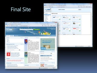
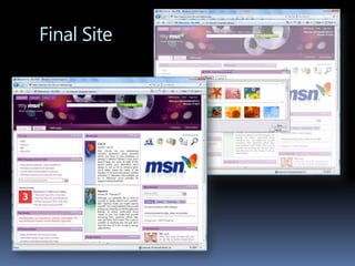
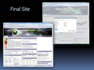
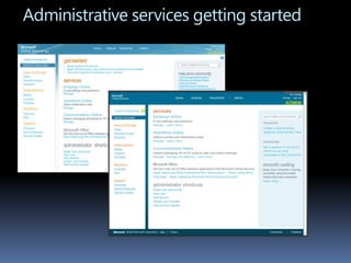
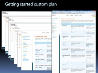
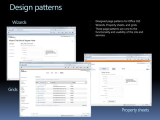
1) A redesign of MSN's "My MSN" portal website. The goal was to update the look and improve usability. Wireframes and mockups were created and modules were developed.
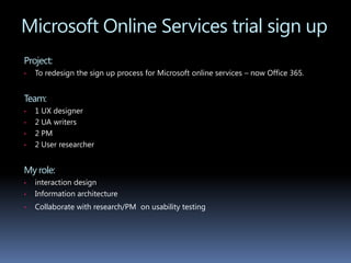
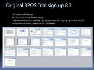
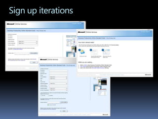
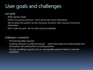
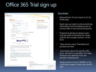
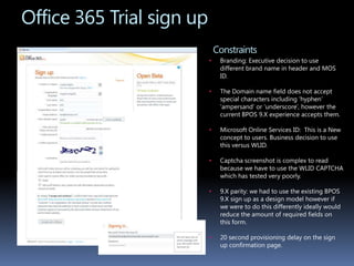
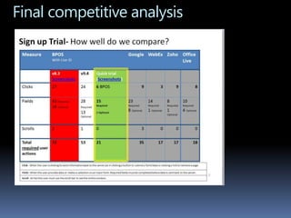
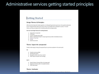
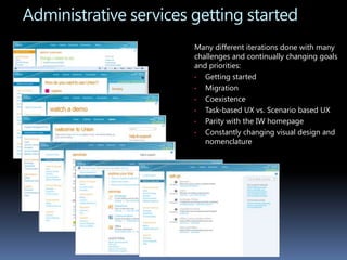
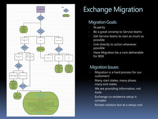
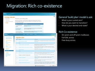
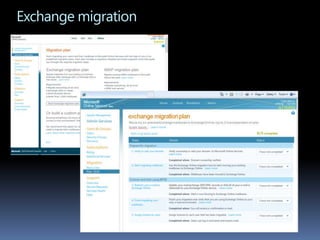
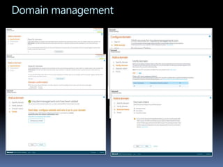
2) Redesigning the signup process for Microsoft Online Services trials. The original process took over 70 clicks to complete. The redesign simplified the process and provided immediate access to services.