Download to read offline

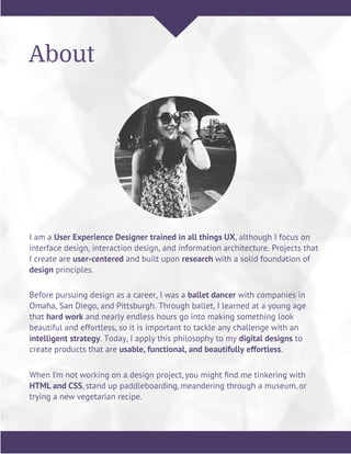

Carly Bruce is a user experience designer with a background in ballet. She utilizes a thorough design process that begins with research like interviews and usability testing. For a case study, she worked with Texts.com to redesign their information architecture and user flows based on findings from analyzing their current site. Key changes included separating the buying and selling features in the navigation and simplifying product pages. Testing the new wireframes provided insights that further improved the redesign.