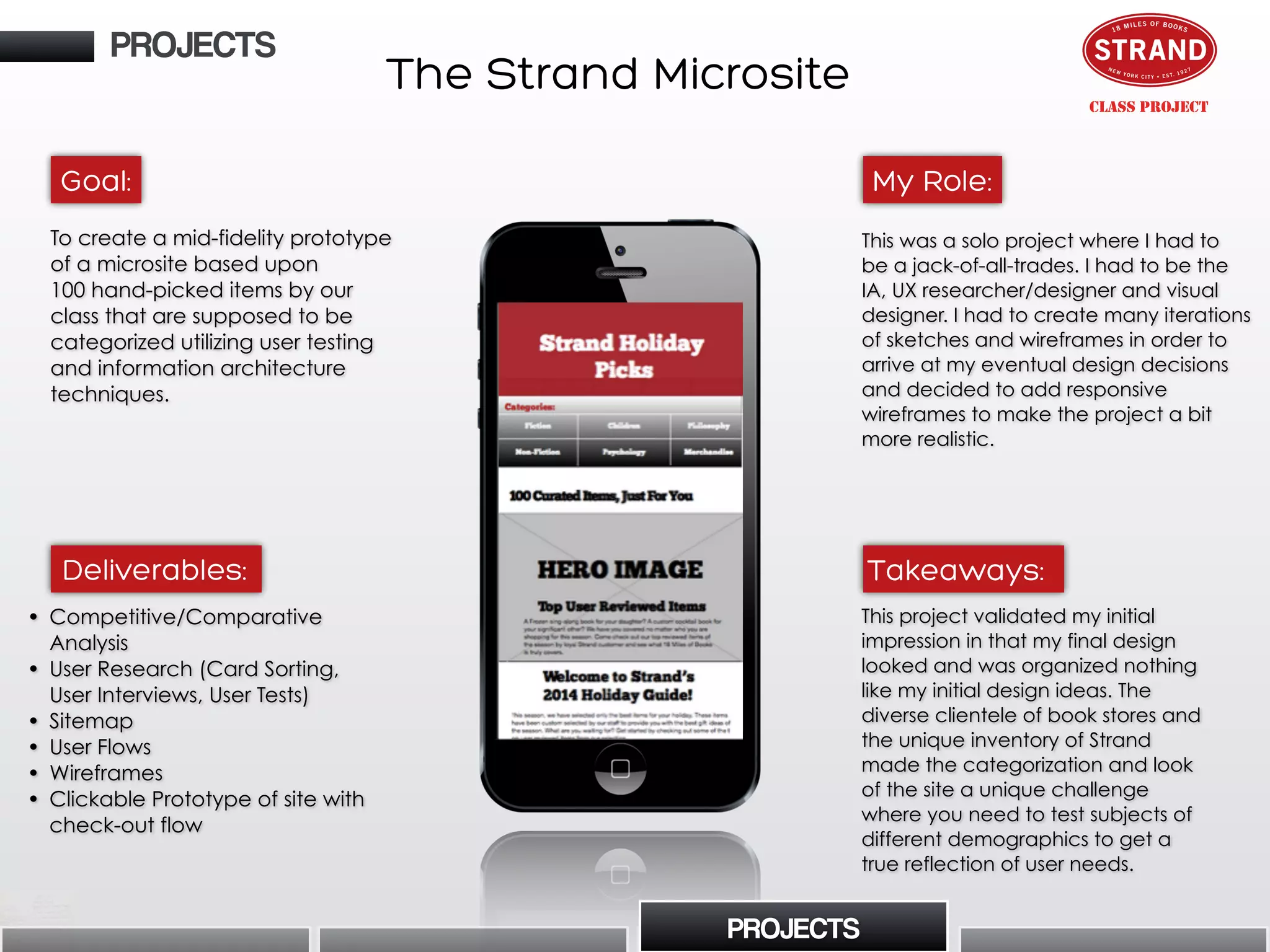
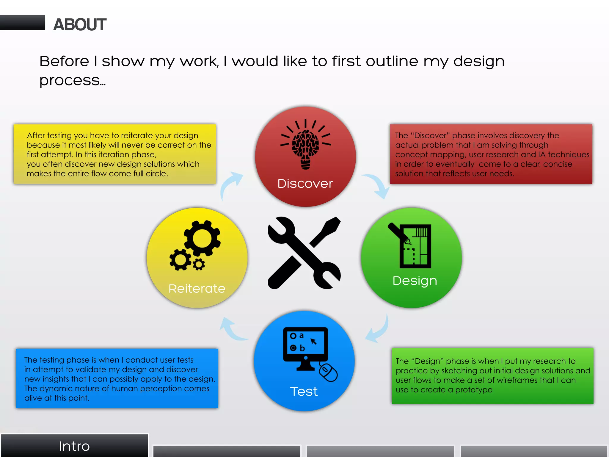
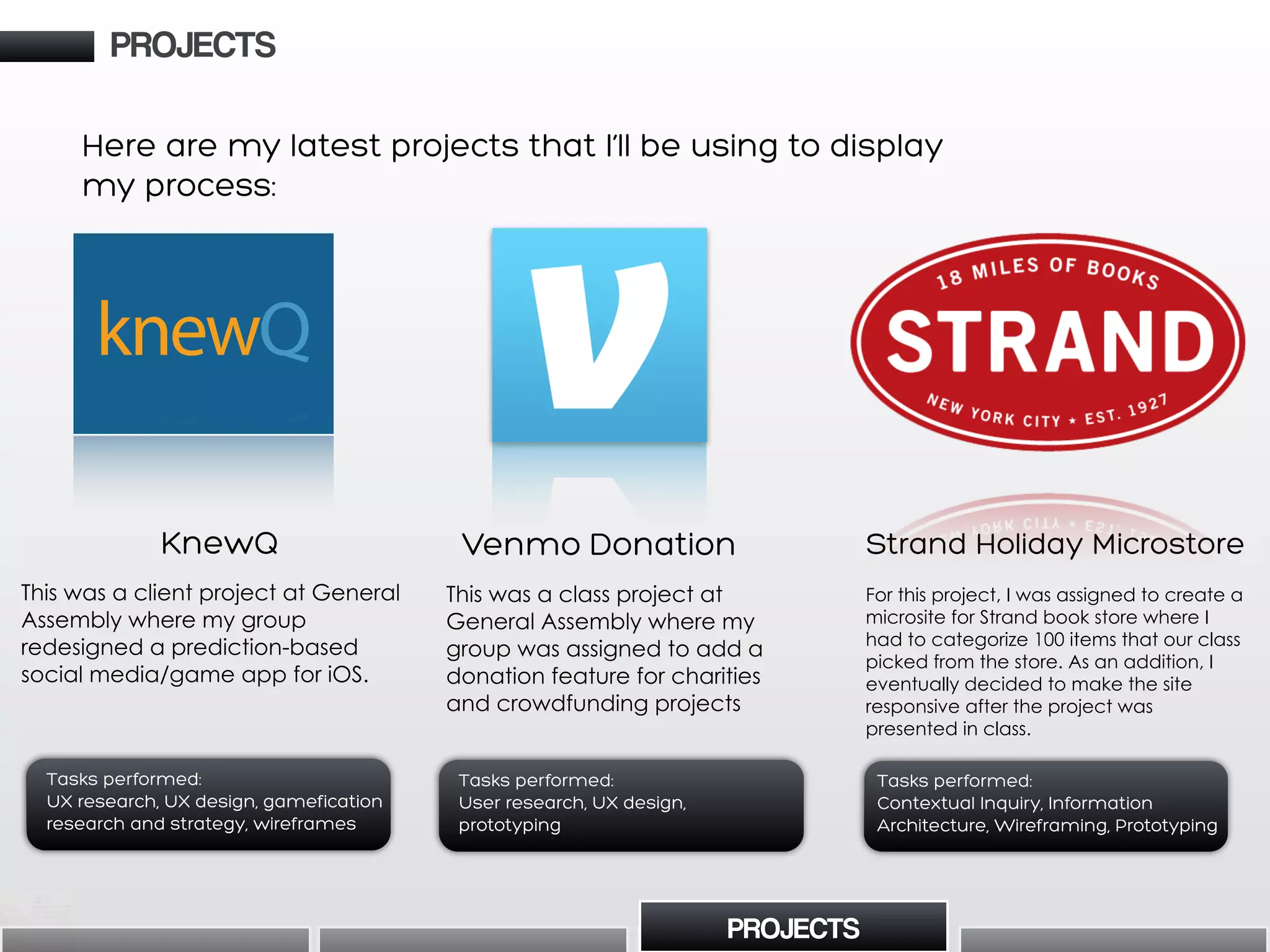
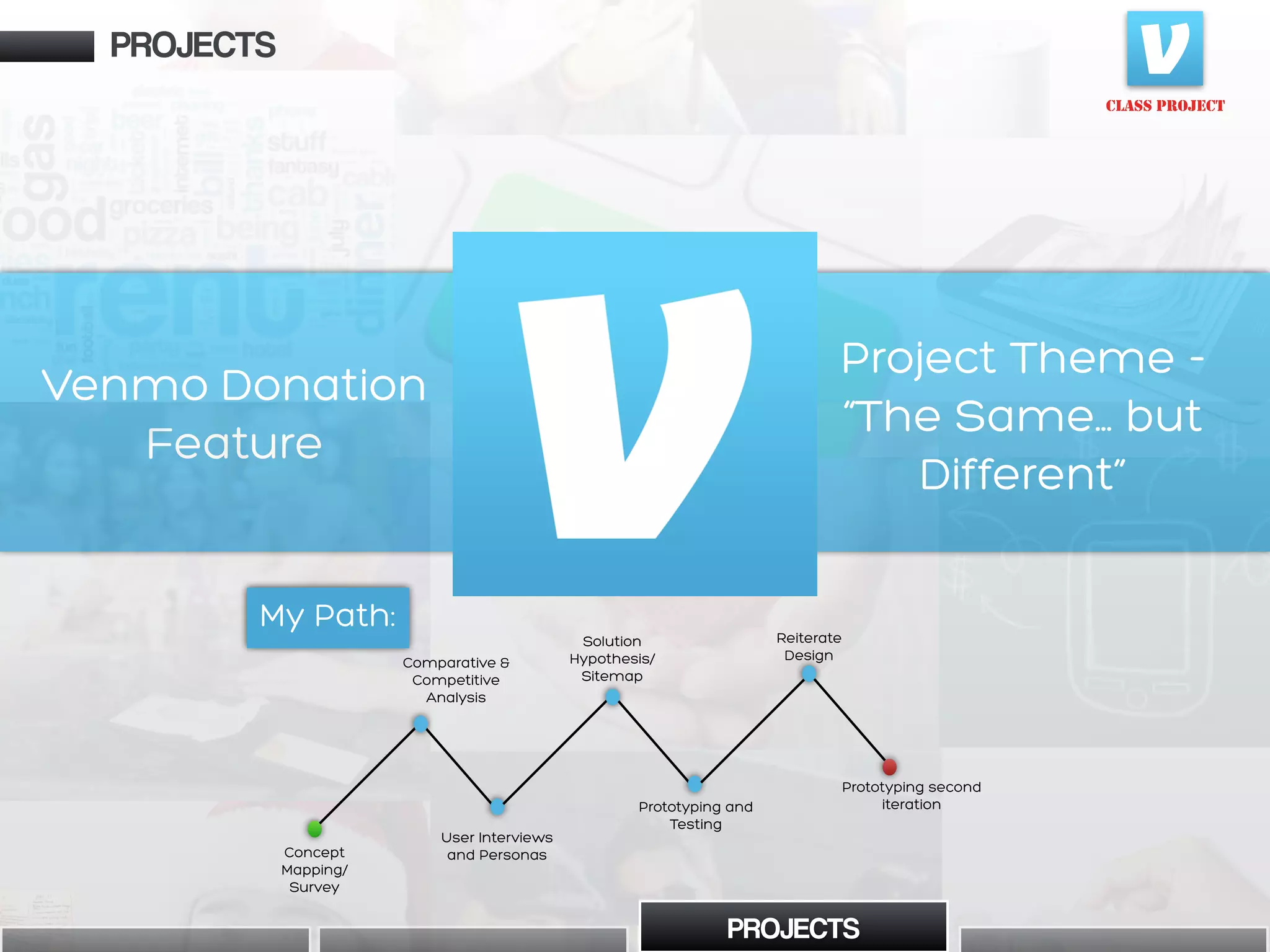
Sean Culley provides a summary of his UX portfolio and design process. He begins with an introduction and overview of his approach to understand user behaviors through research in order to create intuitive experiences. He then outlines his design process of discover, design, test, and reiterate. Several case studies are presented, including a donation feature for Venmo and a redesign of the KnewQ prediction app. For each project, Sean discusses the goals, tasks performed, deliverables and key learnings. He provides documentation of user research, wireframes, prototypes and results from usability testing.


![Home/Landing page
Options from Home
Pay Screen from Home
Transaction Screen from
Home
Displayed Content from
Profile
Features from Profile
Options from Hamburger Button
(Settings)
Settings Sub-Options
Legend
CLASS PROJECT
Sitemap
• I created a sitemap for
Venmo’s current interface
along with our added features
built into the landing page and
settings page to gain a better
understanding of the content
hierarchy. For a mobile app like
Venmo with a less distinct
content hierarchy, this was a
unique challenge.
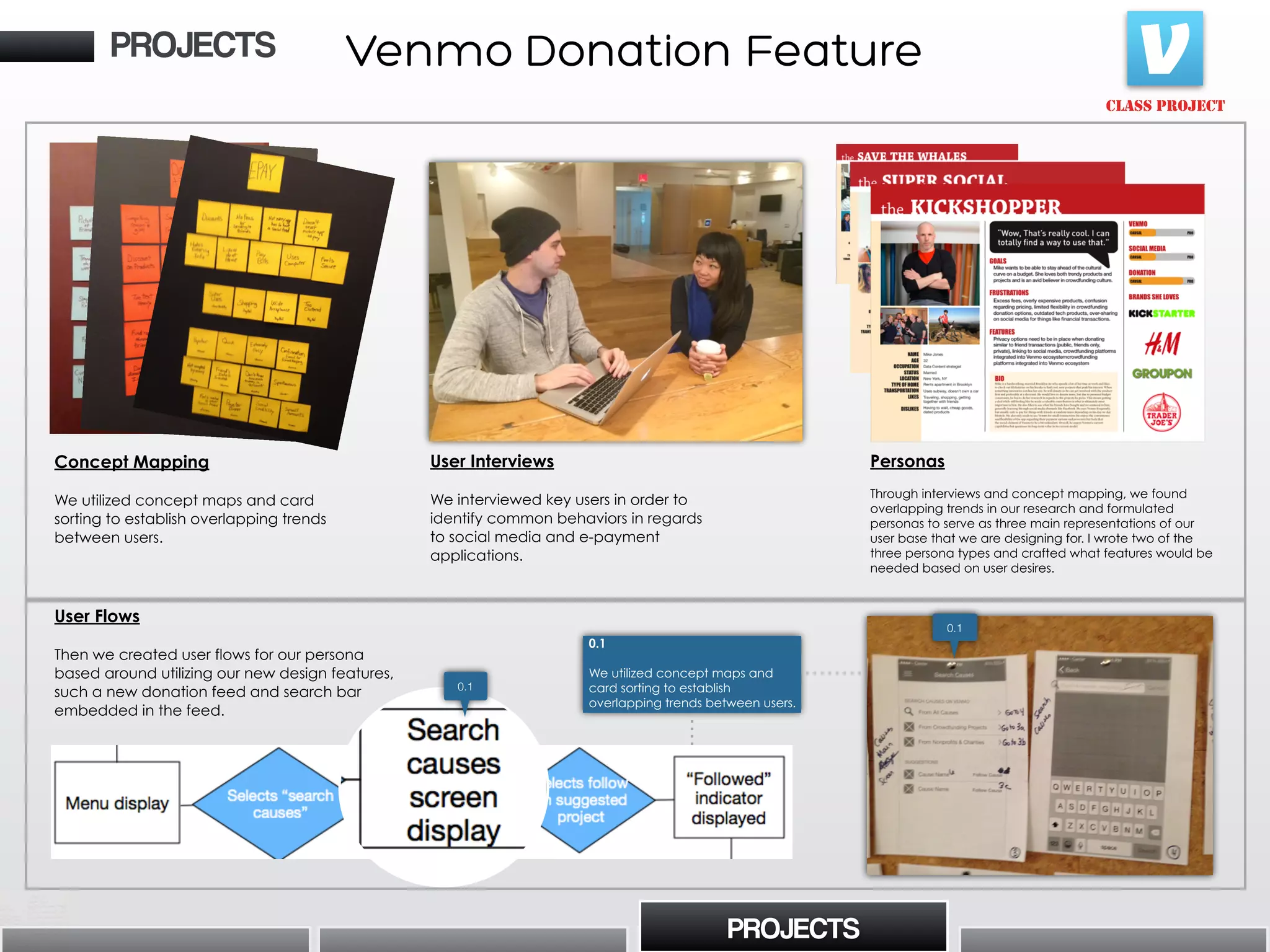
PROJECTS
0.1
PROJECTS
0.1
• Highlights our design decision to
use “causes” as an umbrella term with
“non-profit/charities” and
“crowdfunding” as sub-categories.
• This decision caters to both the
users’ desire to access content quickly
but also making the cultural distinction
between “cause” types in the search
menu.
“If we provide a structure that differentiates
between causes and people on Venmo, then we
can provide more efficient searching capabilities
because users want to browse and search for
causes.”
Solution Hypothesis
(i.e. my favorite UX technique)
In the middle of our research, we realized that the initial
scope of the project began changing due to the clear
demographic distinction between users who donating to
charities and users who only contributed to
crowdfunding projects. For clarification, I suggested that
we should brainstorm a solution hypothesis (if/then
statement) that directly states what we are solving. His
helped us stay on task and not get lost in the process.
Venmo Donation Feature
If [action] then [outcome] because
[customer need/problem]](https://image.slidesharecdn.com/uxportfolioslideshare-150305171012-conversion-gate01/75/Ux-portfolio-slideshare-16-2048.jpg)