1. Dylan Reynolds
Fonts research.
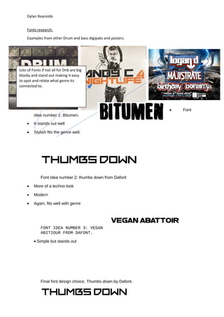
Examples from other Drum and bass digipaks and posters.
• Font
idea number 1: Bitumen.
• It stands out well
• Stylish fits the genre well.
Font idea number 2: thumbs down from Dafont
• More of a techno look
• Modern
• Again, fits well with genre
FONT IDEA NUMBER 3: VEGAN
ABITIOUR FROM DAFONT.
• Simple but stands out
Final font design choice. Thumbs down by Dafont.
Lots of Fonts if not all for Dnb are big
blocky and stand out making it easy
to spot and relate what genre its
connected to.
2. Dylan Reynolds
I decided to go with this font because of its modern stand out look. As you can see
from some of the examples above it has a similar look which is good as that will make it easy
for the target audience to relate to it.