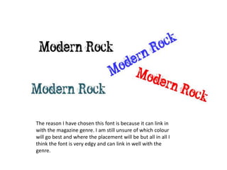
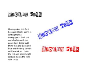
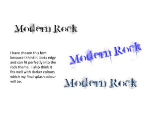
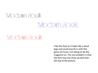
FontI have decide to call my music magazine modern rock because the type of music I will be doing it on it indie which is  a mixture of different rock sounds. I am going to be looking at different fonts to see which one will fit best in my final product. I will be using various fonts on my front cover contents and double page spread but the first thing I am looking at will be what the splash font will be. I am also going to be looking at different colours to see which colour will fit the best to the magazine.
The reason I have chosen this font is because it can link in with the magazine genre. I am still unsure of which colour will go best and where the placement will be but all in all I think the font is very edgy and can link in well with the genre.
I have picked this font because it looks as if it is cutting from a newspaper. I think this can also link with the genre I am doing but I think that the black and blue are the only colours which work, as I think the red and other bright  colours makes the font look tacky.
I have chosen this font because I think it looks edgy and can fit perfectly into the rock theme.  I also think it fits well with darker colours which my final splash colour will be.
I like this font as it looks like a band logo and could also fit in with the genre of music I am doing to do the magazine on. The one problem is that the font may not show up well over the top of the picture.
To conclude I think that all the fonts could fit in well with my magazine. So I have decided to do the whole of my magazine and put the different fonts for my splash on at the end and see which one looks the best .

Fonts N Tht

  • 1.
    FontI have decideto call my music magazine modern rock because the type of music I will be doing it on it indie which is a mixture of different rock sounds. I am going to be looking at different fonts to see which one will fit best in my final product. I will be using various fonts on my front cover contents and double page spread but the first thing I am looking at will be what the splash font will be. I am also going to be looking at different colours to see which colour will fit the best to the magazine.
  • 2.
    The reason Ihave chosen this font is because it can link in with the magazine genre. I am still unsure of which colour will go best and where the placement will be but all in all I think the font is very edgy and can link in well with the genre.
  • 3.
    I have pickedthis font because it looks as if it is cutting from a newspaper. I think this can also link with the genre I am doing but I think that the black and blue are the only colours which work, as I think the red and other bright colours makes the font look tacky.
  • 4.
    I have chosenthis font because I think it looks edgy and can fit perfectly into the rock theme. I also think it fits well with darker colours which my final splash colour will be.
  • 5.
    I like thisfont as it looks like a band logo and could also fit in with the genre of music I am doing to do the magazine on. The one problem is that the font may not show up well over the top of the picture.
  • 6.
    To conclude Ithink that all the fonts could fit in well with my magazine. So I have decided to do the whole of my magazine and put the different fonts for my splash on at the end and see which one looks the best .