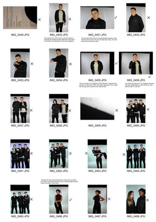
IMG_0449.JPG
IMG_0453.JPG
IMG_0457.JPG
IMG_0461.JPG
IMG_0465.JPG
IMG_0450.JPG
IMG_0454.JPG
IMG_0458.JPG
IMG_0462.JPG
IMG_0466.JPG
IMG_0451.JPG
IMG_0455.JPG
IMG_0459.JPG
IMG_0463.JPG
IMG_0467.JPG
IMG_0452.JPG
IMG_0456.JPG
IMG_0460.JPG
IMG_0464.JPG
IMG_0468.JPG
The reason why I didn't want to use this picture is
because the camera and the angle that I took this in
is not what I am looking for in my music magazine.
This picture will be one of my model photos because I really
like this picture and in this one he looks like a thug. This one
really suits my idea very well.
I thought this was a good picture and it really suits my genre
and I think it would go really well with a contents page because
it suits the layout I would want.
This one will go in my magazine 100% because I really like this
picture on a DPS and I think it will looks really good. Also I really
like the way josh is posed in this camera shot.
This picture will also go in my magazine because
I like the representation on this picture an Josh
looks the part in it as well.
IMG_0469.JPG
IMG_0473.JPG
IMG_0477.JPG
IMG_0481.JPG
IMG_0470.JPG
IMG_0474.JPG
IMG_0478.JPG
IMG_0482.JPG
IMG_0471.JPG
IMG_0475.JPG
IMG_0479.JPG
IMG_0472.JPG
IMG_0476.JPG
IMG_0480.JPG
In this picture there is too many people so I don't think it would be a good idea
to have them all in one picture also it doesn't really suit my idea well.
This picture would be an okay picture for a DPS or contents page
because it can be in the centre then have text around it, but I haven't
chose this one because I don't like the background.
This is the same as the other image but
in this one the camera angle is a bit off so I chose
not to use it.
In this group photos I think there is too many people
also I think it doesn't really suit my genre so i decided not
to pick it.
I picked this one because I think it looks really good
with a contents page or a DPS. This one is really efffective
because it looks thuggish.

Contacts sheet