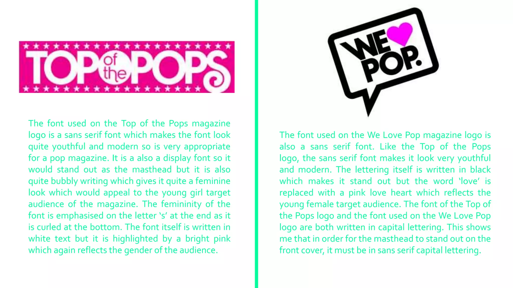
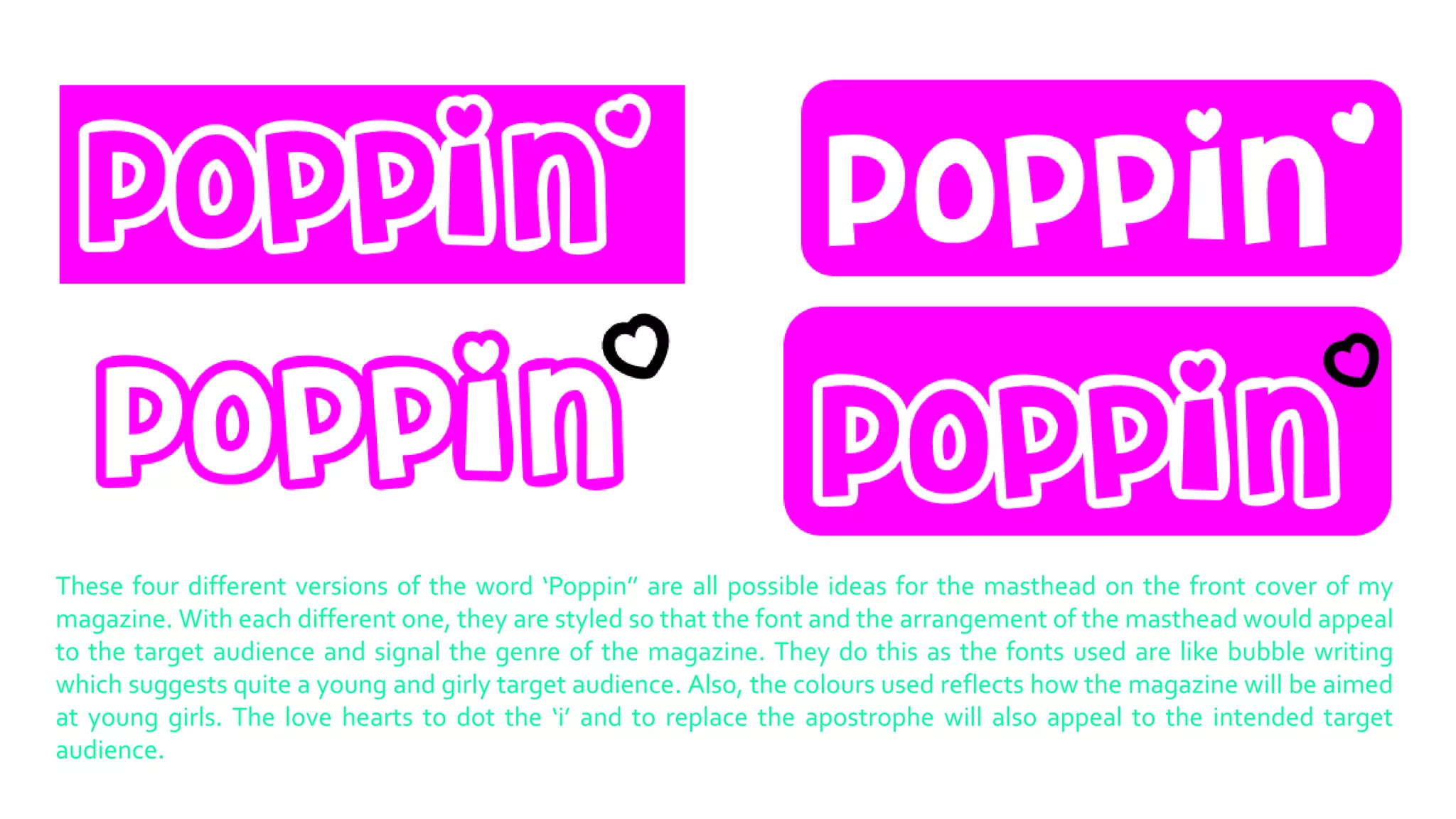
The document discusses fonts used for magazine logos and mastheads. It analyzes fonts used for the Top of the Pops and We Love Pop magazine logos, noting they are sans serif fonts that look youthful, modern, and appropriate for pop magazines. Both logos use all capital lettering to make the mastheads stand out. The document also presents four versions of "Poppin'" as possible ideas for a magazine masthead, featuring bubbly fonts, colors, and hearts appealing to a young female audience.