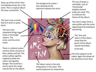
1. Close-up of the artist’s face. The use of props is
The background is plain – inevitable. Lots of
Immediately know she is the thus drawing all the
artist. This is a typical album ‘homemade’
attention towards the artist. brightly colored
CD cover convention.
props are used. This
re-enforces the
theme of the album.
The text is has an Aztec
feel to it and it is quite The shot is taken from a
blunt. side-profile with the artist
appearing to be looking at
The two most something.
important things are
those in the bright The font and
colours. The colour of the album
artist, and the artist show that the
name. genre of the album
would most likely
There is a distinct colour to be pop.
scheme which consists of
blue, yellow and red. The The artist appears to be
colour yellow signifies naked. Again this draws all
happiness while the the attention to her face.
colour red signifies
danger. This could be a The album name is the only
clue to what the songs thing white in this cover. This
may be like on the album. could emphasise its importance.
2. Information overload – Obvious colour scheme –
lots of bright different red, yellow, orange, white. Name is in the middle of
colours. the page (conventional)
but it is not immediately
The genre looks like it will obvious.
be a folk album. The album name is not
immediately obvious
either – so she has put
The font is swirly and her name and the album
folk-like. This conveys name in the top left so it
the idea that the album is clearer.
will be mostly folky
(possibly just a guitar
and her voice). Follows the
convention: album
name, artist, songs
The album name – Alas I
included and a
cannot Swim is an
review.
unconventional name
which may signify that
this is how the album
and the songs will be
like – unconventional. The illustrations are
made to deliberately The album cover is similar
The colour red signifies look hand-drawn to Craig Thompson’s –
danger, while the colour this could give the Friend and Foe. In the fact
orange symbolises album a personal that it is an information
happiness. feel. overload.
3. The hat is juxtaposed in this Strict colour scheme.
The font looks almost like a image because it looks out of Black, white and red. The
circus font. This idea I re- place compared to everything black and white is
enforced by the hat that the else in the image. monochrome so this tells
artist is wearing. us that the album might be
quite conventional – but
the red implies that their
might be a few twists.
Close-up shot of the artist
– typical convention of a
pop-album cover. The album name is un-
conventional (like Laura
Marling’s album) –
shows that it may not
Direct mode of be the typical pop
address – eye contact genre convention.
being made with the
audience.
Because her eyes are
the only thing blue in The background is a
plain wight – drawing Similar album cover to
this picture – the
all of our attention to Jessie J’s cover – Who
audience are instantly
the artist (typical pop You Are.
drawn to them.
genre convention).