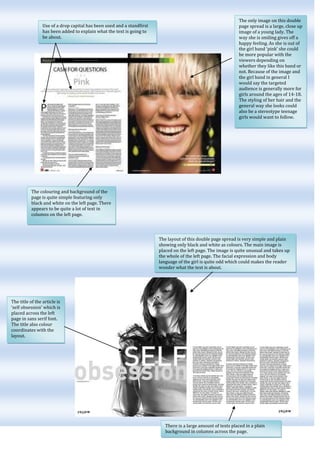
The document describes the layout and design elements of several magazine double page spreads. It notes the use of large images, colored text, drop caps, and column formatting to draw the eye and guide the reader through the content. Specific techniques mentioned include highlighting names in color, using quotations and catchphrases, and coordinating stylistic elements like colors with the topic or people featured. The target audiences seem to be teenagers and fans of rock music or particular bands based on the images and styles presented.