SlideShare a Scribd company logo
1 of 3
After experimenting with
different fonts I narrowed
them down to a top
three. I have decided to
use the last one (Viranda)
as it is bold and stands
out but at the same time
its not overly
exaggerated. As well as
that the letters are quite
compressed together
making it easier to fit on
the magazine. This font
also looks sophisticated
and will convey the
higher quality of my
magazine.
I have also experimented
with different colours. I
have decided to use a
white font as I feel that
the red one will be too
much because my
background will also be
red therefore there would
be too many shades of
red on the page. Similarly,
I discarded the turquoise
font because my actress
will be wearing her
turquoise dress, and as
much as it would work
well with it I feel that it
wouldn’t really stand out.
The masthead will be on a black background so that the contrast between
the black and the white will clearly stand out, however I feel that at the
moment this doesn’t look like a masthead because of the two words.


This is the final masthead the contrasting colours make it clearly stand out
as well as memorable. The overlapping words make this look more like a
professional masthead and at the same time make it more eye-catching.

More Related Content

Viewers also liked (19)

MorenoHernándezAlejandro_AVI
MorenoHernándezAlejandro_AVIMorenoHernándezAlejandro_AVI
MorenoHernándezAlejandro_AVI
 
Glocalschool160325
Glocalschool160325Glocalschool160325
Glocalschool160325
 
HardPoint info
HardPoint infoHardPoint info
HardPoint info
 
Letter Dadang (1)
Letter Dadang (1)Letter Dadang (1)
Letter Dadang (1)
 
Gâteau déli cannelle
Gâteau déli cannelleGâteau déli cannelle
Gâteau déli cannelle
 
Oracle Mobile Sales Assistant At Work 2008
Oracle Mobile Sales Assistant At Work 2008Oracle Mobile Sales Assistant At Work 2008
Oracle Mobile Sales Assistant At Work 2008
 
17 สรุป
17 สรุป17 สรุป
17 สรุป
 
Paper 5
Paper 5Paper 5
Paper 5
 
CV
CVCV
CV
 
BFBM(13-2015) Waves of change bfbm-13
 BFBM(13-2015) Waves of change  bfbm-13 BFBM(13-2015) Waves of change  bfbm-13
BFBM(13-2015) Waves of change bfbm-13
 
Ensayo
EnsayoEnsayo
Ensayo
 
Yourprezi
YourpreziYourprezi
Yourprezi
 
My Application
My ApplicationMy Application
My Application
 
Conquiztador- 2012 Finals
Conquiztador- 2012 FinalsConquiztador- 2012 Finals
Conquiztador- 2012 Finals
 
Glocalschool(特別編)池田町スペシャル
Glocalschool(特別編)池田町スペシャルGlocalschool(特別編)池田町スペシャル
Glocalschool(特別編)池田町スペシャル
 
La cistitis
La cistitisLa cistitis
La cistitis
 
Cistitis
CistitisCistitis
Cistitis
 
Basel 2
Basel 2Basel 2
Basel 2
 
America's economic engine: Tapping the brakes
America's economic engine: Tapping the brakesAmerica's economic engine: Tapping the brakes
America's economic engine: Tapping the brakes
 

Similar to Choosing the Perfect Font and Color Combination for a Magazine Masthead

Colour themes and fonts
Colour themes and fontsColour themes and fonts
Colour themes and fontsjudytakulpa
 
Colour themes and fonts
Colour themes and fontsColour themes and fonts
Colour themes and fontsjudytakulpa
 
School publication evaluation
School publication evaluation School publication evaluation
School publication evaluation LaylaMed
 
School puplication evaluation
School puplication evaluationSchool puplication evaluation
School puplication evaluationLaylaMed
 
Fonts N Tht
Fonts N ThtFonts N Tht
Fonts N Thtbenjo7
 
Fonts N Tht
Fonts N ThtFonts N Tht
Fonts N Thtbenjo7
 
Fonts N Tht
Fonts N ThtFonts N Tht
Fonts N Thtbenjo7
 
Stylesheet
StylesheetStylesheet
StylesheetBirteb
 
Final why are fonts and colours important
Final why are fonts and colours importantFinal why are fonts and colours important
Final why are fonts and colours importantAS Media Column E
 
Font analysis 10 different fonts
Font analysis 10 different fontsFont analysis 10 different fonts
Font analysis 10 different fontslouisahill99
 
Masthead analysis
Masthead analysisMasthead analysis
Masthead analysiskiera1995
 
why are fonts and colours important
 why are fonts and colours important why are fonts and colours important
why are fonts and colours importantAS Media Column E
 
Magazine title designs.
Magazine title designs.Magazine title designs.
Magazine title designs.ryanrococo
 
Magazine Details and Planning
Magazine Details and Planning Magazine Details and Planning
Magazine Details and Planning Bryony Storm
 

Similar to Choosing the Perfect Font and Color Combination for a Magazine Masthead (20)

Colour themes and fonts
Colour themes and fontsColour themes and fonts
Colour themes and fonts
 
Colour themes and fonts
Colour themes and fontsColour themes and fonts
Colour themes and fonts
 
School publication evaluation
School publication evaluation School publication evaluation
School publication evaluation
 
School puplication evaluation
School puplication evaluationSchool puplication evaluation
School puplication evaluation
 
Style sheet
Style sheetStyle sheet
Style sheet
 
Fonts N Tht
Fonts N ThtFonts N Tht
Fonts N Tht
 
Fonts N Tht
Fonts N ThtFonts N Tht
Fonts N Tht
 
Fonts N Tht
Fonts N ThtFonts N Tht
Fonts N Tht
 
Mood board
Mood boardMood board
Mood board
 
Colours
ColoursColours
Colours
 
Stylesheet
StylesheetStylesheet
Stylesheet
 
Final why are fonts and colours important
Final why are fonts and colours importantFinal why are fonts and colours important
Final why are fonts and colours important
 
Font analysis 10 different fonts
Font analysis 10 different fontsFont analysis 10 different fonts
Font analysis 10 different fonts
 
Masthead analysis
Masthead analysisMasthead analysis
Masthead analysis
 
why are fonts and colours important
 why are fonts and colours important why are fonts and colours important
why are fonts and colours important
 
Magazine title designs.
Magazine title designs.Magazine title designs.
Magazine title designs.
 
Fonts
FontsFonts
Fonts
 
Photoshop skills
Photoshop skillsPhotoshop skills
Photoshop skills
 
Magazine Details and Planning
Magazine Details and Planning Magazine Details and Planning
Magazine Details and Planning
 
Fonts
FontsFonts
Fonts
 

Choosing the Perfect Font and Color Combination for a Magazine Masthead

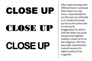
  • 1. After experimenting with different fonts I narrowed them down to a top three. I have decided to use the last one (Viranda) as it is bold and stands out but at the same time its not overly exaggerated. As well as that the letters are quite compressed together making it easier to fit on the magazine. This font also looks sophisticated and will convey the higher quality of my magazine.
  • 2. I have also experimented with different colours. I have decided to use a white font as I feel that the red one will be too much because my background will also be red therefore there would be too many shades of red on the page. Similarly, I discarded the turquoise font because my actress will be wearing her turquoise dress, and as much as it would work well with it I feel that it wouldn’t really stand out.
  • 3. The masthead will be on a black background so that the contrast between the black and the white will clearly stand out, however I feel that at the moment this doesn’t look like a masthead because of the two words. This is the final masthead the contrasting colours make it clearly stand out as well as memorable. The overlapping words make this look more like a professional masthead and at the same time make it more eye-catching.