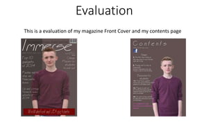
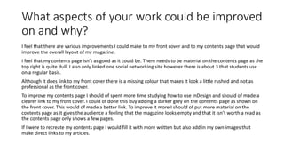
Evaluation 
This is a evaluation of my magazine Front Cover and my contents page
How does your magazine represent particular 
social groups? 
My magazine represents particular social groups in many ways. For example my main 
cover image shows a teenage boy which represents that my magazine is aimed at a 
teenage audience. In multiple places on the front cover it also has cover lines that are 
aimed at students which also connote my target audience of the magazine. For example 
the picture underneath is a cut out of a cover line from my magazine saying “ Cheap 
places for students to eat out” this represents students by connoting that it can be hard 
to eat out without a constant income. 
The skyline on my magazine also denotes my target audience as students/young people 
by reading “The magazine that every student must read” this was 
used to entice my target audience and make them feel as though 
they are missing out if they don’t read it. 
The colours used on the front cover and the contents page are dull 
colours however I used them to represent a mature magazine that 
my target audience will be attracted to.
How did you attract/address your audience? 
Throughout the whole magazine I addressed my target audience as students rather than young people as I feel 
that gives my magazine a more mature feel which is what I was wanting to achieve. I also feel that by using the 
3 colour rule on my magazine front cover and contents page I have made it more professional, this is also an 
effect many well known magazines use because by using more than 3 colours it can make your magazine look 
like there is to much going on and can put readers off buying or reading your magazine. 
My main cover image also plays a big part when attracting my audience to my magazine. This is because my 
main cover image is a picture of a teenage student around the same age of my target audience. I used that 
aged model as a representation of my target audience in hope that my target audience would feel they can 
relate to the age of my model and therefore buy the magazine. 
I used my cover lines to help my represent my target audience by talking about topics that students will be 
interested in. This attracts my target audience because people will only read magazines that feature articles 
that they have a interest or passion in.
What aspects of your work are you pleased 
and why? 
In general I am very pleased with how my front cover and how my contents page look like. I feel like my front 
cover has been made to a professional standard and attracts my target audience. It has all the conventions of a 
magazine that are expected like a masthead, skyline, puff, cover lines, main image, barcode, date and price. 
My main cover image fits the shot type that are used by nearly all magazines this being a medium close up 
with my model making direct eye contact with the audience. He is making direct eye contact with the audience 
because it give the audience and effect that the magazine is directly linked to them. 
I am also vey pleased with my masthead design as I feel that it has a professional look however it also has a 
nice style to it that would appeal to my target audience. The masthead is located in the top third of the 
magazine which is the norm in magazines, it also is big and bold. I have made it big and bold so that it stands 
out to my target audience when it is displayed on shop shelf's. 
I am very pleased with my skyline which is also located in the top third of the front cover. This also attracts the 
target audience because it makes the feel that if they don’t by the magazine that they are missing out. They 
feel this because of the way I worded my skyline stating “ The magazine that every student must read” this 
intrigues the reader and makes them wonder why every student should read, this then creates the desire to 
buy the magazine, once the desire is made they then act on the desire and purchase the magazine.
What aspects of your work could be improved 
on and why? 
I feel that there are various improvements I could make to my front cover and to my contents page that would 
improve the overall layout of my magazine. 
I feel that my contents page isn’t as good as it could be. There needs to be material on the contents page as the 
top right is quite dull. I also only linked one social networking site however there is about 3 that students use 
on a regular basis. 
Although it does link to my front cover there is a missing colour that makes it look a little rushed and not as 
professional as the front cover. 
To improve my contents page I should of spent more time studying how to use InDesign and should of made a 
clearer link to my front cover. I could of done this buy adding a darker grey on the contents page as shown on 
the front cover. This would of made a better link. To improve it more I should of put more material on the 
contents page as it gives the audience a feeling that the magazine looks empty and that it isn’t worth a read as 
the contents page only shows a few pages. 
If I were to recreate my contents page I would fill it with more written but also add in my own images that 
make direct links to my articles.

Evaluation

  • 1.
    Evaluation This isa evaluation of my magazine Front Cover and my contents page
  • 2.
    How does yourmagazine represent particular social groups? My magazine represents particular social groups in many ways. For example my main cover image shows a teenage boy which represents that my magazine is aimed at a teenage audience. In multiple places on the front cover it also has cover lines that are aimed at students which also connote my target audience of the magazine. For example the picture underneath is a cut out of a cover line from my magazine saying “ Cheap places for students to eat out” this represents students by connoting that it can be hard to eat out without a constant income. The skyline on my magazine also denotes my target audience as students/young people by reading “The magazine that every student must read” this was used to entice my target audience and make them feel as though they are missing out if they don’t read it. The colours used on the front cover and the contents page are dull colours however I used them to represent a mature magazine that my target audience will be attracted to.
  • 3.
    How did youattract/address your audience? Throughout the whole magazine I addressed my target audience as students rather than young people as I feel that gives my magazine a more mature feel which is what I was wanting to achieve. I also feel that by using the 3 colour rule on my magazine front cover and contents page I have made it more professional, this is also an effect many well known magazines use because by using more than 3 colours it can make your magazine look like there is to much going on and can put readers off buying or reading your magazine. My main cover image also plays a big part when attracting my audience to my magazine. This is because my main cover image is a picture of a teenage student around the same age of my target audience. I used that aged model as a representation of my target audience in hope that my target audience would feel they can relate to the age of my model and therefore buy the magazine. I used my cover lines to help my represent my target audience by talking about topics that students will be interested in. This attracts my target audience because people will only read magazines that feature articles that they have a interest or passion in.
  • 4.
    What aspects ofyour work are you pleased and why? In general I am very pleased with how my front cover and how my contents page look like. I feel like my front cover has been made to a professional standard and attracts my target audience. It has all the conventions of a magazine that are expected like a masthead, skyline, puff, cover lines, main image, barcode, date and price. My main cover image fits the shot type that are used by nearly all magazines this being a medium close up with my model making direct eye contact with the audience. He is making direct eye contact with the audience because it give the audience and effect that the magazine is directly linked to them. I am also vey pleased with my masthead design as I feel that it has a professional look however it also has a nice style to it that would appeal to my target audience. The masthead is located in the top third of the magazine which is the norm in magazines, it also is big and bold. I have made it big and bold so that it stands out to my target audience when it is displayed on shop shelf's. I am very pleased with my skyline which is also located in the top third of the front cover. This also attracts the target audience because it makes the feel that if they don’t by the magazine that they are missing out. They feel this because of the way I worded my skyline stating “ The magazine that every student must read” this intrigues the reader and makes them wonder why every student should read, this then creates the desire to buy the magazine, once the desire is made they then act on the desire and purchase the magazine.
  • 5.
    What aspects ofyour work could be improved on and why? I feel that there are various improvements I could make to my front cover and to my contents page that would improve the overall layout of my magazine. I feel that my contents page isn’t as good as it could be. There needs to be material on the contents page as the top right is quite dull. I also only linked one social networking site however there is about 3 that students use on a regular basis. Although it does link to my front cover there is a missing colour that makes it look a little rushed and not as professional as the front cover. To improve my contents page I should of spent more time studying how to use InDesign and should of made a clearer link to my front cover. I could of done this buy adding a darker grey on the contents page as shown on the front cover. This would of made a better link. To improve it more I should of put more material on the contents page as it gives the audience a feeling that the magazine looks empty and that it isn’t worth a read as the contents page only shows a few pages. If I were to recreate my contents page I would fill it with more written but also add in my own images that make direct links to my articles.