Download to read offline
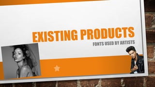
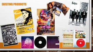
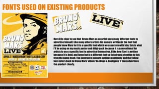
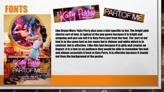
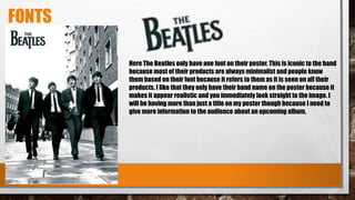
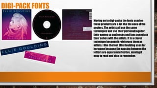

The document discusses fonts used on existing music products such as posters and digital packs. It notes that artists often use custom fonts to advertise themselves which become associated with their brand. Bruno Mars' name uses a distinctive font while "Live" stands out in a different, bold font. Katy Perry also uses an electro pink font that people associate with her brand. The Beatles keep their poster minimalistic with just their name in their iconic font. For a music poster and digital pack, the document recommends using consistent fonts throughout but featuring the artist's name in a different font to draw attention, mimic existing successful designs, and make the products look realistic.


![2015 aha-guidelines-highlights-spanish[1][1]](https://cdn.slidesharecdn.com/ss_thumbnails/2015-aha-guidelines-highlights-spanish11-160304113344-thumbnail.jpg?width=640&height=640&fit=bounds)


![Hypothalamus short notes on location, function and disorders by Dr. Neha [PT]...](https://cdn.slidesharecdn.com/ss_thumbnails/hypothalamusbydr-260124142231-2b48143d-thumbnail.jpg?width=640&height=640&fit=bounds)


