Q2. HOW EFFECTIVE IS THE
 COMBINATION OF YOUR MAIN
PRODUCT AND ANCILLARY TEXTS
• We created a house style where we have used a constant font of Trajan Pro
  throughout our ancillary text and also kept a constant colour scheme of
  black, white and dark grey.

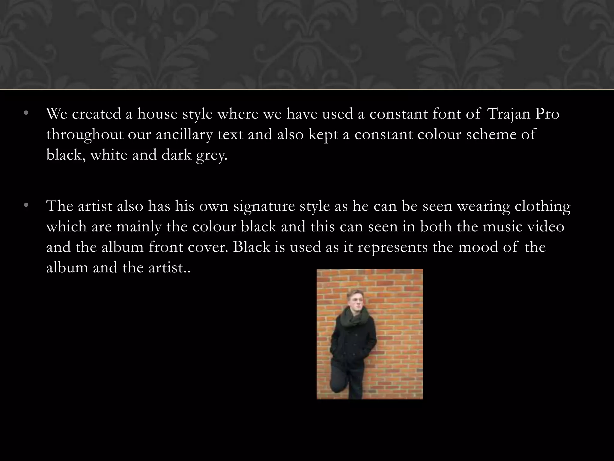
• The artist also has his own signature style as he can be seen wearing clothing
  which are mainly the colour black and this can seen in both the music video
  and the album front cover. Black is used as it represents the mood of the
  album and the artist..
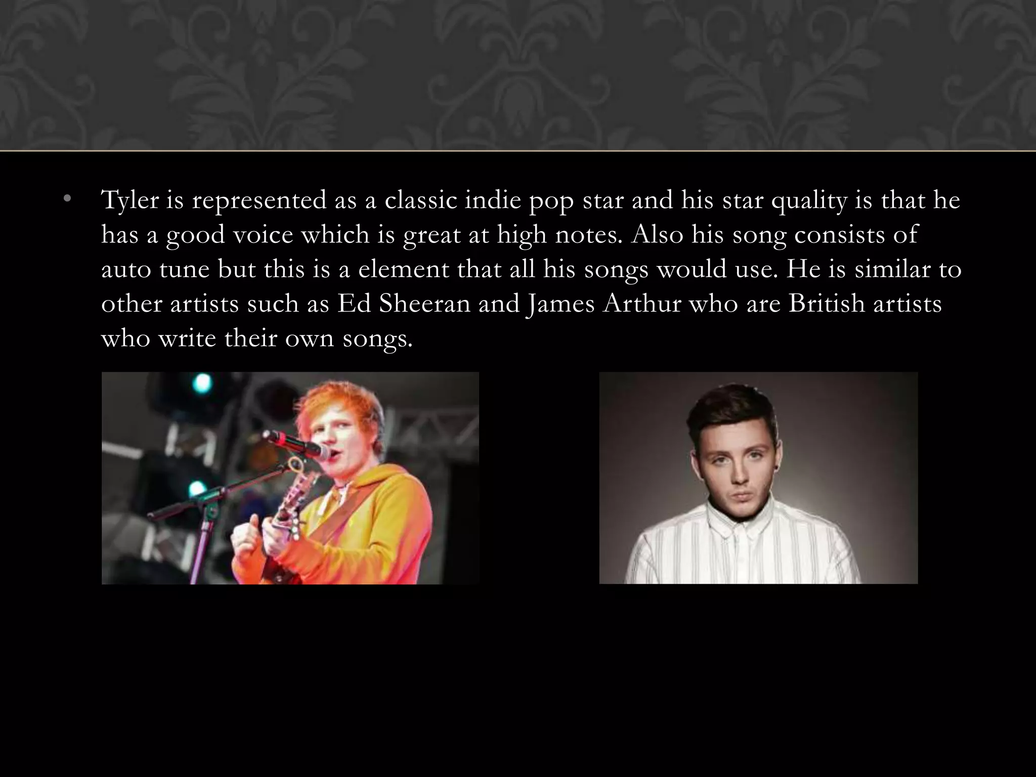
• Tyler is represented as a classic indie pop star and his star quality is that he
  has a good voice which is great at high notes. Also his song consists of
  auto tune but this is a element that all his songs would use. He is similar to
  other artists such as Ed Sheeran and James Arthur who are British artists
  who write their own songs.
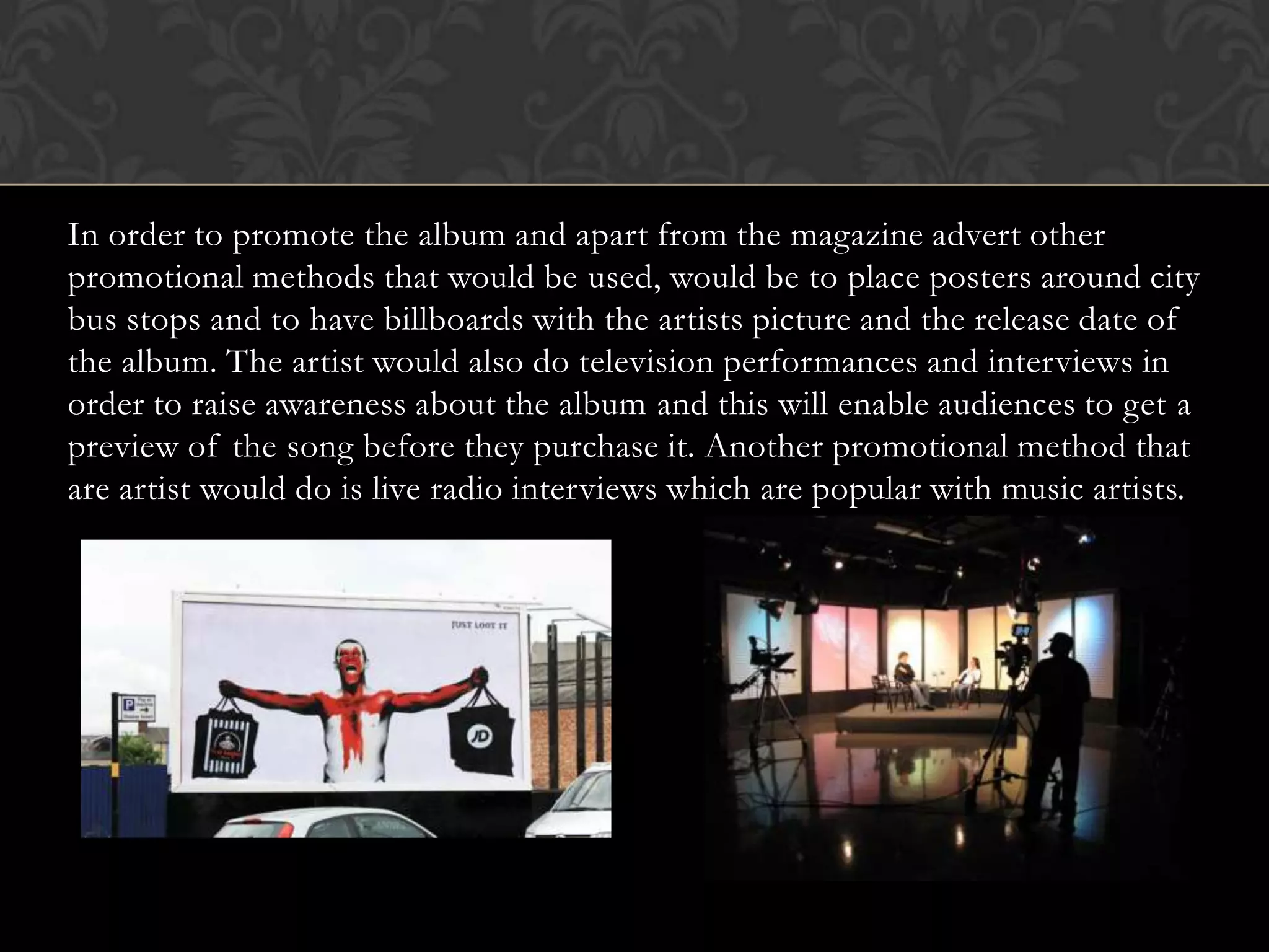
In order to promote the album and apart from the magazine advert other
promotional methods that would be used, would be to place posters around city
bus stops and to have billboards with the artists picture and the release date of
the album. The artist would also do television performances and interviews in
order to raise awareness about the album and this will enable audiences to get a
preview of the song before they purchase it. Another promotional method that
are artist would do is live radio interviews which are popular with music artists.
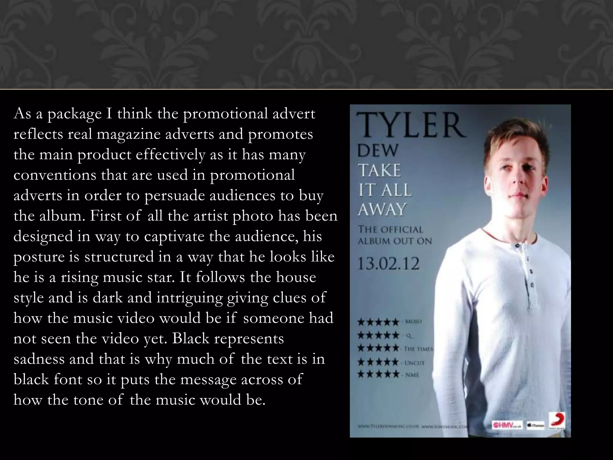
As a package I think the promotional advert
reflects real magazine adverts and promotes
the main product effectively as it has many
conventions that are used in promotional
adverts in order to persuade audiences to buy
the album. First of all the artist photo has been
designed in way to captivate the audience, his
posture is structured in a way that he looks like
he is a rising music star. It follows the house
style and is dark and intriguing giving clues of
how the music video would be if someone had
not seen the video yet. Black represents
sadness and that is why much of the text is in
black font so it puts the message across of
how the tone of the music would be.
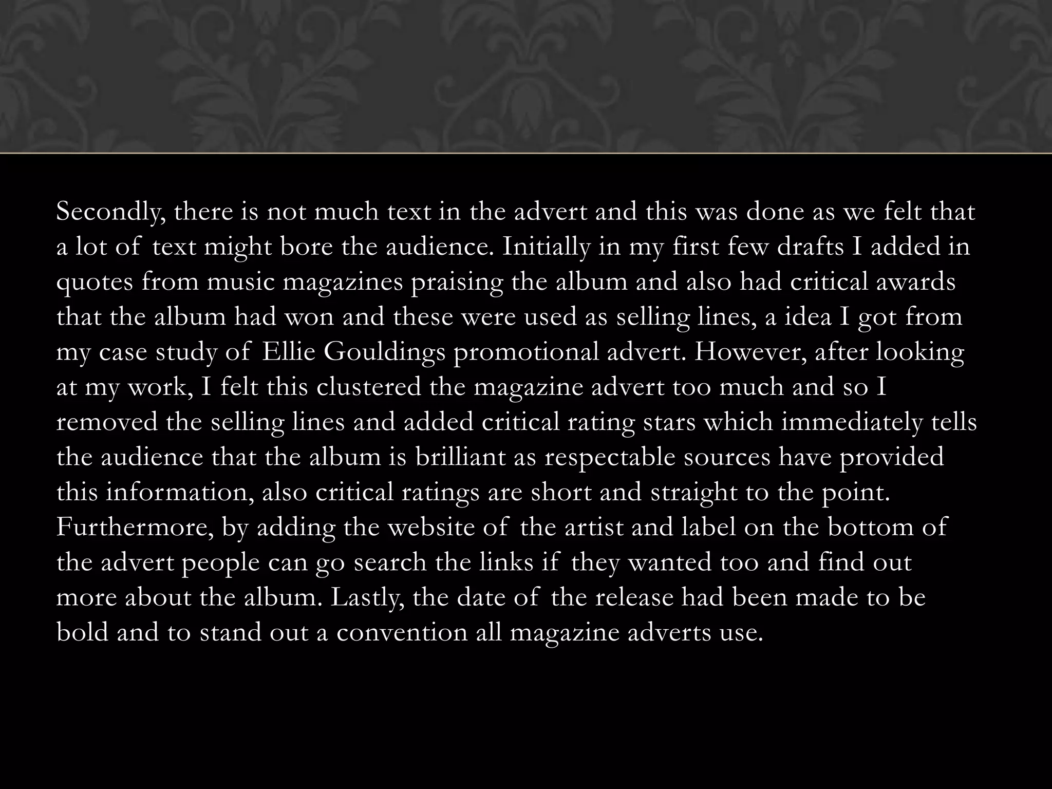
Secondly, there is not much text in the advert and this was done as we felt that
a lot of text might bore the audience. Initially in my first few drafts I added in
quotes from music magazines praising the album and also had critical awards
that the album had won and these were used as selling lines, a idea I got from
my case study of Ellie Gouldings promotional advert. However, after looking
at my work, I felt this clustered the magazine advert too much and so I
removed the selling lines and added critical rating stars which immediately tells
the audience that the album is brilliant as respectable sources have provided
this information, also critical ratings are short and straight to the point.
Furthermore, by adding the website of the artist and label on the bottom of
the advert people can go search the links if they wanted too and find out
more about the album. Lastly, the date of the release had been made to be
bold and to stand out a convention all magazine adverts use.
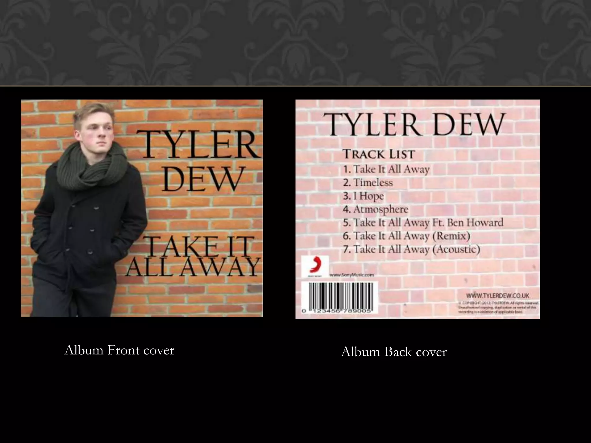
Album Front cover   Album Back cover
Throughout the ancillary texts we have used themes and motifs which relate
to the main music video. In our album cover design the idea behind the brick
wall was that in the music video an iconic scene in the video is one where the
artist is alone under a bridge leaning back against a brick wall suffering from
the pain of his relationship, so therefore the album strongly reflects to the
music video and is consistent.
CD on right insert


First Insert                        Second insert
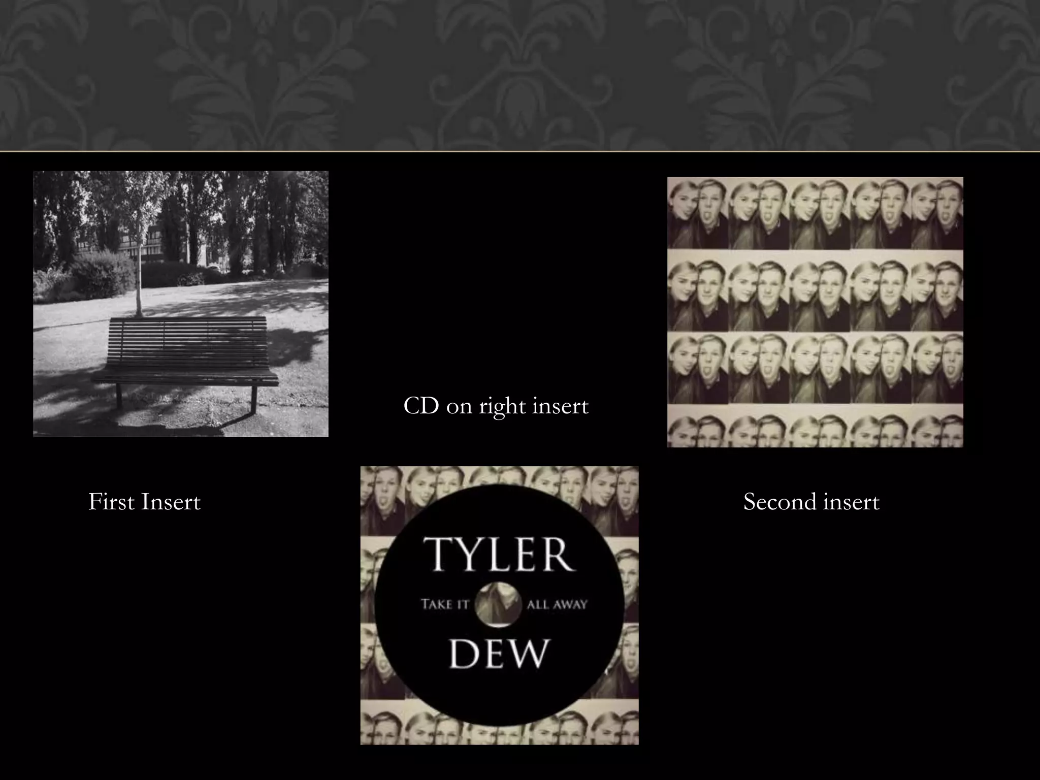
We have also related close to themes and motif in the music video again with
the inserts of the album where the empty bench connotes the past in which it
relates to the music video as the video switches between the past and the
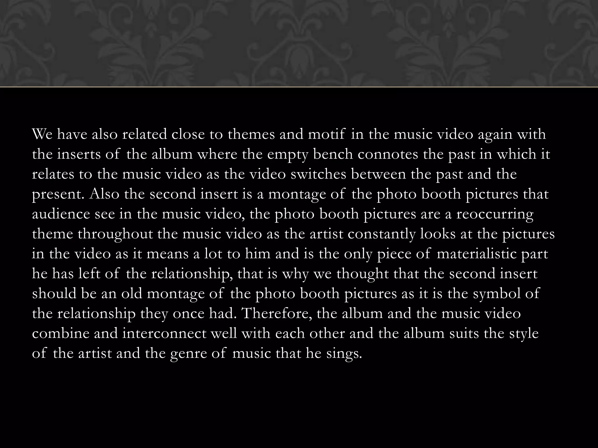
present. Also the second insert is a montage of the photo booth pictures that
audience see in the music video, the photo booth pictures are a reoccurring
theme throughout the music video as the artist constantly looks at the pictures
in the video as it means a lot to him and is the only piece of materialistic part
he has left of the relationship, that is why we thought that the second insert
should be an old montage of the photo booth pictures as it is the symbol of
the relationship they once had. Therefore, the album and the music video
combine and interconnect well with each other and the album suits the style
of the artist and the genre of music that he sings.

Q2 evaluation

  • 1.
    Q2. HOW EFFECTIVEIS THE COMBINATION OF YOUR MAIN PRODUCT AND ANCILLARY TEXTS
  • 2.
    • We createda house style where we have used a constant font of Trajan Pro throughout our ancillary text and also kept a constant colour scheme of black, white and dark grey. • The artist also has his own signature style as he can be seen wearing clothing which are mainly the colour black and this can seen in both the music video and the album front cover. Black is used as it represents the mood of the album and the artist..
  • 3.
    • Tyler isrepresented as a classic indie pop star and his star quality is that he has a good voice which is great at high notes. Also his song consists of auto tune but this is a element that all his songs would use. He is similar to other artists such as Ed Sheeran and James Arthur who are British artists who write their own songs.
  • 4.
    In order topromote the album and apart from the magazine advert other promotional methods that would be used, would be to place posters around city bus stops and to have billboards with the artists picture and the release date of the album. The artist would also do television performances and interviews in order to raise awareness about the album and this will enable audiences to get a preview of the song before they purchase it. Another promotional method that are artist would do is live radio interviews which are popular with music artists.
  • 5.
    As a packageI think the promotional advert reflects real magazine adverts and promotes the main product effectively as it has many conventions that are used in promotional adverts in order to persuade audiences to buy the album. First of all the artist photo has been designed in way to captivate the audience, his posture is structured in a way that he looks like he is a rising music star. It follows the house style and is dark and intriguing giving clues of how the music video would be if someone had not seen the video yet. Black represents sadness and that is why much of the text is in black font so it puts the message across of how the tone of the music would be.
  • 6.
    Secondly, there isnot much text in the advert and this was done as we felt that a lot of text might bore the audience. Initially in my first few drafts I added in quotes from music magazines praising the album and also had critical awards that the album had won and these were used as selling lines, a idea I got from my case study of Ellie Gouldings promotional advert. However, after looking at my work, I felt this clustered the magazine advert too much and so I removed the selling lines and added critical rating stars which immediately tells the audience that the album is brilliant as respectable sources have provided this information, also critical ratings are short and straight to the point. Furthermore, by adding the website of the artist and label on the bottom of the advert people can go search the links if they wanted too and find out more about the album. Lastly, the date of the release had been made to be bold and to stand out a convention all magazine adverts use.
  • 7.
    Album Front cover Album Back cover
  • 8.
    Throughout the ancillarytexts we have used themes and motifs which relate to the main music video. In our album cover design the idea behind the brick wall was that in the music video an iconic scene in the video is one where the artist is alone under a bridge leaning back against a brick wall suffering from the pain of his relationship, so therefore the album strongly reflects to the music video and is consistent.
  • 9.
    CD on rightinsert First Insert Second insert
  • 10.
    We have alsorelated close to themes and motif in the music video again with the inserts of the album where the empty bench connotes the past in which it relates to the music video as the video switches between the past and the present. Also the second insert is a montage of the photo booth pictures that audience see in the music video, the photo booth pictures are a reoccurring theme throughout the music video as the artist constantly looks at the pictures in the video as it means a lot to him and is the only piece of materialistic part he has left of the relationship, that is why we thought that the second insert should be an old montage of the photo booth pictures as it is the symbol of the relationship they once had. Therefore, the album and the music video combine and interconnect well with each other and the album suits the style of the artist and the genre of music that he sings.