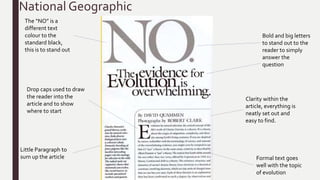
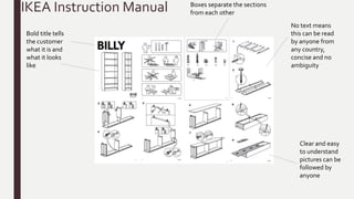
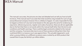
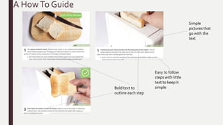
TASK 1
Sjon Barnes
National Geographic
Bold and big letters
to stand out to the
reader to simply
answer the
question
Little Paragraph to
sum up the article
Drop caps used to draw
the reader into the
article and to show
where to start
Formal text goes
well with the topic
of evolution
Clarity within the
article, everything is
neatly set out and
easy to find.
The “NO” is a
different text
colour to the
standard black,
this is to stand out
This is the
full article
of the
National
Geographic
article by
David
Quammen
Was
Darwin
Wrong?
With this magazine there is little ambiguity, with the words being clearly spaced and written
well to avoid vagueness on such an important article.The magazines headline is bold, and
simply answers the question before going into the detail at the bottom of the page. Overall the
National Geographic has clarity as it’s clear and easy to understand, without using too many
technical terms that could put off some of the audience.The information displayed in this
magazine has a strong bias leaning towards the argument of evolution rather than offering
evidence that supports the creationist point of view. Factual writing in general should avoid
bias however, for this article it’s hard to find evidence to support the creationist views because
it’s fact that animals evolved over time and to support creationism is non existent now. Despite
the bias towards evolution in the article the National Geographic magazine is accurate and
correct, the articles are written by professionals including biologists, chemists, and physicists.
Grammatically the magazine is rarely ever wrong, they are a professional factual magazine and
it would be rare to spot a grammatical mistake in such a professional company.
National Geographic
Due to the broad question asked at the start of the article, it then goes into detail about the
topic and because of this the article is not concise. However if they were to keep the article
concise with it’s argument for evolution then some of the audience could not feel satisfied and
uninformed with the article so being concise is not really an option for the National
Geographic.The language used in the magazine article is very formal, this is because the topic
in the article is very professional and would require formal language for it to reach out to the
audience.There is plenty of evidencing of arguments in the article however it only clearly
explains one side, as I have mentioned before this is because there is so much evidence leading
towards evolution that there isn’t much point of including both sides of the argument in today’s
society.There are external sources within the article, these are mostly quotes from books by
other people and surveys to help back up the support for evolution. (Legal Constraints and
Codes Of Practice Needed)
National Geographic
IKEA Instruction Manual
Bold title tells
the customer
what it is and
what it looks
like
No text means
this can be read
by anyone from
any country,
concise and no
ambiguity
Clear and easy
to understand
pictures can be
followed by
anyone
Boxes separate the sections
from each other
IKEA is famous for it’s universal instructions, how they can be received and done by
anyone and anywhere because of the lack of text and the inclusion of simple images.
There is a lot of clarity in this instruction guide, with the work being very clear and easy to
understand as it’s all very simplistic pictures. I think these manuals are also concise, always
sticking to simplicity to show you how to build the items on the manual which is very
much the opposite to the article that I did as that was not concise at all. I think these
guides are not ambiguous, as I said at the start they can be used in any country due to the
lack of language used in the manual compared to others that use a lot of text. However
any person can be confused by pictures and could get something wrong, so there could be
a little ambiguity in the manual.
IKEA Manual
The manual is accurate, the pictures are clear and detailed and can tell you how to build
furniture, if the manual wasn't accurate then that would be a big mistake for such a huge
and professional company however this is unlikely to happen. It is also impossible for bias
to happen as there isn’t any text to be biased on this also goes the same for evidencing of
argument, referencing sources, register and codes of practice, these are all non applicable
due to the fact that there is not words within the manual itself other than the terms and
conditions and health warnings.There could be legal constraints related to the manual
and the company, if someone dies due to one of there products killing them then that
could land IKEA in a massive court case against them.This actually happened in 2016
when 3 young children on 3 different occasions were crushed by an IKEA product that
caused them to pay the family's 50 million dollars.
IKEA Manual
A HowTo Guide
Easy to follow
steps with little
text to keep it
simple
Simple
pictures that
go with the
text
Bold text to
outline each step
AWiki How article is a basic guide on how to do anything, the one I have chosen for this
presentation is How to toast bread.These guides are simple and easy to follow with
pictures to help explain the text, they can be followed by anyone because it’s on the
internet and most internet browsers provide a translate tool.They can however be quite
ambiguous, this is becauseWiki How are notorious for having images that are either not
helpful or completely un related to the text. Despite the guide having some flaws on some
of it’s guides, the majority of the time the guides are concise and accurate to the reader
and can actually be helpful.The language used in these guides are almost always informal,
this is because the guides are trying to connect to the reader this could then help them
through the guide if it looks like the guide is helping them specifically. In conclusion these
guides are helpful for anyone who hasn’t done specific tasks and they can be available to
anyone at anytime because it’s on the internet.
HowTo Guide
University Prospectus
A university prospectus is a helpful guide on a university and it’s courses, these are made
to impress the reader which would help towards picking that university over the others.
The pages that I have on display in the presentation have a lot of clarity, they are clearly
displayed and easy to read with a clear structure. However 2 o the 3 pages are not concise,
this is because those are descriptive pages informing the reader of the qualities ofYork
University.The first page is an introduction to that specific section of the prospectus, and
so will contain little to no text on that page and will instead focus on the images and
typography which it has done.The titles of the pages are in bold and various yet matching
colours for the prospectus, these are big and clear for the reader to see before reading the
text below and that avoids ambiguity for the reader.
University Prospectus
There is a heavy bias in the prospectus only because this is an informative guide on a
university instead of a guide on all the universities, so technically there is no bias in this
because it’s an informative guide rather than an article debating a subject.The language
used in the prospectus is informal rather than the formal method, this is because the
prospectus is trying to reel in the reader by making the language personal by using words
like ‘your’ and ‘you’ this will make the reader feel included
University Prospectus

Factual studff

  • 1.
  • 2.
    National Geographic Bold andbig letters to stand out to the reader to simply answer the question Little Paragraph to sum up the article Drop caps used to draw the reader into the article and to show where to start Formal text goes well with the topic of evolution Clarity within the article, everything is neatly set out and easy to find. The “NO” is a different text colour to the standard black, this is to stand out
  • 3.
    This is the fullarticle of the National Geographic article by David Quammen Was Darwin Wrong?
  • 5.
    With this magazinethere is little ambiguity, with the words being clearly spaced and written well to avoid vagueness on such an important article.The magazines headline is bold, and simply answers the question before going into the detail at the bottom of the page. Overall the National Geographic has clarity as it’s clear and easy to understand, without using too many technical terms that could put off some of the audience.The information displayed in this magazine has a strong bias leaning towards the argument of evolution rather than offering evidence that supports the creationist point of view. Factual writing in general should avoid bias however, for this article it’s hard to find evidence to support the creationist views because it’s fact that animals evolved over time and to support creationism is non existent now. Despite the bias towards evolution in the article the National Geographic magazine is accurate and correct, the articles are written by professionals including biologists, chemists, and physicists. Grammatically the magazine is rarely ever wrong, they are a professional factual magazine and it would be rare to spot a grammatical mistake in such a professional company. National Geographic
  • 6.
    Due to thebroad question asked at the start of the article, it then goes into detail about the topic and because of this the article is not concise. However if they were to keep the article concise with it’s argument for evolution then some of the audience could not feel satisfied and uninformed with the article so being concise is not really an option for the National Geographic.The language used in the magazine article is very formal, this is because the topic in the article is very professional and would require formal language for it to reach out to the audience.There is plenty of evidencing of arguments in the article however it only clearly explains one side, as I have mentioned before this is because there is so much evidence leading towards evolution that there isn’t much point of including both sides of the argument in today’s society.There are external sources within the article, these are mostly quotes from books by other people and surveys to help back up the support for evolution. (Legal Constraints and Codes Of Practice Needed) National Geographic
  • 7.
    IKEA Instruction Manual Boldtitle tells the customer what it is and what it looks like No text means this can be read by anyone from any country, concise and no ambiguity Clear and easy to understand pictures can be followed by anyone Boxes separate the sections from each other
  • 8.
    IKEA is famousfor it’s universal instructions, how they can be received and done by anyone and anywhere because of the lack of text and the inclusion of simple images. There is a lot of clarity in this instruction guide, with the work being very clear and easy to understand as it’s all very simplistic pictures. I think these manuals are also concise, always sticking to simplicity to show you how to build the items on the manual which is very much the opposite to the article that I did as that was not concise at all. I think these guides are not ambiguous, as I said at the start they can be used in any country due to the lack of language used in the manual compared to others that use a lot of text. However any person can be confused by pictures and could get something wrong, so there could be a little ambiguity in the manual. IKEA Manual
  • 9.
    The manual isaccurate, the pictures are clear and detailed and can tell you how to build furniture, if the manual wasn't accurate then that would be a big mistake for such a huge and professional company however this is unlikely to happen. It is also impossible for bias to happen as there isn’t any text to be biased on this also goes the same for evidencing of argument, referencing sources, register and codes of practice, these are all non applicable due to the fact that there is not words within the manual itself other than the terms and conditions and health warnings.There could be legal constraints related to the manual and the company, if someone dies due to one of there products killing them then that could land IKEA in a massive court case against them.This actually happened in 2016 when 3 young children on 3 different occasions were crushed by an IKEA product that caused them to pay the family's 50 million dollars. IKEA Manual
  • 10.
    A HowTo Guide Easyto follow steps with little text to keep it simple Simple pictures that go with the text Bold text to outline each step
  • 11.
    AWiki How articleis a basic guide on how to do anything, the one I have chosen for this presentation is How to toast bread.These guides are simple and easy to follow with pictures to help explain the text, they can be followed by anyone because it’s on the internet and most internet browsers provide a translate tool.They can however be quite ambiguous, this is becauseWiki How are notorious for having images that are either not helpful or completely un related to the text. Despite the guide having some flaws on some of it’s guides, the majority of the time the guides are concise and accurate to the reader and can actually be helpful.The language used in these guides are almost always informal, this is because the guides are trying to connect to the reader this could then help them through the guide if it looks like the guide is helping them specifically. In conclusion these guides are helpful for anyone who hasn’t done specific tasks and they can be available to anyone at anytime because it’s on the internet. HowTo Guide
  • 12.
  • 13.
    A university prospectusis a helpful guide on a university and it’s courses, these are made to impress the reader which would help towards picking that university over the others. The pages that I have on display in the presentation have a lot of clarity, they are clearly displayed and easy to read with a clear structure. However 2 o the 3 pages are not concise, this is because those are descriptive pages informing the reader of the qualities ofYork University.The first page is an introduction to that specific section of the prospectus, and so will contain little to no text on that page and will instead focus on the images and typography which it has done.The titles of the pages are in bold and various yet matching colours for the prospectus, these are big and clear for the reader to see before reading the text below and that avoids ambiguity for the reader. University Prospectus
  • 14.
    There is aheavy bias in the prospectus only because this is an informative guide on a university instead of a guide on all the universities, so technically there is no bias in this because it’s an informative guide rather than an article debating a subject.The language used in the prospectus is informal rather than the formal method, this is because the prospectus is trying to reel in the reader by making the language personal by using words like ‘your’ and ‘you’ this will make the reader feel included University Prospectus