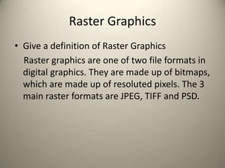
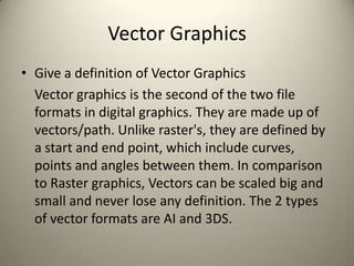
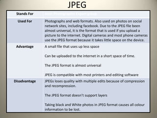
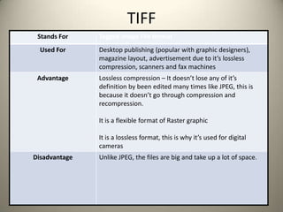
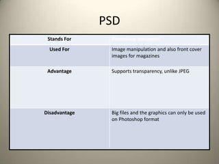
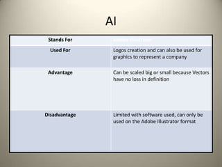
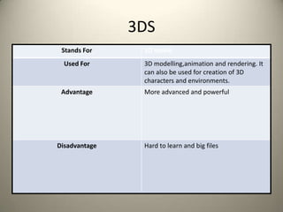
The document discusses different digital graphics file formats including raster graphics (JPEG, TIFF, PSD), vector graphics (AI, 3DS), and provides definitions and examples of uses for each file type. It also examines specific graphics file formats in more detail, outlining what each file type stands for, common uses, advantages, and disadvantages. The document serves as an overview of common digital graphics file formats and their applications.
The Art of the Pitch: WordPress Relationships and SalesLaura Byrne
Clients don’t know what they don’t know. What web solutions are right for them? How does WordPress come into the picture? How do you make sure you understand scope and timeline? What do you do if sometime changes?
All these questions and more will be explored as we talk about matching clients’ needs with what your agency offers without pulling teeth or pulling your hair out. Practical tips, and strategies for successful relationship building that leads to closing the deal.
Dev Dives: Train smarter, not harder – active learning and UiPath LLMs for do...UiPathCommunity
💥 Speed, accuracy, and scaling – discover the superpowers of GenAI in action with UiPath Document Understanding and Communications Mining™:
See how to accelerate model training and optimize model performance with active learning
Learn about the latest enhancements to out-of-the-box document processing – with little to no training required
Get an exclusive demo of the new family of UiPath LLMs – GenAI models specialized for processing different types of documents and messages
This is a hands-on session specifically designed for automation developers and AI enthusiasts seeking to enhance their knowledge in leveraging the latest intelligent document processing capabilities offered by UiPath.
Speakers:
👨🏫 Andras Palfi, Senior Product Manager, UiPath
👩🏫 Lenka Dulovicova, Product Program Manager, UiPath
Search and Society: Reimagining Information Access for Radical FuturesBhaskar Mitra
The field of Information retrieval (IR) is currently undergoing a transformative shift, at least partly due to the emerging applications of generative AI to information access. In this talk, we will deliberate on the sociotechnical implications of generative AI for information access. We will argue that there is both a critical necessity and an exciting opportunity for the IR community to re-center our research agendas on societal needs while dismantling the artificial separation between the work on fairness, accountability, transparency, and ethics in IR and the rest of IR research. Instead of adopting a reactionary strategy of trying to mitigate potential social harms from emerging technologies, the community should aim to proactively set the research agenda for the kinds of systems we should build inspired by diverse explicitly stated sociotechnical imaginaries. The sociotechnical imaginaries that underpin the design and development of information access technologies needs to be explicitly articulated, and we need to develop theories of change in context of these diverse perspectives. Our guiding future imaginaries must be informed by other academic fields, such as democratic theory and critical theory, and should be co-developed with social science scholars, legal scholars, civil rights and social justice activists, and artists, among others.
GDG Cloud Southlake #33: Boule & Rebala: Effective AppSec in SDLC using Deplo...James Anderson
Effective Application Security in Software Delivery lifecycle using Deployment Firewall and DBOM
The modern software delivery process (or the CI/CD process) includes many tools, distributed teams, open-source code, and cloud platforms. Constant focus on speed to release software to market, along with the traditional slow and manual security checks has caused gaps in continuous security as an important piece in the software supply chain. Today organizations feel more susceptible to external and internal cyber threats due to the vast attack surface in their applications supply chain and the lack of end-to-end governance and risk management.
The software team must secure its software delivery process to avoid vulnerability and security breaches. This needs to be achieved with existing tool chains and without extensive rework of the delivery processes. This talk will present strategies and techniques for providing visibility into the true risk of the existing vulnerabilities, preventing the introduction of security issues in the software, resolving vulnerabilities in production environments quickly, and capturing the deployment bill of materials (DBOM).
Speakers:
Bob Boule
Robert Boule is a technology enthusiast with PASSION for technology and making things work along with a knack for helping others understand how things work. He comes with around 20 years of solution engineering experience in application security, software continuous delivery, and SaaS platforms. He is known for his dynamic presentations in CI/CD and application security integrated in software delivery lifecycle.
Gopinath Rebala
Gopinath Rebala is the CTO of OpsMx, where he has overall responsibility for the machine learning and data processing architectures for Secure Software Delivery. Gopi also has a strong connection with our customers, leading design and architecture for strategic implementations. Gopi is a frequent speaker and well-known leader in continuous delivery and integrating security into software delivery.
JMeter webinar - integration with InfluxDB and GrafanaRTTS
Watch this recorded webinar about real-time monitoring of application performance. See how to integrate Apache JMeter, the open-source leader in performance testing, with InfluxDB, the open-source time-series database, and Grafana, the open-source analytics and visualization application.
In this webinar, we will review the benefits of leveraging InfluxDB and Grafana when executing load tests and demonstrate how these tools are used to visualize performance metrics.
Length: 30 minutes
Session Overview
-------------------------------------------
During this webinar, we will cover the following topics while demonstrating the integrations of JMeter, InfluxDB and Grafana:
- What out-of-the-box solutions are available for real-time monitoring JMeter tests?
- What are the benefits of integrating InfluxDB and Grafana into the load testing stack?
- Which features are provided by Grafana?
- Demonstration of InfluxDB and Grafana using a practice web application
To view the webinar recording, go to:
https://www.rttsweb.com/jmeter-integration-webinar
Builder.ai Founder Sachin Dev Duggal's Strategic Approach to Create an Innova...Ramesh Iyer
In today's fast-changing business world, Companies that adapt and embrace new ideas often need help to keep up with the competition. However, fostering a culture of innovation takes much work. It takes vision, leadership and willingness to take risks in the right proportion. Sachin Dev Duggal, co-founder of Builder.ai, has perfected the art of this balance, creating a company culture where creativity and growth are nurtured at each stage.
LF Energy Webinar: Electrical Grid Modelling and Simulation Through PowSyBl -...DanBrown980551
Do you want to learn how to model and simulate an electrical network from scratch in under an hour?
Then welcome to this PowSyBl workshop, hosted by Rte, the French Transmission System Operator (TSO)!
During the webinar, you will discover the PowSyBl ecosystem as well as handle and study an electrical network through an interactive Python notebook.
PowSyBl is an open source project hosted by LF Energy, which offers a comprehensive set of features for electrical grid modelling and simulation. Among other advanced features, PowSyBl provides:
- A fully editable and extendable library for grid component modelling;
- Visualization tools to display your network;
- Grid simulation tools, such as power flows, security analyses (with or without remedial actions) and sensitivity analyses;
The framework is mostly written in Java, with a Python binding so that Python developers can access PowSyBl functionalities as well.
What you will learn during the webinar:
- For beginners: discover PowSyBl's functionalities through a quick general presentation and the notebook, without needing any expert coding skills;
- For advanced developers: master the skills to efficiently apply PowSyBl functionalities to your real-world scenarios.
UiPath Test Automation using UiPath Test Suite series, part 3DianaGray10
Welcome to UiPath Test Automation using UiPath Test Suite series part 3. In this session, we will cover desktop automation along with UI automation.
Topics covered:
UI automation Introduction,
UI automation Sample
Desktop automation flow
Pradeep Chinnala, Senior Consultant Automation Developer @WonderBotz and UiPath MVP
Deepak Rai, Automation Practice Lead, Boundaryless Group and UiPath MVP
Kubernetes & AI - Beauty and the Beast !?! @KCD Istanbul 2024Tobias Schneck
As AI technology is pushing into IT I was wondering myself, as an “infrastructure container kubernetes guy”, how get this fancy AI technology get managed from an infrastructure operational view? Is it possible to apply our lovely cloud native principals as well? What benefit’s both technologies could bring to each other?
Let me take this questions and provide you a short journey through existing deployment models and use cases for AI software. On practical examples, we discuss what cloud/on-premise strategy we may need for applying it to our own infrastructure to get it to work from an enterprise perspective. I want to give an overview about infrastructure requirements and technologies, what could be beneficial or limiting your AI use cases in an enterprise environment. An interactive Demo will give you some insides, what approaches I got already working for real.
Connector Corner: Automate dynamic content and events by pushing a buttonDianaGray10
Here is something new! In our next Connector Corner webinar, we will demonstrate how you can use a single workflow to:
Create a campaign using Mailchimp with merge tags/fields
Send an interactive Slack channel message (using buttons)
Have the message received by managers and peers along with a test email for review
But there’s more:
In a second workflow supporting the same use case, you’ll see:
Your campaign sent to target colleagues for approval
If the “Approve” button is clicked, a Jira/Zendesk ticket is created for the marketing design team
But—if the “Reject” button is pushed, colleagues will be alerted via Slack message
Join us to learn more about this new, human-in-the-loop capability, brought to you by Integration Service connectors.
And...
Speakers:
Akshay Agnihotri, Product Manager
Charlie Greenberg, Host
3. Raster Graphics
• Give a definition of Raster Graphics
Raster graphics are one of two file formats in
digital graphics. They are made up of bitmaps,
which are made up of resoluted pixels. The 3
main raster formats are JPEG, TIFF and PSD.
4. Vector Graphics
• Give a definition of Vector Graphics
Vector graphics is the second of the two file
formats in digital graphics. They are made up of
vectors/path. Unlike raster's, they are defined by
a start and end point, which include curves,
points and angles between them. In comparison
to Raster graphics, Vectors can be scaled big and
small and never lose any definition. The 2 types
of vector formats are AI and 3DS.
5. JPEG
Stands For
Used For
Advantage
Joint Photographic Expert group
Photographs and web formats. Also used on photos on social
network sites, including facebook. Due to the JPEG file been
almost universal, it is the format that is used if you upload a
picture to the internet. Digital cameras and most phone cameras
use the JPEG format because it takes little space on the device.
A small file that uses up less space
Can be uploaded to the internet in a short space of time.
The JPEG format is almost universal
JPEG is compatible with most printers and editing software
Disadvantage
JPEGs loses quality with multiple edits because of compression
and recompression.
The JPEG format doesn’t support layers
Taking black and White photos in JPEG format causes all colour
information to be lost.
6. TIFF
Stands For
Tagged image File format
Used For
Desktop publishing (popular with graphic designers),
magazine layout, advertisement due to it’s lossless
compression, scanners and fax machines
Advantage
Lossless compression – It doesn’t lose any of it’s
definition by been edited many times like JPEG, this is
because it doesn’t go through compression and
recompression.
It is a flexible format of Raster graphic
It is a lossless format, this is why it’s used for digital
cameras
Disadvantage
Unlike JPEG, the files are big and take up a lot of space.
7. PSD
Stands For
Used For
Advantage
Disadvantage
Photoshop document
Image manipulation and also front cover
images for magazines
Supports transparency, unlike JPEG
Big files and the graphics can only be used
on Photoshop format
8. AI
Stands For
Used For
Advantage
Disadvantage
Adobe Illustrator
Logos creation and can also be used for
graphics to represent a company
Can be scaled big or small because Vectors
have no loss in definition
Limited with software used, can only be
used on the Adobe Illustrator format
9. 3DS
Stands For
Used For
Advantage
Disadvantage
3D studio
3D modelling,animation and rendering. It
can also be used for creation of 3D
characters and environments.
More advanced and powerful
Hard to learn and big files
12. Evaluation
What did you like about your image?
I liked how you could manipulate the shapes
into how you wanted and that the image was
well covered by layers delicately.
What would you improve if you did it again?
I would of spent more time on the detail, such
as the feet and face.
14. Evaluation
What did you like about your image?
I liked the attention the detail on many parts
such as the hair with the combination of two
colours adding to the effect.
What would you improve if you did it again?
I would of like to spent more time on the T-Shirt
of the chosen character as it would of made it
look more professional.
16. Evaluation
What did you like about your image?
The way how symbols and colours were used to
make the words stand out more aswell as having
pictures behind the words which made the
image look better.
What would you improve if you did it again?
Chosen a text which was a little shorter as it
would of allowed more time to concentrate on
other aspects such as the font and size.
18. Evaluation
What did you like about your image?
I liked how simple yet effective it was, also the
use of 3 pictures behind the words was used in a
very clever way such as the keyboard behind the
word Print.
What would you improve if you did it again?
Spent time on the colour association, and
maybe picked colours suited to the York college
colours.
23. Proposal
Dimensions
2400 by 3200 pixels
Export Format
PNG
Advantages; Compatible with Red bubble, can save transparency and lowered opacity.
Disadvantages; Larger file size than similar formats such as JPEG
24. Content
I am going to make that of a sporting T-shirt. I am aiming to make a T-shirt
with Footballer Mesut Özil on, however using the Umlaut as two googly on
the players shirt. Having looked on Red Bubble for similar ideas I have not
found any looking like my idea. My idea consists of having the player stood
with the ball. And using the style of Rotoscoping to make the player look
more of a comic version, this will go with the comic font used for the name.
This printed on a white T-Shirt. Also I will have the German flag behind the
player as it is his nationality and goes with the picture very well.
My second idea is that of forming Thomas Vermaelen head ( The Arsenal
Captain)With Captain Americas body forming one person and calling him
captain fantastic, this will be ideally uploaded on Red bubble as a second
design and to be on posters and Birthday cards. This is to back up for the
ideas involving the First idea and expanding the theme.
25. Proposal
Audience
I want to target football fans, mainly the ones who support arsenal. People of all
ages and both genders. The second idea is targeting both cartoon fans as well as
arsenal fans targeting younger generation.
Deadline
Friday 4th October
Schedule
Monday
Research Existing ideas
Create spider diagram
Proposal
Mood board
Wednesday
Digital Flat plan
Complete final design.
Complete Pro forma
Friday
Final design
Export as PNG file
Upload to Redbubble
Add tag on York college
PBM
Send all work to blog
Email Http address of blog
to Guy
27. Font to be used for final design
The googly eyes representing the umlaut in the footballers name
as he is from Germany. This also adds to the ideas of being
cartoony and the German idea with the flag. The font is used in a
bold way so it grabs the attention and makes the eyes stand out
better. This will be on the T-shirt itself to replace the badge to
prevent copy write issues.
28. Idea 2.
• Arsenal captain Thomas Vermaelen on captain
Americas body. 2 captains formed in one. TO
make a poster
31. Second idea- Finished piece
This is a design that relates to the cartoon theme and
also sticking to the chosen football club one. This is
mainly designed as a poster to follow up on ideas
from the initial design. This can be used on Birthday
Cards aswell.
32. Final idea
This is the final design of the T-Shirt task, this was made solely for
printing on T-Shirts and targeting the Sporting community aswell as the
fans of the chosen club and country.
34. Does your final product reflect your
original intentions?
• Compare your planning/digital flat plans/
storyboards to your final product
In comparison the digital flat plan was almost
identical to the final piece. However the spider
diagram with the original ideas was not quite as
similar, as it was going more down the gaming route.
On the other hand the main idea of having the
certain player on the T-Shirt has stayed the same only
for the text and background to be changed
35. The Flat plan (Left) is clearly a similar product to the final image and gives a better
insight to what the image will look like. Compared to the spider diagram here this
actually gives a spring board to the visualisation of the final piece and the other
methods were more of a distraction as they started looking at other ideas. This
would be good should the idea not have ben chosen already.
36. Here it is clear that the idea chosen was on the right hand side however the ideas
were leaning to the gaming route and I believed this to be too common on t-shirt
designs.
37. Is your product suitable for your
audience?
• Reference your proposal
• Give an audience profile and describe suitability in
reference to content
• I do believe that this Design I have made will reach out
to the original target audience, that being of Sporting
fans of a younger generation between 8-15 which I was
targeting in my Proposal before making the designs.
The product will be targeted at fans of Arsenal the
football team or that from a German background and
the design itself will be very suitable as is it not over
the top but very appropriate for the buyer as it relates
to their interests.
38. What do you like/dislike about the
techniques you have used?
• Reference specific tools
you used with images
I have liked the way in which
I used Rotoscoping to make
the player look more life like
by making the facial aspect
of the body detailed and
therefore make the T-Shirt
look more professional.
However I disliked the
outline of the players shirt
and this could have had
more time spent on to make
sure it looked good.
39. What do you like/dislike about how
your final product looks?
• I liked how the background complements the
image and makes it stand out more. Also the
detail on some of the face I found very
precise. On the other hand the T-Shirt on the
player could have been dealt with better
should more time have been given, however I
am very happy with the overall product and
feel it could make a few sales on
Redbubble.com
40. Why did you include the content you
used?
• Images, fonts, effects, colours
The image was used as it was a very popular image with the target
audience I was aiming at, plus I found it was the appropriate image size
to fit the template given before hand.
The colours I used were very effective in showing what the final image
was such as the German flag in the background as well as the Arsenal
Colours on the player that of red and white.
The font I used was to try and come across as more of a cartoony type
T-Shirt to partner the Googly eye balls also next to the text.
Zooming into the text on t-shirt here it is clear that
eye balls used makes the t-shirt become more
appropriate for younger generations of the
targeted demographic. Here again it is clear the
colours are effective as the black stands out very
well from the popular red.
41. What style have you employed in your
products?
• Discuss influences/ existing products
• What visual style does your work have and why
did you choose it?
The style my products have is that of a not over the
top method and using pictures rather than text to
explain what I want to get across. I chose this way
of using more picture than text as I feel it appeals
more to the audience I was aiming at and generally
T-Shirt buyers as they find it more interesting to
look at.
42. What were the strengths and weaknesses
of the pre-production and planning
• How did the planning and research help
• Reference specific examples
The Planning and Researching was very effective in deciding what image I was
wanted to do but even more important if it was already taken.
One example being, I liked the way in which the game GTA was linked
together with Breaking bad the Television show, but it was sadly taken and I
developed on the idea of this footballing one with a cartoony twist. This was a
very good strength of the Researching stage as it saved time in the long run
and helped me establish what Idea I wanted to do without going into making
an idea that was already taken. One Weakness I felt was that of in the
Planning stage as I found the mood boards did not add to any ideas I had
previously from the spider diagram and the idea generation was not needed
as the idea was already found. This I found only took more time away from
the production side of the project.
43. Strengths and weaknesses of the final
Design (Main Product)
If I was to do this T-shirt design again I would
consider allowing more time on the final piece
and less on researching the idea, this would be
to make the design look more professional and
could be sold on RedBubble.com.
The strengths with this Product I feel is
that of how much time has been spent
on making sure the person looks identical
to the real one and that effort is shown
through the detailed t-shirt and facial
features such as the mouth, eyes and
outline of the nose. The shades of colour
is used particularly well as the shirt
stands out from the background yet still
keeps the simplistic look which is good.
The weaknesses I feel with the product is
the text not being checked thoroughly
and the colour showing over the ‘O’ on
the second word. This as well as may be
adjustments to the hair by adding more
strokes of different tones.
44. The picture itself was taken off the internet and
altered on Adobe Photoshop. The picture looks
very detailed and a well chosen image as this
allows you to see the body and shirt and does
not need to lose its size to fit in any other
sections of the body
The text was off
dafont.com and I used it
as it was a cartoony
theme like my idea. The
text stands out in
contrast to the body not
due only to the size but
the font and colour
chosen has made it clear
and easy to look at for
people which is
important.
The eye balls were off the internet and
cropped on Microsoft Word before being
inserted onto Photoshop
The German flag in the background
was found on the internet and
moved behind the main body on
Photoshop. The contrast of the
colours makes the image look clear
and to a professional standard
I rotoscoped the
body and shirt
using the lasso
tool on the side
bar. Zooming in
on parts of the
face made it
easier to
rotoscope and
also when
dealing with the
amount of layers
that I had on that
PSD
45. Strengths and Weaknesses of
design (Product 2)
Strengths I feel are that of the way in
which not only have two Captains been
included in one but the way in which the
players nationality of Belgium has
replaced the American theme of the
original captain America theme. Also the
way in which the people have been
formed together in a short period of time
was good and that the use of colours
really stands out to the person looking at
it. The Weaknesses I feel are the lack of
detail in facial parts of the person as well
as the body not looking 3D.If this was to
be done again I would allocate more time
to this design and spent that time given
making the design look presentable.
46. Comparing work with existing designs.
The use of the same colours is evident and the
way it is presented, thus meaning the target
audience chosen will see this as a good
product.
The use if the text is also clear on the Right
image as this shares the same name. As a
popular player for the targeted demographic
of supporters of arsenal this t-shirt may
become popular when considering the context
of the design. The contrast of the colours is
almost identical as the white and red is the
colours of the targeted people to sell towards.
It is clear the theme of having the umlaut in the
players name on the shirts is popular however
when looking on redbubble the eye ball
technique on the t-shirt was not taken meaning
the idea shows originality and some creativity.
47. Peer Evaluation
What are the strengths of the final image?
I like the placement of the German flag behind the player. What is particularly
interesting is the fact the image is placed vertically opposed to horizontally, and as a
result of this, makes gives the player more height in the way their stood.
The colours that are used are bold, and when looking at specific details, and the arm
and neck pieces have a smaller stroke, which gives the clothing that the player is
wearing a much realistic look.
What could be developed if the image was repeated?
One thing I noticed was how the “Ozil” on the shirt is slightly faded on the left. This
was something in particular I noticed when you were working on the image. To
prevent this happening in future, I would recommend using a lasso tool to get better
selections. Otherwise, the image is strong, it has great detail and composition. Well
done!
48. Peer Feedback
Summarise peer feedback and discuss
– Responses you agree with: The responses I agree
with are that of the way in which the German flag
is presented as it was how I intended it. I also
agree with the criticism and will take them on
board in future should this design be repeated.