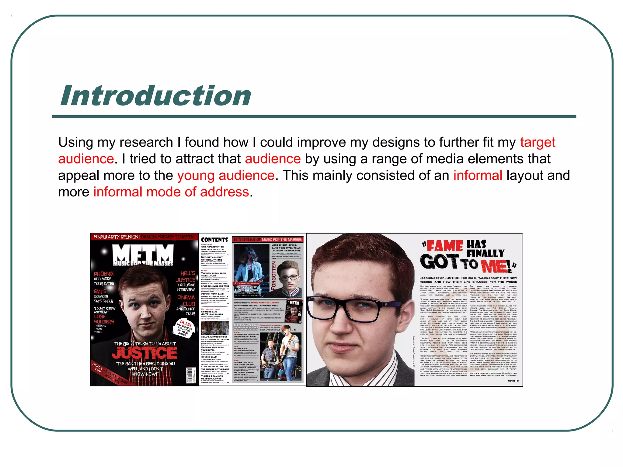
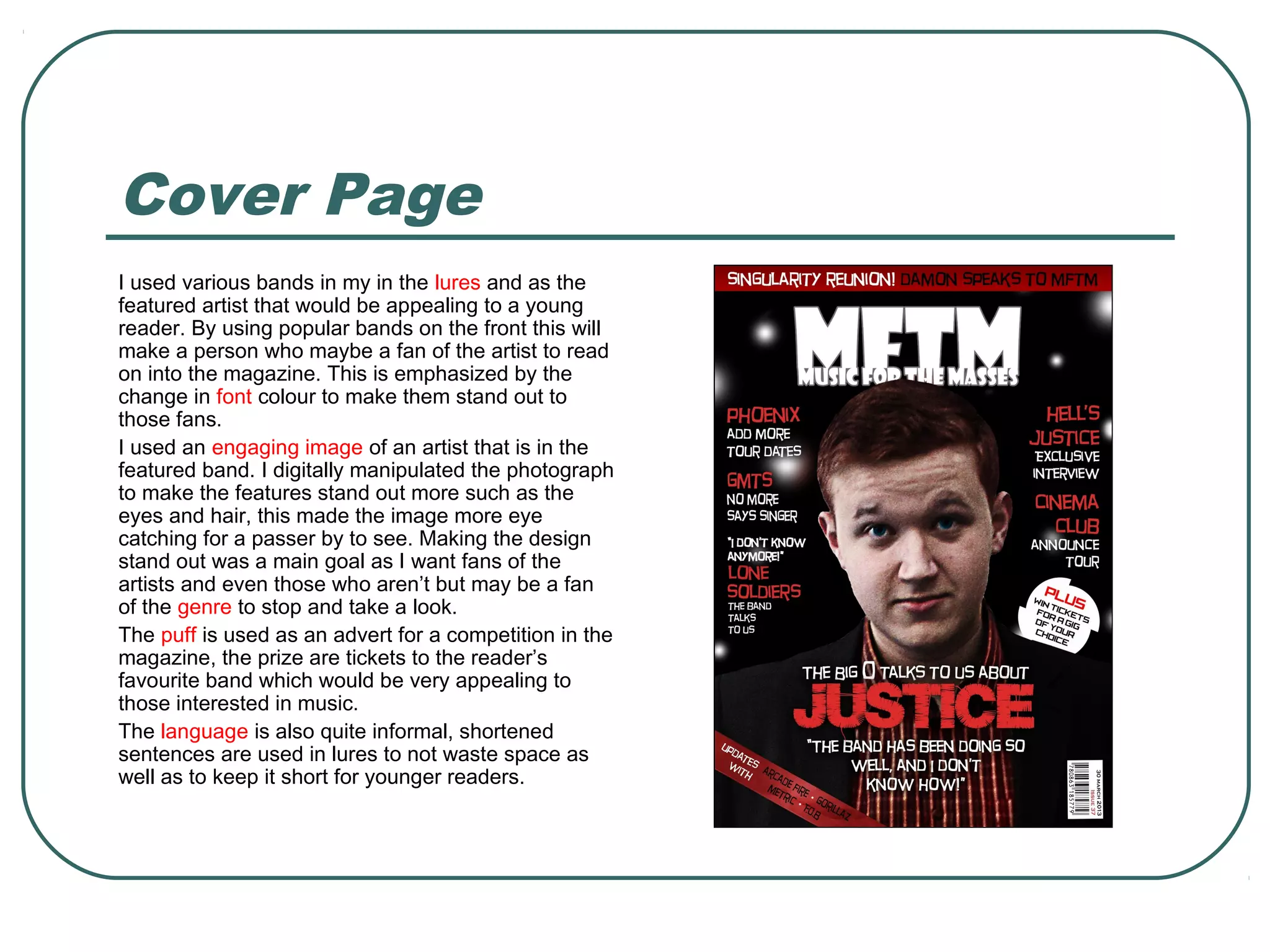
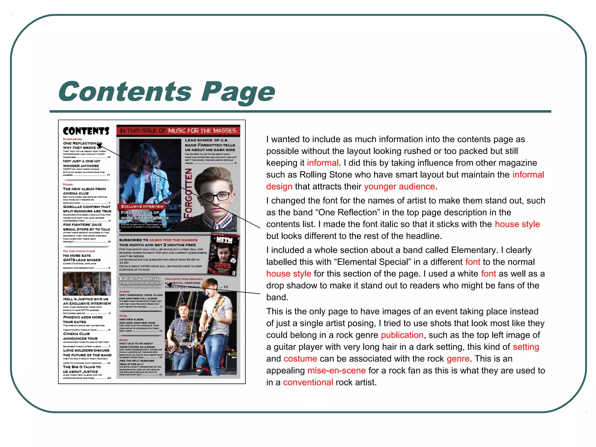
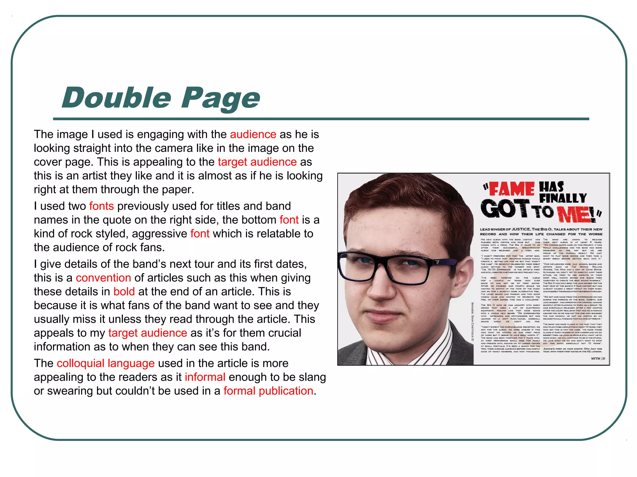
Sam Chittock targeted a young audience for their magazine design. They used popular bands and engaging artist images on the cover to attract fans. Throughout the magazine, they employed an informal layout and language with shortened sentences. Key elements like band names and section titles stood out in different fonts. Images on the contents page depicted rock genre scenes. The double page spread featured an artist looking at the reader and included tour dates, appealing to fans. An informal, engaging tone aimed to attract and keep young music enthusiasts reading.


![Music%20 Magazine%20 Research[1]](https://cdn.slidesharecdn.com/ss_thumbnails/music20magazine20research1-091119194300-phpapp02-thumbnail.jpg?width=640&height=640&fit=bounds)


