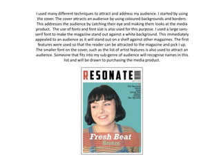
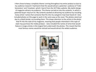
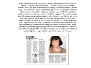
The document discusses techniques used to attract the target audience for a magazine. These techniques included using colorful backgrounds and borders on the cover to catch the eye, a large sans-serif font on the cover to make it stand out, and including names of featured artists to draw in those interested in that style of music. Throughout the magazine, a simplistic theme was maintained to appeal to the target "Indie Scenesters" and "Creatives" audience. Photos on the contents page used borders to draw attention and the largest font was used for the most famous artist names. An informal tone was used in interviews to make the content more relatable to younger readers.